
@work-zhanguo/light-file-preview
v0.0.19
Published
Lightweight file preview component for Vue 3, Vue 2, and standalone usage / 轻量级文件预览组件,支持 Vue3、Vue2 与独立产物嵌入。
Maintainers
 work-zhanguo
Readme
项目简介
- 当前版本:
0.0.18 - 适用场景:业务系统附件预览、在线查看、弹窗预览、新页面预览
- 支持 Vue 3、Vue 2 适配入口,以及非 Vue 项目的 standalone 产物
PPTX预览已拆分为独立项目:@work-zhanguo/pptx-preview / Gitee- 在线演示:可通过顶部
在线演示 Demo入口访问
最近更新:
0.0.18:更新PPTX在线预览效果截图,README 与文档页展示改为真实预览画面0.0.17:补全PPTX在线预览能力,接入@work-zhanguo/pptx-preview,同步更新演示文件与项目文档0.0.16:修复style.css引入后污染业务全局样式的问题,组件样式已收敛到.lfp-*作用域0.0.15:新增 npmREADME.md的中英文双版本折叠切换展示,同步调整包描述与文档版本信息0.0.14:优化xlsx空白区域填充,移除未声明的表头/首列固定效果,并为PDF、DOCX增加默认分页与全部展示切换0.0.13:修复弹窗失败后同文件无法重试、运行时配置更新不生效的问题,补充 README 示例图与发包说明0.0.12:修复xlsx部分单元格背景色、文字颜色和边框颜色未正确展示的问题,补充theme / tint / indexed颜色解析
详细版本记录见 CHANGELOG.md。
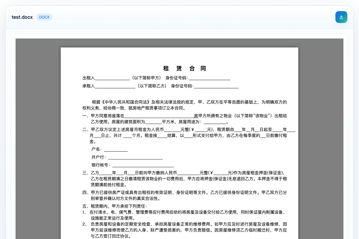
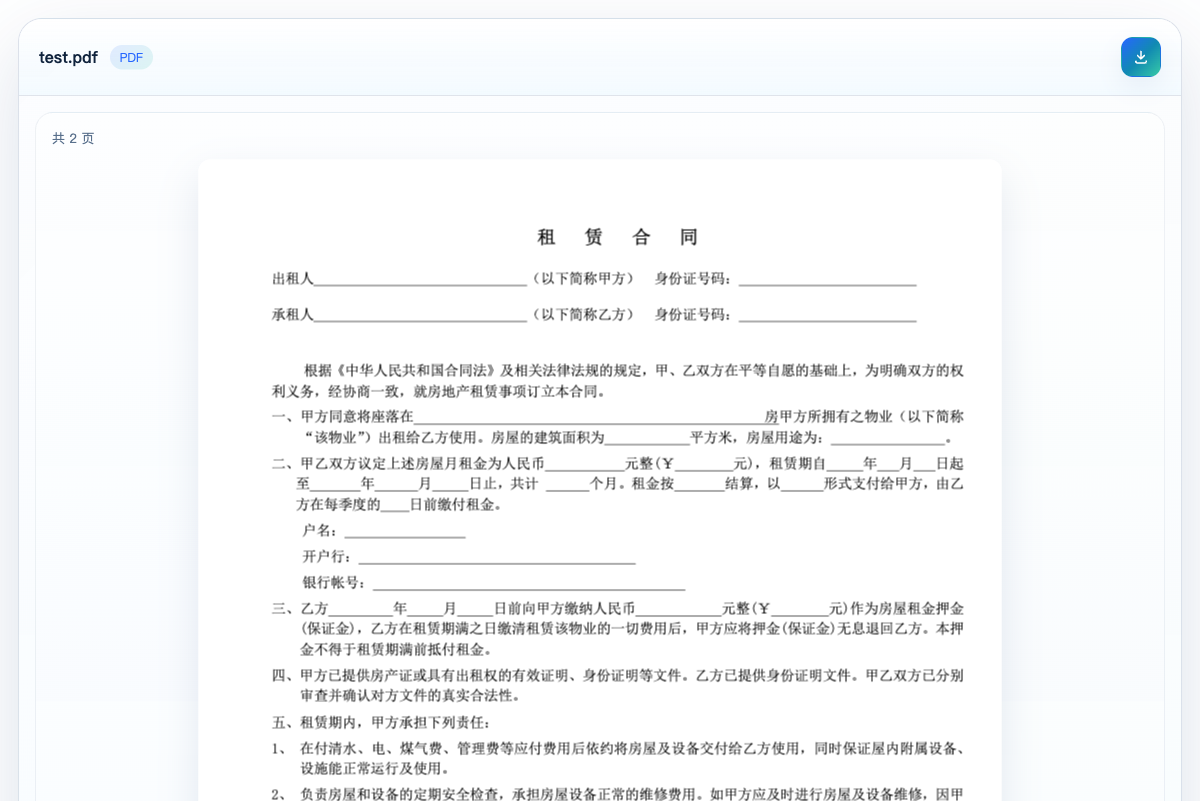
效果预览
仓库里的原始截图在 public/screenshots/ 目录。
下面的示例图使用 npm CDN 地址。当前仓库修改不会立即影响已发布版本;发布包含截图的新版本后,npm 页面会直接显示这些图片。
DOCX
XLSX

PPTX 说明
当前项目不再内置 PPTX 预览和相关集成能力。如需演示文稿预览,请直接使用独立项目:
支持文件
在线预览支持:
PNGJPGJPEGGIFWEBPBMPSVGPDFTXTJSONJSTSJSXTSXHTMLCSSMDDOCXXLSXLSXCSVMP4WEBMMP3WAV
降级为下载入口:
DOCPPTPPTX- 其他未识别格式
补充说明:
- 支持远程
URL、本地File、Blob - 支持直接嵌入和弹窗预览
- 不支持的格式不强行预览,统一保留下载入口
项目依赖
PPTX 预览
PPTX 预览已经拆分到独立项目维护。本项目只保留通用文件预览能力,不再内置 PPTX 渲染器。
安装
npm install @work-zhanguo/light-file-preview组件属性
| 属性 | 类型 | 默认值 | 说明 |
| --- | --- | --- | --- |
| source | string \| File \| Blob | - | 必填。支持远程 URL、本地 File、Blob。 |
| fileName | string | - | 自定义文件名,远程地址没有扩展名时建议传。 |
| mode | 'inline' \| 'dialog' | 'inline' | 直接预览或弹窗预览。 |
| visible | boolean | true | 弹窗模式下控制显示状态,可配合 v-model:visible。 |
| loadingText | string | '文件加载中...' | 加载提示文案。 |
| textEncoding | string | 'utf-8' | 文本类文件读取编码。 |
| maxTextBytes | number | 2097152 | 文本预览最大读取字节数,默认 2MB。 |
| maxSheetRows | number | 200 | 表格预览最大展示行数。 |
| maxSheetCols | number | 50 | 表格预览最大展示列数。 |
| pdfScale | number | 1.35 | PDF 渲染缩放比例。 |
| showToolbar | boolean | true | 是否显示顶部工具栏。 |
| dialogTitle | string | '文件预览' | 预览标题兜底文案。 |
组件事件:
update:visible:弹窗关闭时回传状态error:解析失败时返回错误对象
Vue 3 集成
import { createApp } from 'vue';
import App from './App.vue';
import LightFilePreview from '@work-zhanguo/light-file-preview';
import '@work-zhanguo/light-file-preview/style.css';

createApp(App).use(LightFilePreview).mount('#app');
<template>
<LightFilePreview source="/files/demo.pdf" />
</template>Vue 2 集成
import Vue from 'vue';
import LightFilePreview from '@work-zhanguo/light-file-preview/vue2';
import '@work-zhanguo/light-file-preview/style.css';

Vue.use(LightFilePreview);
<template>
<light-file-preview :source="fileUrl" />
</template>弹窗预览
<template>
  <button @click="show = true">打开弹窗预览</button>

  <LightFilePreview
    v-model:visible="show"
    source="https://501351981.github.io/vue-office/examples/dist/static/test-files/test.docx"
    mode="dialog"
  />
</template>

<script setup lang="ts">
import { ref } from 'vue';

const show = ref(false);
</script>
新页面预览
建议同时传 name,这样扩展名识别更稳定。
const remoteUrl = 'https://example.com/files/test.docx';
const previewUrl =
  '/?preview=1&src=' +
  encodeURIComponent(remoteUrl) +
  '&name=' +
  encodeURIComponent('test.docx');

window.open(previewUrl, '_blank');
原生项目集成
非 Vue 项目可以直接使用 standalone 产物。
如果你是从 npm 包里复制静态文件,建议复制下面两个文件:
dist/standalone/light-file-preview.iife.jsdist/standalone/style.css
<link rel="stylesheet" href="/vendor/light-file-preview/style.css" />
<div id="preview-root"></div>
<script src="/vendor/light-file-preview/light-file-preview.iife.js"></script>
<script>
  window.LightFilePreview.mount('#preview-root', {
    source: '/uploads/report.xlsx'
  });
</script>
Odoo 集成
Odoo 项目推荐走静态资源加 Owl 组件挂载。
/** @odoo-module **/

import { Component, onMounted, useRef } from '@odoo/owl';

export class FilePreviewBlock extends Component {
  setup() {
    this.rootRef = useRef('root');

    onMounted(() => {
      window.LightFilePreview.mount(this.rootRef.el, {
        source: this.props.source,
        fileName: this.props.fileName || 'report.pdf'
      });
    });
  }
}

FilePreviewBlock.template = 'your_module.FilePreviewBlock';
<templates xml:space="preserve">
<t t-name="your_module.FilePreviewBlock">
<div class="o_file_preview_root" t-ref="root" />
</t>
</templates>部署说明
组件库打包:
npm install
npm run build
产物目录:
dist/dist/standalone/
如果要把首页演示页和文档页一起部署成静态站点,执行:
npm run build:site站点部署目录:
dist-site/
Overview
- Current version:
0.0.18 - Use cases: attachment preview in business systems, inline viewing, dialog preview, and standalone preview pages
- Supports Vue 3, a Vue 2 adapter entry, and standalone assets for non-Vue projects
PPTXpreview has been split into a standalone project: @work-zhanguo/pptx-preview / Gitee- Demo: available through the
在线演示 Demolink at the top of this document
Recent updates:
0.0.18: refreshed thePPTXpreview screenshot so README and docs now show the real online preview result0.0.17: added onlinePPTXpreview through@work-zhanguo/pptx-preview, and synchronized the demo file and project documentation0.0.16: fixed global style leakage caused by importingstyle.css, and scoped published component styles to.lfp-*rules only0.0.15: rewroteREADME.mdfor npm with collapsible Chinese and English sections, and synchronized package description and documentation version info0.0.14: optimized blank area handling inxlsx, removed undeclared frozen header/column behavior, and added paged/all display switching forPDFandDOCX0.0.13: fixed retry behavior after preview failures in dialog mode, refreshed README examples, and clarified packaging details0.0.12: fixed missing background, text, and border colors for somexlsxcells, and addedtheme / tint / indexedcolor parsing
For the full release history, see CHANGELOG.md.
Preview Screenshots
Original screenshots are stored in public/screenshots/.
The images below use the npm CDN URL. Local repository changes do not affect the already published package immediately; after publishing a new version, npm will show the latest screenshots directly.
DOCX
XLSX
PPTX Note
This project no longer ships built-in PPTX preview support. If you need slide preview, use the standalone project instead:
Supported Files
Supported for online preview:
PNGJPGJPEGGIFWEBPBMPSVGPDFTXTJSONJSTSJSXTSXHTMLCSSMDDOCXXLSXLSXCSVMP4WEBMMP3WAV
Fallback to download entry:
DOCPPTPPTX- any unrecognized format
Notes:
- Supports remote
URL, localFile, andBlob - Supports both inline embedding and dialog preview
- Unsupported formats are not force-rendered and always keep a download entry
Dependencies
PPTX Preview
PPTX preview is now maintained as a standalone project. This package keeps the generic file preview scope and no longer bundles a PPTX renderer.
Installation
npm install @work-zhanguo/light-file-previewComponent Props
| Prop | Type | Default | Description |
| --- | --- | --- | --- |
| source | string \| File \| Blob | - | Required. Supports remote URLs, local File, and Blob. |
| fileName | string | - | Optional file name. Recommended when a remote URL has no extension. |
| mode | 'inline' \| 'dialog' | 'inline' | Inline preview or dialog preview. |
| visible | boolean | true | Controls dialog visibility and works with v-model:visible. |
| loadingText | string | '文件加载中...' | Loading text displayed during parsing. |
| textEncoding | string | 'utf-8' | Encoding used for text-like files. |
| maxTextBytes | number | 2097152 | Max size for text preview, default is 2 MB. |
| maxSheetRows | number | 200 | Maximum number of rows rendered in sheet preview. |
| maxSheetCols | number | 50 | Maximum number of columns rendered in sheet preview. |
| pdfScale | number | 1.35 | Render scale used for PDF pages. |
| showToolbar | boolean | true | Whether to show the top toolbar. |
| dialogTitle | string | '文件预览' | Fallback title used in dialog mode. |
Events:
update:visible: emitted when the dialog closeserror: emitted with the parsing error object
Vue 3 Integration
import { createApp } from 'vue';
import App from './App.vue';
import LightFilePreview from '@work-zhanguo/light-file-preview';
import '@work-zhanguo/light-file-preview/style.css';

createApp(App).use(LightFilePreview).mount('#app');
<template>
<LightFilePreview source="/files/demo.pdf" />
</template>Vue 2 Integration
import Vue from 'vue';
import LightFilePreview from '@work-zhanguo/light-file-preview/vue2';
import '@work-zhanguo/light-file-preview/style.css';

Vue.use(LightFilePreview);
<template>
<light-file-preview :source="fileUrl" />
</template>Dialog Preview
<template>
  <button @click="show = true">Open dialog preview</button>

  <LightFilePreview
    v-model:visible="show"
    source="https://501351981.github.io/vue-office/examples/dist/static/test-files/test.docx"
    mode="dialog"
  />
</template>

<script setup lang="ts">
import { ref } from 'vue';

const show = ref(false);
</script>
Standalone Preview Page
It is recommended to pass name as well so extension detection stays stable.
const remoteUrl = 'https://example.com/files/test.docx';
const previewUrl =
  '/?preview=1&src=' +
  encodeURIComponent(remoteUrl) +
  '&name=' +
  encodeURIComponent('test.docx');

window.open(previewUrl, '_blank');
Native Project Integration
Non-Vue projects can directly use the standalone bundle.
If you copy static assets from the npm package, the recommended files are:
dist/standalone/light-file-preview.iife.jsdist/standalone/style.css
<link rel="stylesheet" href="/vendor/light-file-preview/style.css" />
<div id="preview-root"></div>
<script src="/vendor/light-file-preview/light-file-preview.iife.js"></script>
<script>
  window.LightFilePreview.mount('#preview-root', {
    source: '/uploads/report.xlsx'
  });
</script>
Odoo Integration
For Odoo projects, the recommended approach is to mount the standalone bundle through static assets and an Owl component.
/** @odoo-module **/

import { Component, onMounted, useRef } from '@odoo/owl';

export class FilePreviewBlock extends Component {
  setup() {
    this.rootRef = useRef('root');

    onMounted(() => {
      window.LightFilePreview.mount(this.rootRef.el, {
        source: this.props.source,
        fileName: this.props.fileName || 'report.pdf'
      });
    });
  }
}

FilePreviewBlock.template = 'your_module.FilePreviewBlock';
<templates xml:space="preserve">
<t t-name="your_module.FilePreviewBlock">
<div class="o_file_preview_root" t-ref="root" />
</t>
</templates>Deployment
Build the component library:
npm install
npm run build
Output directories:
dist/dist/standalone/
If you want to deploy both the demo home page and the docs page as a static site:
npm run build:siteStatic site output:
dist-site/