
@work-zhanguo/pptx-preview
v0.0.4
Published
Lightweight PPTX preview component for Vue 3, Vue 2 adapter, and standalone usage / 轻量级 PPTX 预览组件,支持 Vue3、Vue2、standalone 与 Odoo 等项目集成。
Downloads
542
Maintainers
 work-zhanguo
Readme
项目简介
- 当前版本:
0.0.4 - 项目定位:独立的
PPTX预览组件,只处理PPTX在线预览 - 适用场景:业务系统方案查看、汇报材料查看、页面内嵌预览、弹窗预览、老项目独立挂载
- 集成形态:Vue3、Vue2、原生项目、Odoo等环境
当前能力:
- 支持远程
URL、本地File、Blob - 支持缩略图导航、上下页切换、缩放、自动播放、原文件下载
- 支持页面内嵌预览和弹窗预览
- 支持弹窗工具栏按钮按项配置,默认展示上一页、下一页、播放、缩小、缩放值、放大、下载、关闭
- 支持集成方通过组件实例
ref自己绘制外部工具栏
怎么实现的:
- 第一步,集成方把
source传进来,组件支持远程URL、本地File、Blob。输入层会先把这些来源统一成可读取的数据。 - 第二步,加载层调用
pptxtojson解析原始pptx文件,把它转成中间 JSON。这里会拿到页面尺寸、主题色、每页元素、备注和过渡信息。 - 第三步,项目会把第三方解析结果再做一次标准化,整理成组件内部稳定的数据结构。这样做是为了降低第三方库输出波动对渲染层的影响。
- 第四步,预览组件维护自己的运行状态,包括当前页、总页数、缩放比例、自动播放状态、弹窗显隐状态。工具栏操作、缩略图点击、外部
ref调用,最后都会落到这层状态更新。 - 第五步,渲染层按页渲染内容。右侧主区域只渲染当前页,左侧缩略图区渲染所有页面的小图导航。文本、图片、形状等元素会分配给对应的渲染逻辑处理。
- 第六步,样式层统一收敛在
.ppx-*命名空间下,避免把组件样式污染到宿主项目全局。 - 第七步,输出层按不同集成场景提供不同入口。Vue3 直接用主入口,Vue2 通过适配层挂载隔离的 Vue3 实例,非 Vue 页面和 Odoo 走 standalone 入口。
一句话概括:
- 先把
PPTX解析成稳定数据 - 再用组件状态驱动预览渲染
- 最后按
Vue3 / Vue2 / standalone三种方式提供给集成方使用
核心文件定位:
src/components/PptxPreview.vue:主预览组件,负责状态、工具栏、缩略图、弹窗逻辑src/components/PptxSlideView.vue:单页视图渲染src/components/PptxElementRenderer.vue:元素级渲染src/utils/source.ts:输入源读取src/utils/load.ts:解析与加载src/utils/render.ts:渲染辅助逻辑src/vue2.ts:Vue2 适配入口src/standalone-api.ts:standalone 挂载 API
如果你要预览 PDF / DOCX / XLSX / 图片 / 文本 / 音视频 等其他文件,请使用:
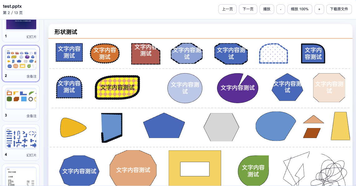
效果预览
弹窗预览示例
样式隔离与集成安全
样式审计结论:
- npm 主入口只引入
src/styles/component.css - 发布到包内的样式都挂在
.ppx-*命名空间下 - 不会主动改写
body、html、button、img、table这类全局选择器 - demo 页使用的页面级样式只在演示站里生效,不会通过组件库主入口带给集成方
集成建议:
- Vue3 项目使用
@work-zhanguo/pptx-preview - Vue2 项目使用
@work-zhanguo/pptx-preview/vue2 - 非 Vue 页面或老系统模板页使用
@work-zhanguo/pptx-preview/standalone - 样式只引入
@work-zhanguo/pptx-preview/style.css或对应入口的style.css
安装
npm install @work-zhanguo/pptx-preview组件属性
| 属性 | 类型 | 默认值 | 说明 |
| --- | --- | --- | --- |
| source | string \| File \| Blob | - | 必填。支持远程 URL、本地 File、Blob。 |
| fileName | string | - | 自定义文件名,远程地址没有扩展名时建议传。 |
| mode | 'inline' \| 'dialog' | 'inline' | 页面内嵌预览或弹窗预览。 |
| visible | boolean | true | 弹窗模式下控制显示状态,可配合 v-model:visible。 |
| loadingText | string | 'PPTX 加载中...' | 加载提示文案。 |
| dialogTitle | string | 'PPTX 预览' | 标题兜底文案。 |
| showToolbar | boolean | true | 是否显示顶部工具栏。 |
| showThumbnails | boolean | true | 是否显示左侧缩略图列表。 |
| autoPlay | boolean | false | 是否默认自动播放。 |
| playInterval | number | 3000 | 自动播放间隔,单位毫秒。 |
| loopPlayback | boolean | true | 播放到最后一页后是否循环。 |
| initialSlide | number | 0 | 初始页索引,从 0 开始。 |
| toolbarActions | Partial<PptxPreviewToolbarActions> | 全部 true | 工具栏按钮显示配置,可按项关闭。 |
toolbarActions 可配置项
| 字段 | 默认值 | 说明 |
| --- | --- | --- |
| prev | true | 上一页 |
| next | true | 下一页 |
| play | true | 播放 / 停止 |
| zoomOut | true | 缩小按钮 |
| zoomReset | true | 中间缩放值按钮 |
| zoomIn | true | 放大按钮 |
| download | true | 下载原文件 |
| close | true | 弹窗关闭按钮,仅弹窗模式生效 |
组件事件:
loaded:解析完成后返回标准化演示文稿对象error:解析失败时返回错误对象slide-change:当前页变更时返回页索引update:visible:弹窗关闭时回传状态
弹窗预览配置示例
默认情况下,弹窗预览会显示:
- 上一页
- 下一页
- 播放
- 缩小
- 缩放值
- 放大
- 下载原文件
- 关闭
如果你想去掉其中一部分按钮:
<template>
  <button @click="show = true">打开弹窗预览</button>

  <PptxPreview
    v-model:visible="show"
    source="/files/demo.pptx"
    mode="dialog"
    :toolbar-actions="{
      play: false,
      download: false,
      close: true
    }"
  />
</template>

<script setup lang="ts">
import { ref } from 'vue';

const show = ref(false);
</script>
Vue 3 集成
import { createApp } from 'vue';
import App from './App.vue';
import PptxPreviewPlugin from '@work-zhanguo/pptx-preview';
import '@work-zhanguo/pptx-preview/style.css';

createApp(App).use(PptxPreviewPlugin).mount('#app');
<template>
<PptxPreview
source="/files/demo.pptx"
:show-toolbar="true"
:show-thumbnails="true"
/>
</template>Vue 3 自定义外部工具栏
如果你不想用组件自带工具栏,可以隐藏它,然后通过实例方法自己接按钮:
<template>
  <div class="toolbar">
    <button @click="previewRef?.prevSlide()">上一页</button>
    <button @click="previewRef?.nextSlide()">下一页</button>
    <button @click="previewRef?.zoomOut()">缩小</button>
    <button @click="previewRef?.zoomIn()">放大</button>
    <button @click="previewRef?.togglePlayback()">播放 / 停止</button>
  </div>

  <PptxPreview
    ref="previewRef"
    :source="source"
    :show-toolbar="false"
    :show-thumbnails="true"
  />
</template>

<script setup lang="ts">
import { ref } from 'vue';
import { PptxPreview } from '@work-zhanguo/pptx-preview';
import type { PptxPreviewInstance } from '@work-zhanguo/pptx-preview';

const source = '/files/demo.pptx';
const previewRef = ref<PptxPreviewInstance | null>(null);
</script>
Vue 2 集成
Vue2 入口不是直接把宿主 Vue2 runtime 和本组件的 Vue3 runtime 混在一起,而是通过适配层挂载隔离的 Vue3 预览实例。
import Vue from 'vue';
import PptxPreview from '@work-zhanguo/pptx-preview/vue2';
import '@work-zhanguo/pptx-preview/vue2/style.css';

Vue.use(PptxPreview);
<template>
<PptxPreview
:source="fileUrl"
:show-toolbar="true"
:toolbar-actions="{ download: false }"
/>
</template>Standalone 集成
如果目标项目不是 Vue,或者现有构建链路不适合直接引入 Vue 组件入口,可以使用 standalone。
1. 通过 bundler 导入 ESM
import PptxPreviewStandalone from '@work-zhanguo/pptx-preview/standalone';
import '@work-zhanguo/pptx-preview/standalone/style.css';

PptxPreviewStandalone.mount('#pptx-root', {
  source: '/files/demo.pptx',
  showToolbar: true,
  toolbarActions: {
    download: true
  }
});
2. 通过脚本标签挂载 IIFE
<link rel="stylesheet" href="/vendor/pptx-preview/style.css" />
<div id="pptx-root"></div>
<script src="/vendor/pptx-preview/pptx-preview.iife.js"></script>
<script>
  window.PptxPreview.mount('#pptx-root', {
    source: '/files/demo.pptx',
    showToolbar: true
  });
</script>
Odoo 集成
Odoo 推荐走 standalone 产物,不要把整个 Vue 工程直接塞进现有页面。
/** @odoo-module **/

import { Component, onMounted, useRef } from '@odoo/owl';
import PptxPreviewStandalone from '@work-zhanguo/pptx-preview/standalone';
import '@work-zhanguo/pptx-preview/standalone/style.css';

export class PptxPreviewBlock extends Component {
  setup() {
    this.rootRef = useRef('root');

    onMounted(() => {
      PptxPreviewStandalone.mount(this.rootRef.el, {
        source: this.props.source,
        fileName: this.props.fileName || 'demo.pptx',
        showToolbar: true
      });
    });
  }
}
打包冲突说明
为降低集成到其他项目后的冲突风险,当前包按下面的方式分流:
- 主入口
@work-zhanguo/pptx-preview:vue作为 peer dependency,给 Vue3 项目复用宿主自己的 Vue3 - Vue2 入口
@work-zhanguo/pptx-preview/vue2:通过适配层挂载隔离的 Vue3 预览实例,不直接和宿主 Vue2 runtime 混编 - Standalone 入口
@work-zhanguo/pptx-preview/standalone:适合非 Vue 项目、老模板页、Odoo、脚本注入页面 - IIFE 入口
@work-zhanguo/pptx-preview/standalone/iife:适合<script>标签直出场景
推荐做法:
- Vue3 项目只用主入口
- Vue2 项目只用
./vue2 - 非 Vue 页面只用 standalone
- 不要在一个页面里同时混用主入口和 standalone
如果想预览其他文件
本项目只负责 PPTX。
如果你还要同时预览这些文件:
PDFDOCXXLSX- 图片
- 文本
- 音视频
请使用:
构建与调试
npm install
npm run generate:demo
npm run dev
组件库打包:
npm run build产物目录:
dist/dist/vue2/dist/standalone/dist-site/
Overview
- Current version:
0.0.4 - Project scope: a dedicated
PPTXpreview component that only handles onlinePPTXpreview - Use cases: proposal decks, business reports, inline preview, dialog preview, and legacy-page embedding
- Integration targets: Vue3, Vue2, native web pages, and Odoo-like environments
Current capabilities:
- Supports remote
URL, localFile, andBlob - Supports thumbnails, paging, zoom, autoplay, and original-file download
- Supports inline preview and dialog preview
- Supports per-action dialog toolbar configuration
- Supports external host-side toolbar control through instance methods
How it works:
- First, the host passes
source, which can be a remoteURL, localFile, orBlob. The input layer normalizes all of them into a readable source. - Second, the loading layer calls
pptxtojsonto parse the originalpptxfile into an intermediate JSON structure. That structure includes slide size, theme colors, slide elements, notes, and transitions. - Third, the project normalizes that parser output into a stable internal data shape so the rendering layer does not depend directly on third-party output quirks.
- Fourth, the preview component manages runtime state such as current slide, slide count, zoom level, autoplay state, and dialog visibility. Toolbar actions, thumbnail clicks, and external
refcalls all update this state. - Fifth, the rendering layer paints the preview. The main stage renders the active slide, while the thumbnail rail renders the full slide list for navigation. Text, image, and shape elements are handled by their corresponding render logic.
- Sixth, styles stay under the
.ppx-*namespace to avoid leaking into the host project's global styles. - Seventh, the package exposes different integration entries for different hosts. Vue3 uses the main entry, Vue2 uses an adapter that mounts an isolated Vue3 instance, and non-Vue or Odoo-like pages use the standalone entry.
Short version:
- parse
PPTXinto stable internal data - use component state to drive preview rendering
- expose the result through
Vue3 / Vue2 / standalone
Core file map:
src/components/PptxPreview.vue: main preview component, state, toolbar, thumbnail rail, dialog behaviorsrc/components/PptxSlideView.vue: single-slide renderingsrc/components/PptxElementRenderer.vue: element-level renderingsrc/utils/source.ts: source loadingsrc/utils/load.ts: parsing and loadingsrc/utils/render.ts: render helperssrc/vue2.ts: Vue2 adapter entrysrc/standalone-api.ts: standalone mount API
If you want to preview other file types such as PDF / DOCX / XLSX / image / text / audio / video, use:
Preview Screenshot
Dialog Preview Example
Style Isolation and Integration Safety
Style audit result:
- The npm main entry only imports
src/styles/component.css - Published styles are scoped under the
.ppx-*namespace - The package does not rewrite generic global selectors such as
body,html,button,img, ortable - Demo-page styles are not shipped through the library entry
Recommended integration paths:
- Vue3 projects should use
@work-zhanguo/pptx-preview - Vue2 projects should use
@work-zhanguo/pptx-preview/vue2 - Non-Vue or legacy pages should use
@work-zhanguo/pptx-preview/standalone - Only import
@work-zhanguo/pptx-preview/style.cssor thestyle.cssfile that belongs to the entry you are using
Installation
npm install @work-zhanguo/pptx-previewFor Vue2 projects, keep the same package name but import from @work-zhanguo/pptx-preview/vue2.
Component Props
| Prop | Type | Default | Description |
| --- | --- | --- | --- |
| source | string \| File \| Blob | - | Required. Supports remote URLs, local File, and Blob. |
| fileName | string | - | Optional file name. Recommended when the URL has no extension. |
| mode | 'inline' \| 'dialog' | 'inline' | Inline preview or dialog preview. |
| visible | boolean | true | Controls dialog visibility and works with v-model:visible. |
| loadingText | string | 'PPTX 加载中...' | Loading text shown during parsing. |
| dialogTitle | string | 'PPTX 预览' | Fallback title. |
| showToolbar | boolean | true | Whether to render the toolbar. |
| showThumbnails | boolean | true | Whether to render the thumbnail rail. |
| autoPlay | boolean | false | Whether playback starts automatically. |
| playInterval | number | 3000 | Autoplay interval in milliseconds. |
| loopPlayback | boolean | true | Whether playback loops after the last slide. |
| initialSlide | number | 0 | Initial slide index. |
| toolbarActions | Partial<PptxPreviewToolbarActions> | all true | Per-button toolbar visibility config. |
toolbarActions Fields
| Field | Default | Description |
| --- | --- | --- |
| prev | true | Previous slide |
| next | true | Next slide |
| play | true | Play / Stop |
| zoomOut | true | Zoom out button |
| zoomReset | true | Zoom status button |
| zoomIn | true | Zoom in button |
| download | true | Download original file |
| close | true | Close button, dialog mode only |
Events:
loaded: returns the normalized presentation object after parsingerror: returns the error object when parsing failsslide-change: returns the current slide index when the active slide changesupdate:visible: returns dialog visibility changes when the dialog closes
Dialog Toolbar Config Example
Dialog preview shows these buttons by default:
- Previous
- Next
- Play
- Zoom Out
- Zoom Value
- Zoom In
- Download
- Close
To remove some of them:
<template>
  <button @click="show = true">Open dialog preview</button>

  <PptxPreview
    v-model:visible="show"
    source="/files/demo.pptx"
    mode="dialog"
    :toolbar-actions="{
      play: false,
      download: false,
      close: true
    }"
  />
</template>

<script setup lang="ts">
import { ref } from 'vue';

const show = ref(false);
</script>
Vue 3 Integration
import { createApp } from 'vue';
import App from './App.vue';
import PptxPreviewPlugin from '@work-zhanguo/pptx-preview';
import '@work-zhanguo/pptx-preview/style.css';

createApp(App).use(PptxPreviewPlugin).mount('#app');
<template>
<PptxPreview
source="/files/demo.pptx"
:show-toolbar="true"
:show-thumbnails="true"
/>
</template>Vue 3 Custom Toolbar
If you do not want to use the built-in toolbar, hide it and connect your own buttons through the component instance methods:
<template>
  <div class="toolbar">
    <button @click="previewRef?.prevSlide()">Prev</button>
    <button @click="previewRef?.nextSlide()">Next</button>
    <button @click="previewRef?.zoomOut()">Zoom Out</button>
    <button @click="previewRef?.zoomIn()">Zoom In</button>
    <button @click="previewRef?.togglePlayback()">Play / Stop</button>
  </div>

  <PptxPreview
    ref="previewRef"
    :source="source"
    :show-toolbar="false"
    :show-thumbnails="true"
  />
</template>

<script setup lang="ts">
import { ref } from 'vue';
import { PptxPreview } from '@work-zhanguo/pptx-preview';
import type { PptxPreviewInstance } from '@work-zhanguo/pptx-preview';

const source = '/files/demo.pptx';
const previewRef = ref<PptxPreviewInstance | null>(null);
</script>
Vue 2 Integration
The Vue2 entry does not mix the host Vue2 runtime with the component's Vue3 runtime directly. It mounts an isolated Vue3 preview instance through an adapter layer.
import Vue from 'vue';
import PptxPreview from '@work-zhanguo/pptx-preview/vue2';
import '@work-zhanguo/pptx-preview/vue2/style.css';

Vue.use(PptxPreview);
<template>
<PptxPreview :source="fileUrl" :toolbar-actions="{ download: false }" />
</template>Standalone Integration
If the target project is not Vue, or the existing build chain is not suitable for importing the Vue component entry directly, use the standalone entry instead.
1. ESM for bundlers
import PptxPreviewStandalone from '@work-zhanguo/pptx-preview/standalone';
import '@work-zhanguo/pptx-preview/standalone/style.css';

PptxPreviewStandalone.mount('#pptx-root', {
  source: '/files/demo.pptx',
  showToolbar: true,
  toolbarActions: {
    download: true
  }
});
2. IIFE for script-tag pages
<link rel="stylesheet" href="/vendor/pptx-preview/style.css" />
<div id="pptx-root"></div>
<script src="/vendor/pptx-preview/pptx-preview.iife.js"></script>
<script>
  window.PptxPreview.mount('#pptx-root', {
    source: '/files/demo.pptx',
    showToolbar: true
  });
</script>
Odoo Integration
For Odoo, prefer the standalone bundle instead of forcing the full Vue component entry into the host page.
/** @odoo-module **/

import { Component, onMounted, useRef } from '@odoo/owl';
import PptxPreviewStandalone from '@work-zhanguo/pptx-preview/standalone';
import '@work-zhanguo/pptx-preview/standalone/style.css';

export class PptxPreviewBlock extends Component {
  setup() {
    this.rootRef = useRef('root');

    onMounted(() => {
      PptxPreviewStandalone.mount(this.rootRef.el, {
        source: this.props.source,
        fileName: this.props.fileName || 'demo.pptx',
        showToolbar: true
      });
    });
  }
}
Bundling Conflict Notes
To reduce integration conflicts:
- Main entry
@work-zhanguo/pptx-previewis for Vue3 hosts and usesvueas a peer dependency - Vue2 entry
@work-zhanguo/pptx-preview/vue2mounts an isolated Vue3 preview instance through an adapter - Standalone entry
@work-zhanguo/pptx-preview/standaloneis intended for non-Vue pages and embedded environments - IIFE entry
@work-zhanguo/pptx-preview/standalone/iifeis intended for direct<script>usage
Recommended usage:
- Vue3 projects: main entry only
- Vue2 projects:
./vue2only - Non-Vue pages: standalone only
- Do not mix the main entry and the standalone entry on the same page
If You Need Other File Types
This project only handles PPTX.
If you also need to preview:
PDFDOCXXLSX- images
- text
- audio or video
use:
Build
npm install
npm run generate:demo
npm run dev
Build the component library:
npm run buildBuild outputs:
dist/dist/vue2/dist/standalone/dist-site/