
@xal3xfx/reactbar
v1.0.6
Published
> Navigation bars for React applications.
Maintainers
 xal3xfx
Readme
reactbar
Navigation bars for React applications.
Dependencies
react >= 16
Table of contents
Installation
npm
$ npm install @xal3xfx/reactbaryarn
$ yarn add @xal3xfx/reactbarUsage
SidebarOld
The SidebarOld is a wrapper for your application. Put all of your components inside the SidebarOld.
Recommended to have
height: 100%on html and #root and nomarginon body.
body{
    margin: 0;
}

html, #root{
    height: 100%;
}
Desktop
| Expanded | Collapsed |
|----------------------------------------------------------------------------------|------------------|
|  |
| 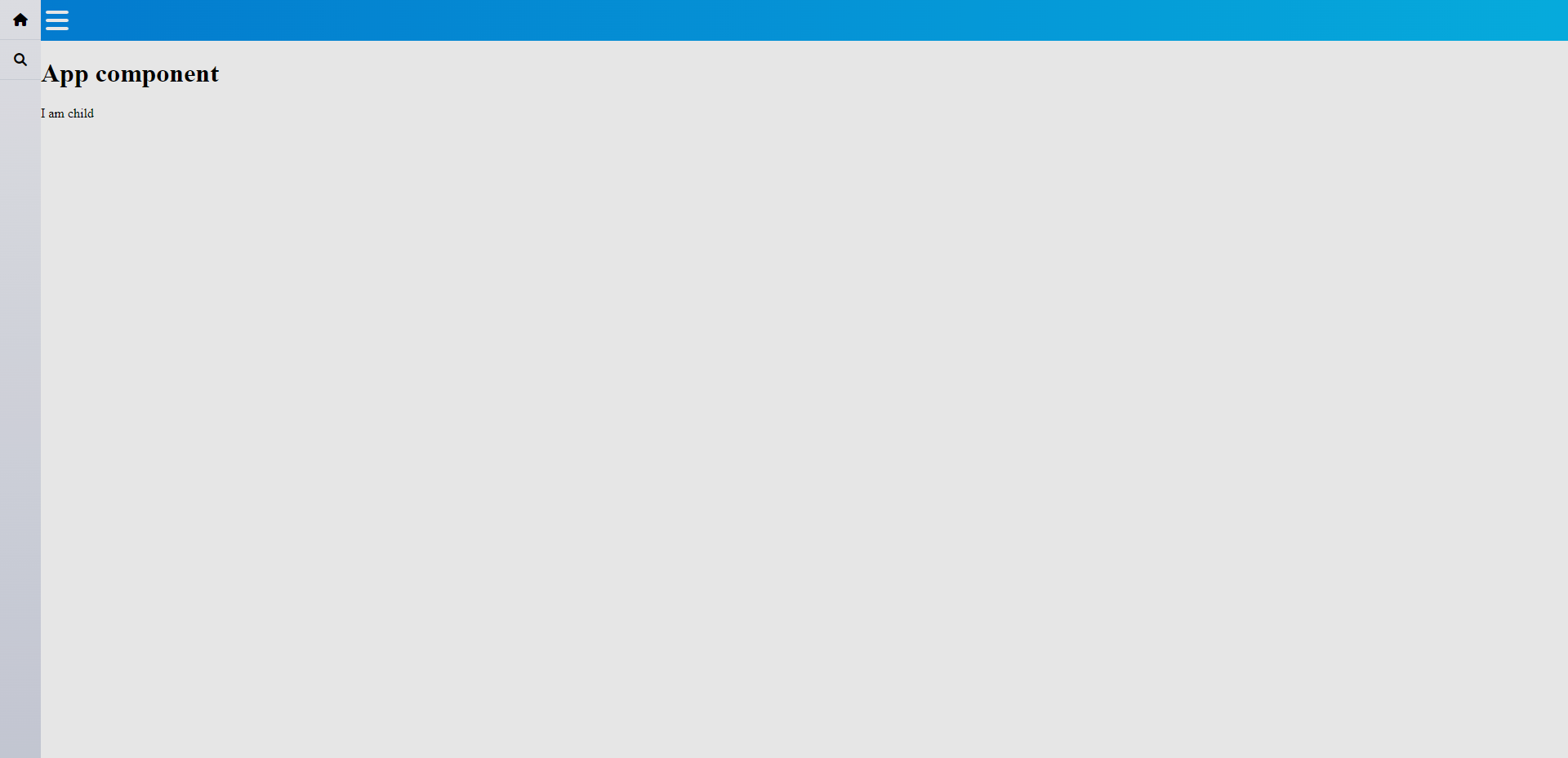 |
|
Mobile
| Expanded | Collapsed |
|----------------------------------------------------------------------------------|----------------------------------------------------------------------------------|
| 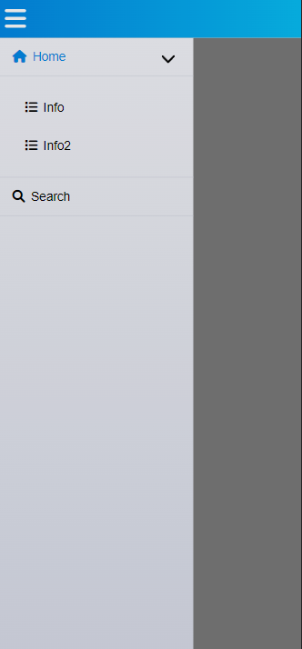 |
|  |
|
Example
import * as React from 'react';
import {SidebarOld, SidebarItem} from "@xal3xfx/reactbar";
import './index.css'
const App = () => {
const items : SidebarItem[] = [
{
className: 'fas fa-house',
command: () => console.log('home'),
label: "Home",
children: [
{
className: 'fa fa-list',
command: () => console.log('info 1'),
label: "Info",
},
{
className: 'fa fa-list',
command: () => console.log('info 2'),
label: "Info2",
}
]
},
{
className: 'fas fa-search',
command: () => 0,
label: "Search"
}
]
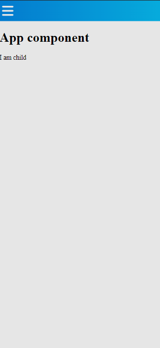
return <>
<SidebarOld items={items} >
<h1>App component</h1>
<ChildComponent />
</SidebarOld>
</>
};
const ChildComponent = () => {
return <>
I am child
</>
}
export default App;SidebarOld has required
itemsproperty which is of typeSidebarItem[]and represents the items in the sidebar menu.
SidebarItem
interface SidebarItem {
    className: string;
    label: string;
    command: () => void;
    children?: SidebarItem[]
}
| Name | Description | Default Value |
|------------|---------------------------------------------------------------------------------------------------|---------------|
| className | className for the item in the list. You can use it to put icon to the list item. | required |
| label | text to display for the item in the list. | required |
| command | function callback which is executed when the item in the list is clicked. | required |
| children | If you want to have expandable item in the list you should pass children which is SidebarItem[] | undefined |
Props
| Name | Description | Default Value |
|-----------------------|-----------------------------------------------------------------------------------------------------------------------------------------------------------------------------------------------|---------------|
| items | SidebarItem[] | required |
| topBarElement | Any JSX.Element which you want to be displayed on the Topbar. | undefined |
| onSidebarToggled | Function callback which is executed when the sidebar is clicked. The function accepts on parameter expanded: boolean which is true if the sidebar is expanded and false if it is collapsed. | undefined |
| topbarStyle | Style for the Topbar | undefined |
Contributing
You are welcome to contribute with any new features or buf fixes.
Built With
Versioning
We use SemVer for versioning. For the versions available, see the tags on this repository.
Authors
- Alex Petrov - Initial work - Alex Petrov - xAl3xFx
See also the list of contributors who participated in this project.
License
MIT License © Alex Petrov