
@yahoo/uds-mobile
v2.22.0
Published
- [Overview](#overview) - [Installation](#installation) - [Quick Start](#quick-start) - [Components](#components) - [Icons](#icons) - [Fonts](#fonts) - [CLI](#cli) - [Testing](#testing) - [Contributing](#contributing) - [API Reference](#api-reference)


Keywords
Readme
@yahoo/uds-mobile
Table of Contents
Overview
@yahoo/uds-mobile brings UDS to React Native. It provides:
- Pre-built Components: Avatar, Badge, Button, Checkbox, Chip, Divider, Icon, IconButton, Image, Input, InputHelpText, Link, Radio, RadioGroup, Switch, Tabs, Text, and layout primitives (Box, VStack, HStack, Screen)
- Theming: Full light/dark mode support with automatic system preference detection
- Design Token Integration: Colors, typography, spacing, and motion configs synced from UDS tokens
- Animations: Smooth, physics-based animations using Reanimated with motion parity to web
- Icon Support: Icon font and SVG icon rendering with full UDS icon library
Key Dependencies
| Package | Purpose | Required |
| ---------------------------- | -------------------------------------------- | -------- |
| react-native-unistyles | Styling and theming engine | Yes |
| react-native-reanimated | Animations | Yes |
| react-native-svg | SVG icon rendering | Yes |
| react-native-nitro-modules | Native module system (required by Unistyles) | Yes |
| react-native-edge-to-edge | Edge-to-edge display (required by Unistyles) | Yes |
| expo-font | Font loading (for bundled UDS fonts) | Optional |
Installation
# npm
npm install @yahoo/uds-mobile
Supported Versions
| Dependency | Supported Version | | ----------------------- | ----------------- | | Expo SDK | 55 | | React Native | ≥ 0.83.0 | | React | ≥ 19.0.0 | | react-native-unistyles | ≥ 3.0.0 | | react-native-reanimated | ≥ 4.0.0 |
[!NOTE] This package is tested against Expo SDK 55. While it may work with other versions, we cannot guarantee compatibility. If you encounter issues on a different Expo SDK version, please check for peer dependency conflicts.
Peer Dependencies
This package requires specific versions of React Native libraries as peer dependencies. Your project must have compatible versions installed for @yahoo/uds-mobile to work correctly.
Install the required peer dependencies:
# Required peer dependencies
expo install react-native-unistyles react-native-reanimated react-native-svg react-native-nitro-modules react-native-edge-to-edge

# Optional: For using bundled UDS fonts via expo-font plugin
expo install expo-font
If your app uses Icon or UDS icon font loading, install @yahoo/uds-icons with your package manager.
Using expo install ensures you get versions compatible with your Expo SDK. If you encounter version conflicts, check the peerDependencies in the package's package.json for the exact version ranges required.
Expo Configuration
For Expo apps, add the expo-font plugin to your app.config.ts and import fonts from the mobile package:
import { fonts } from '@yahoo/uds-mobile/fonts';

export default {
  plugins: [
    ['expo-font', { fonts }],
    // ... other plugins
  ],
};
[!WARNING] Development Build Required:
react-native-unistylesuses native modules and does not work with Expo Go. You must use a development build or prebuild your app. See the Unistyles setup guide for detailed instructions.
Quick Start
1. Configure Babel
Add the Unistyles and Reanimated babel plugins to your babel.config.js:
module.exports = function (api) {
  api.cache(true);
  return {
    presets: ['babel-preset-expo'],
    plugins: [
      [
        'react-native-unistyles/plugin',
        {
          root: 'src',
          autoProcessImports: ['@yahoo/uds-mobile'],
          autoProcessPaths: ['@yahoo/uds-mobile'],
        },
      ],
      ['react-native-reanimated/plugin'], // Must be last
    ],
  };
};
2. Generate Theme
Run the CLI to generate theme files from your UDS config:
# Using a config ID from UDS API
npx uds-mobile sync --id YOUR_CONFIG_ID

# Or using a local config file
npx uds-mobile sync ./uds.config.ts
This generates src/lib/unistyles.uds.ts containing your theme tokens.
3. Configure Unistyles
Create a configuration file that initializes Unistyles with your generated theme:
// src/lib/unistyles.ts
import { StyleSheet } from 'react-native-unistyles';
import { themes, breakpoints } from './unistyles.uds'; // Generated file

StyleSheet.configure({
  themes,
  breakpoints,
  settings: {
    adaptiveThemes: true, // Auto-switch based on system preference
  },
});

// Type augmentation for TypeScript support
declare module 'react-native-unistyles' {
  export interface UnistylesBreakpoints extends typeof breakpoints {}
  export interface UnistylesThemes extends typeof themes {}
}
Update your entry point to import Unistyles before any other imports:
// src/index.ts
import './lib/unistyles'; // Must be first!
// ... your app's existing entry code
[!NOTE] Why? Unistyles must be configured before any
StyleSheet.create()calls execute. Since UDS Mobile components use Unistyles internally, the configuration must happen before any component imports.
4. Rebuild Your App
After adding native modules, rebuild your app:
npx expo prebuild --clean
npx expo run:ios  # or run:android
5. Use Components
import { VStack } from '@yahoo/uds-mobile/VStack';
import { Text } from '@yahoo/uds-mobile/Text';
import { Button } from '@yahoo/uds-mobile/Button';
import { Badge } from '@yahoo/uds-mobile/Badge';
import { Avatar } from '@yahoo/uds-mobile/Avatar';

function MyComponent() {
  return (
    <VStack spacing="4">
      <Text variant="title1">Welcome!</Text>
      <Avatar name="John Doe" size="lg" />
      <Badge variant="success">Active</Badge>
      <Button onPress={() => console.log('pressed')}>Get Started</Button>
    </VStack>
  );
}
Benefits of deep imports:
- Smaller bundle size — Only loads components you actually use
- Faster builds — Tree-shaking eliminates unused code
- Optional dependencies — Future components with optional peer deps won't affect your app
6. Toggle Light/Dark Mode
Use useUnistyles to subscribe to theme changes and UnistylesRuntime to toggle:
import { Icon } from '@yahoo/uds-mobile/Icon';
import { Pressable } from '@yahoo/uds-mobile/Pressable';
import { UnistylesRuntime, useUnistyles } from 'react-native-unistyles';

function ThemeToggle() {
  const { rt } = useUnistyles();
  const isDark = rt.themeName === 'dark';

  const toggleTheme = () => {
    UnistylesRuntime.setTheme(isDark ? 'light' : 'dark');
  };

  return (
    <Pressable onPress={toggleTheme} hitSlop={20}>
      <Icon name={isDark ? 'CrescentMoon' : 'Sun'} size="sm" color="primary" variant="outline" />
    </Pressable>
  );
}
If you configured adaptiveThemes: true, the theme automatically follows the system preference. Calling UnistylesRuntime.setTheme() will override this until the app restarts.
[!WARNING] Performance: Using
useUnistyles()causes component re-renders on theme changes, which negates Unistyles' performance benefits. For theme-aware styles, preferStyleSheet.createwith a dynamic function instead:// ✅ Preferred: No re-renders, styles update automatically const styles = StyleSheet.create((theme) => ({ container: { backgroundColor: theme.colors.background.primary }, })); // ⚠️ Avoid in hot paths: Causes re-renders const { theme } = useUnistyles();Reserve
useUnistyles()for cases where you need runtime theme values (like the toggle above).
Debugging Re-renders
React Native DevTools includes a feature to highlight components when they re-render, helping you identify performance issues:
- Open React Native DevTools (press
jin Metro terminal) - Go to the React Components panel
- Click the View Settings (
⚙︎) icon - Enable "Highlight updates when components render"
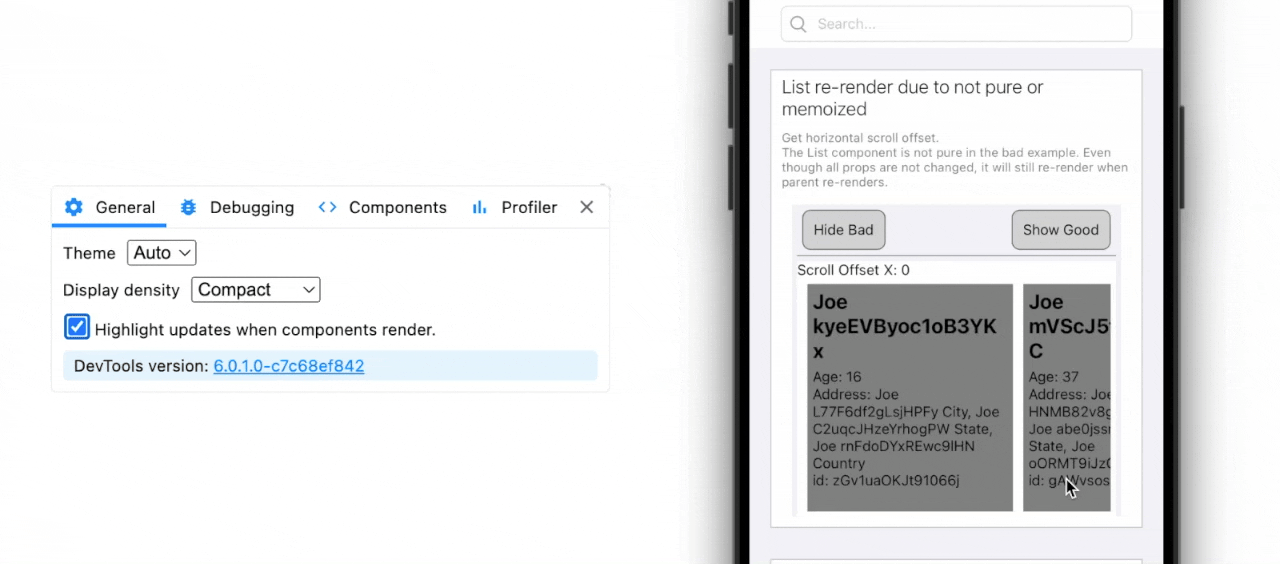
Components will flash with a colored border when they re-render. This makes it easy to spot unnecessary re-renders caused by useUnistyles() or other state changes.
[!TIP] Testing your setup: A good way to verify Unistyles is configured correctly is to toggle light/dark mode with highlighting enabled. If set up properly, only the theme toggle button should re-render — not the rest of your app. If you see the entire screen flash, you likely have
useUnistyles()calls in components that should be usingStyleSheet.createwith dynamic functions instead.
See the React Native DevTools docs for more debugging features.
Extending the Theme
To add custom theme values alongside UDS tokens, merge your additions with the generated theme:
// src/lib/unistyles.ts
import { StyleSheet } from 'react-native-unistyles';
import { breakpoints, themes } from './unistyles.uds';

// Extend with your app-specific tokens
const extendedThemes = {
  light: {
    ...themes.light,
    // Add custom values
    custom: {
      headerHeight: 64,
      tabBarHeight: 80,
      cardShadow: '0 2px 8px rgba(0, 0, 0, 0.1)',
    },
  },
  dark: {
    ...themes.dark,
    custom: {
      headerHeight: 64,
      tabBarHeight: 80,
      cardShadow: '0 2px 8px rgba(0, 0, 0, 0.3)',
    },
  },
} as const;

StyleSheet.configure({
  themes: extendedThemes,
  breakpoints,
  settings: {
    adaptiveThemes: true,
  },
});

// Update type augmentation to include custom values
declare module 'react-native-unistyles' {
  export interface UnistylesBreakpoints extends typeof breakpoints {}
  export interface UnistylesThemes extends typeof extendedThemes {}
}
Now you can use both UDS tokens and your custom values in stylesheets:
const styles = StyleSheet.create((theme) => ({
  header: {
    height: theme.custom.headerHeight,
    backgroundColor: theme.colors.background.primary, // UDS token
  },
}));
Components
Available Components
| Component | Description |
| --------------- | ----------------------------------------------- |
| Avatar | User avatars with image, initials, or icon |
| Badge | Status indicators and labels |
| Box | Flexible container with layout props |
| Button | Interactive button with variants and animations |
| Checkbox | Selectable checkbox with label |
| Chip | Compact elements for filters and selections |
| Divider | Visual separator for grouping content |
| HStack | Horizontal flex container |
| Icon | Icon rendering (font or SVG) |
| IconButton | Icon-only button |
| IconSlot | Flexible icon slot for component composition |
| Image | Image component with loading states |
| Input | Text input with label and helper text |
| InputHelpText | Helper text for custom input layouts |
| Link | Inline text links with icons |
| Pressable | Base pressable component |
| Radio | Radio button with label |
| RadioGroup | Coordinates Radio selection in a group |
| Screen | Screen container with safe area handling |
| Switch | Toggle switch with animations |
| Text | Typography component with variants |
| VStack | Vertical flex container |
Usage Examples
Button with Icons
<Button
  variant="primary"
  size="lg"
  startIcon="Add"
  onPress={handlePress}
>
  Create New
</Button>

<Button
  variant="secondary"
  loading
  disabled
>
  Saving...
</Button>
Form Controls
<VStack spacing="4">
  <Input
    label="Email"
    placeholder="Enter your email"
    helperText="We'll never share your email"
    startIcon="Mail"
  />

  <Checkbox checked={agreed} onValueChange={setAgreed} label="I agree to the terms" />

  <Switch isOn={notifications} onValueChange={setNotifications} label="Enable notifications" />
</VStack>
Avatar
<Avatar
  name="Jane Doe"
  src="https://example.com/avatar.jpg"
  size="lg"
/>

<Avatar
  name="John Smith"
  abbreviation="firstAndLast"  // Shows "JS"
/>

<Avatar showIcon /> // Shows person icon
Link with Icons
<Text variant="body1">
  Read our{' '}
  <Link textVariant="body1" variant="primary" endIcon="ExternalLink">
    Terms of Service
  </Link>
</Text>
Icons
Icon Rendering
Icons can be rendered using the font-based Icon component or as SVGs:
import { Icon } from '@yahoo/uds-mobile/Icon';

// Basic usage
<Icon name="Star" size="md" color="primary" />

// With variant
<Icon name="Heart" variant="fill" size="lg" />

// Custom color
<Icon name="Settings" dangerouslySetColor="#FF5733" />
Available Icons
The icon library includes the full UDS icon set. To see available icons:
import { iconNames, multicolorIconNames } from '@yahoo/uds-mobile/Icon';

console.log(iconNames); // All icon names
console.log(multicolorIconNames); // Multi-color icons
Animation Patterns
State-Driven Animations
Use useDerivedValue instead of useEffect + useSharedValue:
// ✅ Preferred pattern
const progress = useDerivedValue(() => withTiming(visible ? 1 : 0), [visible]);

// ❌ Avoid
const progress = useSharedValue(0);
useEffect(() => {
  progress.value = withTiming(visible ? 1 : 0);
}, [visible]);
Staggered Animations
const progress = useDerivedValue(
  () => withSpring(visible ? 1 : 0, BUTTON_SPRING_CONFIG),
  [visible],
);

const animatedStyle = useAnimatedStyle(() => ({
  width: interpolate(progress.value, [0, 1], [0, totalWidth]),
  opacity: interpolate(progress.value, [0.5, 1], [0, 1], 'clamp'), // Starts at 50%
  transform: [{ scale: interpolate(progress.value, [0.5, 1], [0.7, 1], 'clamp') }],
}));
Fonts
Font Handling
React Native doesn't support variable fonts, so all fonts are static (one file per weight). The package includes pre-converted fonts for:
- Yahoo Product Sans
- Inter
- Roboto Mono
- And other UDS-supported fonts
Font Loading
Fonts are automatically loaded via the expo-font plugin when configured in app.config.ts:
import { fonts } from '@yahoo/uds-mobile/fonts';

export default {
  plugins: [['expo-font', { fonts }]],
};
CLI
The uds-mobile CLI generates React Native theme files from UDS design tokens.
Commands
sync
Generates/updates theme files from UDS tokens.
npx uds-mobile sync [options]Options:
| Option | Description |
| ------------------- | -------------------------------------------------------- |
| --id <config-id> | Fetch config by ID from UDS API |
| [config] | Path to local config file (auto-detects uds.config.ts) |
| --config <path> | Explicit path to config file |
| --output <path> | Output file path (default: src/lib/unistyles.uds.ts) |
| --prettier=<path> | Path to Prettier config (auto-detects if not specified) |
Examples:
# Fetch config from UDS API
npx uds-mobile sync --id abc123

# Use local config file
npx uds-mobile sync ./uds.config.ts

# Custom output location
npx uds-mobile sync --output ./src/theme.ts
Generated Output
The CLI generates a TypeScript file containing:
themes: Light and dark theme objects with all design tokensbreakpoints: Responsive breakpoint definitions
// AUTO-GENERATED FILE. DO NOT EDIT.
export const themes = {
  light: {
    /* ... */
  },
  dark: {
    /* ... */
  },
};

export const breakpoints = {
  /* ... */
};
Testing
Jest Setup
UDS Mobile ships Jest mocks for native dependencies that don't work in Jest/JSDOM, allowing real UDS components to be tested without native module errors. This approach ensures your tests validate actual component behavior.
Quick Start
Add the setup file to your Jest config:
// jest.config.js
module.exports = {
  preset: 'react-native',
  setupFilesAfterEnv: ['@yahoo/uds-mobile/jest'],
  transformIgnorePatterns: [
    'node_modules/(?!(@yahoo/uds-mobile|@yahoo/uds-icons|react-native|@react-native)/)',
  ],
};
Or import manually in your setup file:
// jest.setup.js
import '@yahoo/uds-mobile/jest';
What Gets Mocked
The setup automatically mocks these native dependencies:
| Package | What's Mocked |
| ------------------------- | ----------------------------------------------------------------------------------- |
| react-native-unistyles | useUnistyles(), StyleSheet.create(), UnistylesRuntime |
| react-native-reanimated | Animated components, hooks (useSharedValue, useAnimatedStyle), timing functions |
| react-native-svg | SvgXml, SVG shape components |
| @yahoo/uds-icons | glyphMap, svgMap, ICON_SIZE_MAP |
Example Test
import { render, fireEvent } from '@testing-library/react-native';
import { Button } from '@yahoo/uds-mobile/Button';
import { Text } from '@yahoo/uds-mobile/Text';
import { VStack } from '@yahoo/uds-mobile/VStack';

test('renders button with text and handles press', () => {
  const onPress = jest.fn();

  const { getByRole, getByText } = render(
    <VStack>
      <Button variant="primary" onPress={onPress}>
        Save
      </Button>
    </VStack>,
  );

  expect(getByText('Save')).toBeTruthy();

  fireEvent.press(getByRole('button'));
  expect(onPress).toHaveBeenCalled();
});
Benefits
- Real component testing: Tests validate actual component behavior, not stubs
- No native module errors: Required native dependencies are properly mocked
- Zero configuration: Just add the setup file and transformIgnorePatterns
- Catches regressions: Tests break when component behavior changes
Manual Mock Access
If you need to customize mocks, individual modules are exported:
import { mocks } from '@yahoo/uds-mobile/jest';

// Override a specific mock
jest.mock('react-native-unistyles', () => ({
  ...mocks.unistyles,
  useUnistyles: () => ({
    theme: {
      /* custom theme */
    },
    rt: { themeName: 'dark' },
  }),
}));
Contributing
See CONTRIBUTING.md for the development workflow, architecture details, and internal documentation.
API Reference
Component Props
All components export their props types:
import type { ButtonProps } from '@yahoo/uds-mobile/Button';
import type { TextProps } from '@yahoo/uds-mobile/Text';
import type { AvatarProps } from '@yahoo/uds-mobile/Avatar';
import type { BadgeProps } from '@yahoo/uds-mobile/Badge';
import type { CheckboxProps } from '@yahoo/uds-mobile/Checkbox';
import type { ChipProps } from '@yahoo/uds-mobile/Chip';
import type { IconProps, IconName } from '@yahoo/uds-mobile/Icon';
import type { IconButtonProps } from '@yahoo/uds-mobile/IconButton';
import type { ImageProps } from '@yahoo/uds-mobile/Image';
import type { InputProps } from '@yahoo/uds-mobile/Input';
import type { InputHelpTextProps } from '@yahoo/uds-mobile/InputHelpText';
import type { LinkProps } from '@yahoo/uds-mobile/Link';
import type { RadioProps } from '@yahoo/uds-mobile/Radio';
import type { SwitchProps } from '@yahoo/uds-mobile/Switch';
import type { BoxProps } from '@yahoo/uds-mobile/Box';
import type { VStackProps } from '@yahoo/uds-mobile/VStack';
import type { HStackProps } from '@yahoo/uds-mobile/HStack';
import type { ScreenProps } from '@yahoo/uds-mobile/Screen';
import type { PressableProps } from '@yahoo/uds-mobile/Pressable';
import type { IconSlotProps, IconSlotType } from '@yahoo/uds-mobile/IconSlot';
import type { UDSGestureProviderProps } from '@yahoo/uds-mobile/UDSGestureProvider';
Exports
// Components (one import per component)
import { Avatar } from '@yahoo/uds-mobile/Avatar';
import { Badge } from '@yahoo/uds-mobile/Badge';
import { Box } from '@yahoo/uds-mobile/Box';
import { Button } from '@yahoo/uds-mobile/Button';
import { Checkbox } from '@yahoo/uds-mobile/Checkbox';
import { Chip } from '@yahoo/uds-mobile/Chip';
import { Divider, DividerLabel, DividerLine } from '@yahoo/uds-mobile/Divider';
import { HStack } from '@yahoo/uds-mobile/HStack';
import { Icon, iconNames, multicolorIconNames } from '@yahoo/uds-mobile/Icon';
import { IconButton } from '@yahoo/uds-mobile/IconButton';
import { IconSlot } from '@yahoo/uds-mobile/IconSlot';
import { Image } from '@yahoo/uds-mobile/Image';
import { Input } from '@yahoo/uds-mobile/Input';
import { InputHelpText } from '@yahoo/uds-mobile/InputHelpText';
import { Link } from '@yahoo/uds-mobile/Link';
import { Pressable } from '@yahoo/uds-mobile/Pressable';
import { Radio } from '@yahoo/uds-mobile/Radio';
import { RadioGroup } from '@yahoo/uds-mobile/RadioGroup';
import { Screen } from '@yahoo/uds-mobile/Screen';
import { Switch } from '@yahoo/uds-mobile/Switch';
import { Text } from '@yahoo/uds-mobile/Text';
import { UDSGestureProvider } from '@yahoo/uds-mobile/UDSGestureProvider';
import { VStack } from '@yahoo/uds-mobile/VStack';

// Sub-exports
import { motion, BUTTON_SPRING_CONFIG, SCALE_EFFECTS } from '@yahoo/uds-mobile/motion';
import { fonts, fontAliasToPostscript } from '@yahoo/uds-mobile/fonts';