
@yidun/antd-super-table
v0.1.27
Published
Antd Super Table 是一个基于 Ant Design Vue 的高级表格组件,提供了丰富的功能特性:


Keywords
Readme
Antd Super Table 组件
介绍
Antd Super Table 是一个基于 Ant Design Vue 的高级表格组件,提供了丰富的功能特性:
- 🔍 灵活的查询条件配置
- 📊 强大的表格列配置
- 🎯 场景管理功能
- ⚡️ 高性能渲染
- 🛠 可定制的表格配置
- 🔄 表格拖拽排序
- 📱 响应式设计
- 🎨 主题定制
示例
安装
npm install @yidun/antd-super-table基础用法
<template>
  <SuperTable :form-items="formItems" :columns="columns" :request="onRequest" scene-type="user-list" />
</template>

<script setup lang="ts">
import SuperTable from '@yidun/antd-super-table'
import type { SuperTableFormItem, SuperTableColumn } from '@yidun/antd-super-table'

// 定义查询条件
const formItems: SuperTableFormItem[] = [
  {
    type: 'input',
    name: 'name',
    label: '姓名',
    fixed: true,
  },
  {
    type: 'select',
    name: 'status',
    label: '状态',
    props: {
      options: [
        { label: '启用', value: 1 },
        { label: '禁用', value: 0 },
      ],
    },
  },
]

// 定义表格列
const columns: SuperTableColumn[] = [
  {
    key: 'name',
    title: '姓名',
    content: 'name',
    width: 150,
  },
  {
    key: 'status',
    title: '状态',
    type: 'tag',
    content: record => ({
      label: record.status === 1 ? '启用' : '禁用',
      color: record.status === 1 ? 'green' : 'red',
    }),
  },
  {
    key: 'actions',
    title: '操作',
    type: 'button',
    fixed: 'right',
    content: () => [
      { label: '编辑', onClick: () => console.log('编辑') },
      { label: '删除', onClick: () => console.log('删除') },
    ],
  },
]

// 定义请求函数
const onRequest = async (options: { params: Record<string, any>; pageSize: number; pageNum: number }) => {
  // 这里调用你的实际 API 接口
  const res = await fetch('/api/user/list', {
    method: 'POST',
    headers: { 'Content-Type': 'application/json' },
    body: JSON.stringify({
      ...options.params,
      pageNum: options.pageNum,
      pageSize: options.pageSize,
    }),
  }).then(res => res.json())

  return {
    data: res.data,
    total: res.total,
  }
}
</script>
查询场景配置
默认启用场景,场景相关的配置存储在localStorage中
| 属性名 | 类型 | 默认值 | 说明 |
| ---------------- | ------------ | ------- | ----------------------------------- |
| sceneType | string | '' | 场景对应的标识 |
| enableScene | boolean | true | 是否启用场景管理 |
| sceneStorageType | string | local | 场景存储位置,可选 local 或 api |
| sceneRequest | object | - | 场景请求函数配置(API模式时必填) |
| defaultScene | object/array | | 默认场景配置 |
| maxSceneCount | number | 100 | 最大场景数量 |
场景与查询条(行为说明)
查询条是否展示由内部运行态 _selected 控制。若场景同步误用「空查询项列表」,会把所有 _selected 置为 false,表现为整块查询条件消失(无场景时连「查询 / 重置」一并不渲染)。当前版本已收紧:默认不会用空列表覆盖选中状态;仅在用户显式操作(如高级筛选确定为空、删除当前正在使用的场景)时才允许清空。
enableScene=false:不再根据本地sceneCode、场景列表 watcher 去同步_selected,避免与formItems初始化时序竞态、误清空查询条。enableScene=true:当 localStorage 中的sceneCode与当前接口返回列表(及defaultScene)均无法匹配时,会自动选用列表中第一条场景并回写sceneCode,避免落到「无任何选中查询项」的空洞状态。
查询区与表格间距、圆角(queryTableGap)
- 未传
queryTableGap:有场景时查询区与表格贴紧(与早期行为一致);无场景时保留 16px 间距。 - 传入
queryTableGap:强制开启或关闭间距,不受enableScene影响。 - 圆角取自当前
theme.token.borderRadius(与表单项、按钮一致);有间距时查询区、表格各一块圆角;无间距时外层一体圆角。
<!-- 默认:跟 enableScene 走 -->
<SuperTable :enable-scene="true" />

<!-- 强制无间距 / 有间距 -->
<SuperTable :query-table-gap="false" />
场景存储配置
本地存储模式(默认)
<template>
  <SuperTable :form-items="formItems" :columns="columns" :request="onRequest" scene-storage-type="local" enable-scene />
</template>
API存储模式
<template>
  <SuperTable
    :form-items="formItems"
    :columns="columns"
    :request="onRequest"
    scene-storage-type="api"
    :scene-request="sceneRequest"
    enable-scene
  />
</template>

<script setup>
// 场景请求函数配置
const sceneRequest = {
  // 查询场景列表
  querySceneList: async (params: { type: string }) => {
    const response = await fetch('/api/scene/query', {
      method: 'POST',
      headers: { 'Content-Type': 'application/json' },
      body: JSON.stringify(params)
    })
    return response.json()
  },

  // 创建场景
  createScene: async (params: any) => {
    const response = await fetch('/api/scene/create', {
      method: 'POST',
      headers: { 'Content-Type': 'application/json' },
      body: JSON.stringify(params)
    })
    return response.json()
  },

  // 更新场景
  updateScene: async (params: any) => {
    const response = await fetch('/api/scene/update', {
      method: 'POST',
      headers: { 'Content-Type': 'application/json' },
      body: JSON.stringify(params)
    })
    return response.json()
  },

  // 删除场景
  deleteScene: async (params: string[]) => {
    const response = await fetch('/api/scene/delete', {
      method: 'POST',
      headers: { 'Content-Type': 'application/json' },
      body: JSON.stringify(params)
    })
    return response.json()
  }
}
</script>
错误处理
当 sceneStorageType 为 'api' 但没有提供 sceneRequest 时,组件会在控制台输出错误信息并禁用场景功能:
// 控制台错误信息
SuperTable: sceneStorageType 为 "api" 时,必须提供 sceneRequest 配置
查询条件配置
支持的输入类型
- 文本输入框 (input)
- 组合输入框 (inputGroup)
- 数字输入框 (inputNumber)
- 数字范围输入框 (inputNumberRange)
- 选择器 (select)
- 日期选择器 (datePicker)
- 日期范围选择器 (rangePicker)
- 级联选择 (cascader)
- 树形选择 (treeSelect)
- 自定义组件 (component)
查询条件属性
| 属性名 | 类型 | 默认值 | 说明 |
| ------------- | ------------- | ------- | ----------------------------------------------------------------- |
| type | string | - | 查询条件类型 |
| name | string | - | 字段名称 |
| label | string | - | 显示标签 |
| value | any | - | 默认值 |
| props | object | {} | 传递给组件的属性 |
| component | Component | - | 自定义组件(type为component时必填) |
| modelPropName | string | 'value' | 自定义组件的v-model属性名 |
| span | number | 1 | 列宽系数 |
| visible | boolean | true | 是否显示;可通过 setFormItem(name, 'visible', boolean) 动态切换。无场景时会同步 _selected;有场景时需同时在当前场景 items 中才会展示并参与 getFormValues |
| fixed | boolean | false | 是否固定(不可删除) |
| group | string | - | 分组标识,高级筛选字段选择下拉框按此分组 |
| cache | boolean | false | 无场景时是否持久化该项查询值到本地(与高级筛选共用存储);有本地值时优先恢复 |
| selected | boolean | false | 是否默认选中 |
| quiet | boolean | false | 是否静默更新(不触发 request,等价于 requestOnChange: false) |
| requestOnChange | boolean | - | 该项变更是否触发 request,与全局 requestOnFormItemChange 共同生效 |
| showLabel | boolean | true | 查询区是否展示左侧标签条;false 时仅渲染控件(宽度仍由组件库默认处理,勿在业务 props.style 写宽度) |
| tooltip | string/number | - | 查询项提示信息,展示为标签旁 icon 的 tooltip(默认 top) |
| addonAfter | object | - | 仅 input 生效,后置 link/small 按钮配置(文案/样式/点击事件) |
查询区布局与宽度(由组件库处理,业务勿配 props.style.width):
- 默认(
showLabel未设为false):与其它项相同,左侧标签条 + 控件calc(100% - 标签宽)。 showLabel: false(常见于type: 'component'且控件自带placeholder):无左侧标签,控件默认width: 100%占满当前栅格。- 仅特殊窄控件(如
Switch)若需内容宽度,再由业务通过props.style.width覆盖(如auto)。
完整示例
import dayjs from 'dayjs'
import { Switch } from 'ant-design-vue'

export const createFormItems = () => {
  return [
    {
      key: 'input', // 唯一标识
      type: 'input', // 类型
      label: '输入框',
      name: 'input', // 字段名称
      tooltip: '按关键词过滤',
      fixed: true,
      addonAfter: {
        text: '查询帮助',
        className: 'my-addon-after-btn',
        onClick: ({ name, value }) => {
          console.log('[super-table] addonAfter click:', { name, value })
        },
      },
    },
    {
      key: 'inputGroup',
      type: 'inputGroup',
      label: '输入框组',
      name: 'inputGroup',
      fixed: true,
      addonBeforeProps: {
        style: {
          width: '40%',
        },
        options: [
          {
            label: '大于',
            value: '>',
          },
          {
            label: '小于',
            value: '<',
          },
          {
            label: '大于等于',
            value: '>=',
          },
          {
            label: '小于等于',
            value: '<=',
          },
        ],
      },
      value: {
        select: '<=',
        value: 999,
      },
    },
    {
      key: 'inputNumber',
      type: 'inputNumber',
      label: '数字输入框',
      name: 'inputNumber',
      tooltip: 1001,
      fixed: true,
    },
    {
      key: 'inputNumberRange',
      type: 'inputNumberRange',
      label: '数字范围输入',
      name: 'inputNumberRange',
      fixed: true,
      props: {
        min: 0,
        max: 100,
        placeholder: ['最小值', '最大值'],
      },
    },
    {
      key: 'select',
      type: 'select',
      label: '单选',
      name: 'select',
      fixed: true,
      props: {
        options: Array.from({ length: 3 }).map((_, index) => ({
          label: `选项-${index + 1}`,
          value: index,
        })),
      },
    },
    {
      key: 'multipleSelect',
      type: 'select',
      label: '多选',
      name: 'multipleSelect',
      props: {
        mode: 'multiple',
        options: Array.from({ length: 10 }).map((_, index) => ({
          label: `选项-${index + 1}`,
          value: index,
        })),
      },
    },
    {
      key: 'date',
      type: 'datePicker',
      label: '日期',
      name: 'date',
      props: {
        showTime: true,
        format: 'YYYY-MM-DD HH:mm',
        presets: [
          { label: 'Yesterday', value: dayjs().add(-1, 'd') },
          { label: 'Last Week', value: dayjs().add(-7, 'd') },
          { label: 'Last Month', value: dayjs().add(-1, 'month') },
        ],
      },
    },
    {
      key: 'rangePicker',
      type: 'rangePicker',
      label: '时间范围',
      name: 'rangePicker',
      props: {
        showTime: true,
        format: 'YYYY-MM-DD HH:mm',
        presets: [
          { label: 'Last 7 Days', value: [dayjs().add(-7, 'd'), dayjs()] },
          { label: 'Last 14 Days', value: [dayjs().add(-14, 'd'), dayjs()] },
          { label: 'Last 30 Days', value: [dayjs().add(-30, 'd'), dayjs()] },
          { label: 'Last 90 Days', value: [dayjs().add(-90, 'd'), dayjs()] },
        ],
      },
    },
    {
      key: 'component',
      type: 'component',
      label: '自定义组件',
      name: 'component',
      component: Switch,
      modelPropName: 'checked', // 默认通过v-model:value绑定数据,可通过modelPropName自定义修改,最终效果为v-model:[modelPropName]
      showLabel: false, // 是否显示label,默认为true
    },
    {
      key: 'cascader',
      type: 'cascader',
      label: '级联选择',
      name: 'cascader',
      props: {
        options: [
          {
            value: 'zhejiang',
            label: 'Zhejiang',
            children: [
              {
                value: 'hangzhou',
                label: 'Hangzhou',
              },
            ],
          },
        ],
      },
    },
    {
      key: 'treeSelect',
      type: 'treeSelect',
      label: '树形选择',
      name: 'treeSelect',
      props: {
        treeData: [
          {
            title: 'Node1',
            value: '0-0',
            children: [
              {
                title: 'Child Node1',
                value: '0-0-0',
              },
            ],
          },
        ],
      },
    },
  ]
}
表格列配置
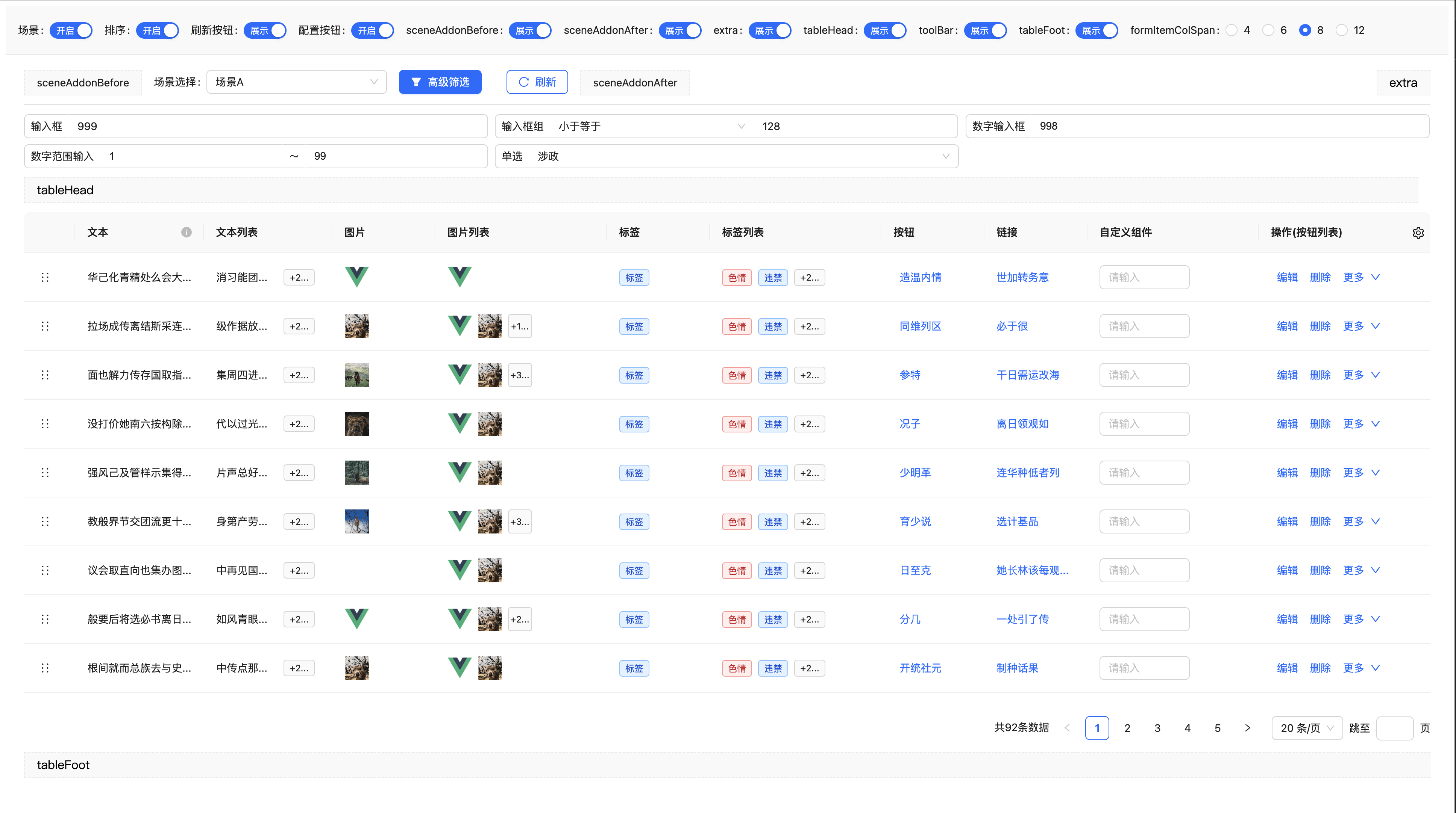
支持的列类型
- 文本 (text)
- 图片 (image)
- 标签 (tag)
- 按钮 (button)
- 链接 (link)
- 自定义 (component)
- 排序 (sort)
内置解析类型,均支持在一个单元格内展示多个节点,超出最大个数后会展示更多按钮,点击更多按钮可展开查看所有数据,所以可以扩展出文本列表、图片列表、按钮列表、标签列表等展示形式
表格列属性
| 属性名 | 类型 | 默认值 | 说明 |
| ------------ | ----------------------- | ------ | ----------------------------------- |
| key | string | - | 列的唯一标识 |
| title | string | - | 列标题 |
| type | string/function | 'text' | 列类型 |
| content | string/function | - | 列内容 |
| titleTooltip | string/function | - | 标题提示信息 |
| tooltip | string/boolean/function | - | 内容提示信息 |
| component | Component | - | 自定义组件(type为component时必填) |
| props | object/function | {} | 传递给组件的属性 |
| dataIndex | string | - | 数据字段路径(与 customRender 组合时优先于 content) |
| customRender | function | - | 自定义渲染(优先级高于 content) |
| width | number | 120 | 列宽度 |
| minWidth | number | 50 | 拖拽时最小宽度 |
| maxWidth | number | - | 拖拽时最大宽度(无限制) |
| visible | boolean | true | 是否可见 |
| showInExpand | boolean | true | 当 visible=false 且开启 showHiddenColumnsInExpand 时,是否展示在展开区 |
| expandItemProps | object | {} | 透传给 a-descriptions-item 的属性(如 label/span/style) |
| fixed | string | - | 固定列位置,可选 'left' 或 'right' |
| copyable | boolean | false | 是否可复制 |
| ellipsis | boolean | true | 是否超出显示省略号,false 时自动换行 |
| flexDirection | string | 'row' | 表格内多元素排布方向,可选 'row' / 'column' |
| expandFlexDirection | string | 'row' | 展开区域(描述组件)排布方向,可选 'row' / 'column',与 flexDirection 解耦 |
| maxRows | number | - | 最大可见行数(视觉行检测),设置后启用内联展开/收起替代 popover |
| maxCount | number | - | 最大可见个数(个数截断),默认行为:text 类型为 1,其余类型不限制 |
| group | string | - | 未使用字段分组标识(Modal 模式下生效) |
| groupTitle | string | - | 分组标题,不传取 group 值(Modal 模式下生效) |
完整示例
import { Input } from 'ant-design-vue'

/**
 * @description 初始化表单配置,操作类方法可通过参数传递进来
 * @param { object } options 一些提供给表格内置组件使用的扩展
 *
 * */
export const createTableColumns = (options: { onDelete: (record: Record<string, any>) => void }) => {
  return [
    {
      key: 'text',
      title: '文本',
      type: 'text', // 默认类型为text,可不填
      content: 'text',
      width: 150,
    },
    {
      key: 'textList',
      title: '文本列表',
      content: 'textList',
      width: 150,
    },
    {
      key: 'image',
      type: 'image',
      title: '图片',
      content: 'imageSrc',
    },
    {
      key: 'tag',
      type: 'tag',
      title: '标签',
      width: 120,
      content() {
        return {
          label: '标签',
          color: 'blue',
        }
      },
    },
    {
      key: 'tagList',
      type: 'tag',
      title: '标签列表',
      width: 200,
      content() {
        return [
          {
            label: '色情',
            color: 'red',
          },
          {
            label: '违禁',
            color: 'blue',
          },
          {
            label: '暴恐',
            color: '#f00',
          },
          {
            label: '涉政',
            color: 'pink',
          },
        ]
      },
    },
    {
      key: 'button',
      type: 'button',
      title: '按钮',
      content() {
        return {
          label: '查看配置',
          onClick() {
            window.open(location.href)
          },
        }
      },
    },
    {
      key: 'link',
      type: 'link',
      title: '链接',
      content() {
        return {
          label: '查看详情',
          to: location.href,
        }
      },
    },
    {
      key: 'custom',
      title: '自定义组件',
      type: 'component',
      component: Input,
      width: 200,
      props: {
        placeholder: '请输入',
        style: {
          width: '120px',
        },
        onChange() {
          console.log('change')
        },
      },
    },
    {
      key: 'actions',
      type: 'button',
      title: '操作',
      fixed: 'right',
      width: 200,
      content() {
        return [
          {
            label: '编辑',
          },
          {
            label: '删除',
            onClick: options.onDelete,
          },

          {
            label: '详情',
            onClick() {
              window.open(location.href)
            },
          },
          {
            label: '上线',
          },
          {
            label: '下线',
          },
        ]
      },
    },
  ]
}
高级功能
表格拖拽排序
<template>
  <SuperTable
    :form-items="formItems"
    :columns="columns"
    :request="onRequest"
    :sortable="true"
    @row-sort-end="onRowSortEnd"
  />
</template>

<script setup>
const onRowSortEnd = newData => {
  console.log('排序后的数据:', newData)
  // 处理排序后的数据
}
</script>
表格配置
<template>
  <SuperTable :form-items="formItems" :columns="columns" :request="onRequest" :enable-table-config="true" />
</template>
自定义查询参数
<template>
  <SuperTable
    :form-items="formItems"
    :columns="columns"
    :request="onRequest"
    :custom-query-params="{ status: 1, type: 'active' }"
  />
</template>
自定义 locale / theme
<script setup lang="ts">
import enUS from 'ant-design-vue/es/locale/en_US'
</script>

<template>
  <SuperTable
    :form-items="formItems"
    :columns="columns"
    :request="onRequest"
    :locale="enUS"
    :theme="{
      token: {
        colorPrimary: '#1677ff',
        borderRadius: 6,
      },
    }"
  />
</template>
关闭场景,仅使用高级筛选
开启后不再在查询条件行展示内置「高级筛选」按钮,请在业务侧通过表格 ref 调用 openAdvancedFilter(),或使用 tableHead / searchActionsExtraBefore / searchActionsExtraAfter(或兼容旧名 searchActionsExtra)等插槽自行放置入口。
<template>
  <SuperTable
    ref="tableRef"
    :form-items="formItems"
    :columns="columns"
    :request="onRequest"
    :enable-scene="false"
    :enable-advanced-filter="true"
  />
</template>
隐藏列在展开区展示
<template>
  <SuperTable
    :form-items="formItems"
    :columns="columns"
    :request="onRequest"
    :show-hidden-columns-in-expand="true"
    :expand-descriptions-props="{ bordered: true, column: 2, labelStyle: { width: '150px' } }"
  />
</template>
插槽使用
<template>
  <SuperTable :form-items="formItems" :columns="columns" :request="onRequest">
    <!-- 场景选择器前的内容 -->
    <template #sceneAddonBefore>
      <a-button type="primary">自定义按钮</a-button>
    </template>

    <!-- 场景选择器后的内容 -->
    <template #sceneAddonAfter>
      <a-button>导出</a-button>
    </template>

    <!-- 表格头部 -->
    <template #tableHead>
      <h3>用户列表</h3>
    </template>

    <!-- 工具栏额外区域 -->
    <template #toolBarExtra>
      <a-button type="primary">新增用户</a-button>
    </template>

    <!-- 查询条件行操作区:内置按钮之前 / 之后(与重置、查询、展开同一栅格列,自左向右排列;旧插槽 searchActionsExtra 仍支持,内容接在 After 之后) -->
    <template #searchActionsExtraBefore="{ search, reset, loading }">
      <a-button @click="search" :loading="loading">前置</a-button>
    </template>
    <template #searchActionsExtraAfter="{ search, reset, loading }">
      <a-button :loading="loading" @click="search">扩展查询</a-button>
      <a-button @click="reset">扩展重置</a-button>
    </template>

    <!-- 表格底部 -->
    <template #tableFoot>
      <div>总计: {{ total }} 条数据</div>
    </template>

    <!-- 展开行 -->
    <template #expandedRowRender="{ record }">
      <p>详细信息: {{ record.description }}</p>
    </template>
  </SuperTable>
</template>
API
Props
| 参数 | 说明 | 类型 | 默认值 |
| -------------------- | -------------------------------- | ----------------------------- | ------------------------------- | --------- |
| formItems | 查询条件配置 | SuperTableFormItem[] | [] |
| columns | 表格列配置 | SuperTableColumn[] | [] |
| request | 数据请求函数 | SuperTableRequestFunction | - |
| sceneType | 场景类型 | string | '' |
| enableScene | 是否启用场景管理 | boolean | true |
| enableAdvancedFilter | 是否启用高级筛选(可独立于场景) | boolean | false |
| sceneStorageType | 场景存储位置 | 'local' | 'api' | 'local' |
| sceneRequest | 场景请求函数配置 | SceneRequestConfig | - |
| defaultScene | 默认场景配置 | SuperTableDefaultSceneConfig | SuperTableDefaultSceneConfig[] | - |
| maxSceneCount | 最大场景数量 | number | 100 |
| formItemColSpan | 查询条件列数 | number | 6 |
| queryTableGap | 查询区(含场景条)与表格之间的间距;未传时 enableScene=true 无间距、false 有间距 | boolean | 未传则按场景模式 |
| queryActionsCoefficient | 查询区操作按钮区域栅格系数(与表单项相同:min(系数 × formItemColSpan, 24));不传则占满最后一行剩余 | number | undefined |
| debounceWait | 查询防抖时间(ms) | number | 100 |
| refreshDeps | 依赖刷新选项 | any[] | [] |
| tableProps | 表格属性 | TableProps | {} |
| locale | ConfigProvider locale 配置 | object | zhCN |
| theme | ConfigProvider theme 配置 | object | { token: { borderRadius: 2 } } |
| formatDataSource | 转换表格数据 | (data: any[]) => any[] | (data) => data |
| sortable | 是否可排序 | boolean | false |
| wrapperStyle | 容器样式 | object | {} |
| tableWrapperStyle | 表格容器样式 | object | {} |
| customQueryParams | 默认查询条件 | object | {} |
| autoRequest | 是否自动调用 request(挂载、refreshDeps、场景同步等;不含表单项变更、手动查询、翻页) | boolean | 未传则见 autoSearch 兼容逻辑 |
| requestOnFormItemChange | 表单项变更后是否调用 request(与 formItem.requestOnChange、quiet 共同生效);输入类仅回车/提交时触发 | boolean | true |
| autoSearch | 已废弃,请改用 autoRequest;未传 autoRequest 时仍控制无场景下旧版 reload 总闸 | boolean | 未传视为 true |
| searchOnFormItemChange | 已废弃,请改用 requestOnFormItemChange | boolean | 未传则同 requestOnFormItemChange |
| showHiddenColumnsInExpand | 是否将隐藏列展示在展开区域 | boolean | false |
| expandDescriptionsProps | 展开区域 a-descriptions 属性透传 | object | {} |
| showRefreshButton | 展示刷新按钮(依赖场景区域) | boolean | false |
| showExpandButton | 查询条件是否展示展开/收起 | boolean | false |
| showResetButton | 是否展示重置(仅 enableScene=false 时生效;未传时非场景下默认展示) | boolean \| undefined | undefined |
| enableTableConfig | 开启表格设置 | boolean | true |
| tableConfigMode | 表格设置模式:'popover'(默认,右侧弹出层) 或 'modal'(居中弹窗) | 'popover' \| 'modal' | 'popover' |
Events
| 事件名 | 说明 | 回调参数 |
| ---------------- | ------------ | ------------------------------------------------------------------ |
| form-item-change | 表单项值变更 | (name: string, value: any, formItem: SuperTableFormItem) => void |
| scene-change | 场景切换 | (scene: SuperTableQueryScene) => void |
| sort-change | 排序变化 | (sorter: any) => void |
| row-sort-end | 行排序结束 | (newData: any[]) => void |
Methods
| 方法名 | 说明 | 参数 |
| ---------------- | ---------------- | --------------------------------------------------------- | --------------------------------- |
| getFormItem | 获取表单项配置 | (name: string) => SuperTableFormItem | undefined |
| setFormItem | 设置表单项配置(如 visible、props.options 等;fixed 项不可改 visible) | (name: string, keyPath: string, newConfig: any) => void |
| getFormValue | 获取表单项值 | (name: string) => any |
| setFormValue | 设置表单项值 | (name: string, value: any) => void |
| getFormValues | 获取所有表单项值 | (name?: string | string[]) => Record<string, any> |
| setFormValues | 批量设置表单项值 | (values: Record<string, any>) => void |
| getTableData | 获取表格数据 | () => any[] |
| setTableData | 设置表格数据 | (data: any[]) => void |
| setTableDataItem | 修改单条数据 | (index: number, data: Record<string, any>) => void |
| reload | 按当前查询条件调用 request(默认回到第 1 页) | (options?: SuperTableReloadOptions) => void |
| onRefresh | 已废弃,请改用 reload | 同 reload |
| onResetForm | 重置表单查询条件 | () => void |
TypeScript 类型定义
基础类型
/** 表格列对应的type类型 */
export type SuperTableColumnType = 'text' | 'link' | 'button' | 'tag' | 'image' | 'component' | 'sort'

/** 查询表单项对应的type类型 */
export type SuperTableFormItemType =
  | 'input'
  | 'inputGroup'
  | 'inputNumber'
  | 'inputNumberRange'
  | 'select'
  | 'treeSelect'
  | 'cascader'
  | 'datePicker'
  | 'rangePicker'
  | 'component'

/** 表格单条数据 */
export type SuperTableDataItem = Record<string, any>

/** 表格列吸附方式 */
export type SuperTableColumnFixedType = 'left' | 'right'

/** 排序方式 */
export type SuperTableSortOrders = 'ascend' | 'descend' | null
表格列配置
/** 表格列配置 */
export interface SuperTableColumn {
  /** 列对应key */
  key: string

  /** 展示类型 */
  type?: SuperTableColumnType | ((row: SuperTableDataItem, index: number) => SuperTableColumnType)

  /** 标题 */
  title: string

  /** 标题对应的提示信息 */
  titleTooltip?: string | ((row: SuperTableDataItem, index: number) => string)

  /** 表格内容 */
  content?: string | ((row: SuperTableDataItem, index: number) => any)

  /** 表格内容对应的提示信息 */
  tooltip?: string | boolean | ((row: SuperTableDataItem, index: number) => string)

  /** 表格内容解析自定义组件 */
  component?: Component

  /** 表格内容解析用到的组件组件对应的props */
  props?: Record<string, any> | ((row: SuperTableDataItem, index: number) => Record<string, any>)

  /** 是否可复制 */
  copyable?: boolean

  /** 是否超出显示省略号 */
  ellipsis?: boolean

  /** 是否可见 */
  visible?: boolean

  /** 宽度 */
  width?: number

  /** 固定列位置 */
  fixed?: SuperTableColumnFixedType

  [key: string]: any
}
查询条件配置
/** 查询条件配置 */
export interface SuperTableFormItem {
  /** 查询详类型 */
  type: SuperTableFormItemType

  /** 查询项对应的字段名称 */
  name: string

  /** 绑定数据时v-model对应的name,默认value */
  modelPropName?: string

  /** 查询项label */
  label: string

  /** 查询项提示信息,展示在标签旁的 tooltip 中 */
  tooltip?: string | number

  /** 传递给查询详的props */
  props?: Record<string, any>

  /** 选项值 */
  value?: any

  /** 自定义组件 */
  component?: Component

  /** 查询项宽度系数 */
  span?: number

  /** 是否显示 */
  visible?: boolean

  /** 带select前缀的组合输入框配置 */
  addonBeforeProps?: SelectProps

  /** input 的后置附加按钮配置 */
  addonAfter?: {
    /** 按钮文案 */
    text?: string
    /** 按钮自定义 class */
    className?: string
    /** 是否显示,默认 true */
    show?: boolean
    /** 是否禁用 */
    disabled?: boolean
    /** 点击回调 */
    onClick?: (context: { name: string; value: any; formItem: SuperTableFormItem }) => void
  }

  /** 改变时保持静默,不要触发搜索*/
  quiet?: boolean

  /** 是否展示label,默认展示 */
  showLabel?: boolean

  /** 固定选项,不允许删除,高级搜索时一定会默认展示 */
  fixed?: boolean

  /** 默认选中,开启后表现为
   * 1. 高级搜索弹窗打开时会默认选中对应的搜索项
   * 2. 没有配置默认场景时,会根据选中的项目生成一个默认场景 */
  selected?: boolean

  // 以下为内置属性,不允许修改
  /** 默认值 */
  _defaultValue?: any

  /** 排序 */
  _order?: number

  /** 是否选中 */
  _selected?: boolean

  /** 在选中场景中的排序 */
  _orderInScene?: number

  [key: string]: any
}
场景管理类型
/** 场景请求函数配置 */
export interface SceneRequestConfig {
  /** 查询场景列表 */
  querySceneList: (params: { type: string }) => Promise<IResponse>

  /** 创建场景 */
  createScene: (params: any) => Promise<IResponse>

  /** 更新场景 */
  updateScene: (params: any) => Promise<IResponse>

  /** 删除场景 */
  deleteScene: (params: string[]) => Promise<IResponse>
}

/** 接口响应数据结构 */
export interface IResponse {
  /** 状态码 */
  code: number

  /** 响应数据 */
  data: any

  /** 响应消息 */
  msg: string
}

/** 查询场景 */
export interface SuperTableQueryScene {
  /** 场景唯一标识 */
  code: string

  /** 场景名称 */
  name: string

  /** 配置类型 */
  type?: string

  /** 配置详情 */
  value?: string

  /** 查询项列表 */
  items: SuperTableQuerySceneItem[]

  /** 是否是私有配置 */
  asPrivate?: boolean

  /** 是否是自定义场景 */
  isCustom?: boolean
}

/** 场景中保存的查询条件配置 */
export interface SuperTableQuerySceneItem {
  /** 字段名称 */
  name: string

  /** 字段类型 */
  type: string

  /** 字段值 */
  value: any
}

/** 默认场景配置 */
export interface SuperTableDefaultSceneConfig {
  /** 场景名称 */
  name?: string

  /** 场景唯一表示,多个自定义场景时必填 */
  code?: string

  /** 查询项列表 */
  items: {
    /** 字段名称 */
    name: string
    /** 字段值 */
    value: any
  }[]
}

/** 场景状态 */
export interface SuperTableSceneState {
  /** 查询场景列表 */
  list: SuperTableQueryScene[]

  /** 是否正在加载场景 */
  loading: boolean

  /** 是否正在保存场景 */
  submiting: boolean

  /** 是否已经加载过场景 */
  loaded: boolean
}
数据请求类型
/** 数据请求方法 */
export type SuperTableRequestFunction = (options: {
  /** 查询参数 */
  params: Record<string, any>

  /** 分页大小 */
  pageSize?: number

  /** 当前页码 */
  pageNum?: number

  [key: string]: any
}) => Promise<{ total: number; data: Record<string, any>[] }>

/** 表格属性扩展 */
export interface SuperTableAntdProps extends TableProps {
  pagination: PaginationProps
  columns: SuperTableColumn[]
  dataSource: Record<string, any>[]
}
注意事项
- 依赖要求:组件依赖于 Ant Design Vue,请确保项目中已安装相关依赖
- TypeScript 支持:TypeScript 项目需要在
tsconfig.json中配置类型声明文件路径 - 自定义组件:通过
component传入并确保已注册;查询区宽度由组件库注入,业务勿写props.style.width。不要左侧标签时设showLabel: false(控件 placeholder 自行展示文案) - 本地联调:升级后若 dev 仍表现旧版,删除消费方
node_modules/.vite/deps/@yidun_antd-super-table*并重启 Vite(预构建缓存不会随替换dist自动更新) - 场景管理:
- 场景管理功能需要配置
sceneType属性 - 使用
local存储模式时,场景数据保存在浏览器的 localStorage 中 - 使用
api存储模式时,必须提供sceneRequest配置,否则会禁用场景功能并在控制台输出错误信息 - 若升级或切换环境后仍残留旧的
sceneCode,组件会尽量回落到可用场景;关闭场景(enableScene=false)时请勿依赖sceneCode驱动查询条展示,详见上文「场景与查询条(行为说明)」
- 场景管理功能需要配置
- 性能优化:组件内置了防抖、虚拟滚动等性能优化,大数据量场景下表现良好
- 响应式设计:组件支持响应式布局,可根据屏幕尺寸自动调整
- 主题定制:支持通过 CSS 变量或 Ant Design 主题系统进行样式定制
更新日志
版本与变更说明统一在 CHANGELOG.md 维护;发版时请更新该文件,避免与本文重复。
从 <=0.1.21 升级且使用查询区 type: 'component' 时,请阅读 查询区 component 升级指引(目标版本 0.1.25)。