
@zhenryx/react-native-indicator-scrollview
v1.1.2
Published
A customizable horizontal ScrollView with an indicator for React Native.
Downloads
21
Maintainers
 zhenryx
Readme
React Native Indicator ScrollView
一个带有滚动指示器的 React Native 横向 ScrollView 组件库,包含两个组件:IndicatorScrollView 和 PaginatedIndicatorScrollView。
安装
npm install @zhenryx/react-native-indicator-scrollview组件
IndicatorScrollView
基础的横向滚动视图组件,带有滚动指示器。

使用示例
import { IndicatorScrollView } from '@zhenryx/react-native-indicator-scrollview';
import { View, Text } from 'react-native';

export default function Demo() {
  return (
    <IndicatorScrollView trackWidth={40} thumbWidth={12}>
      <View style={{ flexDirection: 'row' }}>
        {Array.from({ length: 10 }).map((_, index) => (
          <View key={index} style={{ padding: 16 }}>
            <Text>{`Item ${index + 1}`}</Text>
          </View>
        ))}
      </View>
    </IndicatorScrollView>
  );
}
Props
| 名称 | 类型 | 默认值 | 说明 |
| --- | --- | --- | --- |
| trackWidth | number | 20 | 指示器轨道宽度(水平长度) |
| trackHeight | number | 4 | 指示器轨道高度 |
| trackColor | string | #e2e2e2ff | 指示器轨道颜色 |
| thumbWidth | number | 8 | 指示器滑块宽度 |
| thumbColor | string | #f35c10ff | 指示器滑块颜色 |
| showIndicator | boolean | true | 是否显示指示器 |
| style | StyleProp<ViewStyle> | - | 外层容器样式 |
| scrollMarginVertical | number | 10 | 滚动区域的上下外边距 |
PaginatedIndicatorScrollView
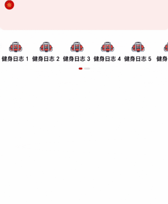
分页式横向滚动视图组件,支持第一页固定显示,第二页展开显示更多内容,带有双指示器。
使用示例
import { PaginatedIndicatorScrollView, MenuItem } from '@zhenryx/react-native-indicator-scrollview';

const menuData: MenuItem[] = [
  { id: 1, name: '首页', icon: require('./assets/home.png'), href: '/' },
  { id: 2, name: '分类', icon: require('./assets/category.png'), href: '/category' },
  { id: 3, name: '购物车', icon: require('./assets/cart.png'), href: '/cart' },
  // ... 更多菜单项
];

export default function MenuDemo() {
  return (
    <PaginatedIndicatorScrollView
      data={menuData}
      firstPageCount={5}
      onItemPress={(item) => console.log('点击了:', item.name)}
      activeColor="#ce0707ff"
      inactiveColor="#e2e2e2ff"
    />
  );
}
Props
| 名称 | 类型 | 默认值 | 说明 |
| --- | --- | --- | --- |
| data | MenuItem[] | - | 菜单数据数组(必需) |
| onItemPress | (item: MenuItem) => void | - | 点击菜单项的回调函数 |
| firstPageCount | number | 5 | 第一页显示的数量 |
| containerStyle | StyleProp<ViewStyle> | - | 容器样式 |
| pageStyle | StyleProp<ViewStyle> | - | 页面样式 |
| itemStyle | StyleProp<ViewStyle> | - | 菜单项样式 |
| menuIconStyle | StyleProp<ImageStyle> | - | 菜单图标样式 |
| menuTextStyle | StyleProp<TextStyle> | - | 菜单文字样式 |
| indicatorStyle | StyleProp<ViewStyle> | - | 指示器容器样式 |
| trackStyle | StyleProp<ViewStyle> | - | 指示器轨道样式 |
| trackLeftStyle | StyleProp<ViewStyle> | - | 左侧指示器轨道样式 |
| trackRightStyle | StyleProp<ViewStyle> | - | 右侧指示器轨道样式 |
| thumbStyle | StyleProp<ViewStyle> | - | 指示器滑块样式 |
| thumbLeftStyle | StyleProp<ViewStyle> | - | 左侧指示器滑块样式 |
| thumbRightStyle | StyleProp<ViewStyle> | - | 右侧指示器滑块样式 |
| activeColor | string | #ce0707ff | 激活状态颜色 |
| inactiveColor | string | #e2e2e2ff | 非激活状态颜色 |
MenuItem 类型
interface MenuItem {
  id: number;
  name: string;
  icon: any; // React Native Image source
  href: string;
}
许可证
ISC © zhenryx