
@ziqx/react-comps
v0.5.0
Published
TypeScript-first React components shared across Ziqx products.


Readme
@ziqx/react-comps
Shared, TSX-first React components for Ziqx products. Includes HoldButton, Button, Input, Checkbox, GlossyContainer, Select (also exported as CleanSelect), DatePicker, Popover, DotsLoader, BeatLoader, and ZiqxLoader. React and React DOM are peer dependencies. Selects and popovers use Radix; the calendar uses React DayPicker. No Tailwind, Next.js, icon library, or animation runtime is required.
Use
Install the package in your React project:
npm install @ziqx/react-compsImport the stylesheet once in your app entry or root layout:
import "@ziqx/react-comps/styles.css";
import { Button, Input, BeatLoader } from "@ziqx/react-comps";
import { ArrowRight, Plus, Mail } from "lucide-react";

export function TaskForm({ saving }: { saving: boolean }) {
  return (
    <form>
      <Input
        label="Email"
        name="email"
        type="email"
        placeholder="[email protected]"
        prefix={Mail}
        required
      />
      <Button
        type="submit"
        bgColor="#07815d"
        fgColor="#ffffff"
        prefix={Plus}
        suffix={ArrowRight}
        loading={saving}
        loadingLabel="Creating task…"
      >
        Create task
      </Button>
      <BeatLoader label="Syncing…" />
    </form>
  );
}
Lucide is optional and belongs to the consuming app. Pass an icon component (prefix={Plus}), not an element (prefix={<Plus />}). Icons receive color={fgColor}, size={18}, a class name, and aria-hidden. Their rendered root should forward those props and use currentColor, so disabled colors follow the surrounding component. Prefix and suffix icons are decorative; give icon-only buttons an aria-label.
Button
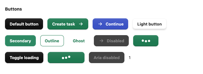
bgColor,fgColor: any valid CSS color, includingvar(--brand). Defaults:#101010/#ffffff.variant:primary(raised Tasks finish),secondary(softened fill),outline, orghost. Defaults toprimary.size:default,compact, oricon.prefix,suffix: icon components.loading,loadingLabel: controlled loading state; shows DotsLoader, disables activation, announces the loading label, and preserves the original content's dimensions. Setloadingfor the duration of your request; there are no automatic timers. Loading retains the active colors.disabled: derives muted background, foreground, and border colors from your colors.aria-disabledalso blocks click activation while allowing keyboard focus.full: fills the available width.- Native button props, event handlers,
className,style, and a forwarded buttonrefare supported.typedefaults tobutton; usesubmitexplicitly for forms.
Hover, pressed, border, focus, and disabled states are derived in CSS using color-mix(). No color parsing, palette object, or per-render JavaScript color calculation is needed. fgColor stays the text/icon color in every variant. For an outlined green button on a light surface, use variant="outline" bgColor="#ffffff" fgColor="#07815d". Choose legible foreground/background pairs; the package does not automatically calculate contrast.
HoldButton
An original hold-to-confirm component inspired by the React Bits Hold Button interaction. It uses a liquid fill with a moving wave edge, contrasting text over the fill, and a completion label. No React Bits source is distributed.
import { HoldButton } from "@ziqx/react-comps/hold-button";
import "@ziqx/react-comps/hold-button/styles.css";

<HoldButton
  holdTime={2000}
  fillColor="#dc2626"
  doneLabel="Deleted"
  onHold={() => deleteItem()}
>
  Hold to delete
</HoldButton>;
Also available from the root import and included in the combined stylesheet.
children,doneLabel: idle and completion content; defaults to “Hold to confirm” and “Confirmed”.icon,doneIcon: decorative React elements before each label.backgroundColor,fillColor,textColor,fillTextColor: surface, liquid, and the two label colors.size:sm,md(default), orlg;radius: corner radius in pixels (default 14).fillDirection:right(default) orup;wave,waveAmplitude: enable the wave and set its amplitude in pixels (defaults true / 6).holdTime: required uninterrupted duration in milliseconds (default 2000). Each new hold starts from zero, even while a canceled fill is retreating.releaseTime: fill retreat duration (default 200);pressScale: held scale (default 0.97);glow: enable glow and completion pulse (default true).resetAfter: time to show completion before resetting (default 1200). Set 0 to keep it completed; remount with a newkeyto reset it.onHold: fires once per completed hold.onTap: optional separate action for a release shorter than 250ms; it never confirms the hold.- Hold with a primary mouse/touch/pen pointer, Space, or Enter. Leaving the button, pointer cancellation, Escape, lost focus, hidden tabs, or disabling cancels an unfinished hold. Key auto-repeat and additional pointers cannot confirm again.
- Native button attributes, event handlers,
className,style, and a forwarded buttonrefare supported. Bothdisabledandaria-disabledblock activation.preventDefault()in a down handler prevents starting. - The button always uses
type="button"and intentionally has noonClickaction. Put confirmation work inonHold; a normal click must not bypass the hold. For async work, controldisabledfrom your pending state and handle errors in your application; the completion label indicates that the hold completed. - The hold duration is announced in an accessible description, completion uses a polite live region, and reduced-motion preferences disable decorative motion. In reduced-motion mode the fill indicates holding/completion without sweeping.
Input
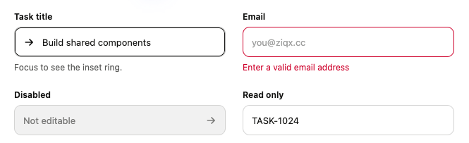
The Tasks input geometry: 43px height, 10px corners, 12px horizontal padding, and a 200ms border/inset-ring transition. The focus ring grows inward without shifting text or changing the layout.
bgColor,fgColor: defaults#ffffff/#11110f; focus usesfgColorand neutral states derive from the pair.label,description,error: optional accessible field content. IDs connect the label and descriptions to the native input; errors setaria-invalidand a red border/ring.prefix,suffix: decorative icon components, with automatic padding.- All native input props, including
value,defaultValue,onChange,name,required,readOnly,disabled, and a forwarded inputref. classNameandstyletarget the native input;containerClassNametargets the field wrapper. Withoutlabel, supplyaria-labelor an external label.
The component does not mirror values into state and works with controlled inputs, uncontrolled inputs, native forms, and ref-based form libraries. Intended for text-like input types, including email, password, search, number, and URL; use Checkbox and DatePicker for those controls. Radio, range, and file controls are outside this release.
Checkbox
Core’s gray-to-black checkbox with a white check and a brief circle-to-rounded-square pulse, adapted from Uiverse.io by bociKond. Native checkbox behavior supports keyboard activation, forms, external labels, and controlled or uncontrolled usage.
import { Checkbox } from "@ziqx/react-comps/checkbox";
import "@ziqx/react-comps/checkbox/styles.css";

<Checkbox
  label="Assigned to me"
  checked={assignedToMe}
  onChange={(event) => setAssignedToMe(event.currentTarget.checked)}
/>;
<Checkbox
  aria-label="Select all tasks"
  checked={allSelected}
  indeterminate={someSelected && !allSelected}
  onChange={toggleAll}
/>;
<Checkbox
  label="Subscribe"
  name="subscribe"
  defaultChecked
  bgColor="#0B6E4F"
/>;bgColor,fgColor,uncheckedColor: default to#1b1b1b,#ffffff, and#deddd9.size: visual size in pixels, default20. The transparent native input covers the full control.label: optional visible label. Otherwise providearia-label,aria-labelledby, or an external<label>.indeterminate: mixed selection, useful for select-all. Update it alongsidechecked; it does not change the submitted value.- Native
checked,defaultChecked,onChange,disabled,required,name,value, andformprops work normally. The forwarded ref targets the native input. classNameandstyletarget the outer wrapper.inputClassNametargets the input. CSS variables--ziqx-checkbox-durationand--ziqx-checkbox-pulse-durationcustomize motion.- Focus remains visible, disabled controls cannot be activated, and reduced-motion/forced-colors preferences are respected. Inside an existing
<label>, omit the component’slabelprop.
GlossyContainer
A common surface with the primary button and active-navigation finish: a subtle top gradient, inner highlight, darker lower edge, and soft shadow. Use it for cards, panels, navigation items, or custom controls. It does not impose a content layout, fixed dimensions, or clipping.
import { GlossyContainer } from "@ziqx/react-comps/glossy-container";
import "@ziqx/react-comps/glossy-container/styles.css";

<GlossyContainer padding={24} radius={18}>
  <h2>Project overview</h2>
  <p>Any content can go here.</p>
</GlossyContainer>;

<GlossyContainer as="a" href="/tasks" aria-current="page" padding="12px 16px">
  Tasks
</GlossyContainer>;

<GlossyContainer as="button" onClick={openSettings} padding="10px 16px">
  Settings
</GlossyContainer>;

<GlossyContainer
  as="section"
  bgColor="#f5f3ed"
  fgColor="#11110f"
  style={{ display: "grid", gap: 16 }}
>
  <h2>Workspace</h2>
  <p>A light surface using the same finish.</p>
</GlossyContainer>;as: element or ref-forwarding React component, defaults todiv. Native props, handlers, children, and the correctly typed ref pass through. Native buttons default totype="button"; explicittype="submit"works normally.bgColor,fgColor: defaults#101010/#ffffff. Border and interactive colors derive from this pair.padding,radius: defaults16/12. Numbers mean pixels; CSS lengths and padding shorthands are supported.interactive: visual hover/pressed feedback, on by default for nativeaandbutton. For a custom router Link useas={Link} interactive. It does not add roles, keyboard handlers, or focusability to a plain container; use a semantic link/button for actions.classNameandstyletarget the rendered element. Use them for flex/grid, gap, width, or positioning. Namespaced CSS variables include--ziqx-glossy-bg,--ziqx-glossy-fg,--ziqx-glossy-padding,--ziqx-glossy-radius, and--ziqx-glossy-duration.- Native disabled buttons cannot be activated.
aria-disabledprovides styling only; the consuming link/custom component must prevent its own activation when needed. Focus-visible, reduced-motion, and forced-colors states are included. - In Next.js, import the standalone stylesheet in the root layout (
import "@ziqx/react-comps/glossy-container/styles.css"), like other package CSS. The combined@ziqx/react-comps/styles.cssalso includes it.
Select / CleanSelect
A single-select dropdown with the Tasks styling, keyboard navigation and typeahead, option icons, disabled options, scrolling, and an automatically positioned panel. CleanSelect is an alias of Select.
import { Select } from "@ziqx/react-comps";

<Select
  label="Assignee"
  name="assignee"
  defaultValue=""
  bgColor="#ffffff"
  fgColor="#11110f"
  options={[
    { value: "", label: "Unassigned" },
    { value: "alice", label: "Alice" },
    { value: "bob", label: "Bob", disabled: true },
  ]}
/>;options: an array of{ value, label, disabled?, icon?, labelClassName? }. Values must be unique strings. Empty strings are supported;iconaccepts a React element.- Use
value+onValueChangefor controlled selection, ordefaultValuefor internal state. The selected value should match an option;""also represents no selection when there is no empty option. placeholder,disabled,compact,bgColor, andfgColorcustomize the trigger and panel. The selected label is visible during server rendering.label,description,error,id, andariaLabelconnect accessible field content. Withoutlabel, provideariaLabelor usetriggerProps["aria-labelledby"].name,form,required, andautoCompletesupport native forms. Submitted values are the original option strings, including empty strings. Native form reset restoresdefaultValuefor uncontrolled selects. Required selects treat an empty value as invalid and focus the trigger.open,defaultOpen, andonOpenChangecontrol the panel.dir="rtl"supports right-to-left layouts.className,style,triggerProps, and the forwardedreftarget the trigger.containerClassNametargets the field.contentPropsconfigures the panel's classes, styles, positioning, and dismissal callbacks;portalContainercustomizes its portal destination.
DatePicker
A single-date calendar with the Tasks appearance, Today/Clear actions, keyboard navigation, locale support, and smooth opening/closing. Values use local YYYY-MM-DD strings; clearing emits "". Dates do not pass through UTC conversion.
import { DatePicker } from "@ziqx/react-comps";

<DatePicker
  label="Due date"
  name="dueDate"
  defaultValue="2026-09-08"
  minDate="2026-09-01"
  maxDate="2026-12-31"
  disabledDates={{ dayOfWeek: [0, 6] }}
  description="Choose a weekday."
/>;value+onValueChange, ordefaultValue, work like the select. The forwardedreftargets the trigger button. Invalid or rolled-over date strings display the placeholder.minDateandmaxDateare inclusiveYYYY-MM-DDlimits.disabledDatesaccepts React DayPicker matchers (dates, date arrays, weekdays, intervals, or predicates). Calendar selections and the Today action respect these limits and hidden dates.localeaccepts a React DayPicker locale, for exampleimport { fr } from "react-day-picker/locale".formatDateoptionally customizes trigger text.clearLabel,todayLabel,calendarLabel,requiredLabel, andplaceholderlocalize the surrounding UI.calendarPropsexposes calendar presentation and navigation options, includingweekStartsOn,captionLayout,startMonth,endMonth,numberOfMonths,labels,formatters, andcomponents. Selection mode, selected value, disabled dates, and autofocus are managed by this component. This release supports single dates in the user's local timezone.showClearandshowTodaydefault totrue.requireddisables Clear and enables native required validation.name,form, and native reset are supported;minDateandmaxDateare also applied to the native date control. Applications should validate dates again when processing submissions.label,description,error,id,ariaLabel,bgColor,fgColor,compact,disabled,open,defaultOpen, andonOpenChangework as onSelect.className,style, andtriggerPropscustomize the trigger;containerClassNamestyles the field.contentPropscustomizes the panel andportalContainersets its portal destination. Calendar CSS is bundled and scoped to this component.
Popover
A general floating panel for filters, forms, and custom content. It supports controlled or uncontrolled opening, collision-aware positioning, Escape/outside dismissal, focus restoration, and nested controls.
import { Button, Input, Popover, PopoverClose } from "@ziqx/react-comps";

<Popover
  trigger={<Button>Filters</Button>}
  ariaLabel="Task filters"
  align="start"
>
  <Input label="Search tasks" />
  <PopoverClose asChild>
    <Button>Done</Button>
  </PopoverClose>
</Popover>;triggermust be one React element that forwards DOM props and a ref (the packageButtondoes this). Give the trigger an accessible name.- Use
open+onOpenChangefor controlled behavior, ordefaultOpenfor internal state.modaldefaults tofalse. ariaLabelnames the dialog.PopoverClosecloses the nearest popover; useasChildto compose a custom button.side,align,sideOffset,collisionPadding, and other Radix content props customize placement and dismissal. Defaults:align="end",sideOffset={8},collisionPadding={16}.bgColorandfgColorcolor the panel.className,style, and the forwardedreftarget the panel. Setstyle={{ "--ziqx-popover-width": "360px" }}for a custom width; it remains constrained to the viewport.portalContainerchanges the portal destination.
Loaders
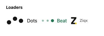
import { DotsLoader, BeatLoader, ZiqxLoader } from "@ziqx/react-comps/loaders";

<DotsLoader size="sm" label="Saving…" />;
<BeatLoader
  showLabel
  label="Syncing…"
  style={{ color: "#07815d", "--ziqx-loader-cycle": "1200ms" }}
/>;
<ZiqxLoader label="Loading workspace…" />;
All three support size="sm" | "md" | "lg", tone="default" | "inverse", label, showLabel, className, and style. Colors inherit by default. CSS variables --ziqx-loader-color, --ziqx-loader-width, and --ziqx-loader-cycle customize appearance and timing. ZiqxLoader shows its label by default; the dot loaders do not. Standalone loaders expose role="status"; button loaders are hidden from assistive technology because the button supplies the progress name.
Styles and compatibility
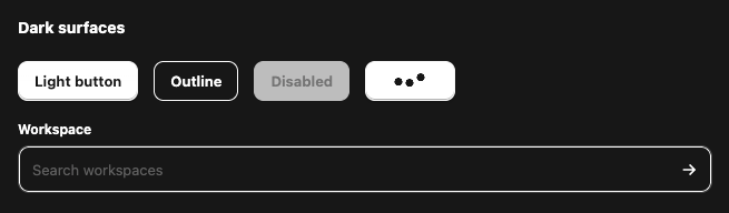
Every component has scoped ziqx-* styles, reduced-motion handling, and forced-colors support. React 18.2+ and React 19 are supported. Use a modern browser with CSS color-mix() support. Fonts inherit from your product.
For smaller CSS imports, use component entry points:
import { Button } from "@ziqx/react-comps/button";
import "@ziqx/react-comps/button/styles.css"; // includes button DotsLoader CSS
import { Input } from "@ziqx/react-comps/input";
import "@ziqx/react-comps/input/styles.css";
import "@ziqx/react-comps/loaders/styles.css"; // all standalone loaders
import { Select } from "@ziqx/react-comps/select";
import "@ziqx/react-comps/select/styles.css";
import { DatePicker } from "@ziqx/react-comps/date-picker";
import "@ziqx/react-comps/date-picker/styles.css";
import { Popover } from "@ziqx/react-comps/popover";
import "@ziqx/react-comps/popover/styles.css";
Prefer either the combined stylesheet or the required component styles. Source .tsx files and generated ESM/declaration files are shipped. Client directives are preserved for Next.js. CommonJS require() is not a supported entry point.
Development
npm install
npm run check
npm pack --dry-run
check runs strict source types, build, component rendering tests, consumer types (including CSS imports), and formatting. npm pack rebuilds the ESM and declaration output. Component folders and subpath exports can be extended for additional shared controls. Upstream calendar CSS licensing is preserved in THIRD_PARTY_NOTICES.md.