
a11y-panel
v1.1.0
Published
An modern draggable React Accessibility Widget that allows users to change sites visual changes
Maintainers
 theabgarg
Readme
React Accessibility Widget
A customizable embedded widget that allows users to adjust the visual appearance of React applications to meet their accessibility needs.
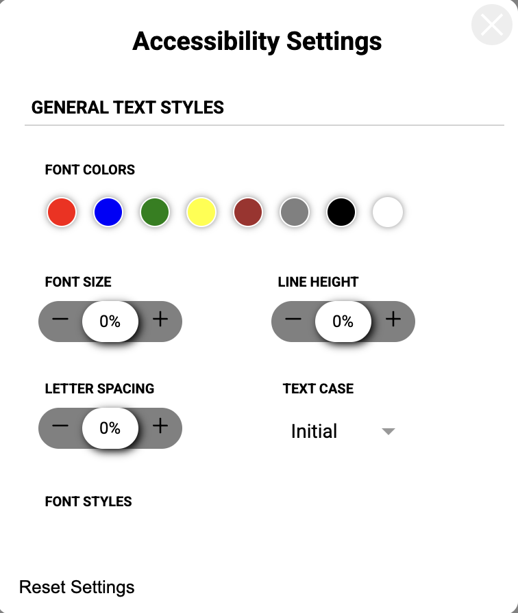
Features
- Font Styling: Adjust font size, color, emphasis, and text case.
- Layout Adjustments: Modify line height, letter spacing, and text alignment.
- Visual Assistance: Highlight links and titles, or hide non-essential images.
- Contrast Modes: Toggle high contrast, low contrast, or monochrome themes.
- Modern UI: Use a responsive, draggable floating panel with grouped tabs for typography, colors, and display controls.
- Persistent Settings: Save user preferences across reloads with configurable
localStoragesupport.
Installation
bun add a11y-panelnpm install a11y-panelyarn add a11y-panelNo extra styling peer dependency is required.
Usage
1. Basic Integration
Mount the <AccessibilityWidget /> near the root of your application. The widget uses absolute positioning to float above your interface.
import React from "react";
import { AccessibilityWidget } from "a11y-panel";

export default function App() {
  return (
    <div>
      <AccessibilityWidget />
      <main>
        <h1>Welcome</h1>
        <p>Your accessible application content goes here.</p>
      </main>
    </div>
  );
}
2. Custom Theming
Override the widget's internal colors using the theme prop to match your brand identity.
import React from "react";
import { AccessibilityWidget, WidgetTheme } from "a11y-panel";

const customTheme: WidgetTheme = {
  primary: "#005f73",
  background: "#ffffff",
  widgetBackground: "#1a1a1a",
  text: "#eaeaea",
  iconColor: "#005f73",
};

export default function App() {
  return (
    <>
      <AccessibilityWidget theme={customTheme} />
      <main>...</main>
    </>
  );
}
3. Positioning and Custom Icons
Control where the widget spawns on the screen or replace the default trigger icon.
import React from "react";
import { AccessibilityWidget } from "a11y-panel";

const EyeIcon = () => (
  <svg viewBox="0 0 24 24" fill="currentColor" width="24" height="24">
    <path d="M12 4.5C7 4.5 2.73 7.61 1 12c1.73 4.39 6 7.5 11 7.5s9.27-3.11 11-7.5c-1.73-4.39-6-7.5-11-7.5zM12 17c-2.76 0-5-2.24-5-5s2.24-5 5-5 5 2.24 5 5-2.24 5-5 5zm0-8c-1.66 0-3 1.34-3 3s1.34 3 3 3 3-1.34 3-3-1.34-3-3-3z" />
  </svg>
);

export default function App() {
  return (
    <>
      <AccessibilityWidget
        initialPosition={{ x: 20, y: 80 }}
        customIcon={<EyeIcon />}
      />
      <main>...</main>
    </>
  );
}
Props Reference
| Prop | Type | Description |
| ----------------- | -------------------------- | ----------------------------------------------------------------- |
| theme | WidgetTheme | A partial theme object to override the widget's default colors. |
| initialPosition | { x: number; y: number } | The starting coordinates for the draggable widget trigger. |
| customIcon | React.ReactNode | A custom React element to replace the default accessibility icon. |
| storageKey | string | Optional custom localStorage key for persisting user settings. |
Use Cases
- Healthcare & Government Portals: Ensure strict compliance with WCAG guidelines by giving users direct control over text sizes and contrast parameters.
- E-Learning Platforms: Allow neurodivergent students or those with visual impairments to modify line height and typography for better readability.
- E-Commerce Web Apps: Assist users who are color blind by providing a monochrome mode or by highlighting essential actionable links across the site.