
adtabbar
v1.0.0
Published
适用于uni-app的底部导航栏,支持当中自定义按钮,支持小程序
Downloads
5
Maintainers
 jiabin87428
Readme
介绍
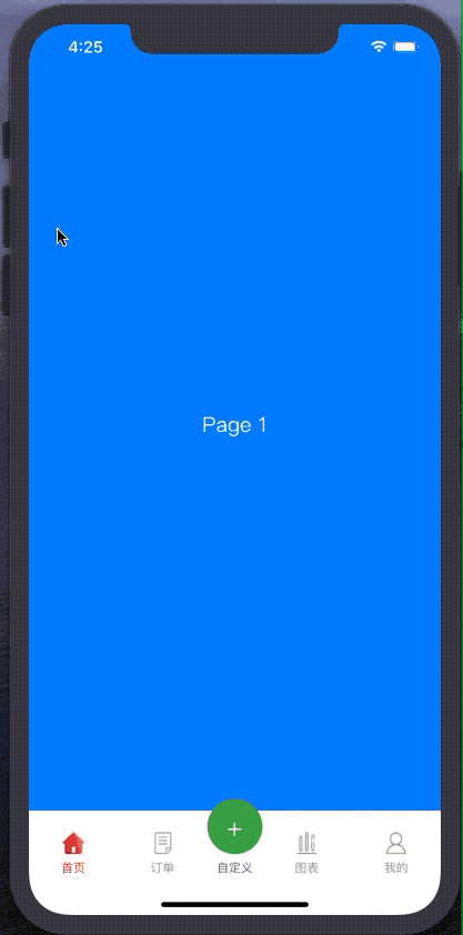
uni-app自带的底部导航栏虽然也很好用,但是遇到中间需要有一个自定义按钮的需求的时候如果使用自带的midButton,就只支持App,小程序什么都不支持。
ADTabbar自定义底部导航栏支持App、小程序的中间自定义按钮,可以自己设置css让他凸起。
注:配合该组件的根页面(也就是每个底部菜单对应的第一个页面),需要用到自定义组件模式,详细用法可以看Demo工程
暂不支持nvue
还有不足的地方会及时优化,也欢迎提出建议! Demo工程
使用方式
- 在uni-app项目根目录执行命令初始化npm工程:
npm init -y - 通过npm安装包:
npm i adtabbar - 然后在工程中就会出现一个node_module文件夹,这个里面就是ADTabbar的包
- 在 script 中引用组件
import adTabbar from '@/node_modules/adTabbar/ADTabbar.vue';
import adTabbarItem from '@/node_modules/adTabbar/ADTabbarItem.vue';
export default {
    components: {adTabbar,adTabbarItem}
}
在 template 中使用组件
<adTabbar>
	<adTabbarItem text="首页" dataCur="page1" class="maxWidth" @click="navClick" :textColor="curPage=='page1'? '#DF421D':'#9B9B9B'" :icon="'../../static/home' + [curPage=='page1'?'-hover':''] + '.png'"></adTabbarItem>
	<adTabbarItem text="订单" dataCur="page2" class="maxWidth" @click="navClick" :textColor="curPage=='page2'? '#DF421D':'#9B9B9B'" :icon="'../../static/order' + [curPage=='page2'?'-hover':''] + '.png'"></adTabbarItem>
	<!--自定义中间View,可以注释掉就是正常4个Tab菜单-->
	<view class="middleItem" @click="middleClick">
		<view class="buttonView">+</view>
		<text>自定义</text>
	</view>
	<adTabbarItem text="图表" dataCur="page3" class="maxWidth" @click="navClick" :textColor="curPage=='page3'? '#DF421D':'#9B9B9B'" :icon="'../../static/chart' + [curPage=='page3'?'-hover':''] + '.png'"></adTabbarItem>
	<adTabbarItem text="我的" dataCur="page4" class="maxWidth" @click="navClick" :textColor="curPage=='page4'? '#DF421D':'#9B9B9B'" :icon="'../../static/my' + [curPage=='page4'?'-hover':''] + '.png'"></adTabbarItem>
</adTabbar>
adTabbar属性说明
| 属性 | 类型 | 默认 | 备注 | | -------- | :-----: | :----: | :----: | | backgroundColor | String | #FFFFFF | 背景色 |
adTabbarItem属性说明
| 属性 | 类型 | 默认 | 备注 | | -------- | :-----: | :----: | :----: | | dataCur | String | - | 绑定页面 | | icon | String | - | 图标 | | text | String | - | 菜单名称 | | textColor | String | #5E5E5E | 文字颜色 | | textSize | String | 22 | 文字大小 |
事件说明
| 事件名称 | 说明 | 返回 | | -------- | :-----: | :----: | :----: | | click | 点击菜单触发的事件 | e.currentTarget.dataset.cur,查看当前点击的菜单 |