
afms
v1.0.2
Published
ant design form render solution
Maintainers
 guobiao.xgb
Readme
Afms


Ant Design form render solution.
It helps you render a form easily through configuration data instead of using the original antd form api.
Features
- ✔︎ Out of the box, base on the most popular react ui library Ant Design, easy to get started.
- ✔︎ Data driven, any action on the form can be done by manipulating the configuration data.
- ✔︎ High maintainability, maintaining the form requires only maintaining the configuration data.
- ✔︎ High scalability, can highly customize your form field and assemble the field to meeting individual requirements.
- ✔︎ Status Switching, has multiple status(such as preview, edit, disabled), which can be switched quickly.
- ✔︎ Complex layout, flexible layout, no longer afraid of complex forms.
Install
npm install afms --saveGetting Started
import React from 'react';
import { Form, Button } from 'antd';
import { FormRender } from 'afms';
import 'afms/dist/afms.css';
const FormItem = Form.Item;
const formConfig = {
fields: [
{ field: 'input', id: 'name', config: { placeholder: 'UserName' }, },
{ field: 'input', id: 'password', type: 'password',config: { placeholder: 'Password' }, },
],
};
class App extends React.Component {
handleSubmit = () => {
const { form } = this.formRef.props;
console.log(form.getFieldsValue());
}
render() {
return (
<div>
<FormRender
config={formConfig}
wrappedComponentRef={(ref) => {
this.formRef = ref;
}}
/>
<FormItem>
<Button type="primary" onClick={this.handleSubmit}>
Login
</Button>
</FormItem>
</div>
);
}
};
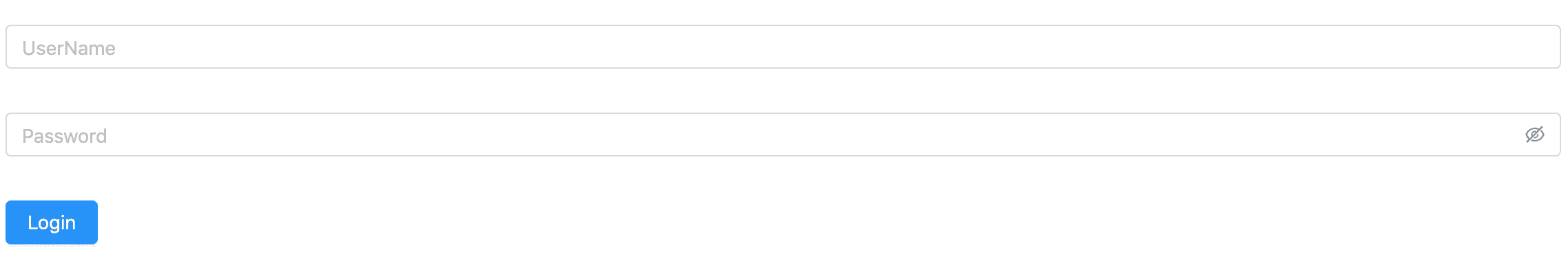
ReactDOM.render(<App />, document.getElementById('root'));Then you can get a form like this:
You can see more examples in this.
API Reference
FormRender
| Property | Description | Type | Default |
| --- | --- | --- | --- |
| config | The config of the FormRender, see more about in FormRender.Config | Object | - |
| data | Values of the fields | Object | null |
| onChange | Called when all fields value change | (field, ..arg) => void | null |
| children | Child element | any | - |
| className | ClassName of FormRender | string | - |
| style | Style of FormRender | object | - |
| needWrapFormRenderCore | Set if need div wrap for FormRenderCore | boolean | true |
How to use:
const formConfig = {...};
<FormRender
  className="form-render"
  config={formConfig}
  data={{ name: 'beyondxgb' }}
  onChange={(field, event) => {}}
/>
FormRender.Config
| Property | Description | Type | Default |
| --- | --- | --- | --- |
| status | The status of all fields, can be covered by field config | 'preview' 'disabled' 'readonly' 'none' | 'edit' |
| fields | Define form fields, it is a field array. Field detail config you can see in FormRender.Config.Field | Array | - |
| layout | Define form layout | 'horizontal' 'vertical' 'inline' 'multi-column' | 'horizontal' |
| column | Columns of multi-clomun layout | number | 1 |
| gutter | Spacing between grids, could be a number or a object like { xs: 8, sm: 16, md: 24} | Number Object Array | 0 |
| emptyContent | Set the content when field value is null or undefined, only available when then status is preview, can be covered by field config | - |
| .... | Extend all props of Ant Design Form, such as layout, labelCol, wrapperCol and so on | - | - |
How to use:
const formConfig = {
  status: 'edit',
  layout: 'horizontal',
  labelCol: {
    span: 4,
  },
  wrapperCol: {
    span: 10,
  },
  fields: [{ field: 'input', id: 'name' }],
  emptyContent: '-',
};
<FormRender
  config={formConfig}
/>
FormRender.Config.Field
| Property | Description | Type | Default |
| --- | --- | --- | --- |
| field | Define field type, such as input, select or custom field | string | - |
| id | The unique identifier of form field | string | - |
| type | The extend type of the component field | string | - |
| value | The field content value | any | - |
| defaultValue | The initial field content value | any | - |
| status | The status of the field | 'preview' 'disabled' 'readonly' 'none' | 'edit' |
| formItem | Extend Ant Design Form.Item config | FormItemProps | - |
| decorator | Extend Ant Design getFieldDecorator config | GetFieldDecoratorOptions | - |
| config | Component config of the field, extend Ant Design components config | Object | - |
| colSpan | How many columns the field should take up | Number | 1 |
| emptyContent | Set the content when field value is null or undefined, only available when then status is preview | any | - |
| previewRender | Define the content when the field status is preview | (field: FieldProps) => React.ReactNode | - |
| disabledRender | Define the content when the field status is disabled | (field: FieldProps) => React.ReactNode | - |
| readonlyRender | Define the content when the field status is readonly | (field: FieldProps) => React.ReactNode | null |
How to use:
const formConfig = {
  fields: [{
    field: 'input',
    id: 'password',
    type: 'password',
    value: '5201314',
    status: 'edit',
    formItem: {
      label: 'Password',
    },
    decorator: {
      rules: [{
        required: true,
        message: 'Please input your password',
      }],
    },
    config: {
      placeholder: 'password',
    },
    previewRender: field => field.value,
    emptyContent: '-',
  }],
};
<FormRender
  config={formConfig}
/>
FormRenderCore
The props of FormRenderCore is the same as FormRender.
It can use in the scene that there are many form modules:
<FormRender>
  <h3>BaseInfo</h3>
  <FormRenderCore
    config={form1Config}
  />
  <h3>MoreInfo</h3>
  <FormRenderCore
    className="form-panel"
    config={form2Config}
  />
</FormRender>
registerFormField
import { FormRenderCore } from 'afms';

FormRenderCore.registerFormField('price-input', PriceInputField);
registerFormFields
import { FormRenderCore } from 'afms';

FormRenderCore.registerFormFields({
  'price-input': PriceInputField,
  ...
});
FormRender.FormConfig
It helps you manipulate configuration data easily.
How to use:
const formConfig = {...}
const formConfigHelper = new FormRender.FormConfig(formConfig);

<FormRender config={formConfigHelper.getConfig()} />
| Method | Description | Type | Version |
| --- | --- | --- | --- |
| getConfig | Get form render config | Function() | |
| getFieldById | Get field by id | Function(id: string) | |
| setFieldById | Set field by id | Function(id: string, callback: (field: FieldProps) => FieldProps) | |
| insertField | Insert field in target index, default in the last | Function(field: FieldProps, targetIndex: number) | |
| setFieldOrder | Adjust the field position | Function(currentIndex: number, targetIndex: number) | |
| deleteFieldById | Delete field by id | Function(id: string) | |
Using in TypeScript
import React from 'react';
import { Form, Button } from 'antd';
import { FormComponentProps } from 'antd/lib/form';
import { FormRender } from 'afms';
import { FormConfigProps } from 'afms/lib/types';
import 'afms/dist/afms.css';

const FormItem = Form.Item;

const formConfig: FormConfigProps = {
  fields: [
    { field: 'input', id: 'name', config: { placeholder: 'UserName' }, },
    { field: 'input', id: 'password', type: 'password',config: { placeholder: 'Password' }, },
  ],
};

class App extends React.Component {
  private formRef: React.Component<FormComponentProps>
  handleSubmit = () => {
    const { form } = this.formRef.props;
    console.log(form.getFieldsValue());
  }
  render() {
    return (
      <div>
        <FormRender
          config={formConfig}
          wrappedComponentRef={(c: React.Component<FormComponentProps>) => {
            this.formRef = c;
          }}
        />
        <FormItem>
          <Button type="primary" onClick={this.handleSubmit}>
            Login
          </Button>
        </FormItem>
      </div>
    );
  }
};

ReactDOM.render(<App />, document.getElementById('root'));
Import on Demand
There is a small problem that if you use configuration data to render a form, all form fields is imported. Because We don't know which form field will be used.
If your application pursues high performance, you can use the method of assembling form fields, like this example.
We strongly recommend using babel-plugin-import, which can convert the following code to the 'afms/es/xxx' way:
import { InputField } from 'afms';And this plugin can load styles too. Read usage for more details.
Contribute
LICENSE
MIT