
ai-suspended-ball-chat
v0.3.69
Published
一个功能强大的AI聊天组件,支持流式响应、图片上传、语音播报、历史记录管理等功能。可以作为悬浮球或独立面板使用。
Maintainers
 mingle998
Readme
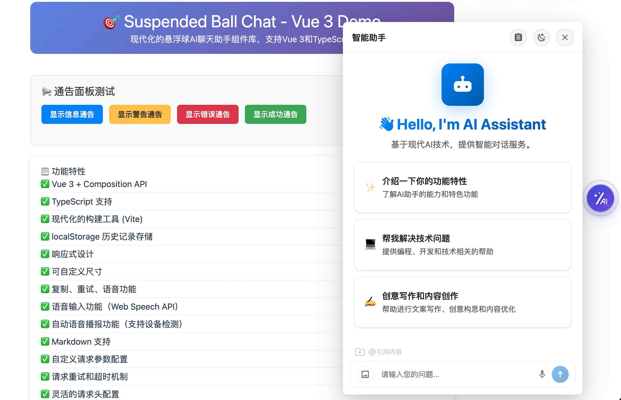
AISuspendedBallChat(AI助手组件)
一个功能强大的AI聊天Vue3组件,支持流式响应、图片上传、语音播报、历史记录管理等功能。该AI组件可以作为悬浮球或独立面板使用。
⚠️使用场景注意: 当前是Vue3专用组件版本,如果您的业务是其他技术栈(例如React、Vue2、原生应用等),请使用 ai-chat-embed 版本→。
《组件落地场景体验1-AI简历助手》: 点击直达案例1🔗
《组件落地场景体验2-AI编程助手》: 点击直达案例2🔗
🔔 温馨提示: 如果您觉得阅读文档困难,也可以选择咨询在线AI助手: 🤖点击直达咨询→
✨ 特性
- 🤖 AI对话: 支持与AI进行自然语言对话
- 📡 多模式请求: 支持普通请求和流式(SSE)响应、WebSocket三种模式
- 🖼️ 图片上传: 支持图片上传和AI图像识别
- 🎤 语音输入: 支持语音转文字输入,便捷的语音交互
- 🔊 语音播报: 支持AI回复内容的语音播报
- 📝 获取AI消息: 支持将AI内容插入到用户的编辑器或其他应用
- 💾 历史记录: 本地存储对话历史,支持历史记录管理
- 🎨 主题切换: 支持白天/夜间模式切换
- 🔗 引用内容: 支持选择引用页面中(上传)的文本作为上下文
- 📱 自定义接口: 支持用户自定义后端接口
- 🔧 高度可配置: 丰富的配置选项和回调函数
- 🚀 TypeScript支持: 完整的TypeScript类型定义
- ☎️ 问题工单搜集: 支持搜集需人工处理的问题
- 📅 渲染自定义组件: 对话流中支持渲染自定义系列的组件(shoelace)
- 📊 ECharts 图表渲染: 支持在 Markdown 中使用 echarts 代码块渲染图表
- 🎛️ 更多抽屉: 支持自定义"更多"抽屉面板,可通过插槽渲染自定义内容
📦 安装
npm install ai-suspended-ball-chat
# 或
yarn add ai-suspended-ball-chat
# 或
pnpm add ai-suspended-ball-chat
🚀 快速开始
基础使用
流式响应模式
<template>
  <div id="app">
    <SuspendedBallChat
      :url="apiUrl"
      :app-name="appName"
      :domain-name="domainName"
      :enable-streaming="true"
      :enable-context="true"
      :enable-local-storage="true"
      :enable-voice-input="true"
      :callbacks="callbacks"
    />
  </div>
</template>

<script>
import { SuspendedBallChat } from 'ai-suspended-ball-chat'

export default {
  name: 'App',
  components: {
    SuspendedBallChat
  },
  data() {
    return {
      apiUrl: 'https://your-api-endpoint.com/chat',
      appName: 'my-app',
      domainName: 'user123',
      callbacks: {
        onUserMessage: (message) => {
          console.log('用户发送消息:', message)
        },
        onAssistantMessage: (message, res) => {
          console.log('AI回复:', message, res)
        },
        onError: (error) => {
          console.error('发生错误:', error)
        }
      }
    }
  }
}
</script>
普通请求模式
<template>
  <div id="app">
    <SuspendedBallChat
      :url="apiUrl"
      :app-name="appName"
      :domain-name="domainName"
      :enable-streaming="false"
      :enable-context="true"
      :enable-local-storage="true"
      :enable-voice-input="true"
      :callbacks="callbacks"
    />
  </div>
</template>

<script>
import { SuspendedBallChat } from 'ai-suspended-ball-chat'

export default {
  name: 'App',
  components: {
    SuspendedBallChat
  },
  data() {
    return {
      apiUrl: 'https://your-api-endpoint.com/chat',
      appName: 'my-app',
      domainName: 'user123',
      callbacks: {
        onUserMessage: (message) => {
          console.log('用户发送消息:', message)
        },
        onAssistantMessage: (message, res) => {
          console.log('AI回复:', message, res)
        },
        onError: (error) => {
          console.error('发生错误:', error)
        }
      }
    }
  }
}
</script>
使用ChatPanel组件
<template>
  <div>
    <ChatPanel
      :url="apiUrl"
      :app-name="appName"
      :domain-name="domainName"
      :enable-streaming="true"
      :enable-context="true"
      :callbacks="callbacks"
      @close="handleClose"
    />
  </div>
</template>

<script>
import { ChatPanel } from 'ai-suspended-ball-chat'

export default {
  name: 'App',
  components: {
    ChatPanel
  },
  data() {
    return {
      apiUrl: 'https://your-api-endpoint.com/chat',
      appName: 'my-app',
      domainName: 'user123',
      callbacks: {
        onUserMessage: (message) => {
          console.log('用户发送消息:', message)
        },
        onAssistantMessage: (message, res) => {
          console.log('AI回复:', message, res)
        },
        onError: (error) => {
          console.error('发生错误:', error)
        }
      }
    }
  },
  methods: {
    handleClose() {
      console.log('聊天面板已关闭')
    }
  }
}
</script>
使用Composition API
<template>
  <div id="app">
    <SuspendedBallChat
      :url="apiUrl"
      :app-name="appName"
      :domain-name="domainName"
      :enable-streaming="true"
      :enable-context="true"
      :enable-local-storage="true"
      :enable-voice-input="true"
      :callbacks="callbacks"
    />
  </div>
</template>

<script setup>
import { SuspendedBallChat } from 'ai-suspended-ball-chat'

const apiUrl = 'https://your-api-endpoint.com/chat'
const appName = 'my-app'
const domainName = 'user123'

const callbacks = {
  onUserMessage: (message) => {
    console.log('用户发送消息:', message)
  },
  onAssistantMessage: (message, res) => {
    console.log('AI回复:', message, res)
  },
  onError: (error) => {
    console.error('发生错误:', error)
  }
}
</script>
自定义图标
你可以通过 custom-icon-url 属性来自定义悬浮球的图标:
<template>
  <div id="app">
    <SuspendedBallChat
      :url="apiUrl"
      :app-name="appName"
      :domain-name="domainName"
      custom-icon-url="https://example.com/your-custom-icon.png"
      :enable-streaming="true"
      :enable-context="true"
      :enable-local-storage="true"
    />
  </div>
</template>

<script setup>
import { SuspendedBallChat } from 'ai-suspended-ball-chat'

const apiUrl = 'https://your-api-endpoint.com/chat'
const appName = 'my-app'
const domainName = 'user123'
</script>
注意事项:
- 支持PNG、JPG、SVG等常见图片格式
- 建议使用28x28像素或更大尺寸的图片
- 如果不提供
custom-icon-url,将使用默认的SVG图标 - 自定义图标会自动适应悬浮球的大小和样式
自定义AI助手头像
你可以通过 assistant-config 属性来自定义AI助手的头像:
<template>
  <div id="app">
    <SuspendedBallChat
      :url="apiUrl"
      :app-name="appName"
      :domain-name="domainName"
      :assistant-config="assistantConfig"
      :enable-streaming="true"
      :enable-context="true"
      :enable-local-storage="true"
    />
  </div>
</template>

<script setup>
import { SuspendedBallChat } from 'ai-suspended-ball-chat'

const apiUrl = 'https://your-api-endpoint.com/chat'
const appName = 'my-app'
const domainName = 'user123'

const assistantConfig = {
  avatar: 'https://example.com/assistant-avatar.png',
  name: '智能助手',
  description: '您的专属AI助手'
}
</script>
注意事项:
- 支持PNG、JPG、SVG等常见图片格式
- 建议使用32x32像素或更大尺寸的图片
- 如果不提供
assistant-config.avatar,将使用默认的SVG图标 - 自定义头像会自动适应头像容器的大小和样式
自定义"更多"抽屉
启用 show-more-button 后,点击头部"更多"按钮会从右侧滑出抽屉,内容通过 #more 插槽自定义:
<template>
  <SuspendedBallChat
    :show-more-button="true"
    more-drawer-title="更多"
  >
    <template #more="{ close }">
      <div style="padding: 20px;">
        <p>这里放你的自定义内容</p>
        <button @click="close">关闭</button>
      </div>
    </template>
  </SuspendedBallChat>
</template>
ChatPanel 组件用法相同。插槽参数 { close } 可用于关闭抽屉。
自定义聊天内容区插槽
ChatPanel、SuspendedBallChat 还支持在聊天内容区上下方注入自定义内容,适合补充公告、说明、快捷操作等能力。
<template>
  <ChatPanel :url="apiUrl" :app-name="appName" :domain-name="domainName">
    <template #chat-box-head="{ uiHistory, showWelcomeScreen, isStreaming }">
      <div>
        <p>顶部插槽示例</p>
        <span>消息数:{{ uiHistory.length }}</span>
      </div>
    </template>

    <template #chat-box-footer="{ uiHistory, showWelcomeScreen, isStreaming }">
      <div>
        <span>底部插槽示例:当前共 {{ uiHistory.length }} 条消息</span>
      </div>
    </template>
  </ChatPanel>
</template>
这两个插槽当前对外暴露的上下文为:
uiHistory:当前 UI 历史消息列表showWelcomeScreen:是否正在显示欢迎页isStreaming:是否正在流式输出
自定义欢迎区插槽
ChatPanel、SuspendedBallChat 还支持通过 #welcome 自定义欢迎区内容。一旦传入该插槽,就会覆盖默认欢迎内容,不再渲染组件内置的头像、标题、描述和默认任务布局。
<template>
  <ChatPanel
    :url="apiUrl"
    :app-name="appName"
    :domain-name="domainName"
    :welcome-config="welcomeConfig"
    :preset-tasks="presetTasks"
  >
    <template #welcome="{ title, welcomeConfig, presetTasks, onTaskClick }">
      <div>
        <h2>{{ welcomeConfig?.title || title }}</h2>
        <p>{{ welcomeConfig?.description }}</p>

        <button
          v-for="task in presetTasks"
          :key="task.id"
          @click="onTaskClick(task)"
        >
          {{ task.title }}
        </button>
      </div>
    </template>
  </ChatPanel>
</template>
该插槽当前对外暴露的上下文为:
welcomeConfig:欢迎区配置对象presetTasks:预设任务列表onTaskClick:触发预设任务点击的函数
📋 API 参考
SuspendedBallChat Props
| 属性名 | 类型 | 默认值 | 说明 |
|--------|------|--------|------|
| url | string | '/nlweb/query' | API接口地址 |
| app-name | string | 'ai-chat' | 应用名称 |
| disable-input | boolean | 'false' | 是否禁用输入框 |
| custom-placeholder | string | '请输入你的问题...' | 输入框的placeholder |
| show-task-running-box | boolean | false | 是否显示任务执行中提示框 |
| task-running-text | string | '任务执行正在进行中' | 任务执行中提示文本 |
| size | 'small' \| 'medium' \| 'large' | 'medium' | 聊天面板大小 |
| location | 'left-top' \| 'left-center' \| 'left-bottom' \| 'right-top' \| 'right-center' \| 'right-bottom' | 'right-center' | 悬浮球位置 |
| custom-icon-url | string | - | 自定义悬浮球图标URL |
| max-input-length | number | 2000 | 用户输入最大字符数限制 |
| enable-streaming | boolean | false | 是否启用流式响应 |
| enable-context | boolean | true | 是否启用上下文记忆 |
| allow-history-search | boolean | false | 是否启用记录搜索功能 |
| enable-local-storage | boolean | true | 是否启用本地存储 |
| domain-name | string | default | 用户域,可以关联用户id实现用户维度的区分 |
| storage-key | string | 'ai-chat-history' | 本地存储键名 |
| max-history-count | number | 50 | 最大历史记录数量(非alpha版本中这个值建议设置不大于200避免影响性能;alpha版本为虚拟化版本不受限制) |
| context-history-count | number | 10 | 作为上下文参与请求的历史消息条数(会自动向上取偶数;仅在 enable-context=true 时生效) |
| enable-image-upload | boolean | false | 是否启用图片上传 |
| enable-multi-image-upload | boolean | false | 是否启用多图上传能力,开启后最多支持上传3张图片 |
| supported-custom-context | boolean | false | 否启用页面内容(文件内容)选择引用功能 |
| enable-voice-input | boolean | false | 是否启用语音输入 |
| enable-deep-thinking | boolean | false | 是否显示深度思考模式开关;开启后用户可在输入区切换该模式,发送请求时会影响请求参数中的 isThinkMode 值 |
| custom-tools | ChatInputCustomTool[] | [] | 输入区顶部自定义工具配置;支持通过数组渲染自定义工具按钮,可选激活态,并可通过 clickCallback 响应点击事件 |
| show-avatar | boolean | true | 是否显示聊天头像(移动端小屏幕会强制隐藏) |
| align-user-messages-right | boolean | false | 是否将用户消息布局到右侧,开启后更接近传统聊天界面布局 |
| enable-auto-speech | boolean | false | 是否启用AI助理完成输出后自动语音播报 |
| title | string | 'AI助手' | 聊天面板标题 |
| show-header | boolean | true | 是否显示头部 |
| show-close-button | boolean | true | 是否显示关闭按钮 |
| show-clear-button | boolean | false | 是否显示清除按钮 |
| show-theme-toggle | boolean | false | 是否显示白天/夜间模式切换按钮 |
| show-feedback-button | boolean | false | 是否显示工单提交按钮 |
| show-more-button | boolean | false | 是否显示"更多"按钮,点击后从右侧滑出抽屉面板 |
| more-drawer-title | string | '更多' | "更多"抽屉面板的标题 |
| enable-fullscreen-toggle | boolean | false | 是否启用全屏切换功能(仅悬浮球模式下显示全屏切换按钮) |
| welcome-config | WelcomeConfig | - | 欢迎界面配置 |
| preset-tasks | PresetTask[] | - | 预设任务列表 |
| assistant-config | AssistantConfig | - | AI助手配置 |
| custom-request-config | CustomRequestConfig | - | 自定义请求配置 |
| callbacks | ChatCallbacks | - | 回调函数 |
ChatPanel Props
| 属性名 | 类型 | 默认值 | 说明 |
|--------|------|--------|------|
| url | string | '/nlweb/query' | API接口地址 |
| app-name | string | 'ai-chat' | 应用名称 |
| disable-input | boolean | 'false' | 是否禁用输入框 |
| custom-placeholder | string | '请输入你的问题...' | 自定义输入框的placeholder |
| show-task-running-box | boolean | false | 是否显示任务执行中提示框 |
| task-running-text | string | '任务执行正在进行中' | 任务执行中提示文本 |
| max-input-length | number | 2000 | 用户输入最大字符数限制 |
| enable-streaming | boolean | false | 是否启用流式响应 |
| enable-context | boolean | true | 是否启用上下文记忆 |
| allow-history-search | boolean | false | 是否启用记录搜索功能 |
| enable-local-storage | boolean | true | 是否启用本地存储 |
| domain-name | string | default | 用户域,可以关联用户id实现用户维度的区分 |
| storage-key | string | 'ai-chat-history' | 本地存储键名 |
| max-history-count | number | 50 | 最大历史记录数量(非alpha版本中这个值建议设置不大于200避免影响性能;alpha版本为虚拟化版本不受限制) |
| context-history-count | number | 10 | 作为上下文参与请求的历史消息条数(会自动向上取偶数;仅在 enable-context=true 时生效) |
| enable-image-upload | boolean | false | 是否启用图片上传 |
| enable-multi-image-upload | boolean | false | 是否启用多图上传能力,开启后最多支持上传3张图片 |
| supported-custom-context | boolean | false | 否启用页面内容(文件内容)选择引用功能 |
| enable-voice-input | boolean | false | 是否启用语音输入 |
| enable-deep-thinking | boolean | false | 是否显示深度思考模式开关;开启后用户可在输入区切换该模式,发送请求时会影响请求参数中的 isThinkMode 值 |
| custom-tools | ChatInputCustomTool[] | [] | 输入区顶部自定义工具配置;支持通过数组渲染自定义工具按钮,可选激活态,并可通过 clickCallback 响应点击事件 |
| show-avatar | boolean | true | 是否显示聊天头像(移动端小屏幕会强制隐藏) |
| align-user-messages-right | boolean | false | 是否将用户消息布局到右侧,开启后更接近传统聊天界面布局 |
| enable-auto-speech | boolean | false | 是否启用AI助理完成输出后自动语音播报 |
| title | string | 'AI助手' | 聊天面板标题 |
| show-header | boolean | true | 是否显示头部 |
| show-close-button | boolean | true | 是否显示关闭按钮 |
| show-clear-button | boolean | false | 是否显示清除按钮 |
| show-theme-toggle | boolean | false | 是否显示白天/夜间模式切换按钮 |
| show-feedback-button | boolean | false | 是否显示工单提交按钮 |
| show-more-button | boolean | false | 是否显示"更多"按钮,点击后从右侧滑出抽屉面板 |
| more-drawer-title | string | '更多' | "更多"抽屉面板的标题 |
| welcome-config | WelcomeConfig | - | 欢迎界面配置 |
| preset-tasks | PresetTask[] | - | 预设任务列表 |
| assistant-config | AssistantConfig | - | AI助手配置 |
| custom-request-config | CustomRequestConfig | - | 自定义请求配置 |
| callbacks | ChatCallbacks | - | 回调函数 |
Events
| 事件名 | 参数 | 说明 |
|--------|------|------|
| close | - | 聊天面板关闭时触发 |
Methods
SuspendedBallChat Methods
你可以通过
ref获取组件实例并调用以下方法(Vue 3script setup/ Options API 均可)。
| 方法名 | 参数 | 返回值 | 说明 |
|--------|------|--------|------|
| sendMessage | message: string | - | 主动发起AI对话 |
| getChatState | - | ChatState | 获取聊天状态 |
| clearHistory | - | - | 清除对话历史 |
| stopRequest | - | - | 停止当前请求 |
| isStreaming | - | boolean | 检查是否正在流式响应 |
| openPanel | - | - | 打开聊天面板 |
| closePanel | - | boolean | 关闭聊天面板 |
| isPanelVisible | - | boolean | 检查面板是否可见 |
| getUiHistory | - | ChatMessage[] | 获取当前 UI 历史列表(内存快照) |
| reloadUiHistory | - | Promise<ChatMessage[]> | 从本地存储重载并返回最新 UI 历史列表 |
| setUiHistory | nextUiHistory: ChatMessage[] | - | 主动设置 UI 历史列表(用于从后端注入历史,内部会进行必要校验;校验失败会提示且不会写入) |
ChatPanel Methods
| 方法名 | 参数 | 返回值 | 说明 |
|--------|------|--------|------|
| sendMessage | message: string | - | 主动发起AI对话 |
| getChatState | - | ChatState | 获取聊天状态 |
| clearHistory | - | - | 清除对话历史 |
| stopRequest | - | - | 停止当前请求 |
| isStreaming | - | boolean | 检查是否正在流式响应 |
| scrollToBottom | - | - | 滚动到底部 |
| getUiHistory | - | ChatMessage[] | 获取当前 UI 历史列表(内存快照) |
| reloadUiHistory | - | Promise<ChatMessage[]> | 从本地存储重载并返回最新 UI 历史列表 |
| setUiHistory | nextUiHistory: ChatMessage[] | - | 主动设置 UI 历史列表(用于从后端注入历史,内部会进行必要校验;校验失败会提示且不会写入) |
🔌 自定义后端接口需要返回数据格式
流式响应格式(Server-Sent Events)
响应头设置:
Content-Type: text/event-stream
Cache-Control: no-cache
Connection: close
Access-Control-Allow-Origin: *
数据格式:
每行返回一个JSON对象,以\n\n分隔
{"code": 0, "result": "Vue.js是一个用于构建", "is_end": false}
{"code": 0, "result": "用户界面的渐进式", "is_end": false}
{"code": 0, "result": "JavaScript框架。", "is_end": false}
{"code": 0, "result": "", "is_end": true}
字段说明:
| 字段 | 类型 | 说明 |
| ----------| -----------| ----------------------|
| code | number | 状态码,0表示成功 |
| result | string | 返回的文本内容片段 |
| is_end | boolean | 是否为最后一个数据块 |
📅 支持渲染一些自定义组件(Shoelace Components)
组件支持在 Markdown 中通过占位符语法渲染自定义组件(主要是shoelace库的组件)。后端在流式响应中下发组件配置,前端会把占位符替换成组件挂载点并渲染对应组件。
| 项目 | 位置 | 类型 | 说明 | |
| ----------------| ----------------------| ----------------------------| -----------------------------------------------------------------------------------------------------------------| -----|
| 占位符语法 | Markdown 文本 | [[~n]] | n 为数字编号,例如 [[~1]]、[[~2]]、[[~3]]。 | |
| 组件数据块标识 | SSE 单个 JSON 数据块 | type: "custom-component" | 表示本块用于描述自定义组件(不可更改)。 | |
| 组件渲染位置 | SSE 单个 JSON 数据块 | result: "[[~n]]" | 需要与 Markdown 中的占位符编号一致,用于绑定组件数据与挂载位置。 | |
| 组件配置 | SSE 单个 JSON 数据块 | props: object | 组件工厂消费的配置对象。props.type 决定渲染哪种组件。props.data 是不同组件需要的数据(其中 data.id? 可用于区分不同组件实例),具体参考下面案例说明。 | |
内置组件类型(props.type):
| props.type | 组件 | data 关键字段 | 说明 |
| ---------------------| -----------------------| ------------------------------------------------------------------------------------------------------| ---------------------------------------------------------------------------|
| card | DefaultCard | id?、title、 description、 imageUrl 、jumpLink | 默认卡片组件(支持点击跳转)。 |
| sl-card | ShoelaceCard | id?、title、 description 、imageUrl 、jumpLink、buttonText?、buttonLink? | 基于 Shoelace 的卡片组件(支持点击跳转,支持底部按钮独立跳转) |
| sl-gallery | ShoelaceGallery | id?、images: {src, alt?, jumpUrl?}[] | 基于 Shoelace 的轮播组件(支持点击跳转)。 |
| sl-qr-code | ShoelaceQrCode | id?、qrCodeUrl、 errorCorrection? 、size? | 基于 Shoelace 的二维码组件。 |
| sl-image-comparer | ShoelaceImageComparer | id?、before: {src, alt?}、after: {src, alt?} | 基于 Shoelace 的图片对比组件。 |
| sl-card-group | ShoelaceCardGroup | id?、items: {imageUrl?, videoUrl?, title?, description?, jumpLink?}[] | 基于 Shoelace 的横向媒体卡片组(图片/视频自适应宽度,支持点击跳转)。 |
| select-list-card | SelectListCard | id?、title?、multiple?、confirmText?、options: {label, value, disabled?}[] | 可选择列表项组件(支持单选/多选),点击确认后会派发全局事件供业务层消费。 |
| input-form-card | InputFormCard | id?、title?、placeholder?、submitText?、required?、requiredMessage?、clearAfterSubmit? | 输入表单组件,支持必填校验,提交后会派发全局事件供业务层消费。 |
| sources-card | SourcesCard | id?、title?、defaultExpanded?、items: {title?, url?, icon?}[] | 来源列表组件,默认折叠/展开来源条目,支持文本链接跳转,适合知识库来源、引用来源等场景。 |
| 持续增加中... | 持续增加中.. | 持续增加中.. | 持续增加中... |
如果你不了解shoelace组件库的功能可以前往官网体验: shoelace组件官网:https://shoelace.style
流式请求模式下的渲染自定义组件的数据块示例:
// card组件的数据块示例
{
  "code": 0,
  "result": "[[~1]]",// 固定格式,其中的数字可以更改
  "type": "custom-component", // 固定值,不可更改
  "props": {
    "type": "card",
    "data": {
      "id": "1",
      "title": "自定义组件测试",
      "description": "...",
      "jumpLink": "https://www.example.com",
      "imageUrl": "https://picsum.photos/id/1016/800/520"
    }
  }
}

// sl-card组件的数据块示例

{
  "code": 0,
  "result": "[[~2]]",// 固定格式,其中的数字可以更改
  "type": "custom-component", // 固定值,不可更改
  "props": {
    "type": "sl-card",
    "data": {
      "id": "2",
      "title": "自定义-ShoelaceCard组件",
      "description": "...",
      "jumpLink": "https://www.example.com",
      "buttonText": "点击按钮",
      "buttonLink": "https://www.baidu.com",
      "imageUrl": "https://picsum.photos/id/1016/800/520"
    }
  }
}


// sl-gallery组件的数据块示例

{
  "code": 0,
  "result": "[[~3]]", // 固定格式,其中的数字可以更改
  "type": "custom-component", // 固定值,不可更改
  "props": {
    "type": "sl-gallery",
    "data": {
      "id": "3",
      "images": [
        {
          "src": "https://picsum.photos/id/1015/800/520",
          "alt": "mountains",
          "jumpUrl": "https://www.baidu.com"
        },
        {
          "src": "https://picsum.photos/id/1016/800/520",
          "alt": "waterfall",
          "jumpUrl": "https://www.baidu.com"
        },
        {
          "src": "https://picsum.photos/id/1018/800/520",
          "alt": "sunset"
        }
      ]
    }
  }
}

// sl-qr-code组件的数据块示例

{
  "code": 0,
  "result": "[[~6]]", // 固定格式,其中的数字可以更改
  "type": "custom-component", // 固定值,不可更改
  "props": {
    "type": "sl-qr-code", // 组件类型
    "data": {
      "id": "6",
      "title": "自定义-ShoelaceQrCode组件", // 组件标题
      "qrCodeUrl": "https://www.baidu.com",// 二维码内容
      "errorCorrection": "M",// 容错率:L/M/H/Q
      "size": 200,// 二维码大小
    }
  }
},


// sl-image-comparer组件的数据块示例

{
  "code": 0,
  "result": "[[~7]]", // 固定格式,其中的数字可以更改
  "type": "custom-component", // 固定值,不可更改
  "props": {
    "type": "sl-image-comparer", // 组件类型
    "data": {
      "id": "7",
      "before": {
        "src": "https://images.unsplash.com/photo-1517331156700-3c241d2b4d83?ixlib=rb-1.2.1&ixid=eyJhcHBfaWQiOjEyMDd9&auto=format&fit=crop&w=800&q=80&sat=-100&bri=-5",
        "alt": "Grayscale version of kittens in a basket looking around."
      },
      "after": {
        "src": "https://images.unsplash.com/photo-1517331156700-3c241d2b4d83?ixlib=rb-1.2.1&ixid=eyJhcHBfaWQiOjEyMDd9&auto=format&fit=crop&w=800&q=80",
        "alt": "Color version of kittens in a basket looking around."
      }
    }
  }
},


// sl-card-group组件的数据块示例

{
  "code": 0,
  "result": "[[~8]]", // 固定格式,其中的数字可以更改
  "type": "custom-component", // 固定值,不可更改
  "props": {
    "type": "sl-card-group", // 组件类型
    "data": {
      "id": "8",
      "items": [
        {
          "imageUrl": "https://picsum.photos/id/1011/360/520",
          "title": "色拉寺的辩经很有意思,但标题太长需要省略显示",
          "description": "这里是描述,超过一行时应该出现省略号。",
          "jumpLink": "https://www.example.com"
        },
        {
          "imageUrl": "https://picsum.photos/id/1025/420/520",
          "title": "带你了解:色拉寺的辩经与流派文化",
          "description": "点击卡片会跳转到 jumpLink;如果没给 jumpLink,则会打开媒体地址。",
          "jumpLink": "https://www.baidu.com"
        },
        {
          "videoUrl": "https://interactive-examples.mdn.mozilla.net/media/cc0-videos/flower.mp4",
          "title": "远看像:短视频卡片(videoUrl 优先)",
          "description": "这是一个视频示例(muted/playsinline/autoplay/loop),用于测试宽度由媒体撑开。",
          "jumpLink": "https://developer.mozilla.org/"
        }
      ]
    }
  }
},

// select-list-card 组件的数据块示例
{
  "code": 0,
  "result": "[[~9]]", // 固定格式,其中的数字可以更改
  "type": "custom-component",// 固定值,不可更改
  "props": {
    "type": "select-list-card",// 组件类型
    "data": {
      "id": "9",
      "title": "可选择列表项(单选)",
      "multiple": false, // 是否是多选
      "confirmText": "确认选择",
      "options": [
        { "label": "选项 A", "value": "A" },
        { "label": "选项 B", "value": "B" },
        { "label": "选项 C(禁用)", "value": "C", "disabled": true },
        { "label": "选项 D", "value": "D" }
      ]
    }
  }
},

// input-form-card 组件的数据块示例
{
  "code": 0,
  "result": "[[~11]]", // 固定格式,其中的数字可以更改
  "type": "custom-component",// 固定值,不可更改
  "props": {
    "type": "input-form-card",// 组件类型
    "data": {
      "id": "11",
      "title": "请输入你的姓名:",
      "placeholder": "输入框",
      "submitText": "提交按钮",
      "required": true, // 是否是必须的
      "requiredMessage": "姓名不能为空",
      "clearAfterSubmit": false // 是否在提交后清空输入内容
    }
  }
},

// sources-card 组件的数据块示例
{
  "code": 0,
  "result": "[[~12]]", // 固定格式,其中的数字可以更改
  "type": "custom-component",// 固定值,不可更改
  "props": {
    "type": "sources-card",// 组件类型
    "data": {
      "id": "12",
      "title": "Used 3 sources",
      "defaultExpanded": false,
      "items": [
        {
          "title": "Data source from twitter",
          "url": "https://x.ant.design/components/overview",
          "icon": "📧"
        },
        {
          "title": "Data source from youtube",
          "url": "https://x.ant.design/components/overview",
          "icon": "https://cdn.simpleicons.org/youtube/FF0000"
        },
        {
          "title": "Data source from github",
          "url": "https://x.ant.design/components/overview",
          "icon": "⏰"
        }
      ]
    }
  }
},
📣 业务层如何接收 SelectListCard / InputFormCard 的提交结果
这类自定义组件是在 Markdown 渲染阶段动态挂载的(不是你模板里手写的组件标签)。因此业务层建议通过全局事件接收交互结果。
SelectListCard 确认选择事件:
- 事件名:
cc-select-list-confirm detail结构:{ id?: any; selected: any; data: any }
InputFormCard 表单提交事件:
- 事件名:
cc-input-form-submit detail结构:{ id?: any; value: string; data: any }
// 业务层监听(示例)
window.addEventListener('cc-select-list-confirm', (e) => {
  const { id, selected, data } = e.detail || {}
  console.log('[SelectListCard] 确认选择:', { id, selected, data })
})

window.addEventListener('cc-input-form-submit', (e) => {
  const { id, value, data } = e.detail || {}
  console.log('[InputFormCard] 表单提交:', { id, value, data })
})
普通请求模式(非流式)同样支持自定义组件:后端在 JSON 响应中可选返回
result.customComponents(key 为编号n),前端会自动写入消息并渲染 Markdown 中的[[~n]]。
普通 JSON 响应示例(可选 customComponents):
{
  "code": 0,
  "result": {
    "answer": "这里是正文... [[~1]] ... [[~2]]",
    "customComponents": {
      "1": {
        "type": "card",
        "data": {
          "id": "1",
          "title": "自定义-卡片组件",
          "description": "...",
          "jumpLink": "https://www.example.com",
          "imageUrl": "https://picsum.photos/id/1016/800/520"
        }
      },
      "2": {
        "type": "sl-card",
        "data": {
          "id": "2",
          "title": "自定义-ShoelaceCard组件",
          "description": "...",
          "jumpLink": "https://www.example.com",
          "buttonText": "点击按钮",
          "buttonLink": "https://www.baidu.com",
          "imageUrl": "https://picsum.photos/id/1016/800/520"
        }
      }
    }
  }
}
🍡 完整的node后端流式响应示例:
// node后端流式响应示例
let mockDataArr = [
  {"code": 0, "result": "# Vue.js特点介绍\n\n", "is_end": false},
  {"code": 0, "result": "## 1. 渐进式框架\n", "is_end": false},
  {"code": 0, "result": "Vue.js采用渐进式设计,", "is_end": false},
  {"code": 0, "result": "可以逐步集成到现有项目中。\n\n", "is_end": false},
  {"code": 0, "result": "## 2. 响应式数据绑定\n", "is_end": false},
  {"code": 0, "result": "数据变化时自动更新DOM,", "is_end": false},
  {"code": 0, "result": "无需手动操作。\n\n", "is_end": false},
  {"code": 0, "result": "```javascript\n", "is_end": false},
  {"code": 0, "result": "// Vue响应式示例\n", "is_end": false},
  {"code": 0, "result": "data() {\n  return {\n", "is_end": false},
  {"code": 0, "result": "    message: 'Hello Vue!'\n", "is_end": false},
  {"code": 0, "result": "  }\n}\n```\n\n", "is_end": false},
  // 特殊片段1: 这是一个渲染自定义DefaultCard组件的片段
  // { code: 0,
  //   result: "[[~1]]",
  //   type: "custom-component",
  //   props: {
  //     type: 'card',
  //     name: "TestComponent",
  //     data: {
  //     id: "1",
  //     title: "自定义-卡片组件",
  //     description: "这是一个模拟的自定义组件数据块,用于测试前端的组件渲染能力。",
  //     jumpLink: "https://www.example.com",
  //     imageUrl: "https://picsum.photos/id/1016/800/520",
  //     }
  //   }
  // },
  {"code": 0, "result": "以上就是Vue.js的主要特点。", "is_end": false},
  {"code": 0, "result": "", "is_end": true}
]

// 流式响应示例
res.writeHead(200, {
  'Content-Type': 'text/event-stream',
  'Cache-Control': 'no-cache',
  'Connection': 'close',
  'Access-Control-Allow-Origin': '*'
})

mockDataArr.forEach((data, index) => {
  // 注意:每行返回一个JSON对象,以'\n\n'分隔
  res.write(JSON.stringify(data) +'\n\n');
  if (index === mockDataArr.length - 1) {
    res.end()
  }
})
WebSocket 流式响应兼容格式
组件当前会自动识别 ws:// / wss://,并兼容以下两类 WebSocket 分片格式:
1. 兼容原有流式格式
{"code": 0, "result": "# Vue.js特点介绍\n\n", "is_end": false}
{"code": 0, "result": "以上就是Vue.js的主要特点。", "is_end": false}
{"code": 0, "result": "", "is_end": true}
说明:这类格式与原有 SSE/流式分片定义保持一致,result 为字符串分片,is_end 为结束标识。
2. 更常见的业务型 WebSocket 协议
{"code": 0, "type": "token", "data": {"content": "# Vue.js特点介绍\n\n"}, "is_end": false}
{"code": 0, "type": "token", "data": {"content": "以上就是Vue.js的主要特点。"}, "is_end": false}
{"code": 0, "type": "finish", "data": {"content": "# Vue.js特点介绍\n\n以上就是Vue.js的主要特点。"}, "is_end": true}
说明:对于 type: "token" / "finish" 这类消息,前端会优先读取 data.content;同时也兼容 data.text、data.delta、result.answer、result 等字段。
3. WebSocket 自定义组件片段
如果需要在 WebSocket 流式返回中插入自定义组件,也兼容以下形式:
{
  "code": 0,
  "type": "finish",
  "data": {
    "content": "这里是正文... [[~1]]",
    "customComponents": {
      "1": {
        "type": "card",
        "data": {
          "id": "1",
          "title": "自定义-卡片组件",
          "description": "这是一个模拟的自定义组件数据块,用于测试前端的组件渲染能力。",
          "jumpLink": "https://www.example.com",
          "imageUrl": "https://picsum.photos/id/1016/800/520"
        }
      }
    }
  },
  "is_end": true
}==温馨提示:==
如果你不知道如何实现一个后端AI Agent的接口,可以使用下面这个现成的Node版本“Agent脚手架”: https://github.com/mingle98/AI-Agent-Node
普通响应格式(JSON)
成功响应:
{
  "code": 0,
  "result": {
    "answer": "Vue.js是一个用于构建用户界面的渐进式JavaScript框架。它具有以下特点:\n\n1. **渐进式框架**:可以逐步采用\n2. **响应式数据绑定**:数据变化自动更新视图\n3. **组件化开发**:提高代码复用性\n4. **虚拟DOM**:提升性能\n5. **易学易用**:学习成本低"
  }
}
错误响应格式
错误响应统一格式:
{
  "code": 1,
  "message": "错误描述",
  "error": "详细错误信息"
}
常见错误码:
| 错误码 | 说明 |
|--------|------|
| 0 | 成功 |
| 1 | 参数错误 |
| 2 | 认证失败 |
| 3 | 服务限流 |
| 4 | 服务异常 |
| 5 | 上下文过长 |
错误响应示例:
{
  "code": 1,
  "message": "参数错误",
  "error": "query参数不能为空"
}
{
"code": 4,
"message": "服务异常",
"error": "AI服务暂时不可用,请稍后重试"
}🔌 使用官方提供的AI接口
如果你不希望自己去实现这个接口,您也可以选择官方提供的API接口
接口文档:https://luckycola.com.cn/public/docs/shares/sdk/ai-assistant.html
<SuspendedBallChat
  :app-name="appName"
  :domain-name="domainName"
  :enable-streaming="true"
  :enable-context="true"
  :enable-local-storage="true"
  :callbacks="callbacks"
  url="https://luckycola.com.cn/aiTools/openAiAssistant"
  :custom-request-config="{
    headers: {
      'X-Custom-Header': 'custom-value',
    },
    customParams: {
      // 自定义的系统提示词
      systemPrompt: '你是一位精通各种编程语言的高级工程师,可以帮我用户解答各种编程问题.',
      // 官网(luckycola.com.cn)[用户中心]获取的AppKey
      appKey: '643d*********a'
    },
    requestParamProcessor: (baseParams, customParams) => {
      // ...
    }
    // ...组件其他详细配置请查看组件文档:https://www.npmjs.com/package/ai-suspended-ball-chat
/>
🔧 高级配置
悬浮球全屏模式配置
悬浮球模式支持通过配置开启“全屏”按钮。开启后,在桌面端打开悬浮聊天面板时,头部会出现全屏切换按钮;点击后会进入全屏覆盖层模式,使用白色页面覆盖底层内容,并以固定宽度内容区居中展示。
注意:
- 该功能默认关闭
- 仅
SuspendedBallChat组件支持该入口,ChatPanel独立模式不会显示该按钮- 移动端/小屏幕(宽度
<= 768px)不显示该按钮- 当 AI 正在流式回复时,该按钮会自动禁用,避免切换布局影响交互
<template>
  <SuspendedBallChat
    :url="apiUrl"
    :app-name="appName"
    :domain-name="domainName"
    :enable-streaming="true"
    :enable-fullscreen-toggle="true"
  />
</template>
配置项
| 配置项 | 类型 | 默认值 | 说明 |
|--------|------|--------|------|
| enableFullscreenToggle | boolean | false | 是否开启悬浮球聊天面板的全屏切换按钮 |
行为说明
- 打开悬浮球聊天面板后,若配置开启且当前不是小屏设备,则头部显示全屏按钮
- 点击后进入全屏覆盖层模式,聊天区域会在页面中居中展示
- 退出全屏后恢复悬浮球面板布局
自定义请求配置
const customRequestConfig = {
  headers: {
    'Authorization': 'Bearer your-token',
    'Content-Type': 'application/json'
  },
  timeout: 30000,
  retryCount: 3,
  retryDelay: 1000
}
欢迎界面配置
const welcomeConfig = {
  title: '欢迎使用AI助手',
  description: '我是您的智能助手,有什么可以帮助您的吗?',
  avatar: 'https://example.com/avatar.png'
}
获取/设置历史列表数据
getUiHistory():获取当前内存中的 UI 历史列表快照reloadUiHistory():从本地存储重载后,返回最新 UI 历史列表setUiHistory(nextUiHistory):业务方从后端获取历史列表后,主动注入到组件中渲染(会做必要格式校验;校验失败会console.error+alert,并拒绝写入)
import { ref } from 'vue'
import type { SuspendedBallChatInstance, ChatMessage } from 'ai-suspended-ball-chat'

const chatRef = ref<SuspendedBallChatInstance>()

const onGet = () => {
  const list = chatRef.value?.getUiHistory() || []
  console.log('uiHistory:', list)
}

const onReload = async () => {
  const list = (await chatRef.value?.reloadUiHistory()) || []
  console.log('uiHistory (reloaded):', list)
}

// 从后端拿到历史后注入
const onSetFromServer = (serverList: ChatMessage[]) => {
  const serverUiHistory: any[] = [
    {
      id: 1,
      role: 'assistant',
      content: '(模拟后端历史)你好,我是服务端下发的第一条消息',
      timestamp: Date.now() - 60_000
    },
    {
      id: 2,
      role: 'user',
      content: '(模拟后端历史)收到,我来继续对话',
      timestamp: Date.now() - 55_000
    },
    {
      id: 3,
      role: 'assistant',
      content: '(模拟后端历史)已注入成功,你可以继续发送新消息',
      timestamp: Date.now() - 50_000
    },
  ]
  chatRef.value?.setUiHistory(serverUiHistory)
}
否启用页面内容(文件内容)选择引用功能
<SuspendedBallChat
  :supported-custom-context="true"
/>
自定义工具 custom-tools 配置示例
适用于在输入区顶部扩展业务工具按钮,例如“联网搜索”“插入模板”“生成周报”等。支持普通点击按钮和可激活按钮两种模式。
<template>
  <SuspendedBallChat
    :custom-tools="customTools"
  />
</template>

<script setup>
import { ref } from 'vue'

const chatRef = ref()

const customTools = [
  {
    id: 'tool-network-search',
    toolName: '联网搜索',
    icon: 'https://example.com/icons/network-search.png',
    enableActive: true,
    clickCallback: ({ id, toolName, icon, active, enableActive }) => {
      console.log('自定义工具点击:', { id, toolName, icon, active, enableActive })
      chatRef.value?.sendMessage('请使用联网搜索能力,帮我检索并总结今天 AI 领域的 3 条重要资讯。')
    }
  },
  {
    id: 'tool-meeting-template',
    toolName: '会议模板',
    icon: 'https://example.com/icons/template.png',
    enableActive: false,
    clickCallback: ({ id, toolName, icon, active, enableActive }) => {
      console.log('自定义工具点击:', { id, toolName, icon, active, enableActive })
      chatRef.value?.sendMessage('请帮我生成一个会议纪要模板,包含会议主题、参会人、待办事项和风险项。')
    }
  }
]
</script>
字段说明:
id:工具唯一标识toolName:按钮文案icon:可选,按钮图标 URLenableActive:是否支持激活态;为true时点击会切换激活/非激活样式clickCallback:点击回调,可在这里执行发送消息、切换业务状态等操作
建议:
- 需要“模式开关类”能力时,使用
enableActive: true - 需要“快捷指令类”能力时,使用
enableActive: false
AI助手配置
const assistantConfig = {
  avatar: 'https://example.com/assistant-avatar.png',
  name: '智能助手',
  description: '您的专属AI助手'
}
预设任务配置
const presetTasks = [
  {
    icon: '💡',
    title: '创意写作',
    description: '帮助您进行创意写作和内容创作'
  },
  {
    icon: '📊',
    title: '数据分析',
    description: '协助您进行数据分析和可视化'
  },
  {
    icon: '🔧',
    title: '技术支持',
    description: '提供技术问题和编程帮助'
  }
]
消息插入功能使用示例
新增的"获取AI消息"功能允许用户将AI回复的内容直接插入到其他应用或编辑器中,这在代码编辑器、文档编辑等场景中非常有用。
启用插入功能:
<SuspendedBallChat
  :enable-insert-message="true"
  :callbacks="callbacks"
/>
注意: enable-insert-message 默认为 false,需要显式设置为 true 才能显示插入按钮。
// 示例:将AI回复插入到代码编辑器
const callbacks = {
  clickAssistantMsgCallback: (message, index, messageObj) => {
    console.log('插入内容:', { message, index, messageObj })
    // 这里可以将消息内容插入到用户的编辑器或其他地方
    console.log(`准备插入内容: ${message.substring(0, 100)}...`)
    // 去掉思考过程和布局调用提示的内容
    let filterContent = message.replace(/<details[\s\S]*?<\/details>/g, '').replace(/<div\s+data-tool[\s\S]*?<\/div>/g, '');
    console.log(`准备插入内容(过滤版本): ${filterContent.substring(0, 100)}...`)
  }
}
回调函数配置
const callbacks = {
  // 用户发送消息时触发
  onUserMessage: (message) => {
    console.log('用户消息:', message)
  },

  // AI回复时触发
  onAssistantMessage: (message, res) => {
    console.log('AI回复:', message, res)
  },

  // 图片选择回调(用户选择图片后触发)
  onImageSelect: (imageData) => {
    console.log('图片选择:', imageData)
  },

  // 图片移除回调(用户移除已选择图片后触发)
  onImageRemove: () => {
    console.log('图片移除')
  },

  // 流式响应时触发
  onStreamData: (data) => {
    console.log('流式数据回调函数:', data)
  },

  // 流式(或普通请求)响应结束时触发
  onRequestEnd: (response) => {
     console.log('请求结束:', response)
  },

  // 发生错误时触发
  onError: (error) => {
    console.error('错误:', error)
  },

  // 历史会话已清除时候触发
  onClearHistory: () => {
    console.log('历史会话已清除')
  },

  // 预制任务点击时候触发
  onPresetTaskClick: (task) => {
    console.log('预制任务点击:', task)
  },

  // 点击AI助理消息"插入含义"按钮时触发
  clickAssistantMsgCallback: (message, index, messageObj) => {
    console.log('插入内容:', { message, index, messageObj })
    // 这里可以将消息内容插入到用户的编辑器或其他地方
    console.log(`准备插入内容: ${message.substring(0, 100)}...`)
    // 去掉思考过程和布局调用提示的内容
    let filterContent = message.replace(/<details[\s\S]*?<\/details>/g, '').replace(/<div\s+data-tool[\s\S]*?<\/div>/g, '');
    console.log(`准备插入内容(过滤版本): ${filterContent.substring(0, 100)}...`)
  },

  // 工单提交时触发
  onFeedbackSubmit: (data) => {
    console.log('工单提交:', data)
    // data 包含:
    // - issue: string (问题标题,最多30字)
    // - description: string (问题描述,最多2000字)
    // - images: FeedbackImageData[] (图片数组,最多3张)
    // - contact: string (联系方式,邮箱或手机号)

    // 示例:发送到后端
    fetch('/api/feedback', {
      method: 'POST',
      headers: { 'Content-Type': 'application/json' },
      body: JSON.stringify({
        issue: data.issue,
        description: data.description,
        images: data.images.map(img => img.base64), // 使用base64
        contact: data.contact
      })
    })

    // 或者使用FormData上传原始文件
    const formData = new FormData()
    formData.append('issue', data.issue)
    formData.append('description', data.description)
    formData.append('contact', data.contact)
    data.images.forEach((img, index) => {
      formData.append(`image_${index}`, img.file) // 使用原始File对象
    })
    fetch('/api/feedback', {
      method: 'POST',
      body: formData
    })
  }
}
🎫 工单提交功能
组件支持收集需要人工处理的问题反馈,方便用户提交工单。
启用工单功能
<template>
  <SuspendedBallChat
    :show-feedback-button="true"
    :callbacks="callbacks"
  />
</template>

<script>
export default {
  data() {
    return {
      callbacks: {
        onFeedbackSubmit: (data) => {
          console.log('收到工单:', data)
          // 处理工单提交
          this.submitFeedback(data)
        }
      }
    }
  },
  methods: {
    async submitFeedback(data) {
      try {
        // 方式1: 使用JSON格式(base64图片)
        const response = await fetch('/api/feedback', {
          method: 'POST',
          headers: { 'Content-Type': 'application/json' },
          body: JSON.stringify({
            issue: data.issue,
            description: data.description,
            images: data.images.map(img => ({
              base64: img.base64,
              name: img.name,
              type: img.type,
              size: img.size
            })),
            contact: data.contact
          })
        })

        if (response.ok) {
          alert('工单提交成功!')
        }
      } catch (error) {
        console.error('工单提交失败:', error)
      }
    }
  }
}
</script>
📱 响应式设计
组件完全支持响应式设计,在不同屏幕尺寸下都能提供良好的用户体验:
- 桌面端: 完整的聊天界面,支持拖拽和调整大小
- 平板端: 适配中等屏幕,优化触摸交互
- 移动端: 移动优先设计,支持手势操作
🔒 安全性
- 支持HTTPS请求
- 输入内容过滤和清理
- 防止XSS攻击
- 安全的本地存储
🌐 浏览器支持
- Chrome 88+
- Firefox 85+
- Safari 14+
- Edge 88+
📋 类型定义
AssistantConfig
interface AssistantConfig {
  avatar?: string      // AI助手头像URL
  name?: string        // AI助手名称
  description?: string // AI助手描述
}
📝 Markdown 渲染增强
组件支持对 Markdown 内容进行增强渲染,包括高亮标记、Callout 提示框等语法。
高亮标记语法
支持使用 == == 语法高亮文本,可指定自定义颜色。
基本用法:
这是一段 ==高亮文本== 示例自定义颜色:
支持十六进制颜色: =={#ff6b6b}红色高亮==
支持颜色名称: =={#FFD93D}黄色高亮==
渲染效果:
- 基础高亮使用默认黄色背景
- 自定义颜色使用 CSS 变量动态设置
- 支持跨行断行显示
Callout 提示框
支持使用 ::: 语法创建多种类型的提示框。
语法格式:
:::type 标题
提示内容,支持完整的 Markdown 语法
:::
支持的类型:
| 类型 | 说明 | 示例 |
|------|------|------|
| tip | 提示信息,绿色边框 | :::tip 提示 |
| info | 信息说明,蓝色边框 | :::info 信息 |
| note | 普通注释,灰色边框 | :::note 注意 |
| warning | 警告信息,黄色边框 | :::warning 警告 |
| danger | 危险提示,红色边框 | :::danger 危险 |
完整示例:
:::tip 提示
这是一个提示信息,支持**粗体**和*斜体*。
:::

:::warning 注意事项
1. 第一项注意
2. 第二项注意
   - 子项 A
   - 子项 B
:::
特性说明:
- Callout 内部支持完整的 Markdown 语法
- 标题可自定义,不填写则显示类型大写名称
- 五种预设样式,适配不同场景
- 自动处理内部内容的 Markdown 渲染
📊 Markdown 渲染 ECharts 图表
组件支持在 Markdown 内容中通过 echarts 代码块渲染 ECharts 图表。
1) 宿主页面引入 ECharts(CDN)
该能力默认不打包 ECharts,请在你的宿主页面通过 script 标签手动引入(示例:index.html):
<!-- ECharts CDN -->
<script src="https://cdn.jsdelivr.net/npm/echarts@5/dist/echarts.min.js"></script>
<!-- <script src="https://unpkg.com/[email protected]/dist/echarts.min.js"></script> -->
2) Markdown 语法
在 AI 回复(或任意 Markdown 内容)中输出如下代码块:
\`\`\`echarts
{
  "title": { "text": "每周销量" },
  "tooltip": {},
  "xAxis": { "type": "category", "data": ["Mon","Tue","Wed","Thu","Fri","Sat","Sun"] },
  "yAxis": { "type": "value" },
  "series": [
    { "type": "bar", "data": [120, 200, 150, 80, 70, 110, 130] }
  ]
}
\`\`\`
下面是流式响应中返回的 echarts 代码块示例:
{ code: 0, result: "## 📊 ECharts 图表测试\n\n" },
  { code: 0, result: "下面是一个柱状图(使用 echarts 代码块,内容为 JSON 配置):\n\n" },
  { code: 0, result: "```echarts\n{\n  \"title\": { \"text\": \"每周销量\" },\n  \"tooltip\": {},\n  \"xAxis\": { \"type\": \"category\", \"data\": [\"Mon\",\"Tue\",\"Wed\",\"Thu\",\"Fri\",\"Sat\",\"Sun\"] },\n  \"yAxis\": { \"type\": \"value\" },\n  \"series\": [\n    { \"type\": \"bar\", \"data\": [120, 200, 150, 80, 70, 110, 130] }\n  ]\n}\n```\n\n" },
  { code: 0, result: "再来一个折线图:\n\n" },
  { code: 0, result: "```echarts\n{\n  \"title\": { \"text\": \"温度趋势\" },\n  \"tooltip\": { \"trigger\": \"axis\" },\n  \"legend\": { \"data\": [\"最高\", \"最低\"] },\n  \"xAxis\": {\n    \"type\": \"category\",\n    \"boundaryGap\": false,\n    \"data\": [\"Mon\",\"Tue\",\"Wed\",\"Thu\",\"Fri\",\"Sat\",\"Sun\"]\n  },\n  \"yAxis\": { \"type\": \"value\" },\n  \"series\": [\n    { \"name\": \"最高\", \"type\": \"line\", \"data\": [11, 11, 15, 13, 12, 13, 10], \"smooth\": true },\n    { \"name\": \"最低\", \"type\": \"line\", \"data\": [1, -2, 2, 5, 3, 2, 0], \"smooth\": true }\n  ]\n}\n```\n\n" },
  { code: 0, result: "饼图:\n\n" },
  { code: 0, result: "```echarts\n{\n  \"title\": { \"text\": \"浏览器份额\", \"left\": \"center\" },\n  \"tooltip\": { \"trigger\": \"item\" },\n  \"legend\": { \"orient\": \"vertical\", \"left\": \"left\" },\n  \"series\": [\n    {\n      \"name\": \"Share\",\n      \"type\": \"pie\",\n      \"radius\": \"55%\",\n      \"center\": [\"50%\", \"60%\"],\n      \"data\": [\n        { \"value\": 1048, \"name\": \"Chrome\" },\n        { \"value\": 735, \"name\": \"Firefox\" },\n        { \"value\": 580, \"name\": \"Edge\" },\n        { \"value\": 484, \"name\": \"Safari\" },\n        { \"value\": 300, \"name\": \"Other\" }\n      ]\n    }\n  ]\n}\n```\n\n" },
下面是非流式响应中返回的 echarts 代码块示例:
{
  "code": 0,
  "result": {
    "answer": `
### 📊 ECharts 图表测试

下面是一个柱状图(使用 echarts 代码块,内容为 JSON 配置):

\`\`\`echarts
{
  "title": { "text": "每周销量" },
  "tooltip": {},
  "xAxis": { "type": "category", "data": ["Mon","Tue","Wed","Thu","Fri","Sat","Sun"] },
  "yAxis": { "type": "value" },
  "series": [
    { "type": "bar", "data": [120, 200, 150, 80, 70, 110, 130] }
  ]
}
\`\`\`

再来一个折线图:

\`\`\`echarts
{
  "title": { "text": "温度趋势" },
  "tooltip": { "trigger": "axis" },
  "legend": { "data": ["最高", "最低"] },
  "xAxis": {
    "type": "category",
    "boundaryGap": false,
    "data": ["Mon","Tue","Wed","Thu","Fri","Sat","Sun"]
  },
  "yAxis": { "type": "value" },
  "series": [
    { "name": "最高", "type": "line", "data": [11, 11, 15, 13, 12, 13, 10], "smooth": true },
    { "name": "最低", "type": "line", "data": [1, -2, 2, 5, 3, 2, 0], "smooth": true }
  ]
}
\`\`\`

饼图:

\`\`\`echarts
{
  "title": { "text": "浏览器份额", "left": "center" },
  "tooltip": { "trigger": "item" },
  "legend": { "orient": "vertical", "left": "left" },
  "series": [
    {
      "name": "Share",
      "type": "pie",
      "radius": "55%",
      "center": ["50%", "60%"],
      "data": [
        { "value": 1048, "name": "Chrome" },
        { "value": 735, "name": "Firefox" },
        { "value": 580, "name": "Edge" },
        { "value": 484, "name": "Safari" },
        { "value": 300, "name": "Other" }
      ]
    }
  ]
}
\`\`\`

`
  }
}
3) 注意事项
- 配置格式: 当前 echarts 代码块内容以
JSON.parse解析,因此需要是严格 JSON(不支持函数等 JS 写法)。
❓ 常见问题
Q: 样式不生效怎么办?
A: 从v0.1.33版本开始,样式已经内联到JS中,不再需要单独导入CSS文件。直接导入组件即可:
import { SuspendedBallChat } from 'ai-suspended-ball-chat'
// 不需要再导入 CSS 文件
Q: 如何自定义API接口?
A: 通过url属性设置API接口地址,通过custom-request-config配置请求参数:
<SuspendedBallChat
  :url="'https://your-api.com/chat'"
  :custom-request-config="{
    headers: { 'Authorization': 'Bearer token' },
    timeout: 30000
  }"
/>
Q: 如何禁用流式响应?
A: 设置enable-streaming="false"即可:
<SuspendedBallChat :enable-streaming="false" />Q: 如何清除聊天历史?
A: 通过ref调用clearHistory方法:
const chatRef = ref()

const clearHistory = () => {
  chatRef.value.clearHistory()
}
Q: 如何获取聊天状态?
A: 通过ref调用getChatState方法:
const chatRef = ref()

const getState = () => {
  const state = chatRef.value.getChatState()
  console.log('聊天状态:', state)
}
Q: 如何启用/禁用语音输入功能?
A: 通过enable-voice-input属性控制语音输入功能:
<!-- 启用语音输入 -->
<SuspendedBallChat :enable-voice-input="true" />

<!-- 禁用语音输入 -->
<SuspendedBallChat :enable-voice-input="false" />
Q: 如何限制登录后才能使用?
A: 可以通过disable-input配合custom-placeholder属性来实现:
原理逻辑是: 如果用户未登录就禁用输入框并通过输入框的placeholder提示“登录后可发送消息”
<template>
  <div id="app">
    <SuspendedBallChat
      :disable-input="!isLogin"
      :custom-placeholder="isLogin ? '请输入你的消息' : '登录后可发送消息'"
    />
  </div>
</template>

<script setup>
import { ref } from 'vue'
import { SuspendedBallChat } from 'ai-suspended-ball-chat'

const isLogin = ref(false)
const apiUrl = 'https://your-api-endpoint.com/chat'
const appName = 'my-app'
const domainName = 'user123'
Q: 语音输入不工作怎么办?
A: 请检查以下几点:
- 确保浏览器支持Web Speech API
- 确保已授权麦克风权限
- 确保网站使用HTTPS协议(本地开发可使用localhost)
- 检查浏览器控制台是否有错误信息
支持的浏览器:
- Chrome 25+
- Firefox 44+
- Safari 14.1+
- Edge 79+
Q: 如何自定义语音输入的语言?
A: 目前语音输入默认使用中文简体(zh-CN).
Q: 如何在小助理消息中支持解析mermaid语法
A: 如果需要支持解析mermaid语法请提前在你的项目中引入资源:https://cdn.jsdelivr.net/npm/[email protected]/dist/mermaid.min.js 或者 https://unpkg.com/[email protected]/dist/mermaid.min.js
Q: 组件是否支持“深度思考模式”?
A: beta版本已支持“独立协议的深度思考模式”,如需使用请下载beta版本.主版本中将不支持“独立协议的深度思考模式”,但是你仍然可以通过后端流式响应的“思考过程内容”通过包裹<details><summary >思考过程</summary>思考的内容</details>这种方式间接实现“深度思考模式”的功能,下面附上实现的关键代码.
export function escapeHtml(input) {
return String(input)
.replaceAll("&", "&")
.replaceAll("<", "<")
.replaceAll(">", ">")
.replaceAll('"', """)
.replaceAll("'", "'");
}
export function wrapThinkingOpen(summaryText = "深度思考过程") {
return `<details open style="margin: 8px 0; padding: 0;"><summary style="cursor: pointer; color: #999; font-size: 13px;position: relative;left: -2px;font-weight: 500;padding-bottom: 3px;">${escapeHtml(summaryText)} 🌀 </summary><div style="border-left: 2px solid #d9d9d9; padding-left: 8px; color: #999; font-size: 12px; font-family: inherit;">`;
}
export function wrapThinkingClose() {
return `</div></details>\n\n---\n`;
}
这种
<details><summary >实现“深度思考功能”的方案已经在下面这个开源Node Agent脚手架项目中已经实现,可参考: https://github.com/mingle98/AI-Agent-Node
Q: 不同版本功能上是否有差异?
A: 是的,当前有三个版本: 正式版、beta版本、alpha版本。他们的差异如下:
正式版: 稳定版,功能最新且齐全,但此版本不支持“独立协议的深度思考模式”,但是你可以通过后端将“思考内容”用
<details><summary >包裹间接实现这个功能.beta版本: 这是一个差异版本,对齐正式版90%的功能,支持“独立协议的深度思考模式”,但是此版本不支持“渲染自定义组件”等功能,具体参考 beta版本文档🔗
alpha版本: 这是一个实验版本, 对齐正式版100%的功能, 唯一的差异是此版本已经将“对话列表虚拟化”了以提升性能,此版本和主版本一样不支持“独立协议的深度思考模式”, 可能存在一些未知Bug,谨慎使用.
总结: 根据您的需求选择需要的版本, 无特殊需求建议使用正式版。
📦 包体积优化建议
由于本组件支持代码高亮、数学公式等诸多功能,包体积较大。在业务场景使用建议按需加载:
1. 动态导入(推荐)
// 在需要时才加载组件
const loadChatComponent = async () => {
  const { SuspendedBallChat } = await import('ai-suspended-ball-chat')
  return SuspendedBallChat
}
2. 路由懒加载
// router.js
const routes = [
  {
    path: '/chat',
    component: () => import('ai-suspended-ball-chat').then(m => m.SuspendedBallChat)
  }
]
3. 条件渲染(组合式 API)
<template>
  <div>
    <button @click="showChat = true">打开AI助手</button>
    <SuspendedBallChat
      v-if="showChat"
      :url="apiUrl"
      :app-name="appName"
      :domain-name="domainName"
    />
  </div>
</template>

<script setup>
import { ref } from 'vue'
import { SuspendedBallChat } from 'ai-suspended-ball-chat'

const showChat = ref(false)
const apiUrl = ref('your-api-url')
const appName = ref('your-app-name')
const domainName = ref('your-domain-name')
</script>
4. 使用Suspense(Vue 3)
<template>
  <Suspense>
    <template #default>
      <SuspendedBallChat
        :url="apiUrl"
        :app-name="appName"
        :domain-name="domainName"
      />
    </template>
    <template #fallback>
      <div>加载中...</div>
    </template>
  </Suspense>
</template>

<script setup>
import { SuspendedBallChat } from 'ai-suspended-ball-chat'
</script>
5. 按需导入特定功能
// 如果只需要聊天面板,可以只导入ChatPanel
import { ChatPanel } from 'ai-suspended-ball-chat'
6. 组合式API按需加载
<template>
  <div>
    <button @click="loadChat">加载AI助手</button>
    <component :is="chatComponent" v-if="chatComponent" />
  </div>
</template>

<script setup>
import { ref } from 'vue'

const chatComponent = ref(null)

const loadChat = async () => {
  if (!chatComponent.value) {
    const { SuspendedBallChat } = await import('ai-suspended-ball-chat')
    chatComponent.value = SuspendedBallChat
  }
}
</script>
7. 工厂函数模式
// chatFactory.js
export const createChatComponent = async (type = 'SuspendedBallChat') => {
  const { [type]: Component } = await import('ai-suspended-ball-chat')
  return Component
}

// 在组件中使用(组合式 API)
<script setup>
import { createChatComponent } from './chatFactory'
import { ref, onMounted } from 'vue'

const SuspendedBallChat = ref(null)
const ChatPanel = ref(null)

onMounted(async () => {
  SuspendedBallChat.value = await createChatComponent('SuspendedBallChat')
  ChatPanel.value = await createChatComponent('ChatPanel')
})
</script>
优化效果:
- 初始包体积减少 60-80%
- 首屏加载速度提升
- 按需加载,提升用户体验
- 支持多种Vue版本和写法
📄 问题与交流
1、问题建议可提交issue: https://github.com/mingle1998/AISuspendedBallChat/issues
2、或者加入我们的QQ群: 592895347
3、组件npm地址: https://www.npmjs.com/package/ai-suspended-ball-chat
4、组件CDN资源地址: https://unpkg.com/ai-suspended-ball-chat@latest/dist/suspended-ball-chat.umd.js