
alopeyk-picker
v1.2.1
Published
Picker component for Android
Downloads
33
Maintainers
 alopeykltd
Readme
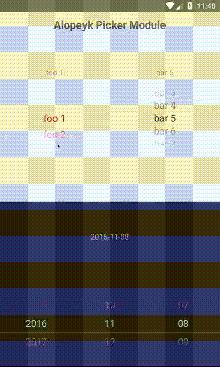
alopeyk-picker
iOS like Picker plugin for android
Getting started
$ npm install alopeyk-picker --save
Mostly automatic installation
$ react-native link alopeyk-picker
Manual installation
Android
- Open up
android/app/src/main/java/[...]/MainActivity.java
- Add
import com.alopeyk.nativemodule.RNPickerPackage;to the imports at the top of the file - Add
new RNPickerPackage()to the list returned by thegetPackages()method
- Append the following lines to
android/settings.gradle:include ':alopeyk-picker' project(':alopeyk-picker').projectDir = new File(rootProject.projectDir, '../node_modules/alopeyk-picker/android') - Insert the following lines inside the dependencies block in
android/app/build.gradle:compile project(':alopeyk-picker')
Usage
import {PickerView, DatePickerView} from 'alopeyk-picker';

// TODO: What to do with the module?
<PickerView .../>
<DatePickerView .../>
PickerView Properties
|Props |Type |is Required |
|---------------------------|-----------------------|-------------|
|onSelectedItemChanged |'func' |- |
|selectedItem |'number' |- |
|fontSize |'number' |- |
|fontFamily |'string' |- |
|cyclic |'bool' |- |
|color |'string' |- |
|backgroundColor |'string' |- |
|selectedItemBorderColor |'string' |- |
|items |'array' |True |
|itemHeight |'number' |- |
DatePickerView Properties
|Props |Type |is Required |
|---------------------------|-----------------------|-------------|
|onSelectedItemChanged |'func' |- |
|selectedDate |'Date' 'number' |- |
|startDate |'Date' 'number' |- |
|endDate |'Date' 'number' |- |
|fontSize |'number' |- |
|fontFamily |'string' |- |
|color |'string' |- |
|backgroundColor |'string' |- |
|selectedItemBorderColor |'string' |- |
|itemHeight |'number' |- |