
amharic-datepicker
v1.0.4
Published
A modern, highly customizable React component for picking Amharic (Ethiopian) dates, built with zero external calendar dependencies.

Maintainers
 mikiyaset
Readme
Amharic Date Picker
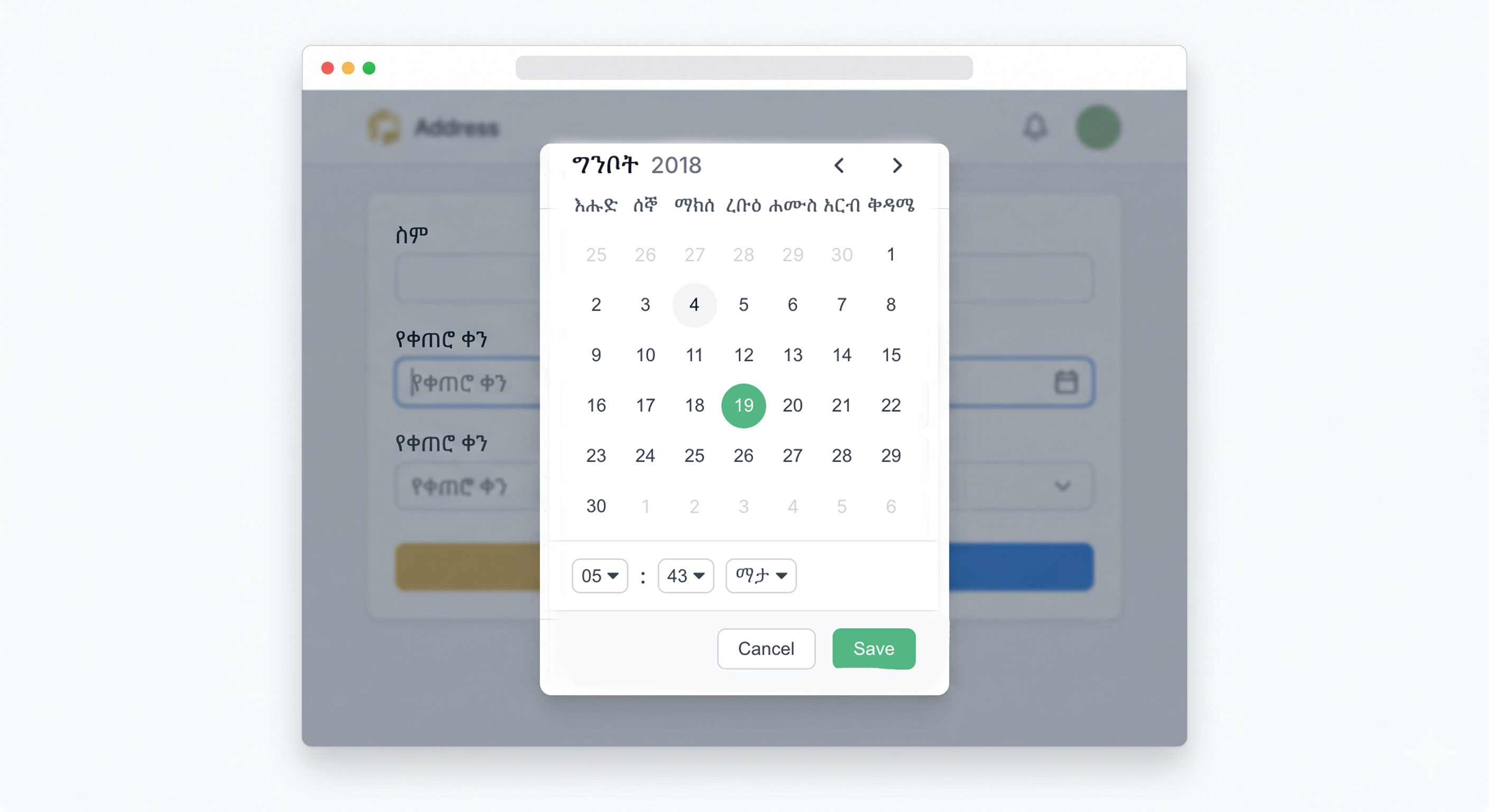
A modern, highly customizable React component for picking Amharic (Ethiopian) dates. Built with zero external calendar dependencies to keep it lightweight, fast, and bug-free.
Looking for the backend/logic-only package? Use
amharic-datepicker-utils— the same calendar conversion logic with no React dependency. This package (amharic-datepicker) depends on it automatically and re-exports all its functions.
Features
- Standalone Logic: Uses custom internal logic for the Ethiopian calendar (including leap years and Pagume logic).
- Beautiful UI: Styled with Vanilla CSS featuring clean typography, smooth transitions, and responsive design.
- Conversion Utilities: Provides helper functions to easily convert between Gregorian and Ethiopian dates.
- TypeScript Ready: Full TypeScript definitions included.
Installation
# npm
npm install amharic-datepicker

# yarn
yarn add amharic-datepicker

# pnpm
pnpm add amharic-datepicker

# bun
bun add amharic-datepicker
Usage
1. React Component
import React, { useState } from 'react';
import { AmharicDatePicker, toEthiopian } from 'amharic-datepicker';

function App() {
  const [date, setDate] = useState(() => {
    const now = new Date();
    // Default to today's Ethiopian date
    return toEthiopian(now.getFullYear(), now.getMonth() + 1, now.getDate());
  });

  return (
    <div>
      <h2>Select Date</h2>
      <AmharicDatePicker
        value={date}
        onChange={setDate}
        showTime={true}
        theme="light" // 'light' | 'dark'
        calendarType="ethiopian" // 'ethiopian' | 'gregorian'
        primaryColor="#0b7077" // any valid CSS color
      />
      <p>Selected: {date.year}/{date.month}/{date.day}</p>
    </div>
  );
}

export default App;
Component Props
| Prop | Type | Default | Description |
|------|------|---------|-------------|
| value | EthDateValue | current date | The currently selected date/time |
| onChange | (date: EthDateValue) => void | | Callback when date or time is selected/saved |
| placeholder | string | "ቀን ይምረጡ / Select Date" | Placeholder text for the input field |
| showTime | boolean | false | Whether to show the time picker |
| theme | 'light' \| 'dark' | 'light' | Toggle between light and dark modes explicitly |
| calendarType | 'ethiopian' \| 'gregorian'| 'ethiopian' | Toggle between Ethiopian and Gregorian logic and rendering |
| outputFormat | 'ethiopian' \| 'gregorian' | undefined | Forces the output (value emitted in onChange) to always be converted to this calendar type, regardless of what calendarType the UI is using. |
| selectsRange | boolean | false | Enable range selection mode. If true, onChange emits [EthDateValue, EthDateValue] |
| startDate | EthDateValue \| null | undefined | The start date of the selected range |
| endDate | EthDateValue \| null | undefined | The end date of the selected range |
| size | 'small' \| 'medium' \| 'large' | 'small' | Sets the physical size and font sizing of the calendar component |
| primaryColor | string | "#0b7077" | A hex code or CSS color to customize the primary theme of the calendar |
| showActions | boolean | true | Show or hide the Save/Cancel actions bar. If false, date selection is instant. |
| customColors | CustomColors | {} | Complete text and background color override for every sub-component (see below) |
CustomColors Options
You can pass a customColors object to override specific colors. It merges seamlessly with the default and dark themes.
interface CustomColors {
    text?: string;               // Default calendar text color
    selectedText?: string;       // Text color of the selected day
    hoverBg?: string;            // Background color when hovering over a day
    hoverText?: string;          // Text color when hovering over a day
    selectedHoverText?: string;  // Text color when hovering over a selected day
    disabledText?: string;       // Text color for empty/disabled filler days
    monthHeader?: string;        // Text color for the Month/Year header
    saveBtnBg?: string;          // Save button background
    saveBtnText?: string;        // Save button text
    cancelBtnBg?: string;        // Cancel button background
    cancelBtnText?: string;      // Cancel button text
    inRangeBg?: string;          // Background color for dates within a selected range
}
2. Utility Functions
All calendar and time conversion functions are re-exported from amharic-datepicker-utils. You can import them directly:
// Import from this package (re-exported for convenience)
import { toGregorian, toEthiopian, ethMonths, ethDays } from 'amharic-datepicker';

// Or import from the utils package directly (same functions)
import { toGregorian, toEthiopian } from 'amharic-datepicker-utils';

// Gregorian to Ethiopian
const ethDate = toEthiopian(2023, 9, 12);
console.log(ethDate); // { year: 2016, month: 1, day: 1 }

// Ethiopian to Gregorian
const gregDate = toGregorian(2016, 1, 1);
console.log(gregDate); // { year: 2023, month: 9, day: 12 }

console.log(ethMonths[0]); // "መስከረም"
console.log(ethDays[0]); // "እሑድ"
Tip for backend developers: If you only need the conversion logic (no React UI), install
amharic-datepicker-utilsinstead. It has zero dependencies and works in any JavaScript runtime.
Package Architecture
This project is split into two packages:
| Package | Description | Install |
|---------|-------------|---------|
| amharic-datepicker-utils | Pure TS calendar/time conversion logic (zero deps) | npm install amharic-datepicker-utils |
| amharic-datepicker | React UI component (depends on utils) | npm install amharic-datepicker |
Running the Example Locally
An example application is included in the example folder.
- Clone this repository.
- Run
npm installin the root directory. - Run
npm run buildin the root directory. - Navigate to
cd example. - Run
npm install. - Run
npm run devto start the local vite server.
License
MIT
Author & Credits
- Developer: Mikiyas Lemlemu
- Powered by: Codeabay (A professional software development solutions provider)