
angular-kalendar
v2.0.0
Published
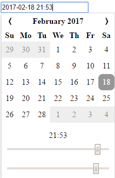
Angular 2 Datetime Picker/Calendar
Maintainers
 peterlaraia
Readme
Angular (Angular 2) Kalendar
Getting Started
Npm Install
$ npm install angular-kalendarImporting the module
import { NgModule } from '@angular/core';
import { BrowserModule } from '@angular/platform-browser';

import { AppComponent } from './app.component';
import { AngularKalendarModule } from 'angular-kalendar';

@NgModule({
    imports: [AngularKalendarModule, BrowserModule],
    exports: [],
    declarations: [AppComponent],
    bootstrap: [AppComponent],
    providers: [],
})
export class AppModule { }
Using the Component
Basic Usage
<angular-kalendar></angular-kalendar>Using NgModel
<angular-kalendar [(ngModel)]="date" (ngModelChange)="doSomething()"></angular-kalendar>
...
export class Component implements OnInit {
    date: Date;
}
Using Model Driven Forms
<form [formGroup]="formGroup" (ngSubmit)="onSubmit()">
  <angular-kalendar [formControl]="formGroup.get('date')"></angular-kalendar>
  <button type="submit">SUBMIT</button>
  <button type="button" (click)="reset()">Reset</button>
</form>
...
export class FormGroupComponent implements OnInit {
    formGroup: FormGroup;

    ngOnInit() {
        this.formGroup = new FormGroup({
            'date': new FormControl(new Date())
        });
    }

    onSubmit(): void {
		//do something
    }

    reset(): void {
        this.formGroup.reset({
            'date': new Date()
        });
    }
}
Calendar Options
Angular Kalendar accepts an input called 'options'
<angular-kalendar [options]="myOptions"></angular-kalendar>
...
import { KalendarOptions } from 'angular-kalendar';

export class Hours12Component implements OnInit {
    options: KalendarOptions = {
        format: 'dd.mm.yyyy',
        showTimepicker: false
    }
}
Options
interface KalendarOptions {
    format?: string,
    hours24?: boolean,
    showTimepicker?: boolean
}
format
DEFAULT: 'yyyy-mm-dd H:MM'
Format string accepts the following values
| Format String | Description | |---------------|-------------| | d | day of the month| |dd | day of the month, zero padded| | m | month (eg. 3)| | mm | month, zero padded (eg. 03)| | mmm | month text, short (eg. Mar)| | mmmm | month text, long (eg. March) | |yy | double digit year (eg. 2007 becomes 07)| |yyyy|full year (eg. 2007)| |H|hour value| |HH| hour value, zero padded| |MM| minute value| Examples:
- dd.mm.yyyy -> 03.01.1997
- m/d/yy -> 1/3/97
- yyyy-mm-dd H:MM -> 1997-01-03 15:38
hours24
DEFAULT: true.
If true, display hours 0-23 If false, display hours 1-12 AM, 1-12 PM
showTimepicker
DEFAULT: true.
If true, show the timepicker under the calendar If false, don't
CSS
Don't like the way it looks? You can override the existing styles in the following manners
Inline Styles:
@Component({
    selector: 'my-component',
    template: `
    <angular-kalendar class="kalendar"></angular-kalendar>
    `,
    styles: [`
        :host /deep/ .kalendar .ang2cal-btn:hover {
            background-color: blue;
            color: white;
            border-radius: 0;
        }
    `]
})
Global Styles (angular-cli example)
In angular-cli.json
styles: [
	"styles.css"
]
In styles.css
.kalendar .ang2cal-day {
	background-color: pink;
    border: 1px solid grey;
    border-radius: 0;
}