
antd-input-otp
v2.1.0
Published
An OTP Input Component based on Ant Design Component Library for React.
Maintainers
 ralfarios
Readme
antd-input-otp 📱
A custom input component for OTP (One Time Password) based on Ant Design Input for React.
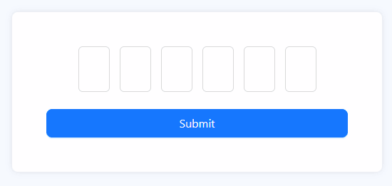
Demo 🧪
Prerequisite ⭐
- Ant Design >= 4.19.1
- React >= 16.8.0
Install 💻
npm
npm install antd-input-otp
yarn
yarn add antd-input-otp
How to use 🪴
Simply import like other antd's components as usual and call it. You can use it uncontrolled with Form from Ant Design Form or use it controlled with React useState.
Keep in mind this component will return undefined or array of string.
Uncontrolled
import { Button, Form } from 'antd';
import { InputOTP } from 'antd-input-otp'; // Don't forget to import this too!

const InputOTPPage = () => {
  const [form] = Form.useForm();

  const handleFinish = (values) => {
    // Your logic
  };

  return (
    <Form onFinish={handleFinish} form={form}>
      <Form.Item label="OTP" name="otp">
        <InputOTP autoSubmit={form} inputType="numeric" />
      </Form.Item>

      <Form.Item>
        <Button htmlType="submit">Submit</Button>
      </Form.Item>
    </Form>
  );
};
Controlled
import { useState } from 'react';
import { Button } from 'antd';
import { InputOTP } from 'antd-input-otp'; // Don't forget to import this too!

const InputOTPPage = () => {
  const [value, setValue] = useState([]); // Since the value will be array of string, the default value of state is empty array.

  const handleFinish = (otp) => {
    const payload = otp || value; // Since useState work asynchronously, we shall add the field value from the autoSubmit.
    // Your logic with state
  };

  return (
    <div>
      <InputOTP onChange={setValue} value={value} autoSubmit={handleFinish} />

      <Button onClick={() => handleFinish()}>Submit</Button>
    </div>
  );
};
Props 🥠
Keep in mind, the props will be extended to antd InputProps, which means properties that are not listed below can be seen on Ant Design Input.
| Property | Type | Default Value | Description |
| :----------------- | :---------------------------------------------------------------------------------------------------------------------- | :-----------: | :--------------------------------------------------------------------------------------------------------------------------------------------------------------------------------------------------------------------------------------------------------------------------------------------------------------------------------------------------------------------------------------------------------------------------------------------------------------------------- |
| autoFocus | boolean | false | Autofocus for the first field of OTP. If you want to make the second or third or even the last field autofocused, use inputRef. |
| autoSubmit |FormInstance\|(value: string[]) => void\|null | null | Autosubmit when the value is fully filled. |
|disabled |boolean | false | |
|inputClassName |string | | Classes for styling input field. |
|inputRef |Mutable Reference Object (InputRef[], null[], null) | null | Reference for the input fields. Inside of thecurrentshould be array ofInputReffrom antd. |
|inputRegex |RegExporstringwheninputTypeset ascustom.<br/> Other than that is never | | If you choosecustomasinputType, inputRegexwill be mandatory.<br/><br/>Wrote your validation with regex here. |
|inputStyle |CSSProperties | | Inline style input field. |
|inputType |all\|alphabet\|alphabet-numeric\|alphabet-symbol\|numeric\|numeric-symbol\|symbol\|custom| all |customvalidation will be requiring your own regex oninputType.<br/><br/>Selecting allas the value will invalidate the field and every field can be filled with anything. |
|length |number | 6 | Determine the total of your fields.<br/><br/> Keep in mind the minimum value is2and the maximum value is16. The length will stay on the limit if you fill it outside the limit. |
| isPreservedFocus|boolean | false | Determine whether the input is still focused or not when every field is filled. |
|onChange |(value: string[]) => void | | |
|placeholder |string | | Placeholder for each field. When the value is only **one character** It will apply to **all fields with the same value**.<br/><br/>For example, if you put"x", all fields will have xas placeholder.<br/><br/>If you want to keep it **unique for each field**, you must **input the characters with the length same as the field**.<br/><br/>For example, if you have 6 fields and want to keep the placeholder unique to each field, the value should be"x_x_x_". |
| value |string[]\|null | | |
|wrapperClassName|string | | Classes for styling input wrapper. |
|wrapperStyle |CSSProperties` | | Inline style input wrapper. |
FAQ ❓
Q: (NEW) When I use autoSubmit on controlled field, why my value always late 1 step?
A: You see, React useState works asynchronously, so when autoSubmit is triggered, the setState is not running yet. The solution so far is by using the value from the argument of the functions. You can see this in the example above.
Q: (NEW) I am using Webpack / create-react-app, why I always get an error Failed to parse source map from...?
A: To be honest, I am not quite sure about this, but the solution for now is to add this line of code inside your .env file.
GENERATE_SOURCEMAP=falseQ: Can I paste the OTP to this component?
A: YES! But you should update it to v1.1.0 first. Keep in mind, the value that you copy should be suitable with your inputType, for example if you have 030212 in your clipboard, and your inputType is numeric, it will work. But it will be a different story when your value is A023@c!, it won't work.
Q: What will this component return?
A: This component will return an array of strings if erased or already filled, or undefined if this component remains untouched.
Q: Can I use it on Ant Design Form?
A: Ofcourse, the best part is you don't need to setup anything. Just write and go!
Q: Ant Design Form is not my cup of tea, can I use it with useState instead?
A: You bet! Use it like other input with onChange and value.
Q: So I'm using Ant Design Form and I want to add an error below it, but it's ugly. How to fix it?
A: Interesting, first of all, add a class on your InputOTP's Form.Item. then add text-align: center on .ant-form-item .ant-form-item-explain-error.
If you are using antd v5, be sure to wrap .ant-form-item with :where(), so it will become like this..
.your-classname:where(.ant-form-item) .ant-form-item-explain-error {
  text-align: center;
}
Having another question? Ask me on the github issue!