
apostrophe-dialog-box
v1.2.2
Published
`apostrophe-dialog-box` provides simple pop-up dialog boxes for your Apostrophe site. Manage them you would like any other piece type, edit their content in-context, provide your own templates, and have users trigger them with various configuration.
Downloads
41


Readme

apostrophe-dialog-box
apostrophe-dialog-box provides simple pop-up dialog boxes for your Apostrophe site. Manage them you would like any other piece type, edit their content in-context, provide your own templates, and have users trigger them with various configuration.
Installation
npm install apostrophe-dialog-box
Basic configuration
In app.js
var apos = require('apostrophe')({
  shortName: 'dialog-sandbox',
  modules: {
    // ... other modules
    'apostrophe-dialog-box': {},
    'apostrophe-dialog-box-modal': {},
    // optional index page for dialog boxes, useful if dialog styles conflict with apos modal styles
    'apostrophe-dialog-box-pages': {}
  }
});
This will give you a piece type called Dialog Boxes in the admin bar as well as several enhancements to existing Apostrophe modules.
Working with your first Dialog Box
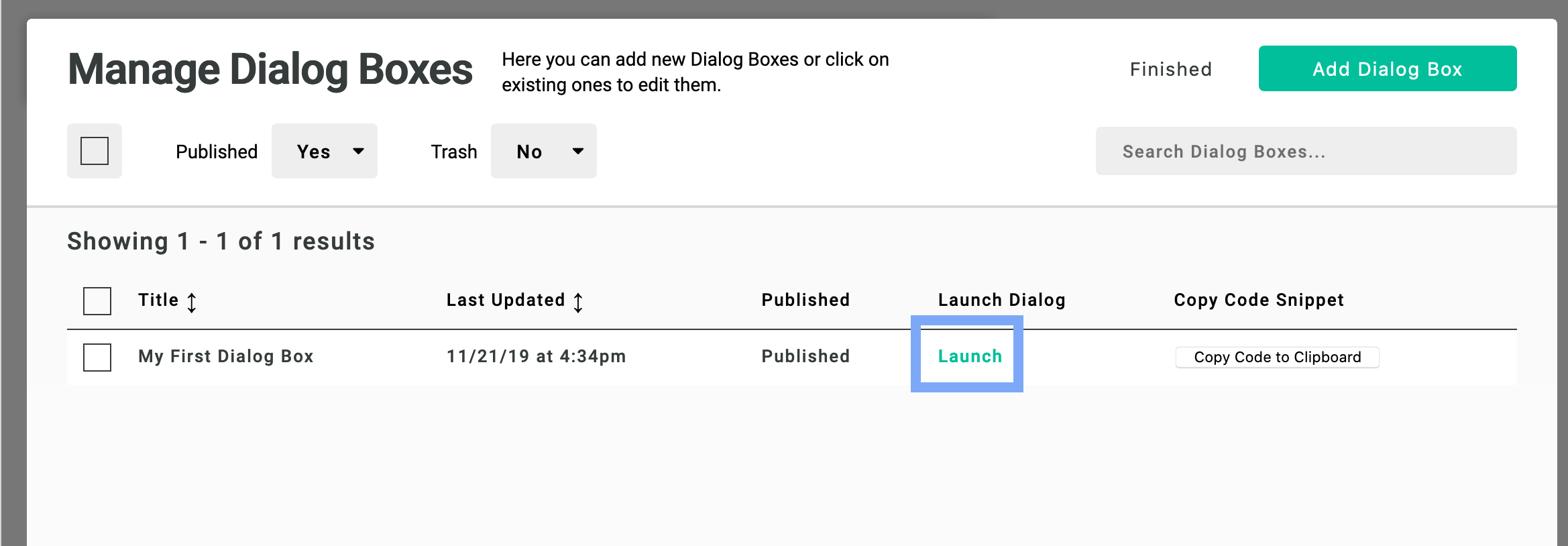
Create a new dialog box from the admin bar. Give it a title and leave the template as Default.
You'll be brought back to the manager where your new Dialog Box will have a Launch link in its table row. Click it!
This will activate the basic dialog template. It comes stock with basic Apostrophe area. Make your edits and close the dialog naturally and your edits will save.
Dedicated Index Page of Dialogs
If you've opted to install apostrophe-dialog-box-pages you can also create a new page and give it a type of Dialog Index. Placing it in your page tree will give you a dedicated space where you can trigger and edit dialog boxes outside the Apostrophe modal context. This is useful if your site's styles are being overridden by apos-modal styles and you want a more accurate representation of your modal.
Note that logged-out users will be forwarded to the homepage if they try to visit this URL.
Triggering dialog boxes
Dialog boxes can be triggered by page load or by clicking on elements with the proper data attributes attached to them.
Options for triggering dialog boxes on page load
Page load settings can contain
- Delay (in seconds) for when the dialog box will appear after load
- Ability to set an expiration cookie so that dialogs will only appear once during the expiration lifespan
Triggering a dialog box on all pages
Go to the Global menu and find the Dialog Boxes tab. Join the dialog box you made previously
Triggering a dialog box on one page
Go to the Page Settings of the page the page you want to activate a dialog on. In the Page Settings find the Dialog Boxes tab and configure your dialog
Triggering a dialog box via text link
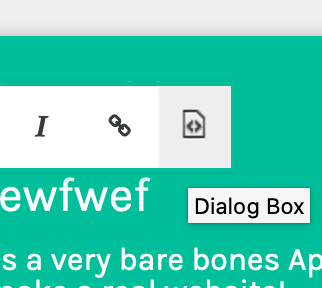
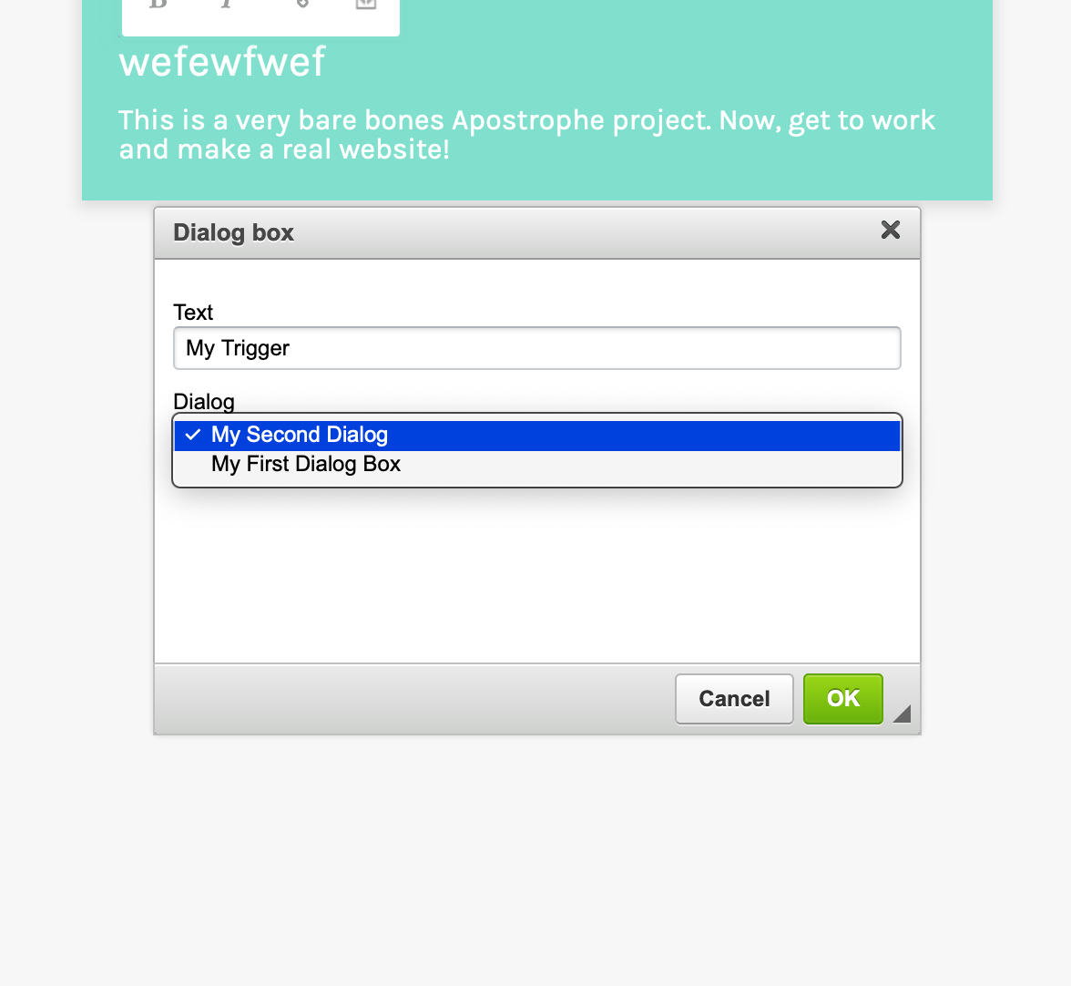
You can optionally enable a Dialog Box plugin for your rich text editors by passing the proper options:
{{
  apos.area(data.page, 'body', {
    widgets: {
      'apostrophe-rich-text': {
        toolbar: [ 'Bold', 'Italic', 'Link', 'Dialogbox' ]
      },
      'apostrophe-video': {}
    }
  })
}}
Using it will present you with a text field you can enter as well a dropdown to select which dialog box you'd like to associate with the ink.
Triggering a dialog box from other things
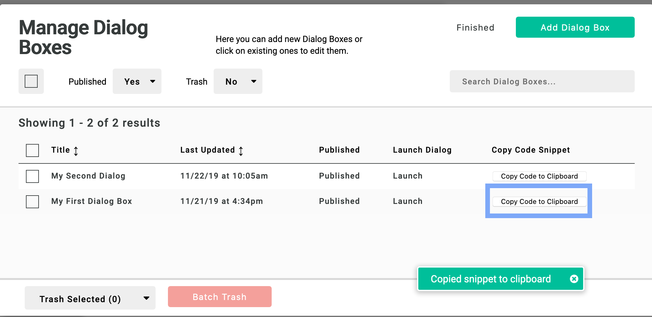
All you need to do to trigger a dialog box from custom widgets or UI is add a data attribute to the element with the dialog boxes ID. The attribute is formatted like data-apos-dialog-box-trigger="APOS_PIECE_ID" To get the snippet open the Dialog Boxes admin menu, find the dialog box you want to trigger in the manager, and click "Copy Code to Clipboard" (you can attach the attribute to anything you want, not just a link).
Listening to events for analytics
There are a few events are triggered for dialog boxes:
time-triggeredwhen a dialog box is opened automatically on page loadopenedwhenever a dialog box is openedclosedwhenever a dialog box is closed
A dialog opening on page load will trigger the two open events, and a manually clicked link opening a dialog box will trigger only the opened event.
These events are dispatched on the page body. Therefore, event listeners can be added to be notified. It can be useful for analytics purposes.
Example of listener to add at project level:
document.body.addEventListener('apostrophe-dialog-box:time-triggered', function (evt) {
  // code for `evt` handling
}, false);
document.body.addEventListener('apostrophe-dialog-box:opened', function (evt) {
  // code for `evt` handling
}, false);
document.body.addEventListener('apostrophe-dialog-box:closed', function (evt) {
  // code for `evt` handling
}, false);
The event emitted contains the dialog box id dialogId in order to distinguish between multiple dialog boxes on a page.
Extending and Customizing Dialog Boxes
You'll probably want to customize and potentially have multiple Dialog Box templates to choose from. In these custom templates you can include projet-level widgets, markup, and CSS.
Adding a new template
- Create a new template like
/lib/modules/apostrophe-dialog-box/views/dialogs/MY_COOL_DIALOG.html - Populate the file with the boilerplate markup
{% extends "dialogs/base.html" %}

{% block main %}
  <!-- your areas here -->
{% endblock %}- Override the default template select with your project level choices
in
app.js
'apostrophe-dialog-bo x': {
  addFields: [
    {
      name: 'template',
      label: 'Template',
      type: 'select',
      choices: [
        { label: 'Default', value: 'default' },
        { label: 'My Cool Dialog', value: 'MY_COOL_DIALOG' }
      ]
    }
  ]
},
'apostrophe-dialog-box-modal': {},
Your template will now be available to editors. You can also change the template of existing dialogs by modifying them in the Dialog Box manager.