
arale-tip-old
v1.1.4
Published
基础提示框组件,用于带箭头的 hover 提示框显示和隐藏。
Downloads
26


Keywords
Readme
Tip

基础提示框组件,用于带箭头的 hover 提示框显示和隐藏。
配置说明
content string|function
提示内容,使用 data-role="content" 标示内容节点。
direction string
提示框在目标的位置方向,可选up|down|left|right。默认为 up。
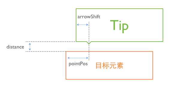
distance number
提示框离目标距离(px),默认为8像素。
arrowShift number
箭头偏移位置(px),正数表示箭头距左边的水平偏移值或距上边的垂直偏移值,负数表示距离右边或下边的偏移值,默认为 24 像素。
pointPos number 1.1.0+
箭头指向的目标元素的位置,指向目标位置的最左边为 0,最右边则为 100% 。
也可以使用 50%+24 这样的组合参数,默认指向中央位置: 50% 。
关于几个位置参数,可以参照下图:
其他配置请参考父模块 popup 和爷爷模块 overlay 的配置。
最佳实践
seajs.use(['arale/tip/{{版本号}}/tip'], function(Tip) {
    new Tip({
        element: '#poptip',     // 提示框
        trigger: '#test',       // 触发器
        direction: 'up',        // 提示框在触发器上方
        arrowShift: 40          // 箭头距框边距离 40 px
    });
});
Tip 组件不和具体结构依赖,可以自由和各种 dom 结构进行搭配,需要在页面上自己写 html (或者传模板参数)。若想直接使用带箭头的Tip,可以试试 Atip。
Tip 组件推荐和 ui-poptip 或 ui-tiptext 等 Tip 样式配合使用,用direction属性来控制提示框出现的位置,用arrowShift属性来调节箭头的偏移。
下面是一个完整的应用示例。
<!-- 这里是触发元素 -->
<p id="test">鼠标移上来试试</p>

<!-- 这里是提示框,一开始是隐藏的 -->
<div class="ui-poptip fn-hide" id="poptip">
    <div class="ui-poptip-shadow">
    <div class="ui-poptip-container">
        <div class="ui-poptip-arrow ui-poptip-arrow-7">
            <em>◆</em>
            <span>◆</span>
        </div>
        <div class="ui-poptip-content" data-role="content">
            <div>我是上方的tip</div>
            <div>我是上方的tip</div>
        </div>
    </div>
    </div>
</div>

<!-- 绑定事件 -->
<script>
seajs.use(['arale/tip/{{版本号}}/tip'], function(Tip) {
    new Tip({
        element: '#poptip',
        trigger: '#test',
        direction: 'up',
        arrowShift: 40
    });
});
</script>