
argentui
v0.4.1
Published
Argent — liquid-metal UI for React. Chrome, gold, and gunmetal surfaces that ripple like mercury, powered by Paper's LiquidMetal WebGL shader. A metal sibling to Glacé.

Maintainers
 seangeng
Readme
Argent
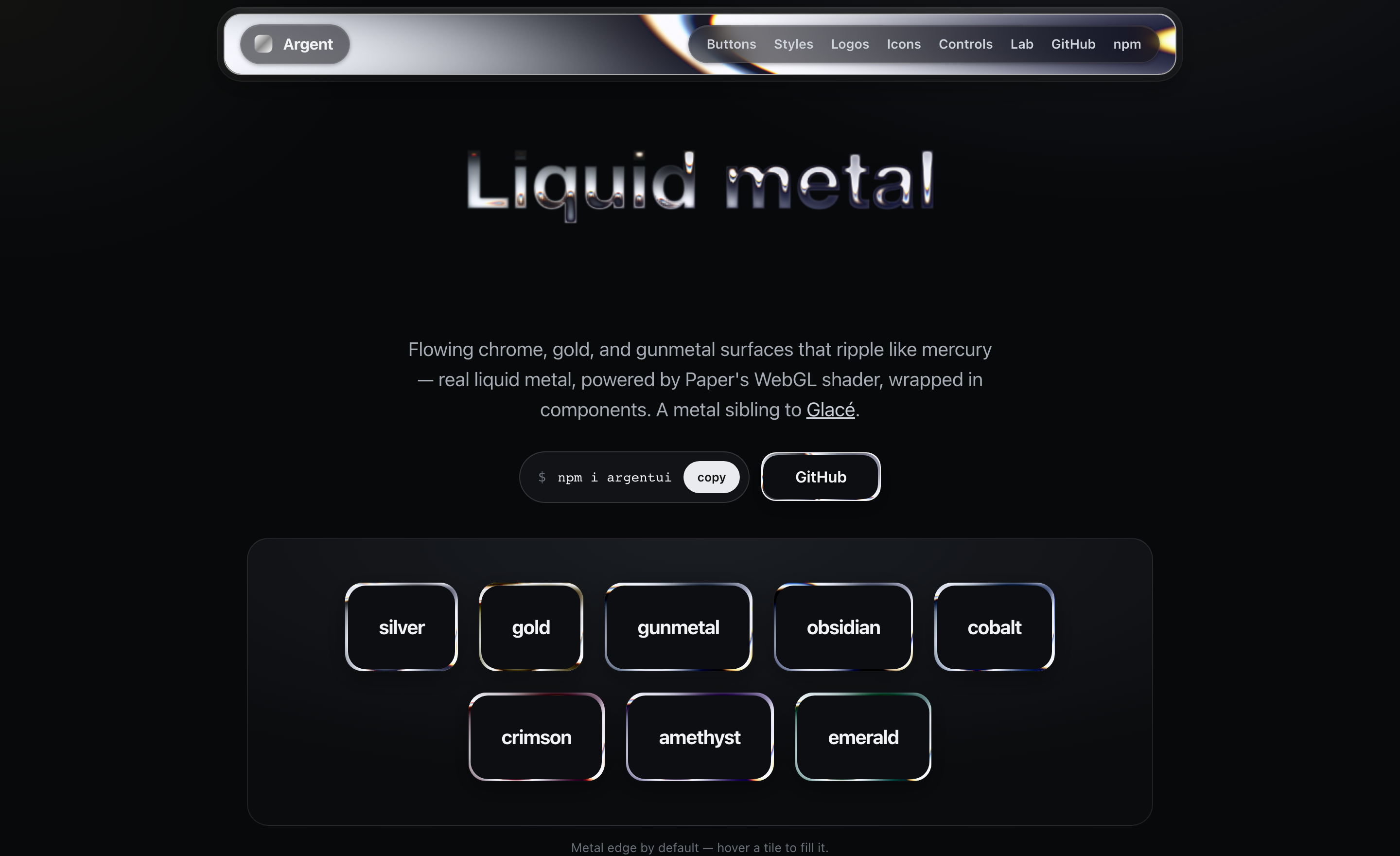
Liquid-metal UI for React. Flowing chrome, gold, and gunmetal surfaces that ripple like mercury — real liquid metal, powered by Paper's LiquidMetal WebGL shader, wrapped in components. A metal sibling to Glacé.
npm i argentui @paper-design/shaders-react
@paper-design/shaders-reactis a peer dependency — install it alongsideargentui. It's the WebGL shader engine, by Paper, licensed under PolyForm Shield.
import { MetalButton, MetalCard, Metal } from "argentui";
import "argentui/styles.css";

<MetalButton tone="silver">Get started</MetalButton>
<MetalCard tone="gunmetal" sheen>Forged in the browser</MetalCard>
How it works
Each surface renders Paper's LiquidMetal shader with shape="none" so the metal fills the whole element instead of painting a blob. The shader canvas sits behind your content, clipped to the surface's radius. A tone is just a tuned set of shader params (colorBack, colorTint, repetition, distortion, shiftRed/Blue, …). Until the canvas mounts on the client, a static CSS gradient stands in (SSR-safe).
Each surface is its own WebGL canvas, and browsers cap concurrent WebGL contexts (~16). Argent handles this for you: the shader only mounts while a surface is on/near screen (IntersectionObserver) and releases its context when it scrolls away, so a long page stays well under the cap. The static gradient shows in the meantime.
By default the metal is just the edge (variant="border") with a calm interior, which keeps content readable; pass variant="fill" for a full molten surface, or revealOnHover to fill in on interaction.
Components
<MetalButton>
A stamped-metal button: readable at rest with a liquid-metal rim, molten on hover, with a real press (and haptics on supporting devices).
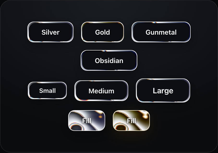
<MetalButton tone="gold" size="lg">Buy</MetalButton>| prop | type | default |
|------|------|---------|
| tone | MetalTone (8 finishes — see Tones) | "silver" |
| size | "sm" \| "md" \| "lg" | "md" |
| speed | number | 1 |
<MetalCard>
A padded liquid-metal panel.
<MetalCard tone="gunmetal" sheen>
  <h3>Title</h3>
  <p>Any content — the metal flows behind it.</p>
</MetalCard>
<MetalText>
Metal type. By default the liquid-metal shader is poured into the glyphs — flowing bands, liquid edges, chromatic fringe. Set variant="outline" to run the metal around the edges of each glyph over a dark or gradient interior — the border treatment, for type. The CSS chrome gradient stands in until the shader loads (and wherever WebGL is unavailable); pass shader={false} to use it on its own, free at any scale.

<MetalText tone="silver" fontSize={64}>Quicksilver</MetalText>

// metal edges, dark gradient interior
<MetalText variant="outline" fillGradient={["#23262c", "#0a0b0d"]} fontSize={64}>
  Quicksilver
</MetalText>

<MetalText shader={false} tone="gold" style={{ fontSize: 64 }}>Solid gold</MetalText>  // pure CSS
Shader mode renders the glyphs into an SVG silhouette, which sees system fonts only by default. To use a webfont (e.g. Google Fonts), pass
fontCsswith an@font-facewhosesrcis a data: URI — it gets embedded in the silhouette and renders correctly (the argentui.com text lab does exactly this). The CSS gradient stands in until the shader loads, and wherever WebGL is unavailable.
<MetalLogo>
Pour the metal into any mark — pass an image with a transparent background and it flows inside the silhouette.

<MetalLogo src="/logo.svg" tone="silver" size={170} /><MetalIcon>
Pour the liquid-metal shader into any SVG icon — a lucide-react or Heroicons element, raw SVG, or a URL. React icons are serialized from the DOM to a silhouette; each icon is one WebGL canvas, gated to the viewport like every metal surface.
import { MetalIcon } from "argentui";
import { Sparkles } from "lucide-react";
import { BeakerIcon } from "@heroicons/react/24/solid";

<MetalIcon icon={<Sparkles />} tone="silver" size={32} />
<MetalIcon icon={<BeakerIcon />} tone="gold" size={64} />
<MetalIcon svg="<svg>…</svg>" />          {/* or raw SVG */}
<MetalIcon src="/icon.svg" tone="gunmetal" />  {/* or a URL */}
Buttons take an icon prop too — it renders before the label in the label colour:
<MetalButton tone="silver" icon={<Sparkles />}>Get started</MetalButton>| prop | type | default |
|------|------|---------|
| icon / svg / src | ReactNode / string / string | — | the icon source (pick one) |
| tone | MetalTone | "silver" |
| size | number | 32 |
<MetalToggle> / <MetalProgress> / <MetalBadge>
A mercury switch (the thumb squishes as you press it), a molten progress bar, and metal-rimmed badges.
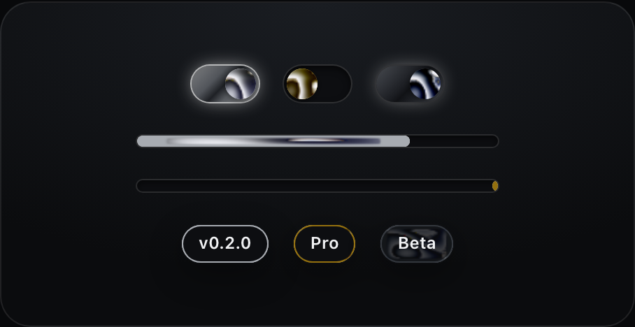
<MetalToggle tone="silver" defaultChecked onCheckedChange={setOn} />
<MetalProgress tone="silver" value={64} />
<MetalProgress tone="gold" />  {/* indeterminate */}
<MetalBadge tone="gold">Pro</MetalBadge>
<Metal>
The base primitive every component is built on. Render any element via as.
<Metal as="nav" tone="silver" radius={16} speed={0.5} sheen>…</Metal>| prop | type | default | notes |
|------|------|---------|-------|
| as | ElementType | "div" | element/component to render |
| tone | MetalTone | "silver" | finish (8 tones — see below) |
| variant | "border" \| "fill" | "border" | metal edge only, or full surface |
| frame | "single" \| "double" | "single" | double adds an inner hairline frame |
| tint | boolean | false | let the metal show faintly through the interior |
| revealOnHover | boolean | false | fill with metal on hover (border variant) |
| borderWidth | number | 1.5 | rim thickness (border variant) |
| radius | number | 14 | corner radius (px) |
| speed | number | 1 | shader speed (0 pauses) |
| finish | "surface" \| "button" \| "bar" \| "orb" \| "rim" | per component | shape-tuned shader preset (see below) |
| effect | "flow" \| "molten" \| "ripple" \| "chrome" \| "wave" | "flow" | the liquid's motion character — from mirror-still chrome to a heavy molten churn |
| halo | boolean \| number | false | frosted standoff ring outside the metal — a few px of backdrop blur finished with a ~5% hairline (true = 8px; theme the line with --argent-halo-line) |
| angle | number | per tone/finish | band direction in degrees |
| metalScale | number | per finish | pattern scale — higher spreads the bands |
| sheen | boolean | false | specular streak on hover |
Theme the border interior with the --argent-panel CSS variable.
Tones
Eight metal finishes: silver, gold, gunmetal, obsidian, and the coloured metals cobalt (blue), crimson (red), amethyst (purple), and emerald (green). Every component takes tone.
<MetalButton tone="cobalt">Blue steel</MetalButton>
<MetalCard tone="amethyst" />
<MetalText tone="emerald">Emerald</MetalText>
Tune any tone's shader params via TONE_PARAMS.
Finishes
One shader tuning can't serve every shape — broad bands that look right on a card read as a smear on a 10px progress bar and a sticker on a 22px toggle thumb. Each component defaults to a finish preset tuned for its geometry, and you can override it anywhere:
| finish | tuned for | character |
|--------|-----------|-----------|
| surface | cards, nav, panels | broad flowing reflection bands |
| button | buttons | spread + calmer warp, label stays readable |
| bar | thin strips (progress) | near-vertical stripes crossing the bar |
| orb | small round things (toggle thumbs) | one soft highlight, like a polished sphere — with per-instance angle variation so rows don't look cloned |
| rim | hairline edges (badges) | dense bands so any visible slice catches light |
<Metal tone="silver" finish="rim" angle={120}>…</Metal>Tune any tone with TONE_PARAMS, or drop down to <MetalFill> / Paper's <LiquidMetal> directly for full control.
The native engine
Argent also ships its own clean-room WebGL2 shader — pass engine="native" to any surface to use it instead of Paper's. Same recipe (reflection banding, noise flow, chromatic dispersion), zero extra dependencies, MIT all the way down. It currently powers the rim/border look best; the Paper engine remains the default.
<Metal tone="silver" engine="native">…</Metal>Accessibility
The shader pauses under prefers-reduced-motion; toggles are real role="switch" buttons; progress bars carry role="progressbar" with values; labels keep WCAG-ish contrast on every variant. Haptics (navigator.vibrate) fire on press where supported — disable globally with setHaptics(false).
Credits
Liquid-metal shader by Paper (@paper-design/shaders). Argent is the component layer, motion, and theming on top.
License
MIT © Sean Geng. The bundled shader engine (@paper-design/shaders-react, a peer dependency) is licensed separately under PolyForm Shield by Paper.