
ark-forms
v2.0.4
Published
<p align="center"> <img src="https://dmytroyeremieiev.github.io/ark-form/images/logo1.svg" height="220"> <h1 align="center">Ark Form validation library</h1> </p>
Maintainers
 arktas
Readme
Table of Contents
Overview
- small, ultra fast and flexible
reactbased form validation library; - predictable and synchronous validation flow, clear and fast test suits
- allows granularly fine-tune each field validation trigger. E.g., consider you need the 1-st field to be validated after
onChangeevent occurred and the second field only afteronBlurevent; - no external dependencies;
- fully written in
typescript; - 2.6 kb minified & gzipped;
- compatible with
React v16.8+;
Codesandbox demos
Installation
npm install ark-form --save or yarn add ark-form
Motivation
Why not formik?
- extra re-renders, e.g., one field value changes, all other fields within same form undergo re-render;
- can't granularly fine-tune each field validation trigger. All fields within the form are subject to the same validation trigger's rules(
validateOnBlur,validateOnChangeexposed only on a top form level); formikasynchronous validation nature requires the use ofawaitconstructs: example1, example2, example3, example4.- bigger lib size: > ~12kb minified & gzipped
- no
dirty/pristineindicators' native support for a particular field(you need to resort to custom statefieldMeta.touched && fieldMeta.initialValue !== fieldMeta.valueconstructs);
Collaboration
Library source files are located at ./ark-forms/src.
Tests reside at ./ark-forms/__tests__ and ./web/__tests__.
web - next.js and web-cra - cra projects are sandboxes of real-world use.
Top-level architecture
ark-from library is based on several components:
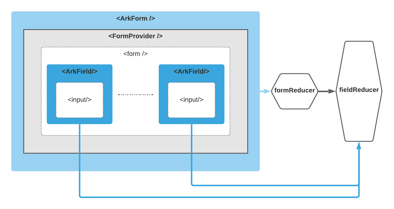
The general data flow
All data flow except form submitting) flows start at <ArkField/> components which listen for proper event type.
changeorblurevent happens to theinputwrapped in a field component<ArkField/>;- Calculating new field state with
fieldReducer; - Dispatching new field state to
formReducer, triggering entire form state re-evaluation; - Propagating new form & field states using
FormContextdownwards;
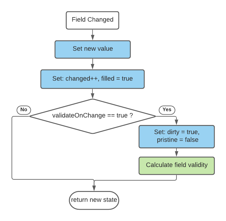
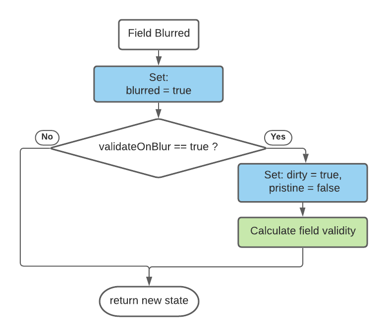
Field state evaluation logic
when a change event occurs:
when a blur event occurs:
Validation
All validation depends on auxiliary function validate which executed within Calculate field validity stage(field state evaluation logic).
    interface BasicInput<ET> {
      // ...
      validate?: (value?: string) => ValidityStateInterface;
      // ...
    }
    interface ValidityStateInterface extends Record<string, any>  {
        valid: boolean;
        className?: string;
        errorMessage?: string;
    }
<ArkForm/> component
- holds inner
<form/>element &<Field>components; - manages form state, configuration, creates
<FormContext/> - distributes it through
<FormContext/>between inner<ArkField>components.
Hooking-up managed state with <form/> elem happens through setting-up name, onSubmit, onChange, onBlur props on your elem. However there's shortcut, through spread operator {...formProps}:
    <ArkForm>
      {({ state, formProps }) => (
        <form name={name} {...formProps}>
          {children}
        </form>
      )}
    </ArkForm>
<ArkForm/> props:
| Props | Description | Default Value | | :--------------- | :----------------------------------------------------------- | ------------: | | name | <form/> name | none | | onSubmit | onsubmit event handler | none | | onChange | onchange event handler, called on any inner field change | none | | validateOnBlur | Runs fields validation on blur | true | | validateOnChange | Runs fields validation on change | false |
<ArkField/> component
- encapsulates input field state
- uses children render prop technique in order to share managed state with user's components
- implicitly connected to parent form state through
FormContext
Hooking-up managed state with html input elem happens through setting-up value, ref, onChange, onBlur, onFocus props on your input elem:
<ArkField>
  {({ fieldProps, fieldState, formContext }) => (
      <div>
          <input id='field1' type='text' {...fieldProps} />
          <label htmlFor='field1'>Field 1</label>
      </div>
  )}
</ArkField>
<ArkField/> props:
| Prop | Description | Default | | ------------ | --------------------------- | ------- | | name | Field name | none | | initialValue | Field initial value | none | | onChange | onchange event handler | none | | onFocus | onfocus event handler | none | | onBlur | onblur event handler | none | | validate | your own validator callback | none |
How manually set the field state
First, you need to hook up to a form context:
export interface FormContextInterface {
  state: FormState;
  dispatch: React.Dispatch<FormAction>;
  setFieldState: (name: string, setState: (currState: FieldState) => DeepPartial<FieldState>) => void;
  setFieldValue: (name: string, value: string, configuration?: Partial<FieldConfiguration>) => void;
}
Within <ArkForm/>, you can call for the form context:
const formContext = useFormContext();Outside of <ArkForm/>, pass ref obj:
  ...
  const contextRef = useRef();
  return <ArkForm formContextRef={contextRef}>
    {({ formContext, formProps }) => (
      <form name={name} {...formProps}>
        {children}
      </form>
    )}
  </ArkForm>
Once you get formContext reference, you're free to use formContext.dispatch, method to alter the form state in any imaginative way. Internally, all components operate only through dispatch method and formReducer, fieldReducer reducers.
Here's implementations of setFieldState, setFieldValue helper methods exposed publicly to cover most of user's needs:
  const setFieldState: FormContextInterface['setFieldState'] = (name, setNewState) => {
    const newState = setNewState(getFieldState(name));
    const mergedNewState = mergeState(getFieldState(name), newState);
    const validatedState = fieldReducer(mergedNewState, { type: 'validate' });
    dispatch({
      type: 'setField',
      fieldState: validatedState,
    });
  };

  const setFieldValue = (name: string, value: string, configuration?: Partial<FieldConfiguration>) => {
    const state = getFieldState(name);
    const newFieldState = fieldReducer(state, {
      value: value,
      type: 'change',
      configuration: { ...state.configuration, ...configuration, validateOnChange: true },
    });
    dispatch({
      type: 'change',
      fieldState: newFieldState,
    });
  };
You can peek more
setFieldState,setFieldValueusages examples at/web/components/TestSuit.tsx.
Setting field valid:
  formContext.setFieldState(name, () => ({
    configuration: {
      validate: value => ({valid: true}),
    },
  }))
Setting field dirty:
formContext.setFieldState(name, () => ({ dirty: true, pristine: false }))Setting field pristine:
formContext.setFieldState(name, () => ({ dirty: false, pristine: true }))Consider you having some custom and complex validation logic described at:
  const checkValidity = (
    value?: string,
    pattern?: {
      regexp: RegExp;
      message?: string;
    },
    required?: boolean
  ): ValidityStateInterface => {
    const result: ValidityStateInterface = {
      valid: true,
    };
    if (required && !value) {
      result.className = FieldStateClassNames.requiredError;
      result.valid = false;
      return result;
    }
    if (pattern && value && !pattern.regexp.test(value)) {
      result.className = FieldStateClassNames.patternError;
      result.valid = false;
      result.errorMessage = pattern.message || 'Invalid value';
      return result;
    }
    return result;
  };
  export const TextInput = ({ initialValue = '', name, label, pattern, required, readOnly, ...rest }) => {
    return (
      <ArkField
        name={name}
        validate={value => checkValidity(value, pattern, required)}
        initialValue={initialValue}
        {...rest}
      >
        {({ fieldProps, fieldState, formContext }) => {
          const id = (formContext.state.configuration.name || '') + '-' + name;

          let ErrorMessage = null;
          if (
            fieldState.validity.errorMessage &&
            !fieldState.validity.valid &&
            (fieldState.dirty || formContext.state.submitted)
          ) {
            ErrorMessage = <span className='error'>{fieldState.validity.errorMessage}</span>;
          }

          return (
            <div>
              <div
                title={`${name} field`}
                className={`txo-input-container ${classnames(
                  {
                    [FieldStateClassNames.filled]: fieldState.filled,
                    [FieldStateClassNames.pristine]: fieldState.pristine,
                    [FieldStateClassNames.dirty]: fieldState.dirty,
                    [FieldStateClassNames.invalid]: !fieldState.validity.valid,
                    [FieldStateClassNames.valid]: fieldState.validity.valid,
                  },
                  {
                    [fieldState.validity.className]: fieldState.validity.className && !fieldState.validity.valid,
                  }
                )}`}
              >
                <input id={id} type='text' readOnly={readOnly} {...fieldProps} />
                <label htmlFor={id}>{label}</label>
              </div>
              {ErrorMessage}
            </div>
          );
        }}
      </ArkField>
    );
  };
, then in order to maintain all existing validation rules except mandatory requirement rule you will just need to update your custom validator checkValidity arguments:
  formContext.setFieldState(name, () => ({
    configuration: {
      validate: value => checkValidity(value, pattern, false),
    },
  }))
Resetting field state:
  formContext.setFieldState(name, () => ({
    ...defaultFieldState,
    configuration: {
      validate: value => checkValidity(value, pattern, required),
    },
  }))
Setting field value:
formContext.setFieldValue(name, 'Some new value')Connecting to more complex elements
Plain and simple examples on how to create and connect with a form validation more complex input elements. Original source code is under ./web/components/**.