
ascii-orb
v0.1.0
Published
Animated ASCII orb component for React — 16 variants, ripples, fully customizable.

Maintainers
 adriancodes
Readme
ascii-orb
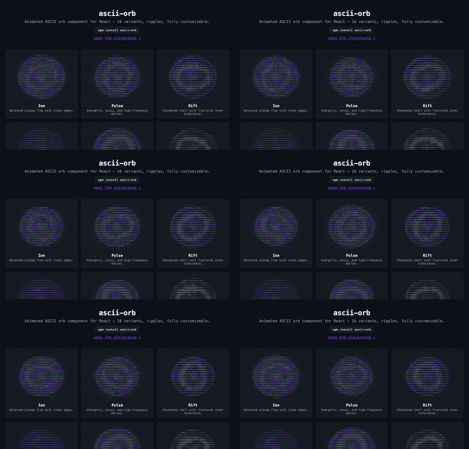
Animated ASCII for React: sixteen living textures with surface ripples, responsive sizing, and a customizable palette. Rendered as real text, with no canvas or required stylesheet.


Quickstart
Requires React 18 or later.
npm install ascii-orbimport { AsciiOrb } from "ascii-orb";
export function Hero() {
return (
<div style={{ height: 400 }}>
<AsciiOrb ariaHidden={false} />
</div>
);
}That's it — no stylesheet import, no Tailwind, no CSS variables required. The orb
ships with inline styles and a concrete default palette, sizes itself to its
container, animates at 30 fps, and spawns ripples when clicked. It fills the
nearest sized ancestor, so give the wrapper a height. ariaHidden={false} makes
this example keyboard accessible; omit it for a decorative orb.
Try the showcase
The showcase includes a large interactive preview and a gallery of all sixteen variants. Click any orb to create an impact, choose Preview to inspect it at full size, or choose Customize to open it in the playground.
The playground lets you adjust the palette, ripple speed and strength, motion preference, and frame rate, then copy the resulting React implementation. Eight site themes include GitHub Dark and Light, Dracula, Nord, Solarized Dark, Monokai, Tokyo Night, and Catppuccin Mocha.
Surface impacts
Every click on the orb's body creates a new ripple. The wave disturbs the existing texture, core, and lighting, like an impact traveling through a planet's surface. It fades at the edge; the surrounding halo stays unchanged. Clicks outside the body are ignored.
<AsciiOrb
  ariaHidden={false}
  rippleDuration={1.9}
  rippleSpeed={1.25}
  rippleStrength={1.1}
  maxRipples={5}
/>
Ripples can overlap. At the concurrent limit, a new click replaces the oldest
ripple. Set enableRipples={false} or maxRipples={0} to disable the effect.
Reduced-motion preferences disable animation and ripples by default.
Picking a variant
Sixteen built-in variants, each with its own motion, texture, and color treatment:
ion · pulse · rift · veil · sigil · eclipse · aether (default) ·
quasar · abyss · wraith · lattice · ember · nova · oracle ·
void · glacier
<AsciiOrb variant="nova" />Browse them all animating in the showcase.
Theming
The orb colors through a four-role palette. Pass any CSS color — hex, hsl(),
or CSS variables if your page defines them:
<AsciiOrb
  variant="ember"
  palette={{
    foreground: "#9a8478",
    primary: "#c2410c",
    accent: "#f97316",
    mutedForeground: "#78716c"
  }}
/>
// Tie the orb to your design system's theme tokens:
<AsciiOrb
palette={{
foreground: "hsl(var(--foreground))",
primary: "hsl(var(--primary))",
accent: "hsl(var(--accent))",
mutedForeground: "hsl(var(--muted-foreground))"
}}
/>Partial palettes are fine — unspecified roles keep their defaults.
Custom variants
Compose your own orb from any base physics and any color character:
import { AsciiOrb, defineOrbVariant } from "ascii-orb";

const customVariants = {
  nebula: defineOrbVariant({
    baseVariant: "aether",   // physics to start from
    colorVariant: "veil",    // color character to borrow
    meta: { label: "Nebula", description: "Aether physics, veil colors." },
    config: { spin: 0.34, turbulence: 0.56, haloBoost: 0.43 }
  })
};

<AsciiOrb variant="nebula" customVariants={customVariants} />
Tweakable config knobs: chars, spin, bandFreq, swirlFreq, turbulence,
coreBoost, rimBoost, innerRadius, innerSharpness, innerPulse,
shellDrift, haloBoost, gloom. Try combinations live in the
playground.
Props
| Prop | Type | Default | Description |
| --- | --- | --- | --- |
| variant | string | "aether" | Built-in variant id or a key of customVariants. |
| customVariants | OrbCustomVariants | — | Map of custom variant definitions (see above). |
| fallbackVariant | OrbVariant | "aether" | Built-in used when variant doesn't resolve. |
| variantConfig | Partial<OrbVariantConfig> | — | Per-instance config overrides on top of the variant. |
| palette | Partial<OrbPalette> | concrete neutral + violet | Colors for the four roles. |
| colorizer | OrbColorizer | built-in | Full custom cell-color function; overrides palette logic. |
| intensityMultiplier | number | 1 | Global brightness/character-density multiplier. |
| active | boolean | true | false renders nothing and stops the loop. |
| fps | number | 30 | Render cap; the clock stays smooth at any cap. |
| reducedMotion | "system" \| "always" \| "never" | "system" | system follows the OS preference; always renders a static frame; never animates regardless of that preference. |
| width / height | number | — | Fixed character-grid size; disables responsive sizing when both set. |
| responsive | boolean | true | Auto-size the grid to the container (ResizeObserver). |
| coverage | number | 1 | Fraction (0.2–1) of the container the orb occupies. |
| baseWidth / baseHeight | number | 58 / 30 | Grid size at scale 1; responsive sizing scales from here. |
| minWidth / minHeight | number | 26 / 14 | Grid floor when shrinking. |
| maxCells | number | 5200 | Cell-count ceiling (performance guard). |
| minScale / maxScale | number | 0.45 / 2.8 | Responsive scale clamps. |
| xScale | number | 1.08 | Horizontal aspect correction for unusual fonts. |
| enableRipples | boolean | true | Click-to-ripple interaction. |
| maxRipples | number | 5 | Concurrent ripple cap; 0 disables ripples. |
| rippleDuration | number | 1.9 | Seconds a ripple lives. |
| rippleSpeed / rippleStrength | number | 1.25 / 0.56 | Wavefront speed / surface disturbance strength. |
| containerClassName | string | — | Class for the outer container div. |
| className | string | — | Class for the <pre> element. |
| style | CSSProperties | — | Inline styles merged over the <pre> base style (e.g. fontSize). |
| ariaHidden | boolean | true | The orb is decorative by default. |
Headless engine — ascii-orb/core
The renderer is a pure function, importable without React (or any DOM):
import { renderOrbFrame, frameToText } from "ascii-orb/core";

const frame = renderOrbFrame({ timeSeconds: 1.5, width: 58, height: 30, variant: "nova" });
console.log(frameToText(frame)); // plain-text frame — CLIs, tests, SSR snapshots
ascii-orb/core also exports createRipple / pruneRipples,
computeResponsiveGridSize, the palette utilities, and every type.
SSR / Next.js
The root entry carries a "use client" banner, so import { AsciiOrb } from "ascii-orb"
works directly in Next.js App Router — no wrapper file needed. The component is
client-only (requestAnimationFrame + ResizeObserver) and renders an empty shell
until hydration.
Accessibility
The orb is aria-hidden by default (it's decorative). prefers-reduced-motion
is respected out of the box: users who ask for reduced motion get a single
static frame and no ripples.
For an interactive orb that also supports keyboard input, set ariaHidden={false}.
Enter or Space creates a centered ripple. Decorative orbs stay out of the tab order.
Animation pauses while the orb is offscreen or the browser tab is hidden.
Performance
The renderer caps responsive grids at 5,200 cells by default. For galleries,
start with fps={30}, use a modest fixed grid, and let offscreen previews pause
automatically. Higher grid sizes and more simultaneous ripples increase rendering
work; maxCells limits responsive grids, while explicit width and height
remain under your control.
The current renderer uses cached color ramps and computes ripple displacement and lighting slopes together. Local CPU measurements across all sixteen variants showed 46–62% less rendering time than the earlier implementation. These figures exclude browser layout and paint; see the benchmark and methodology for the measurements and reproduction command.
Development
Use Node.js 24 (matching CI) and pnpm 10.18.2.
pnpm install --frozen-lockfile
pnpm --dir demo dev
The demo imports the library source directly, so component edits appear without a separate package build.
pnpm lint
pnpm typecheck
pnpm test
pnpm build
pnpm --dir demo build
node scripts/benchmark.mjs
Tests cover all sixteen renderer snapshots, surface-impact boundaries, repeated clicks, keyboard input, reduced motion, sizing, frame cadence, and demo controls.
Releases
Pushing main runs CI and deploys the demo to GitHub Pages. The Release workflow
is dispatched manually and uses Changesets to prepare versions or publish them.
The initial npm publish requires an authenticated maintainer; subsequent automated
publishes require npm trusted publishing to be configured for this repository's
release.yml workflow. See the changelog for release notes.
License
MIT © Adrian Martin