astro-color-mode
v0.7.1
Published
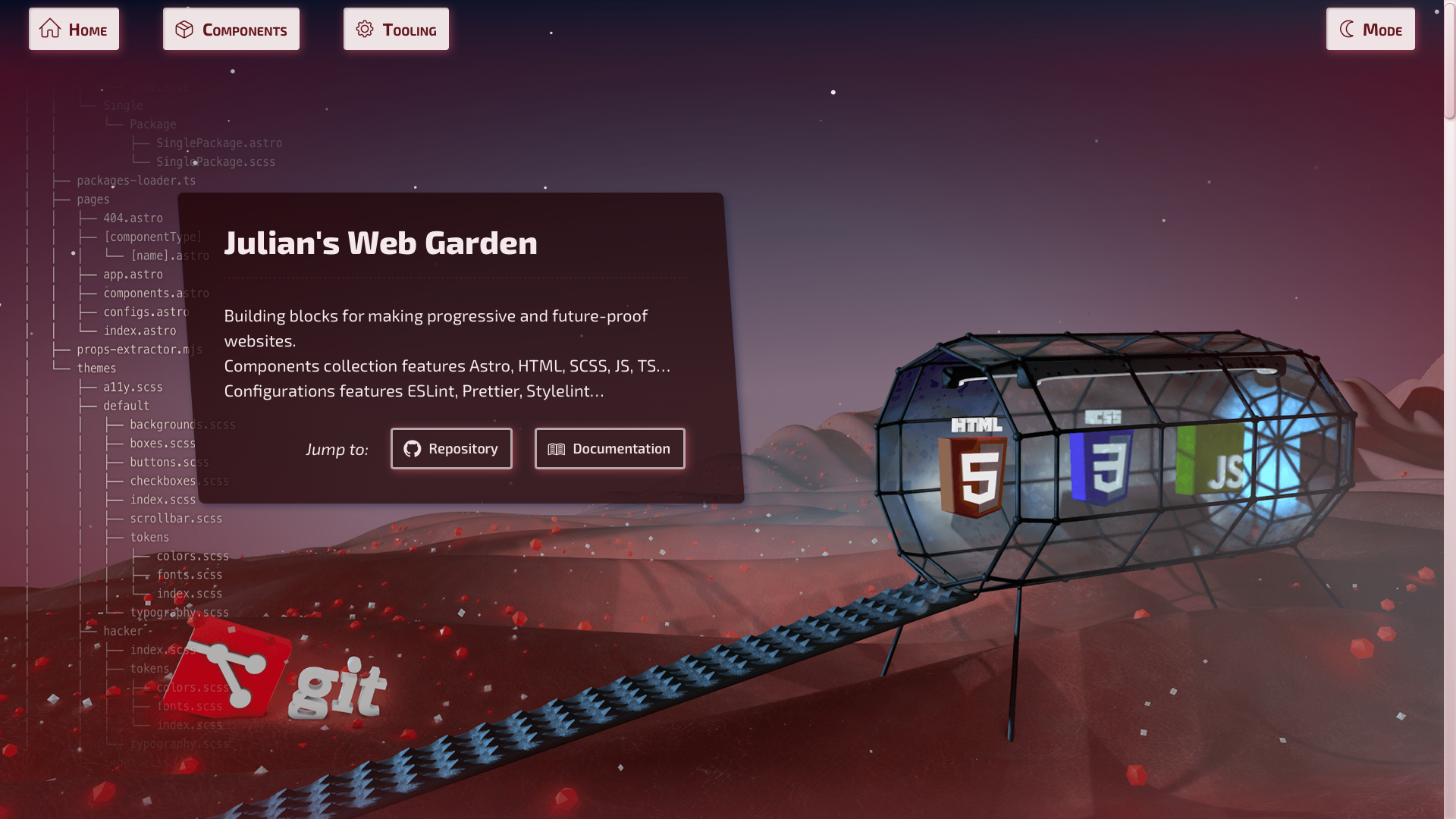
Provides system or user-defined color scheme preference, with a toggle mechanism. Settings are persisted, component is progressively enhanced and flash of unstyled content avoided. Also, it will provide an easier way to target theme with CSS / SCSS / JS.
Maintainers
 julian.cataldo
Readme
🚀 Astro — Color mode, with user override


Provides system or user-defined color scheme preference, with a toggle mechanism.
Settings are persisted, component is progressively enhanced and flash of mis-styled content avoided.
Also, this provides an easier way to target theme with CSS selector / SCSS mixins / JS DOM selector.
Features
- Detects user current color mode
- Apply a
data-color-mode="dark|light"attribute on root document - Provides a toggle mechanism for overriding system preference
- Persists user preference in browser local storage
- Inject saved setting critically, avoiding a blinding flash of mis-styled content.
- Provides SCSS mixins for easy theme targeting
- Supports JS / No-JS, with a fallback to user system preference
📦 Installation
pnpm i astro-color-mode🛠 Usage
---
import { ColorMode } from 'astro-color-mode';
// ...
---
<!-- ... -->
<head>
<!-- Place component inside `HEAD` tag -->
<ColorMode />
<!-- ... -->
</head>Use data-color-mode-switch where you want to toggle theme setting,
on an any element, somewhere inside BODY tag:
<!-- ... -->
<body>
  <!-- ... -->

  <button data-color-mode-switch>Toggle COLOR MODE 💡</button>

  <!-- ... -->
</body>
🎉 Result
<html data-color-mode="light|dark">
  <!-- ... -->
</html>
With SCSS
SCSS mixins registration in astro.config.mjs:
export default defineConfig({
  // ...
  vite: {
    css: {
      preprocessorOptions: {
        scss: {
          additionalData: `
            @use "astro-color-mode/use-color-mode.scss" as *;
          `,
        },
      },
    },
  },
});
Then, use it like this in your stylesheets:
.my-layout {
  :is(.my-link, body) {
    @include color-mode(light) {
      color: black;
      background-color: white;
      // ...
    }
    @include color-mode(dark) {
      color: white;
      background-color: black;
      // ...
    }
  }
}

.some-class {
  @include color-mode(light) {
    color: blue;
    background-color: yellow;
    // ...
  }
  @include color-mode(dark) {
    color: yellow;
    background-color: blue;
    // ...
  }
}
To do
- [ ] Fix no JS support (SCSS mixin…)
- [ ] Full JS independant
@mediaquery support for SCSS mixins - [ ] SCSS mixins demo usage
- [ ] Thorough demo video for all user scenarios
- [ ] With JS, system pref.
- [ ] With JS, persisted user pref.
- [ ] No JS, system pref.
LIVE DEMO 🎭 DOCUMENTATION WEBSITE ⎋