
badgecraft
v0.3.0
Published
Interactive 3D badges from any SVG, in metal, enamel, glitter, pearl and more, for React, Vue, Web Components and JavaScript, with a web Studio and image export CLI.

Maintainers
 parthj
Readme
badgecraft
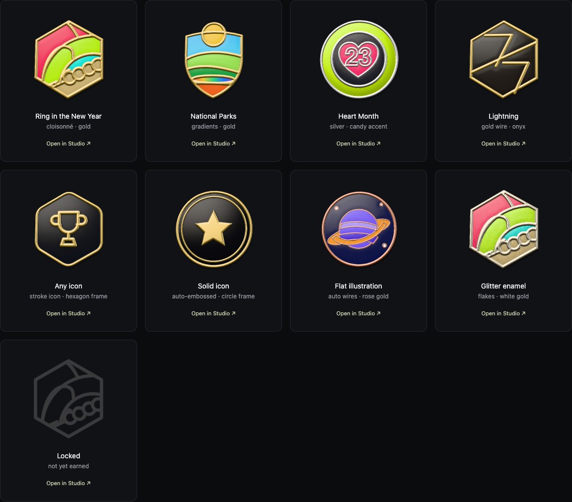
Turn any SVG into a physically based, interactive 3D badge in metal, enamel, candy paint, glitter, pearl or holographic finishes, like the Apple Fitness award medals. Strokes become polished metal wires, fills become glossy enamel, and the whole thing is lit by a real PBR material system: metalness, roughness, clear-coat, image-based reflections, iridescence, metallic flakes and brushed metal.
Works with React, Vue, as a Web Component (Svelte, Angular, Solid, Astro, plain HTML), or from vanilla JS.
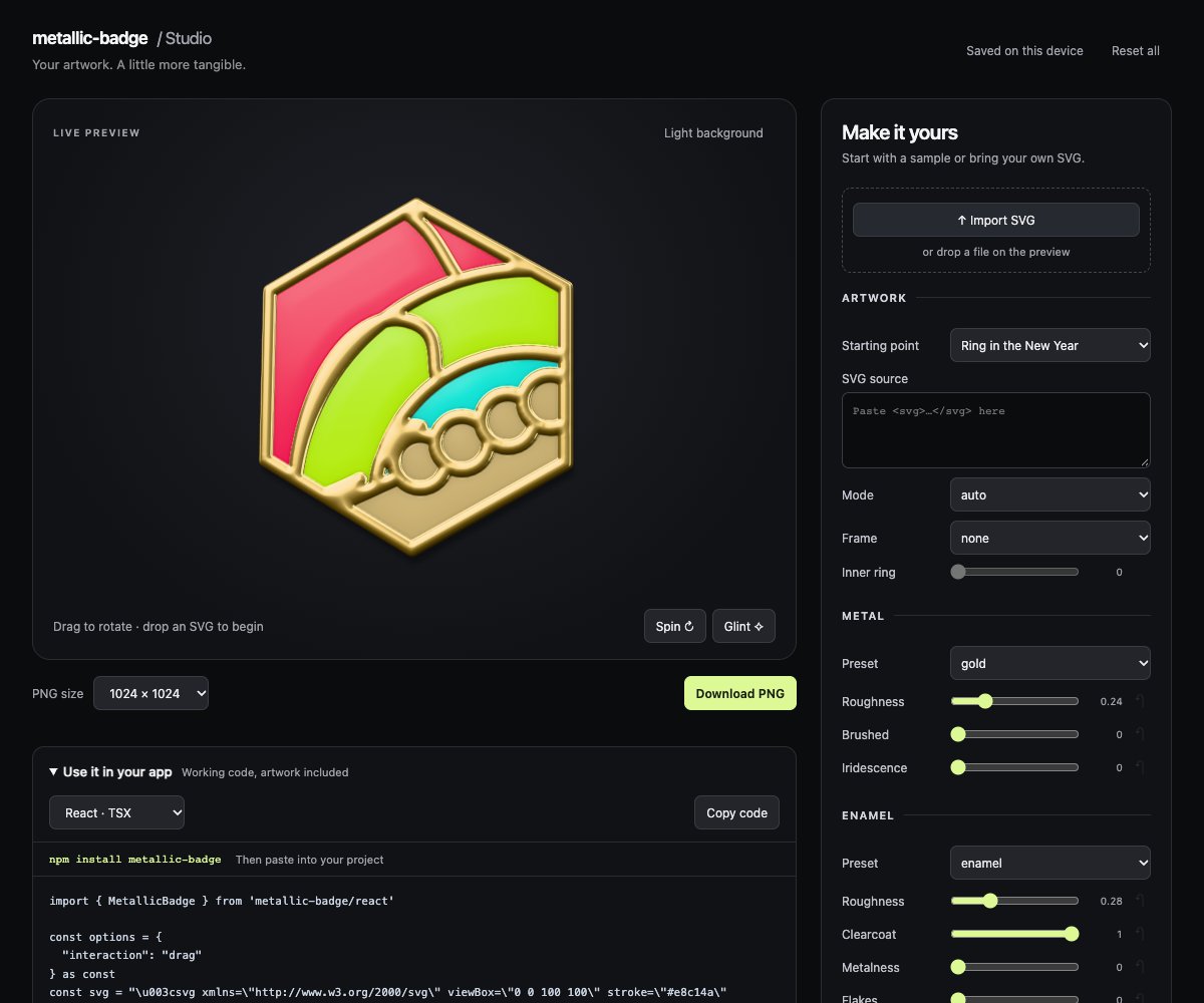
Open the web Studio · Upload an SVG, tweak its materials and lighting, then download a PNG or copy code for your site.
import { Badgecraft } from 'badgecraft/react'

<Badgecraft svg="/awards/new-year.svg" metal="gold" size={200} />- Any SVG in: paths, text, gradients,
<use>/<symbol>,<style>classes, clip paths, masks,currentColor, embedded images. The browser's own SVG renderer is used, so what you see in the SVG is what gets sculpted. - Real materials: GGX microfacet specular with multi-scattering, split-sum image-based lighting, clear-coat, thin-film iridescence, sparkle flakes and brushed metal. 23 presets (gold, rose-gold, silver, chrome, copper, candy, glitter, pearl, holographic…) or fully custom.
- Real 3D: the relief is displaced geometry with a rounded edge and a back plate. Tilt it on hover, drag-spin it with inertia, or call
spin(). - Fast: about 27 KB gzipped with no browser runtime dependencies. The Node CLI uses
playwright-core. One shared WebGL2 context for any number of badges, and baking runs in a Web Worker. 57 badges render in about 0.3 s on an Apple M-series laptop. - Safe everywhere: SSR-safe imports, a sized placeholder on the server, a flat SVG fallback without WebGL2,
prefers-reduced-motionrespected, and badges exposed asrole="img".
Install
npm install badgecraft
# or: pnpm add badgecraft / yarn add badgecraft / bun add badgecraft
Node.js 22+ is required for installation and the CLI. React (≥17) and Vue (≥3.3) are optional peer dependencies. Only install the one you use. Google Chrome is needed only for CLI/Node image exports.
Web Studio
Use the hosted Studio, or start the same app locally:
npx badgecraft studio
# Optional: open Google Chrome automatically
npx badgecraft studio --open
# Choose a port (0 picks an available one)
npx badgecraft studio --port 8080
Open the printed URL. Upload, drop, or paste an SVG; adjust metal, enamel, relief, lighting, frame, and pose; export a transparent PNG at 512, 1024, or 2048 pixels. Copy the finished recipe as React, Vue, Web Component, vanilla JS, or plain HTML with a CDN import. Artwork and saved drafts stay in your browser.
The local app is included in the npm package: no checkout, build tools, or extra
dependencies to install. It serves only on 127.0.0.1; press Ctrl+C to stop it.
After installation it can run offline. Browser rendering requires WebGL2.
CLI: SVG to badge image
npx badgecraft icon.svg --output badge.png --metal gold
npx badgecraft icon.svg --output silver.webp --metal silver --frame circle
The CLI uses installed Google Chrome to render the same badge effect as
the library. Export transparent PNG/WebP or JPEG, up to 2048 × 2048, with material,
lighting, frame, background, and pose controls. It works with local files or piped
SVG markup, without uploading artwork. Use --help for all flags.
For scripted exports, import renderBadge from badgecraft/node.
See the CLI and Node API guide for setup, examples, and limitations.
Usage
Plain HTML — no build tools
Paste this into an HTML page served by your site. Replace src with your SVG URL;
the custom element handles rendering and interaction.
<script type="module" src="https://cdn.jsdelivr.net/npm/[email protected]/dist/element.js"></script>
<badge-craft
  src="/awards/star.svg"
  metal="gold"
  alt="Star award"
  style="width:240px;height:240px"
></badge-craft>
For a self-contained snippet with your SVG and custom settings, choose HTML · CDN in the Studio's code panel. CDN imports need internet access; bundled npm imports work with your site's own assets.
React
import { useRef } from 'react'
import { Badgecraft, type BadgecraftRef } from 'badgecraft/react'

export function Award() {
  const badge = useRef<BadgecraftRef>(null)
  return (
    <>
      <Badgecraft
        ref={badge}
        svg="/awards/lightning.svg"
        metal="gold"
        base="onyx"
        interaction="drag"
        size={240}
        alt="Lightning award"
        onReady={() => console.log('ready')}
      />
      <button onClick={() => badge.current?.spin()}>Spin</button>
    </>
  )
}
Props are the options plus size (number = px, or any CSS length), alt, className, style and any div attribute. Changing props is cheap: only what changed is recomputed.
Vue 3
<script setup lang="ts">
import { ref } from 'vue'
import { Badgecraft } from 'badgecraft/vue'
const badge = ref()
</script>

<template>
  <Badgecraft ref="badge" svg="/awards/parks.svg" metal="silver" :size="240" idle="float" @ready="..." />
  <button @click="badge.spin()">Spin</button>
</template>
To register it globally, use app.use(BadgecraftPlugin).
Web Component (any framework or plain HTML)
<script type="module">
  import 'badgecraft/element'
</script>

<badge-craft src="/awards/new-year.svg" metal="gold" style="width: 200px; height: 200px"></badge-craft>

<!-- inline artwork, JSON for object options -->
<badge-craft frame="hexagon" metal='{"preset":"gold","roughness":0.15}' relief='{"depth":0.06}'>
  <svg viewBox="0 0 24 24" fill="none" stroke="currentColor" stroke-width="2"><path d="M4 18 12 4l8 14z" /></svg>
</badge-craft>
Attributes are kebab-case versions of the options (tilt-max, tone-mapping, fill-holes…). Object options accept JSON, or you can set element.options = {...} from JS. Events: ready and error. Methods: spin(), glint(), toDataURL(), toBlob(). Style the size with CSS (default 160×160).
Vanilla JS
import { Badgecraft } from 'badgecraft'

const badge = new Badgecraft(document.querySelector('#award')!, { svg: svgMarkup, metal: 'rose-gold' })
await badge.ready
badge.update({ metal: 'silver' }) // merge options
badge.spin(2)
const png = await badge.toBlob()
badge.destroy()
The host element needs a size. If it has none, it gets 160px and aspect-ratio: 1.
How an SVG becomes a badge
| SVG | Badge |
| ------------------------------------- | ---------------------------------------------------------------------------- |
| Strokes | Raised, round metal wires (the metal material) |
| Fills | Recessed, slightly domed enamel pools in the fill colour (gradients too) |
| Areas enclosed by the artwork | The backplate (base material), unless fillHoles: false |
| The silhouette | A metal rim (rim), a rounded edge and a solid back plate |
mode: 'auto' (the default) picks a sensible mapping:
- Artwork with strokes, images or several colours → cloisonné (as above). Multi-colour art without strokes gets automatic wires around each shape (
outline: 'auto'), so flat illustrations, flags and emoji work out of the box. - Single-colour artwork (logos, solid icons) → embossed: every shape becomes raised, bevelled metal.
Wrap icons in a badge shape with frame: 'circle' | 'hexagon' | 'octagon' | 'shield' | 'square' | 'diamond' | 'star', or { shape, padding, innerRing, path }.
Per-element control
Annotate SVG elements (or groups) with data attributes:
| Attribute | Values | Effect |
| ----------------------------------------------------- | ---------------------------------------- | ------------------------------------------ |
| data-material | metal enamel base accent | Material slot for the element's fill and stroke |
| data-fill-material / data-stroke-material | same | Slot for just the fill or the stroke |
| data-relief | raised inset flat none | Sculpting of the fill |
| data-stroke-relief | same | Sculpting of the stroke (default raised) |
<circle r="40" fill="#c6f400" data-fill-material="accent" />  <!-- candy-metal ring with accent="candy" -->
<path d="…" fill="#fff" data-relief="raised" />               <!-- embossed metal numerals -->
Options
| Option | Type | Default |
| --------------------- | ------------------------------------------------------------------------- | ----------- |
| svg | SVG markup, URL, data URL or SVGElement | (required) |
| mode | 'auto' \| 'cloisonne' \| 'embossed' | 'auto' |
| metal | material: wires and rim | 'gold' |
| enamel | material: fills (uses SVG colours) | 'enamel' |
| base | material: backplate | 'onyx' |
| accent | material: for data-material="accent" | 'silver' |
| color | value of currentColor in the SVG | '#ffffff' |
| frame | badge shape around the artwork | none |
| rim | outer metal rim width (fraction of badge, 0 = off) | 0.03 |
| outline | wires around filled shapes (fraction), or 'auto' | 'auto' |
| fillHoles | fill enclosed areas with the backplate | true |
| relief | relief options | |
| environment | environment preset, custom lights, or HDR URL | 'studio' |
| environmentRotation | degrees | 0 |
| exposure | linear exposure | 1 |
| toneMapping | 'neutral' \| 'aces' \| 'agx' \| 'none' | 'neutral' |
| interaction | 'tilt' (hover) \| 'drag' (spin with inertia) \| 'none' | 'tilt' |
| tiltMax | max tilt in degrees | 18 |
| pose | resting { pitch, yaw, roll } in degrees (a slight 3/4 view shows the edge) | { pitch: -5, yaw: -8 } |
| idle | 'none' \| 'float' \| 'shine' | 'none' |
| locked | flat grey outline for awards not yet earned | false |
| lockedColor | colour of the locked outline | '#3a3a3c' |
| shadow | contact shadow opacity (0 = off) | 0.35 |
| quality | relief map resolution in px, or 'auto' (matches display size) | 'auto' |
| padding | space around the badge for tilting (fraction of canvas) | 0.06 |
| onReady / onError | callbacks | |
Instance methods (also on the React ref, Vue ref and custom element): spin(turns = 1), glint(), toDataURL(type?, quality?) and toBlob(type?, quality?). The vanilla class adds update(partial), setOptions(all), destroy(), and ready, a promise that resolves after the first draw and rejects if the artwork can't be loaded or baked.
Destroying a badge before its first draw rejects ready with an AbortError. Destruction cancels callbacks from pending work. spin() and glint() respect reduced motion and locked badges. Nonfinite numeric options use safe defaults; bounded material and geometry values are clamped.
Materials
Every material slot takes a preset name, a full material, or a preset with overrides:
metal: 'rose-gold'
metal: { preset: 'gold', roughness: 0.12, brushed: 0.4 }
enamel: { metalness: 0.8, roughness: 0.25, clearcoat: 1 } // candy-paint enamel in SVG colours
base: { preset: 'onyx', color: '#14233f' }
| Parameter | Meaning |
| ------------------------------------- | --------------------------------------------------------------------------- |
| color | base colour; for metals, the specular (F0) tint |
| useSvgColor | take the colour from the SVG (default for the enamel slot) |
| metalness | 0 = dielectric (enamel, paint), 1 = metal |
| roughness | 0 = mirror … 1 = diffuse |
| clearcoat, clearcoatRoughness | glossy lacquer layer on top |
| ior | dielectric index of refraction (reflectance at normal incidence) |
| iridescence, iridescenceThickness | thin-film interference (oil slick, anodised, holographic) |
| flakes, flakeScale | sparkling metallic flakes |
| brushed, brushDirection | brushed streaks: circular, radial, horizontal, vertical |
| emissive | self-illumination of the base colour |
Presets: gold, rose-gold, white-gold, matte-gold, brushed-gold, silver, brushed-silver, platinum, chrome, copper, bronze, brass, titanium, gunmetal, black-chrome, enamel, matte-enamel, candy, glitter, pearl, holographic, onyx, obsidian. They're exported as materials if you want to build on them.
Relief
relief: {
  depth: 0.05,         // max relief height (fraction of badge); wires are shaped as round tubes up to this
  thickness: 0.03,     // back plate thickness
  floor: 0.3,          // backplate height relative to wire tops
  profile: 'round',    // wire cross-section: 'round' | 'soft' | 'chamfer'
  bevel: 0.02,         // bevel width of raised (embossed) shapes
  edge: 0.014,         // rounding of the outer edge
  enamelLevel: 0.16,   // how full the enamel pools are
  enamelDome: 0.12,    // doming of enamel (negative = concave)
  domeWidth: 0.05,
  smoothing: 0.9,
  ao: 0.45,            // ambient occlusion in crevices
}
Lighting & environments
Presets are procedural HDR studios: studio (default), soft, sunset, night, neon. You can also design your own lights or use an equirectangular HDR image:
environment: 'sunset'

environment: {
  top: '#7c7c80', horizon: '#2e2e32', bottom: '#121214',
  lights: [
    // azimuth 0 = behind the viewer (what the badge face reflects), elevation above the horizon
    { azimuth: -40, elevation: 38, size: [70, 50], intensity: 4, color: '#fff6e8', softness: 0.7 },
    { azimuth: 135, elevation: 30, size: 30, shape: 'circle', intensity: 3 },
  ],
}

environment: { url: '/hdri/studio_small_08_1k.hdr', intensity: 1.2 } // .hdr (RGBE) or any image format
Environments are pre-filtered once per page (GGX importance sampling into a roughness mip chain plus a diffuse irradiance map) and shared by all badges.
Technology choices
The goal was photoreal metal for arbitrary SVGs, cheap enough to show dozens on a page, in any framework.
| Approach | Verdict |
| ----------------------------------------------------- | ---------------------------------------------------------------------------------------------------------------------------------------------------------------------------------------------------------------------------------------------- |
| CSS / SVG lighting filters (feSpecularLighting) | Tiny and SSR-able, but not physically based: no environment reflections, and it looks like a 2010-era bevel. |
| three.js SVGLoader + ExtrudeGeometry + MeshPhysicalMaterial | Real PBR out of the box, but ~150 KB gzip. Triangulating arbitrary SVGs (strokes, holes, self-intersections, text) is fragile, there's no control over a cloisonné wire profile, and one context per badge hits the browser's ~16 WebGL-context limit. |
| WebGPU | The future, but not yet available everywhere. |
| Chosen: SVG → distance-field relief bake + custom WebGL2 PBR | Robust for any SVG (the browser rasterises it), exact control over the look, ~27 KB, one shared context for unlimited badges, universal WebGL2 support. |
How it works:
- Classify. The SVG is attached to a hidden shadow root so the browser's style engine resolves classes, inheritance and
currentColor.<use>is inlined, and every painted shape is assigned a relief role and a material slot. - Rasterise. Four passes are rendered by the browser's SVG renderer: role masks, slot masks (colour-coded channels on black, so each channel is exact anti-aliased coverage that respects paint order) and the colour pass.
- Bake (in a Web Worker). Exact Euclidean distance transforms with sub-pixel edge points (Felzenszwalb–Huttenlocher, refined with Gustavson's anti-aliased edge model) produce a smooth height field: round tube wires sized from each wire's local width, domed enamel pools, a rounded outer edge, cavity occlusion and dilated colours.
- Render (WebGL2). A displaced grid mesh (front relief plus back plate) is shaded with GGX, multi-scatter energy compensation, split-sum IBL from pre-filtered environments, clear-coat, flakes, thin-film iridescence, brushed anisotropy and Khronos PBR Neutral tone mapping. Every badge draws through a single shared context into its own 2D canvas.
Performance notes
- Baking is cached by artwork, options and resolution. Identical badges share GPU textures, and remounts within a few seconds (React StrictMode, route changes) reuse them.
quality: 'auto'bakes at roughly the badge's device-pixel size (256–1024 px) and re-bakes only if the badge grows a lot.- Static badges draw once. Only moving badges (hover, drag, spin, idle) draw per frame, and idle animation pauses off-screen.
- Reflection highlights and flakes are filtered at pixel scale to reduce shimmer. The mirror environment level skips convolution; rough reflections still use the cached GGX mip chain. These refinements add no textures or draw passes.
- Material, lighting and pose changes are just uniforms, so they're free to animate. Artwork and relief changes trigger a re-bake: about 5–15 ms of main-thread work (the browser rasterises the SVG), then the distance-field bake in a Web Worker (~75–100 ms at 512 px, ~0.4 s at 1024 px on an M-series laptop).
Limitations
- SVGs are rendered as images, so external resources (linked images, web fonts) aren't loaded. Inline images as data URLs and convert text to paths (or accept system fonts).
- Artwork is static: scripts, event handlers, embedded HTML, animation elements, and external SVG references are removed before classification.
- Badges are square. Non-square artwork is centred.
- WebGL2 is required for the 3D render. Without it, the flat SVG is shown.
Development
The playground's landing page (index.html) and Studio (studio.html) are
React apps in playground/site/. The Studio walks through three steps (artwork,
finish, fine-tune) next to a live preview:
- Open any landing-page example in the Studio with its full material and frame recipe.
- Pick a sample, upload or drop an SVG anywhere on the page (up to 1 MB), or paste SVG markup. Invalid edits show an error and keep the previous preview and saved draft.
- Choose metals, enamels, backplates and frames from visual swatches. Advanced material, depth, lighting and motion controls are grouped and collapsed. Material sliders show actual preset values and can be restored individually.
- Every change can be undone (⌘Z / Ctrl+Z, ⇧⌘Z / Ctrl+Y), including a full reset.
- Copy complete React/TSX, Vue, Web Component, plain HTML or vanilla JS code. The snippet includes your SVG, so it works without the playground's sample files.
- Download a transparent PNG at 512, 1024 or 2048 pixels. Exports use the configured resting pose, independent of preview motion and display density.
- Valid drafts save locally in your browser. The Studio still works when local storage is unavailable.
The site's examples use the Apple, Atlassian, Google, and Meta logo marks in
playground/public/logos/ (trademarks of their owners, shown as sample artwork).
gallery.html is a development render harness for scripts/
(?only=id,id&size=N&opts=<JSON>&light). It and test.html use the artwork in
playground/fixtures/, which the render-quality baselines depend on; neither is
part of the published site.
pnpm install
pnpm dev             # playground at http://localhost:5199 (landing, studio, React, Vue, Web Component)
pnpm test            # unit tests (distance transforms, bake)
pnpm test:browser    # end-to-end checks in installed Google Chrome
pnpm test:studio     # import, drafts, code, clipboard, export and mobile workflows
pnpm test:bugbash    # adversarial API, loading, lifecycle and fallback regressions
pnpm test:package    # build + ESM/CJS imports and React/Vue SSR checks
pnpm test:cli        # real Chrome CLI and Node API export regressions
pnpm test:tarball    # install/test the actual npm tarball in a clean project
pnpm test:quality artifacts/reference # capture 108 reference images before a render edit
pnpm test:quality artifacts/current artifacts/reference # compare after the edit
pnpm benchmark       # five Chrome runs: timing, triangles, long tasks, idle/context checks
pnpm perf:profile artifacts/profile # phase timings, GPU queries, CPU profiles, frame pacing
pnpm typecheck
pnpm doctor          # full React Doctor scan; complete 100/100 required
pnpm verify          # types, unit tests, package build/SSR, CLI checks, Doctor 100
pnpm build           # ESM + CJS + .d.ts + CLI renderer into dist/
pnpm build:studio    # build the gallery and Studio into dist/studio/
See profiling and paired A/B comparisons for baseline snapshots, measurement boundaries, raw evidence, and quality checks.
Maintainers: see release setup and publishing.
License
MIT
React Doctor runs npx react-doctor@latest without scan caches and requires network access. Missing or
incomplete scans fail verification. The JSON report is saved in
node_modules/.cache/react-doctor/report.json. Reviewed inline exceptions cover
dedicated-worker messages and existing object-URL cleanup lifecycles.
doctor.config.json excludes generated bundles; all
authored source remains in the full scan.
Run browser suites sequentially, after build commands have finished: rebuilding
the worker while Vite is serving tests triggers a page reload. Screenshots from
pnpm test:studio are saved in artifacts/studio-check/. See the
maintainer product review for the
remaining opportunities and the reasons behind this Studio pass.
The pnpm policy delays new releases for 24 hours, rejects trust downgrades, and blocks exotic transitive dependencies. Two exact, integrity-pinned tsup/Vitest dependencies have documented trust-policy exceptions; other versions remain checked.