
basic-modals
v2.0.1
Published
A basic and ultra lightweight set of promise based HTML modals (prompt, alert, confirm, veil).

Maintainers
 lanshor
Readme
Basic-Modals
An ultra lightweight set of promise based HTML modals: prompt, alert, confirm and veil.
Install
npm install basic-modalsUsage
Alert
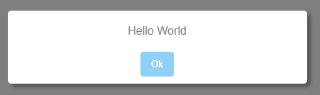
Parameter list
This is the parameter list accepted by alert. All of them are optional.
message: Text content. The default value is "Default Message".button_ok_content: Text for the "ok button". Default value is "Ok".title: A title on the top of the modal. By default alert modals don't have any title.escape: Whether pressing Escape closes the modal. Defaulttrue.className: A class attribute applied to the alert's root element (the<dialog>).id: An id attribute applied to the alert's root element (the<dialog>).
Use 1: Invoking it with a message without parameters
const { alert } = require('basic-modals')

alert('hello world')
Use 2: Invoking it using parameters
alert( { message: 'hello world', button_ok_content: 'close' } )Use 3: Using it with a promise
alert( 'Accept this' )
    .then( _ => console.log('The alert modal has been closed') )
Use 4: Using the BasicModals global object in a browser's scope
<script>
    BasicModals.alert('hello world')
</script>
Confirm
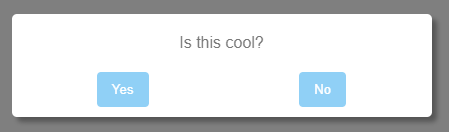
Parameter list
This is the parameter list accepted by confirm. All of them are optional.
question: Text content for the question. Default value is "Default Question".button_yes_content: Text for the "yes button". Default value is "Yes".button_no_content: Text for the "no button". Default value is "No".button_cancel_content: Text for the "cancel button". Default value is null. By default confirm modals don't have a cancel button.title: A title on the top of the modal. By default confirm modals don't have any title.escape: Whether pressing Escape dismisses the modal. Defaulttrue. A dismissal rejects the promise when a cancel button is present, otherwise it resolves tofalse.className: A class attribute applied to the confirm's root element (the<dialog>).id: An id attribute applied to the confirm's root element (the<dialog>).
Use 1: Invoking it with a question without parameters
const { confirm } = require('basic-modals')

confirm('is this cool?')
    .then( response => console.log(`The user said ${ response ? 'yes' : 'no' }`) )
Use 2: Customizing button texts
confirm( { question: 'like notifications?', button_yes_content: 'always', button_no_content:'never' } )
    .then( response => { /* ... */ } )
Use 3: Adding a Cancel button
For adding a cancel button, just add a button_cancel_content parameter with the button text content.
confirm({
    question: 'save changes?',
    button_yes_content: 'Of course',
    button_no_content:'Never',
    button_cancel_content:'Cancel'
    })
    .then( saved => { /* saved = true if button_yes was clicked, false if button_no was clicked */ } )
    .catch( _ => { /* catch section is executed when button_cancel is clicked */ })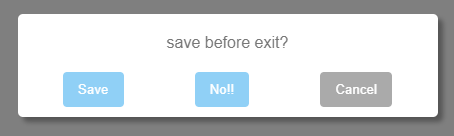
Use 4: Using the BasicModals global object in a browser's scope
<script>
    BasicModals.confirm('do you want some pizza?')
        .then( response => { /* ... */ })
</script>
Prompt
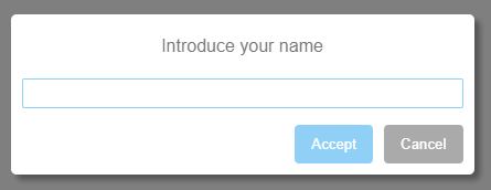
Parameter list
This is the parameter list accepted by prompt. All of them are optional.
question: Text content for the question. Default value is "Default Question".value: Default value in place for the input text box. Default value is '' (empty string).placeholder: Placeholder value for the input text box. Default value is '' (empty string).button_accept_content: Text for the "accept button". Default value is "Accept".button_cancel_content: Text for the "cancel button". Default value is "Cancel".title: A title on the top of the modal. By default prompt modals don't have any title.validate: Either a single function applied to every field, or an object{ fieldName: fn }applying a validator per named field (useful withinputs). Each validator receives the field value and returns...- An empty string: The field is valid; the accept button is enabled.
- A non empty string: The field is invalid; the message is displayed and the accept button is disabled.
inputs: An object{ name: HTMLElement }of pre-built elements that REPLACE the classic question + text input. Every element is rendered (wrapped in a.BasicModalsInputscontainer); those exposing a.valuebecome result fields, while extras without a value (separators, labels) are rendered but ignored. Wheninputsis used the promise resolves to an object{ name: value }instead of a single string.escape: Whether pressing Escape dismisses the modal (rejecting the promise). Defaulttrue. Set tofalsefor a prompt that must be answered.className: A class attribute applied to the prompt's root element (the<dialog>).id: An id attribute applied to the prompt's root element (the<dialog>).
Use 1: Invoking it with a question without parameters
const { prompt } = require('basic-modals')

prompt("what's your name?")
    .then( name => console.log(`The user's name is ${name}`) )
Use 2: Catching when the user closes the modal
When the prompt is dismissed the promise rejects with a reason: 'cancel' if the cancel button was clicked, or 'escape' if it was closed with the Escape key.
prompt("what's your name?")
    .then( name => console.log(`The user's name is ${name}`) )
    .catch( reason => console.warn(`The user closed the modal (${reason})`) )
Use 3: Customizing button texts, add a default response and placeholder
prompt( {
    question: "what's your name?",
    value: 'Eric',
    placeholder: 'Your name here',
    button_accept_content: 'Next',
    button_cancel_content:'Quit',
    })
    .then( response => { /* ... */ } )
Use 4: Adding validation
const validate = value => {
    const forbidden_values = ['hello', 'world']
    return forbidden_values.includes(value) ? 'Value not allowed' : ''
}

prompt( { validate }).then( response => { /* ... */ } )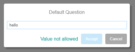
Use 5: Custom inputs (multiple fields)
Pass an inputs object of pre-built elements (native, or your own components) to replace the single text input. The promise resolves to an object keyed by the same names:
const name = document.createElement('input')
name.placeholder = 'project name'
const template = document.createElement('select')
// ...append <option>s to template...

prompt({ title: 'New project', inputs: { name, template } })
    .then( ({ name, template }) => { /* ... */ } )
    .catch( _ => { /* cancelled */ } )
Elements without a .value (e.g. a separator) are rendered but excluded from the result. Style the layout through the .BasicModalsInputs container (scope it with the modal className to target a single modal).
Use 6: Using the BasicModals global object in a browser's scope
<script>
    BasicModals.prompt("what's your name?").then( response => { /* ... */ })
</script>
Veil
The veil is the base primitive every other modal is built on: a full-screen native <dialog> (opened with showModal(), so it lives in the browser's top layer with a real ::backdrop, focus-trap and Escape support) that fades in/out and centers whatever you put inside it. alert, confirm and prompt are just a veil with a box of content.
Parameter list
This is the parameter list accepted by veil. All of them are optional.
content: Either a string (rendered as big centered text — the classic "loading…" veil) or anyHTMLElementinserted as-is (a box, a whole custom modal, anything). Defaultnull(an empty, transparent veil).escape: Whether pressing Escape closes the veil. Defaultfalse(a veil usually blocks the viewport until you close it yourself).className: A class attribute applied to the veil's root element (the<dialog>).id: An id attribute applied to the veil's root element (the<dialog>).
Return value
Unlike the other modals (which return a promise), veil returns an object { dialog, close, closed }:
dialog: the<dialog>element.close( value ): fades the veil out, removes it from the DOM and returns theclosedpromise. The optionalvaluebecomes the dialog's return value.closed: a promise that resolves (with the dialog's return value) once the veil has finished its fade-out and left the DOM — whether it was closed viaclose()or Escape.
Use 1: Invoking it and closing it after 3 seconds
const { veil } = require('basic-modals')

// render the veil
const { close } = veil()
// remove the veil after 3 seconds
setTimeout( close, 3000)
Use 2: Adding some text to the veil
const { close } = veil('some text here')
setTimeout( close, 3000)
or
const { close } = veil({ content: 'some text here' })
setTimeout( close, 3000)
Use 3: Putting your own element in the veil
Because content accepts any element, the veil doubles as the overlay for your own custom modals:
const box = document.createElement('div')
box.innerHTML = '<h1>My custom modal</h1>'
const { close, closed } = veil({ content: box })
closed.then( _ => console.log('the veil is gone') )
Use 4: Knowing when the veil is gone
When you call close the veil isn't removed immediately: it plays a fade-out transition first. Use the returned closed promise (or the one close() itself returns) to know when it has actually left the DOM.
const { close } = veil()
close().then( _ => do_something() )
Use 5: Using the BasicModals global object in a browser's scope
<script>
    const { close } = BasicModals.veil( { content: 'loading... please wait' } )
</script>
Adding custom styles
This package adds a <style> tag with the modal's CSS to your <head>, wrapped in a @layer basic-modals cascade layer. The classes are prefixed by .BasicModals and they should be self-explanatory, so you can add your own CSS selectors for those classes in your CSS and override / expand the default style.
Example:
/* This will turn the Ok button red for all the modals */
.BasicModalsButtonOk:hover {
    background: red
}
Every modal is a native <dialog> whose dark overlay is its ::backdrop. The root <dialog> carries a per-type class so each kind can be themed independently: BasicModalsVeilAlert, BasicModalsVeilConfirm, BasicModalsVeilPrompt, and BasicModalsVeil for the standalone veil. Inside, alert/confirm/prompt render a <div class="BasicModalsBox BasicModals<Type>"> card (BasicModalsAlert, BasicModalsConfirm, BasicModalsPrompt). To style one kind in particular target its class, or pass a className and scope your selectors with it:
/* restyle every confirm's card */
.BasicModalsConfirm {
    border: 2px solid red
}

/* this affects only modals opened with className: 'danger' */
dialog.danger .BasicModalsButtonOk:hover {
    background: red
}
Because the defaults live in a cascade layer, you don't need to fight specificity or worry about load order: any of your own (unlayered) rules win over the defaults automatically — even a lower-specificity one, and even if your stylesheet is injected before this package's.
Adding default values
You can add default values for any parameter, so you don't need to set them again and again.
Getting access to the defaults object
const { defaults } = require('basic-modals')or, in a browser's scope:
const defaults = BasicModals.defaultsChanging the default value for the alert button
defaults.alert.button_ok_content = 'Agree'Then, for the scenario below:
alert('hello')

alert( { message: 'world' } )
in both cases the "button ok" will have the text 'Agree' instead of the default 'Ok'.
More examples
The defaults object schema is:
defaults[modal_type][parameter_name]So, the defaults are available for every parameter of every modal, a few examples below:
// setting a default for the ok button in alert modals
defaults.alert.button_ok_content = 'Agree'

// setting a default for "yes" and "no" buttons in confirm modals
defaults.confirm.button_yes_content = 'Yep!'
defaults.confirm.button_no_content = 'Nope'

/* setting a default for the question and the cancel button in a
   single line, overriding the original default objects */
defaults.prompt = { question:'¿?', button_cancel_content: 'Back' }

// setting a default for the veil content
defaults.veil.content = 'loading'

// setting a default for the validate function
defaults.prompt.validate = value => global_validator( value )