
better-themes
v1.1.0
Published
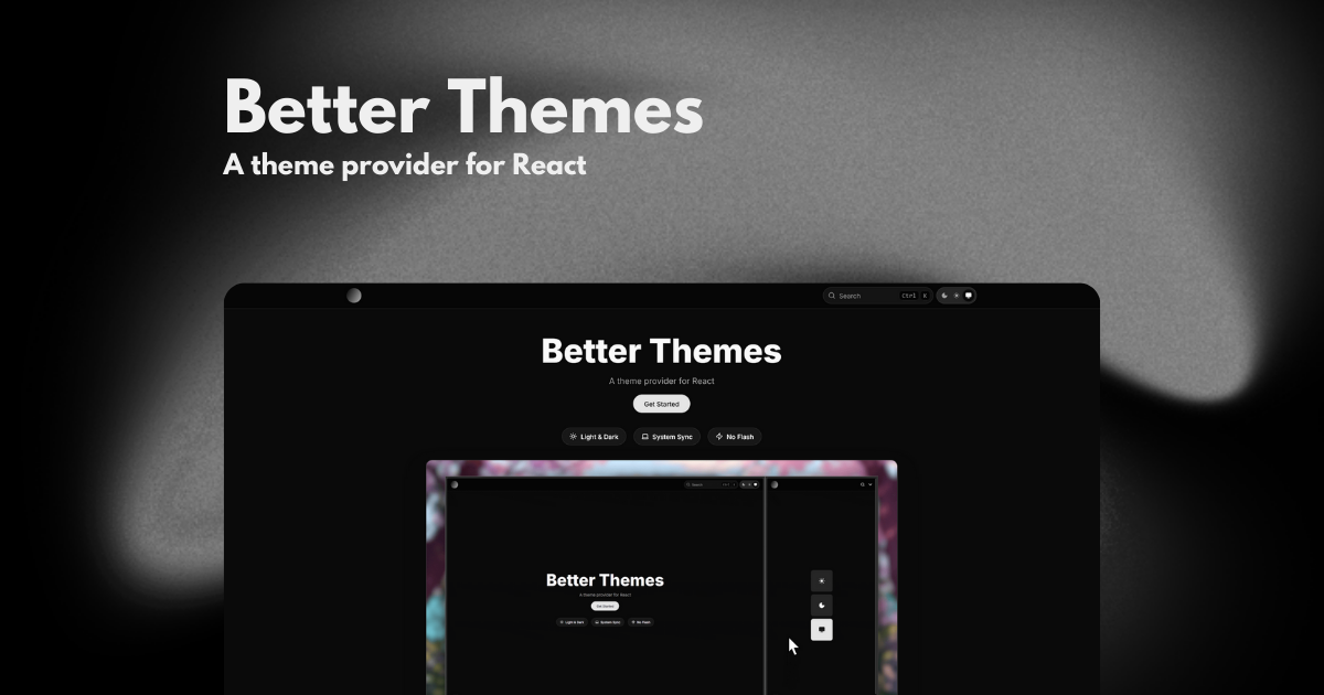
A theme provider for React
Maintainers
 savirufr
Readme
better-themes
A theme provider for React


Features
- Zero flash on load - Prevents theme flash during page load (SSR/SSG safe)
- System preference detection - Automatically detects and respects user's system theme preference via
prefers-color-scheme - Cross-tab synchronization - Theme changes sync across browser tabs and windows
- Themed browser UI - Sets
color-schemeCSS property for native browser UI elements - Custom themes - Support for multiple custom themes beyond light/dark
- Flexible styling - Use class or data attributes (works with Tailwind CSS)
- TypeScript - Fully typed with TypeScript
- Framework agnostic - Works with Next.js, Remix, Vite, TanStack Start, Waku, and more
Installation
npm install better-themes
# or
pnpm add better-themes
# or
yarn add better-themes
# or
bun add better-themes
Quick Start
Wrap your app with ThemeProvider at the root of your application.
Next.js (App Router)
For React Server Components, import from better-themes/rsc:
import { ThemeProvider } from "better-themes/rsc";

export default function RootLayout({ children }: { children: React.ReactNode }) {
  return (
    <html lang="en" suppressHydrationWarning>
      <body>
        <ThemeProvider>
          {children}
        </ThemeProvider>
      </body>
    </html>
  );
}
Vite, TanStack Start, & Others
For client-side applications or other frameworks:
import { ThemeProvider } from "better-themes";

function App() {
  return (
    <ThemeProvider>
      {/* Your app content */}
    </ThemeProvider>
  );
}
Important: Add
suppressHydrationWarningto your<html>tag to prevent hydration warnings.
Usage
Access the current theme and change it with the useTheme hook:
"use client"

import { useTheme } from "better-themes";

function ThemeToggle() {
  const { theme, setTheme, themes } = useTheme();

  return (
    <div>
      <p>Current theme: {theme}</p>
      <button onClick={() => setTheme("light")}>Light</button>
      <button onClick={() => setTheme("dark")}>Dark</button>
      <button onClick={() => setTheme("system")}>System</button>
    </div>
  );
}
Configuration
The ThemeProvider accepts the following props:
themes- List of available theme names (default:["light", "dark"])defaultTheme- Default theme when no preference is saved (default:"system"if enableSystem is true, else"light")storageKey- localStorage key for storing theme preference (default:"theme")forcedTheme- Force a specific theme (overrides user preference)enableSystem- Enable system theme detection (default:true)enableColorScheme- Setcolor-schemeCSS property (default:true)attribute- HTML attribute to modify (default:"class", can be"class"or"data-*")value- Map theme names to attribute valuesdisableTransitionOnChange- Disable CSS transitions on switch (default:false)nonce- Nonce for CSP headers
Styling with Tailwind CSS
Use class-based dark mode in Tailwind:
<ThemeProvider attribute="class">
  {children}
</ThemeProvider>
Then use dark variants:
<h1 className="text-black dark:text-white">
  Hello World
</h1>
This project is deployed on Netlify
Documentation
For complete documentation, examples, and recipes, visit https://better-themes.netlify.app
Credits
This project is inspired by and based on next-themes by Paco Coursey and tanstack-theme-kit by augiwan.
License
MIT