
booklet-react-component
v0.1.1
Published
A simple react booklet component that looks like a booklet and has page turning capabilities
Downloads
73
Maintainers
 bareinhard
Readme

Booklet-React-Component
A booklet styled react component, allowing for page navigation similar to jQuery's booklet plugin
Work in Progress, working to shrink the package
Install
npm install booklet-react-component@latestExample Usage
import React, { Component } from 'react';
import Booklet from 'booklet-react-component';

class UsingBookletComponent extends Component {
    constructor() {
        super();
        this.state = {
            index: 1,
            flipPageIndex: 1,
        };
    }
    genNextPages = () => {
        this.setState({
            index: this.state.index + 2,
        });
    };
    genPrevPages = () => {
        this.setState({
            index: this.state.index - 2,
        });
    };
    flipPageIndexForward = () => {
        this.setState({
            flipPageIndex: this.state.flipPageIndex + 1,
        });
    };
    flipPageIndexBack = () => {
        this.setState({
            flipPageIndex: this.state.flipPageIndex - 1,
        });
    };
    render() {
        return (
            <div>
                <button>Class</button>
                <Booklet
                    flipPageIndex={this.state.flipPageIndex}
                    index={this.state.index}
                    nextPage={this.genNextPages}
                    prevPage={this.genPrevPages}
                    pages={[
                        <div> Ele 0</div>,
                        <div> Ele 1</div>,
                        <div> Ele 2</div>,
                        <div> Ele 3</div>,
                        <div> Ele 4</div>,
                        <div> Ele 5</div>,
                        <div> Ele 6</div>,
                    ]}
                />

                <div className="button-container" style={{ position: 'absolute' }}>
                    <button onClick={this.flipPageIndexForward}>Next Pages</button>
                    <button onClick={this.flipPageIndexBack}>Prev Pages</button>
                </div>
            </div>
        );
    }
}

export default UsingBookletComponent;
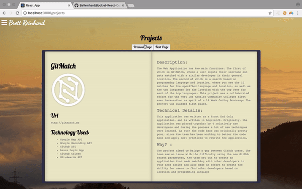
Example Output
API
Changing Pages:
- To change the page and use the animation of the pages you will need to change the flipPageIndex being given to the booklet component
flipPageIndex (Required)
- This index is used to let the Booklet to know to begin the animation, once the animation is completed, it will call either the nextPage or prevPage callback that is passed in. When the flipPageIndex is less than it was previously, it will call the prevPage callback and when it is greater than it was previously it will call the nextPage callback.
index (Required)
- This index is used to tell the Booklet which two pages to current display, the page at this index will be displayed on the left page of the booklet, and the page on the right will be the page at index+1
nextPage (Required)
- This call back should simply be a function that changes the index being passed to the Booklet by an increment of 1
previousPage (Required)
- This call back should simply be a function that changes the index being passed to the Booklet by an increment of -1
pages (Required)
- This is an array of Elements styled in whatever fashion you deem suitable, however, it is best not to use any z-indexes greater than 990 as it will interfere with the styling of the booklet component.
Customizing the Component
Overall Size
- The component is sized via 'rem' and is dependent on the root-html element's font-size. When changing the html element's font size you must use !important, e.g.
html { font-size: 30px!important;}
Individual styling of Pages, you will need to use CSS to style the components.
- The use of !important on these elements will vary, some may need it others may not.
- The classes of these components are as follows:
- The current left page : booklet-current-left
- The current right page : booklet-current-right
- The next pages left page: booklet-next-left
- The next pages right page : booklet-next-right
- The previous pages left page: booklet-previous-left
- The previous pages right page : booklet-previous-right
- The Booklet Container itself : booklet-container