bootstrap-jumbotron
v1.0.0
Published
Responsive Jumbotron built with Bootstrap 5. Examples of classic hero component, with background image, with navbar and many other combinations.
Maintainers
 mdbootstrap
Readme
Responsive Jumbotron built with Bootstrap 5. Examples of classic hero component, with background image, with navbar and many other combinations.
Check out Bootstrap Jumbotron Documentation for detailed instructions & even more examples.
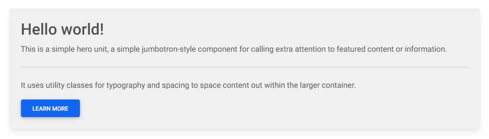
Basic example
<!-- Jumbotron -->
<div class="p-4 shadow-4 rounded-3" style="background-color: hsl(0, 0%, 94%);">
  <h2>Hello world!</h2>
  <p>
    This is a simple hero unit, a simple jumbotron-style component for calling extra
    attention to featured content or information.
  </p>

  <hr class="my-4" />

  <p>
    It uses utility classes for typography and spacing to space content out within the
    larger container.
  </p>
  <button type="button" class="btn btn-primary">
    Learn more
  </button>
</div>
<!-- Jumbotron -->
How to use?
Download MDB 5 - free UI KIT
Choose your favourite customized component and click on the image
Copy & paste the code into your MDB project
▶️ Subscribe to YouTube channel for web development tutorials & resources
More examples
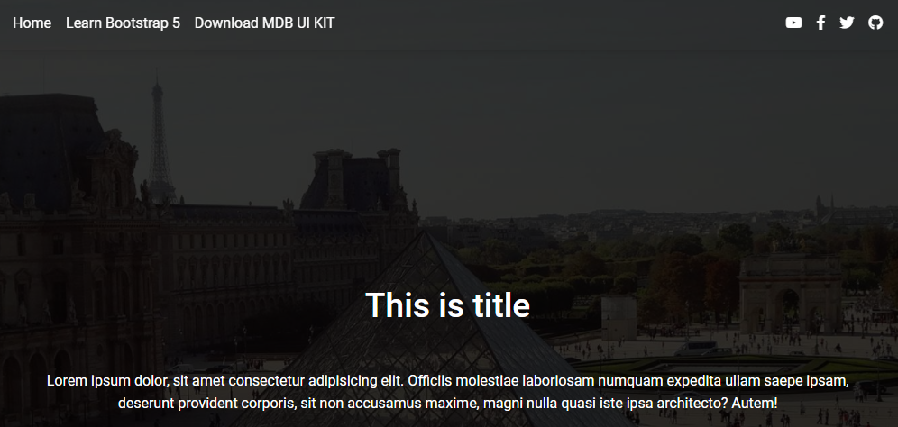
Bootstrap Jumbotron Background image:

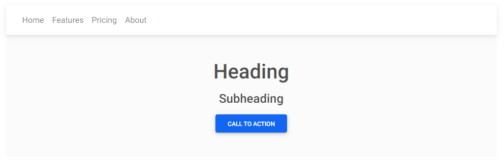
Bootstrap Jumbotron With navbar:
Bootstrap Jumbotron Background image with navbar:

Bootstrap Jumbotron Fixed navbar:

Bootstrap Jumbotron Animated navbar: