npm package discovery and stats viewer.

Discover Tips

  • General search

    [free text search, go nuts!]

  • Package details

    pkg:[package-name]

  • User packages

    @[username]

Sponsor

Optimize Toolset

I’ve always been into building performant and accessible sites, but lately I’ve been taking it extremely seriously. So much so that I’ve been building a tool to help me optimize and monitor the sites that I build to make sure that I’m making an attempt to offer the best experience to those who visit them. If you’re into performant, accessible and SEO friendly sites, you might like it too! You can check it out at Optimize Toolset.

About

Hi, 👋, I’m Ryan Hefner  and I built this site for me, and you! The goal of this site was to provide an easy way for me to check the stats on my npm packages, both for prioritizing issues and updates, and to give me a little kick in the pants to keep up on stuff.

As I was building it, I realized that I was actually using the tool to build the tool, and figured I might as well put this out there and hopefully others will find it to be a fast and useful way to search and browse npm packages as I have.

If you’re interested in other things I’m working on, follow me on Twitter or check out the open source projects I’ve been publishing on GitHub.

I am also working on a Twitter bot for this site to tweet the most popular, newest, random packages from npm. Please follow that account now and it will start sending out packages soon–ish.

Open Software & Tools

This site wouldn’t be possible without the immense generosity and tireless efforts from the people who make contributions to the world and share their work via open source initiatives. Thank you 🙏

© 2024 – Pkg Stats / Ryan Hefner

bootstrap-modal-size

v1.0.1

Published

Responsive popup window sizing with Bootstrap 5. Modal width, modal height, fullscreen modal, large modal with lg & xl modal classes and more.

Downloads

19

Readme

Responsive popup window sizing with Bootstrap 5. Modal width, modal height, fullscreen modal, large modal with lg & xl modal classes and more.

Check out Modal Size Documentation for detailed instructions & even more examples.

Modal Size

Modals have three optional sizes, available via modifier classes to be placed on a .modal-dialog. These sizes kick in at certain breakpoints to avoid horizontal scrollbars on narrower viewports.

Bootstrap Modal Size

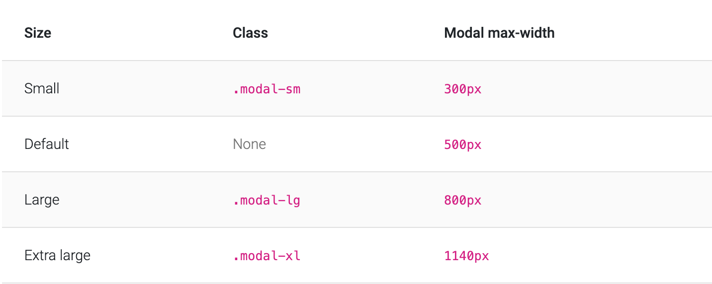
<div class="modal-dialog modal-xl">...</div>
<div class="modal-dialog modal-lg">...</div>
<div class="modal-dialog modal-sm">...</div>

Fullscreen Modal

Another override is the option to pop up a modal that covers the user viewport, available via modifier classes that are placed on a .modal-dialog.

Bootstrap Modal Size

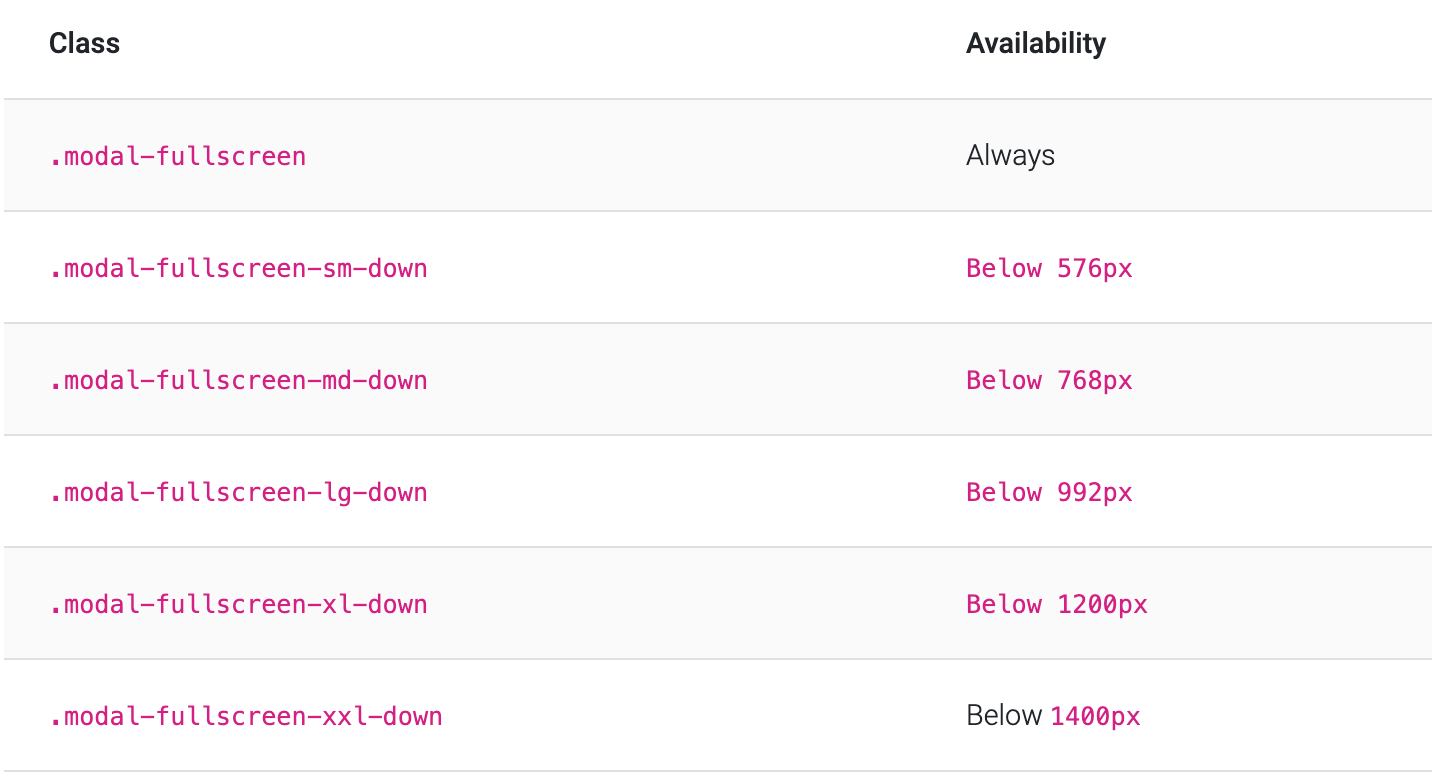
<!-- Full screen modal -->
<div class="modal-dialog modal-fullscreen-sm-down">...</div>

How to use?

  1. Download MDB 5 - free UI KIT

  2. Choose your favourite customized component and click on the image

  3. Copy & paste the code into your MDB project

▶️ Subscribe to YouTube channel for web development tutorials & resources


More extended Bootstrap documentation