
bootstrap-padding
v1.0.1
Published
Responsive Padding styles and classes for Bootstrap 5. Examples of padding left, right, top, bottom, between columns and rows, grid padding, RTL support & more.
Maintainers
 mdbootstrap
Readme
Responsive Padding styles and classes for Bootstrap 5. Examples of padding left, right, top, bottom, between columns and rows, grid padding, RTL support & more.
Before reading this helper page make sure that you have checked out the main documentation pages for Gutters - padding between your columns, used to responsively space and align content in the Bootstrap grid system. Spacing - shorthand responsive margin and padding utility classes to modify an element’s appearance. The links above contain more comprehensive and structured explanations of padding & margin use in Bootstrap 5, this helper page will only provide you with quick examples.
Check out Bootstrap Padding Documentation for detailed instructions & even more examples.
Padding classes
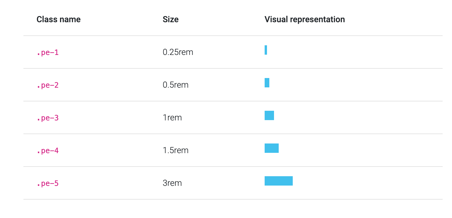
Add padding values to an element or a subset of its sides using shortcode classes. Individual top, bottom, left, right as well as horizontal, vertical and "add to all sides" properties are supported. Classes range from .25rem to 3rem and are based on the default Sass map.
MDB supports RTL, so for example, for the padding on the right: you have to use the class pe-* (padding end) instead of pr-* (padding right). Thanks to this notation, your padding will be inverted for users with right-to-left setting enabled. You can learn more about Right to Left support in our RTL docs.
Below is an example using classes for the right padding (padding at the end) with a visual representation of their sizes. The same sizes apply to all directions (left, right, top, bottom).
How to use?
Download MDB 5 - free UI KIT
Choose your favourite customized component and click on the image
Copy & paste the code into your MDB project
▶️ Subscribe to YouTube channel for web development tutorials & resources