bootstrap-side-navbar
v1.0.0
Published
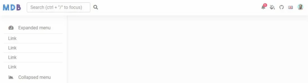
The side navigation component built wit the latest Bootstrap 5 provides an easy way to navigate through your website.
Maintainers
 mdbootstrap
Readme
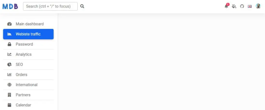
Side Navbar is an additional navigation component that provides extensive support and a clear way for navigating through complex websites with hundreds of links and subpages.
Check out Bootstrap Side Navbar Documentation for detailed instructions & even more examples.
Basic example
<!--Main Navigation-->
<header>
  <!-- Sidebar -->
  <nav id="sidebarMenu" class="collapse d-lg-block sidebar collapse bg-white">
    <div class="position-sticky">
      <div class="list-group list-group-flush mx-3 mt-4">
        <a
          href="#"
          class="list-group-item list-group-item-action py-2 ripple"
          aria-current="true"
        >
          <i class="fas fa-tachometer-alt fa-fw me-3"></i><span>Main dashboard</span>
        </a>
        <a href="#" class="list-group-item list-group-item-action py-2 ripple active">
          <i class="fas fa-chart-area fa-fw me-3"></i><span>Webiste traffic</span>
        </a>
        <a href="#" class="list-group-item list-group-item-action py-2 ripple"
          ><i class="fas fa-lock fa-fw me-3"></i><span>Password</span></a
        >
        <a href="#" class="list-group-item list-group-item-action py-2 ripple"
          ><i class="fas fa-chart-line fa-fw me-3"></i><span>Analytics</span></a
        >
        <a href="#" class="list-group-item list-group-item-action py-2 ripple">
          <i class="fas fa-chart-pie fa-fw me-3"></i><span>SEO</span>
        </a>
        <a href="#" class="list-group-item list-group-item-action py-2 ripple"
          ><i class="fas fa-chart-bar fa-fw me-3"></i><span>Orders</span></a
        >
        <a href="#" class="list-group-item list-group-item-action py-2 ripple"
          ><i class="fas fa-globe fa-fw me-3"></i><span>International</span></a
        >
        <a href="#" class="list-group-item list-group-item-action py-2 ripple"
          ><i class="fas fa-building fa-fw me-3"></i><span>Partners</span></a
        >
        <a href="#" class="list-group-item list-group-item-action py-2 ripple"
          ><i class="fas fa-calendar fa-fw me-3"></i><span>Calendar</span></a
        >
        <a href="#" class="list-group-item list-group-item-action py-2 ripple"
          ><i class="fas fa-users fa-fw me-3"></i><span>Users</span></a
        >
        <a href="#" class="list-group-item list-group-item-action py-2 ripple"
          ><i class="fas fa-money-bill fa-fw me-3"></i><span>Sales</span></a
        >
      </div>
    </div>
  </nav>
  <!-- Sidebar -->

  <!-- Navbar -->
  <nav id="main-navbar" class="navbar navbar-expand-lg navbar-light bg-white fixed-top">
    <!-- Container wrapper -->
    <div class="container-fluid">
      <!-- Toggle button -->
      <button
        class="navbar-toggler"
        type="button"
        data-mdb-toggle="collapse"
        data-mdb-target="#sidebarMenu"
        aria-controls="sidebarMenu"
        aria-expanded="false"
        aria-label="Toggle navigation"
      >
        <i class="fas fa-bars"></i>
      </button>

      <!-- Brand -->
      <a class="navbar-brand" href="#">
        <img
          src="https://mdbcdn.b-cdn.net/img/logo/mdb-transaprent-noshadows.webp"
          height="25"
          alt="MDB Logo"
          loading="lazy"
        />
      </a>
      <!-- Search form -->
      <form class="d-none d-md-flex input-group w-auto my-auto">
        <input
          autocomplete="off"
          type="search"
          class="form-control rounded"
          placeholder='Search (ctrl + "/" to focus)'
          style="min-width: 225px;"
        />
        <span class="input-group-text border-0"><i class="fas fa-search"></i></span>
      </form>

      <!-- Right links -->
      <ul class="navbar-nav ms-auto d-flex flex-row">
        <!-- Notification dropdown -->
        <li class="nav-item dropdown">
          <a
            class="nav-link me-3 me-lg-0 dropdown-toggle hidden-arrow"
            href="#"
            id="navbarDropdownMenuLink"
            role="button"
            data-mdb-toggle="dropdown"
            aria-expanded="false"
          >
            <i class="fas fa-bell"></i>
            <span class="badge rounded-pill badge-notification bg-danger">1</span>
          </a>
          <ul
            class="dropdown-menu dropdown-menu-end"
            aria-labelledby="navbarDropdownMenuLink"
          >
            <li>
              <a class="dropdown-item" href="#">Some news</a>
            </li>
            <li>
              <a class="dropdown-item" href="#">Another news</a>
            </li>
            <li>
              <a class="dropdown-item" href="#">Something else here</a>
            </li>
          </ul>
        </li>

        <!-- Icon -->
        <li class="nav-item">
          <a class="nav-link me-3 me-lg-0" href="#">
            <i class="fas fa-fill-drip"></i>
          </a>
        </li>
        <!-- Icon -->
        <li class="nav-item me-3 me-lg-0">
          <a class="nav-link" href="#">
            <i class="fab fa-github"></i>
          </a>
        </li>

        <!-- Icon dropdown -->
        <li class="nav-item dropdown">
          <a
            class="nav-link me-3 me-lg-0 dropdown-toggle hidden-arrow"
            href="#"
            id="navbarDropdown"
            role="button"
            data-mdb-toggle="dropdown"
            aria-expanded="false"
          >
            <i class="united kingdom flag m-0"></i>
          </a>
          <ul class="dropdown-menu dropdown-menu-end" aria-labelledby="navbarDropdown">
            <li>
              <a class="dropdown-item" href="#"
                ><i class="united kingdom flag"></i>English
                <i class="fa fa-check text-success ms-2"></i
              ></a>
            </li>
            <li><hr class="dropdown-divider" /></li>
            <li>
              <a class="dropdown-item" href="#"><i class="poland flag"></i>Polski</a>
            </li>
            <li>
              <a class="dropdown-item" href="#"><i class="china flag"></i>中文</a>
            </li>
            <li>
              <a class="dropdown-item" href="#"><i class="japan flag"></i>日本語</a>
            </li>
            <li>
              <a class="dropdown-item" href="#"><i class="germany flag"></i>Deutsch</a>
            </li>
            <li>
              <a class="dropdown-item" href="#"><i class="france flag"></i>Français</a>
            </li>
            <li>
              <a class="dropdown-item" href="#"><i class="spain flag"></i>Español</a>
            </li>
            <li>
              <a class="dropdown-item" href="#"><i class="russia flag"></i>Русский</a>
            </li>
            <li>
              <a class="dropdown-item" href="#"><i class="portugal flag"></i>Português</a>
            </li>
          </ul>
        </li>

        <!-- Avatar -->
        <li class="nav-item dropdown">
          <a
            class="nav-link dropdown-toggle hidden-arrow d-flex align-items-center"
            href="#"
            id="navbarDropdownMenuLink"
            role="button"
            data-mdb-toggle="dropdown"
            aria-expanded="false"
          >
            <img
              src="https://mdbcdn.b-cdn.net/img/Photos/Avatars/img (31).webp"
              class="rounded-circle"
              height="22"
              alt="Avatar"
              loading="lazy"
            />
          </a>
          <ul
            class="dropdown-menu dropdown-menu-end"
            aria-labelledby="navbarDropdownMenuLink"
          >
            <li>
              <a class="dropdown-item" href="#">My profile</a>
            </li>
            <li>
              <a class="dropdown-item" href="#">Settings</a>
            </li>
            <li>
              <a class="dropdown-item" href="#">Logout</a>
            </li>
          </ul>
        </li>
      </ul>
    </div>
    <!-- Container wrapper -->
  </nav>
  <!-- Navbar -->
</header>
<!--Main Navigation-->

<!--Main layout-->
<main style="margin-top: 58px;">
  <div class="container pt-4"></div>
</main>
<!--Main layout-->
body {
background-color: #fbfbfb;
}
@media (min-width: 991.98px) {
main {
padding-left: 240px;
}
}
/* Sidebar */
.sidebar {
position: fixed;
top: 0;
bottom: 0;
left: 0;
padding: 58px 0 0; /* Height of navbar */
box-shadow: 0 2px 5px 0 rgb(0 0 0 / 5%), 0 2px 10px 0 rgb(0 0 0 / 5%);
width: 240px;
z-index: 600;
}
@media (max-width: 991.98px) {
.sidebar {
width: 100%;
}
}
.sidebar .active {
border-radius: 5px;
box-shadow: 0 2px 5px 0 rgb(0 0 0 / 16%), 0 2px 10px 0 rgb(0 0 0 / 12%);
}
.sidebar-sticky {
position: relative;
top: 0;
height: calc(100vh - 48px);
padding-top: 0.5rem;
overflow-x: hidden;
overflow-y: auto; /* Scrollable contents if viewport is shorter than content. */
}How to use?
Download MDB 5 - free UI KIT
Choose your favourite customized component and click on the image
Copy & paste the code into your MDB project
▶️ Subscribe to YouTube channel for web development tutorials & resources
More examples
Bootstrap Side Navbar Collapse: