
bootstrap-switch-button
v1.1.0
Published
Bootstrap Switch Button is a bootstrap 4 plugin that converts checkboxes into switch button toggles.
Maintainers
 brentely
Readme


Bootstrap Switch Button
Bootstrap Switch Button converts plain checkboxes into awesome switch buttons.
Library Distributions
Project |Description -------------------------------------------------------------------------------------------|------------------------------------------------------- bootstrap4-toggle | Supports bootstrap4 (requires jQuery) bootstrap-switch-button | Supports bootstrap4+ (ES6 class, no dependencies) bootstrap-switch-button-react | Supports bootstrap4+ (React component, no dependencies)
Demos
Demos and API Docs: https://gitbrent.github.io/bootstrap-switch-button/
Installation
CDN
<link href="https://cdn.jsdelivr.net/gh/gitbrent/[email protected]/css/bootstrap-switch-button.min.css" rel="stylesheet">
<script src="https://cdn.jsdelivr.net/gh/gitbrent/[email protected]/js/bootstrap-switch-button.min.js"></script>
Download
NPM
npm i bootstrap-switch-button -- saveYarn
yarn add bootstrap-switch-buttonUsage
Initialize With HTML
Simply add data-toggle="switchbutton" to automatically convert a plain checkbox into a bootstrap 4 switch button.
<input id="chkSwitch" type="checkbox" data-toggle="switchbutton">Initialize With Code
Switch buttons can also be initialized via JavaScript code.
EX: Initialize id chkSwitch with a single line of JavaScript.
<input id="chkSwitch" type="checkbox" checked>
<script>
  $(function(){
    $('#chkSwitch').switchbutton();
  });
</script>
API
Options
- Options can be passed via data attributes or JavaScript
- For data attributes, append the option name to
data-(ex:data-onlabel="Enabled")
<input type="checkbox" data-toggle="switchbutton" data-onlabel="Enabled" data-offlabel="Disabled">
<input type="checkbox" id="switch-two">
<script>
  $(function() {
    $('#switch-two').switchButton({
      onlabel: 'Enabled',
      offlabel: 'Disabled'
    });
  })
</script>
Name |Type |Default |Description |
----------|-----------|----------|----------------------------|
onlabel |string/html|"On" |Text of the on switch button
offlabel|string/html|"Off" |Text of the off switch button
onstyle |string |"primary" |Style of the on switch button. Possible values are: primary,secondary,success,danger,warning,info,light,dark
offstyle|string |"light" |Style of the off switch button. Possible values are: primary,secondary,success,danger,warning,info,light,dark
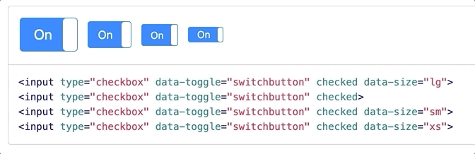
size |string |"normal" |Size of the switch button. Possible values are: large, normal, small, mini.
style |string | |Appends the value to the class attribute of the switch button. This can be used to apply custom styles. Refer to Custom Styles for reference.
width |integer |null |Sets the width of the switch button. if set to null, width will be auto-calculated.
height |integer |null |Sets the height of the switch button. if set to null, height will be auto-calculated.
Methods
Methods can be used to control switch buttons directly.
<input id="switch-demo" type="checkbox" data-toggle="switchbutton">Method |Example |Description
-----------|---------------------------------------------|------------------------------------------
initialize | $('#switch-demo').switchButton() |Initializes the switch button plugin with options
destroy | $('#switch-demo').switchButton('destroy') |Destroys the switch button
on | $('#switch-demo').switchButton('on') |Sets the switch button to 'On' state
off | $('#switch-demo').switchButton('off') |Sets the switch button to 'Off' state
toggle | $('#switch-demo').switchButton('toggle') |Toggles the state of the switch button on/off
enable | $('#switch-demo').switchButton('enable') |Enables the switch button
disable | $('#switch-demo').switchButton('disable') |Disables the switch button
Events
Event Propagation
Note All events are propagated to and from input element to the switch button.
You should listen to events from the <input type="checkbox"> directly rather than look for custom events.
<input id="switch-event" type="checkbox" data-toggle="switchbutton">
<div id="console-event"></div>
<script>
  $(function() {
    $('#switch-event').change(function() {
      $('#console-event').html('Checked?: ' + $(this).prop('checked'))
    })
  })
</script>
API vs Input
This also means that using the API or Input to trigger events will work both ways.
<input id="switch-trigger" type="checkbox" data-toggle="switchbutton">
<button class="btn btn-success" onclick="toggleApiOn()" >On by API</button>
<button class="btn btn-danger"  onclick="toggleApiOff()">Off by API</button>
<button class="btn btn-success" onclick="toggleInpOn()" >On by Input</button>
<button class="btn btn-danger"  onclick="toggleInpOff()">Off by Input</button>
<script>
  function toggleApiOn() {
    $('#switch-trigger').switchButton('on')
  }
  function toggleApiOff() {
    $('#switch-trigger').switchButton('off')
  }
  function toggleInpOn() {
    $('#switch-trigger').prop('checked', true).change()
  }
  function toggleInpOff() {
    $('#switch-trigger').prop('checked', false).change()
  }
</script>