bootstrap-timeline
v1.0.0
Published
Horizontal and vertical examples of responsive Timelines built with the latest Bootstrap 5. Easy to use and customize.
Maintainers
 mdbootstrap
Readme
Responsive Timelines built with the latest Bootstrap 5. Horizontal and vertical examples. Easy to use and customize.
Check out Bootstrap Timeline Documentation for detailed instructions & even more examples.
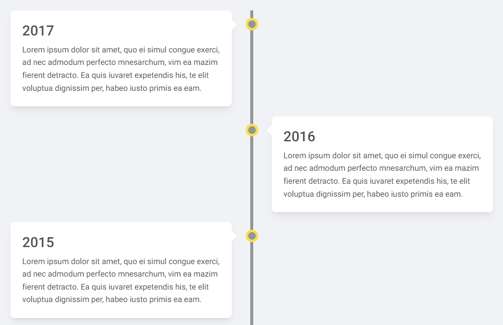
Basic example
<section style="background-color: #F0F2F5;">
  <div class="container py-5">
    <div class="main-timeline">
      <div class="timeline left">
        <div class="card">
          <div class="card-body p-4">
            <h3>2017</h3>
            <p class="mb-0">Lorem ipsum dolor sit amet, quo ei simul congue exerci, ad nec admodum perfecto mnesarchum, vim ea mazim fierent detracto. Ea quis iuvaret expetendis his, te elit voluptua dignissim per, habeo iusto primis ea eam.</p>
          </div>
        </div>
      </div>
      <div class="timeline right">
        <div class="card">
          <div class="card-body p-4">
            <h3>2016</h3>
            <p class="mb-0">Lorem ipsum dolor sit amet, quo ei simul congue exerci, ad nec admodum perfecto mnesarchum, vim ea mazim fierent detracto. Ea quis iuvaret expetendis his, te elit voluptua dignissim per, habeo iusto primis ea eam.</p>
          </div>
        </div>
      </div>
      <div class="timeline left">
        <div class="card">
          <div class="card-body p-4">
            <h3>2015</h3>
            <p class="mb-0">Lorem ipsum dolor sit amet, quo ei simul congue exerci, ad nec admodum perfecto mnesarchum, vim ea mazim fierent detracto. Ea quis iuvaret expetendis his, te elit voluptua dignissim per, habeo iusto primis ea eam.</p>
          </div>
        </div>
      </div>
      <div class="timeline right">
        <div class="card">
          <div class="card-body p-4">
            <h3>2012</h3>
            <p class="mb-0">Lorem ipsum dolor sit amet, quo ei simul congue exerci, ad nec admodum perfecto mnesarchum, vim ea mazim fierent detracto. Ea quis iuvaret expetendis his, te elit voluptua dignissim per, habeo iusto primis ea eam.</p>
          </div>
        </div>
      </div>
      <div class="timeline left">
        <div class="card">
          <div class="card-body p-4">
            <h3>2011</h3>
            <p class="mb-0">Lorem ipsum dolor sit amet, quo ei simul congue exerci, ad nec admodum perfecto mnesarchum, vim ea mazim fierent detracto. Ea quis iuvaret expetendis his, te elit voluptua dignissim per, habeo iusto primis ea eam.</p>
          </div>
        </div>
      </div>
      <div class="timeline right">
        <div class="card">
          <div class="card-body p-4">
            <h3>2007</h3>
            <p class="mb-0">Lorem ipsum dolor sit amet, quo ei simul congue exerci, ad nec admodum perfecto mnesarchum, vim ea mazim fierent detracto. Ea quis iuvaret expetendis his, te elit voluptua dignissim per, habeo iusto primis ea eam.</p>
          </div>
        </div>
      </div>
    </div>
  </div>
</section>
/* The actual timeline (the vertical ruler) */
.main-timeline {
position: relative;
}
/* The actual timeline (the vertical ruler) */
.main-timeline::after {
content: '';
position: absolute;
width: 6px;
background-color: #939597;
top: 0;
bottom: 0;
left: 50%;
margin-left: -3px;
}
/* Container around content */
.timeline {
position: relative;
background-color: inherit;
width: 50%;
}
/* The circles on the timeline */
.timeline::after {
content: '';
position: absolute;
width: 25px;
height: 25px;
right: -13px;
background-color: #939597;
border: 5px solid #F5DF4D;
top: 15px;
border-radius: 50%;
z-index: 1;
}
/* Place the container to the left */
.left {
padding: 0px 40px 20px 0px;
left: 0;
}
/* Place the container to the right */
.right {
padding: 0px 0px 20px 40px;
left: 50%;
}
/* Add arrows to the left container (pointing right) */
.left::before {
content: " ";
position: absolute;
top: 18px;
z-index: 1;
right: 30px;
border: medium solid white;
border-width: 10px 0 10px 10px;
border-color: transparent transparent transparent white;
}
/* Add arrows to the right container (pointing left) */
.right::before {
content: " ";
position: absolute;
top: 18px;
z-index: 1;
left: 30px;
border: medium solid white;
border-width: 10px 10px 10px 0;
border-color: transparent white transparent transparent;
}
/* Fix the circle for containers on the right side */
.right::after {
left: -12px;
}
/* Media queries - Responsive timeline on screens less than 600px wide */
@media screen and (max-width: 600px) {
/* Place the timelime to the left */
.main-timeline::after {
left: 31px;
}
/* Full-width containers */
.timeline {
width: 100%;
padding-left: 70px;
padding-right: 25px;
}
/* Make sure that all arrows are pointing leftwards */
.timeline::before {
left: 60px;
border: medium solid white;
border-width: 10px 10px 10px 0;
border-color: transparent white transparent transparent;
}
/* Make sure all circles are at the same spot */
.left::after, .right::after {
left: 18px;
}
.left::before {
right: auto;
}
/* Make all right containers behave like the left ones */
.right {
left: 0%;
}
}How to use?
Download MDB 5 - free UI KIT
Choose your favourite customized component and click on the image
Copy & paste the code into your MDB project
▶️ Subscribe to YouTube channel for web development tutorials & resources
More examples
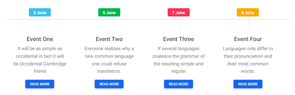
Bootstrap Horizontal timeline:
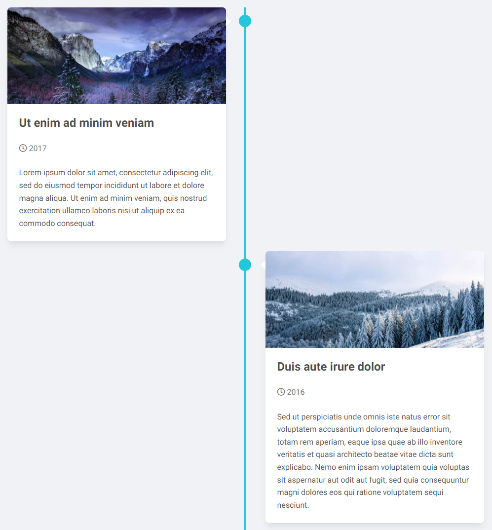
Bootstrap Timeline with images:
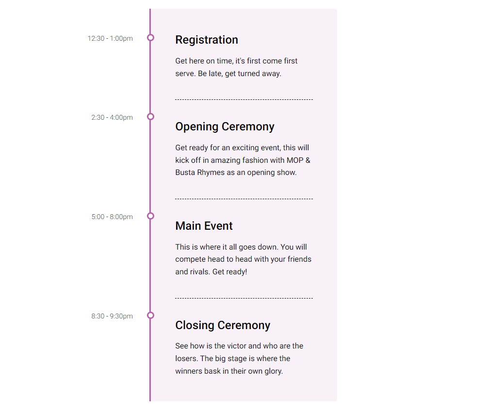
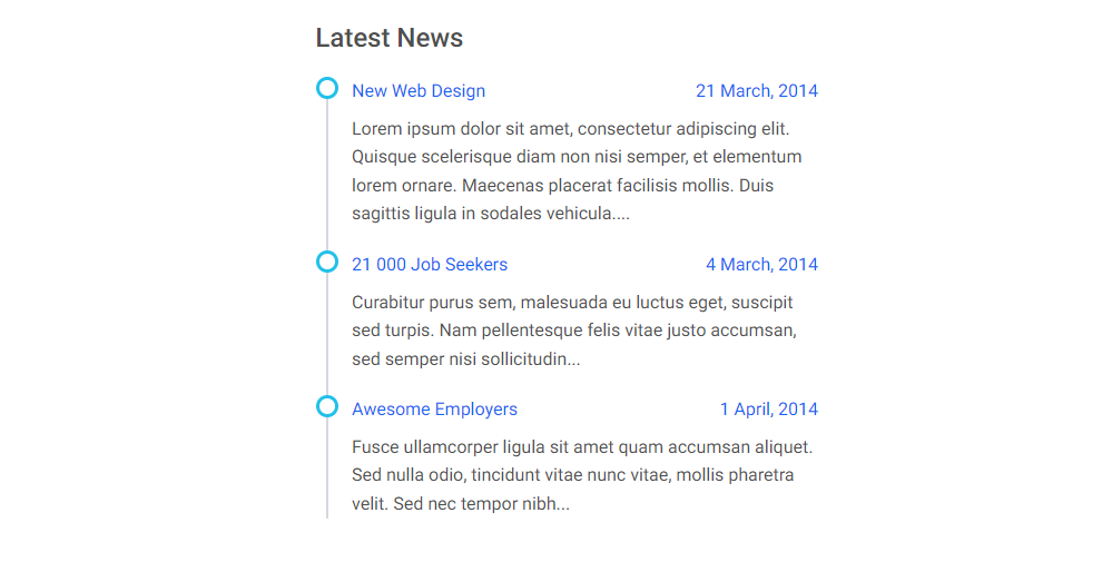
Bootstrap Timeline latest news:
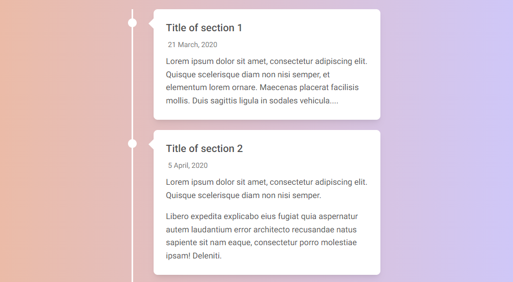
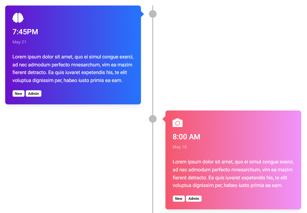
Bootstrap Timeline gradient cards:
Bootstrap Timeline gradient background: