
bootstrap-ui-theme
v1.0.3
Published
Bootstrap 5 with HeroUI, shadcn/ui, NuxtUI v4 themes

Maintainers
 hopegiver
Readme
Bootstrap UI Theme


Drop-in Bootstrap 5 themes that look like HeroUI, shadcn/ui, and NuxtUI v4.
No framework migration. No markup changes. Just swap the CSS/JS files.
Why Bootstrap UI Theme?
Modern design systems like HeroUI, shadcn/ui, and NuxtUI are built for React or Vue. If you're working on a server-rendered project (PHP, Django, Rails, plain HTML) or maintaining a legacy Bootstrap site, adopting those design systems means a full framework migration.
Bootstrap UI Theme bridges that gap — you get the look and feel of those design systems while keeping your Bootstrap 5 markup exactly as-is.
- No HTML changes — all existing Bootstrap class names work as-is
- No JavaScript rewrite — Bootstrap JS stays the same
- One file swap — replace the CSS/JS pair and you're done
Themes
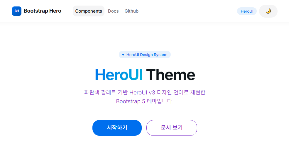
| Theme | Style | Dark Mode | |-------|-------|-----------| | HeroUI | Blue palette, rounded, modern | Yes | | shadcn/ui | Neutral gray, minimal, clean | Yes | | NuxtUI v4 | Practical, production-ready | Yes |
Live Demos
| Theme | Preview | |-------|---------| | HeroUI | heroui.html | | shadcn/ui | shadcn.html | | NuxtUI v4 | nuxtui.html |
Usage
Option A — CDN (recommended)
Pick one theme and add it to your HTML:
<!DOCTYPE html>
<html lang="en">
<head>
  <meta charset="UTF-8">
  <meta name="viewport" content="width=device-width, initial-scale=1.0">
  <title>My App</title>
  <!-- Pick one theme -->
  <link rel="stylesheet" href="https://unpkg.com/bootstrap-ui-theme/dist/heroui.css">
</head>
<body>
  <!-- Your Bootstrap 5 markup goes here, unchanged -->
  <button class="btn btn-primary">Hello</button>

  <script src="https://unpkg.com/bootstrap-ui-theme/dist/heroui.js"></script>
</body>
</html>
Available theme URLs:
https://unpkg.com/bootstrap-ui-theme/dist/heroui.css
https://unpkg.com/bootstrap-ui-theme/dist/heroui.js

https://unpkg.com/bootstrap-ui-theme/dist/shadcn.css
https://unpkg.com/bootstrap-ui-theme/dist/shadcn.js

https://unpkg.com/bootstrap-ui-theme/dist/nuxtui.css
https://unpkg.com/bootstrap-ui-theme/dist/nuxtui.js
Option B — npm
npm i bootstrap-ui-theme<link rel="stylesheet" href="node_modules/bootstrap-ui-theme/dist/heroui.css">
<script src="node_modules/bootstrap-ui-theme/dist/heroui.js"></script>Option C — Download
Download the files from dist/ in the GitHub repository and reference them locally.
Then write Bootstrap 5 markup as usual — no changes needed.
Dark Mode
All themes support dark mode via a toggle button included in main.js. The current mode is persisted in localStorage.
To set dark mode programmatically:
// Enable dark mode
document.documentElement.setAttribute('data-theme', 'dark');
document.documentElement.setAttribute('data-bs-theme', 'dark');

// Disable dark mode
document.documentElement.removeAttribute('data-theme');
document.documentElement.removeAttribute('data-bs-theme');
Development
Prerequisites
- Node.js 18+
- npm
Setup
git clone https://github.com/hopegiver/bootstrap-ui-theme.git
cd bootstrap-ui-theme
npm install
Dev server (with HMR)
npm run dev:heroui
npm run dev:shadcn
npm run dev:nuxtui
Build
npm run build:heroui      # build HeroUI only
npm run build:shadcn      # build shadcn/ui only
npm run build:nuxtui      # build NuxtUI v4 only
npm run build             # build all themes
Output goes to dist/ as {theme}.css + {theme}.js pairs.
Tech Stack
- Bootstrap 5 — base framework
- Vite — bundler (multi-mode)
- Sass/SCSS — style preprocessing
- Autoprefixer — vendor prefixes
Design Principles
- Bootstrap classes are never renamed — themes override only CSS variables and properties
- Custom classes only when Bootstrap has no equivalent — added in
_components.scss - Full Bootstrap component coverage — Accordion, Alert, Badge, Breadcrumb, Button, Card, Carousel, Dropdown, Modal, Navbar, Pagination, Toast, Tooltip, and more
License
MIT