
borodindk-react-js-pager
v2.0.1
Published
React library to alows users to navigate through pages of data.
Maintainers
 borodindk
Readme
react-js-pager


- React library to alows users to navigate through pages of data.
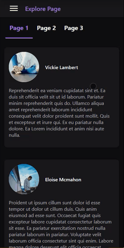
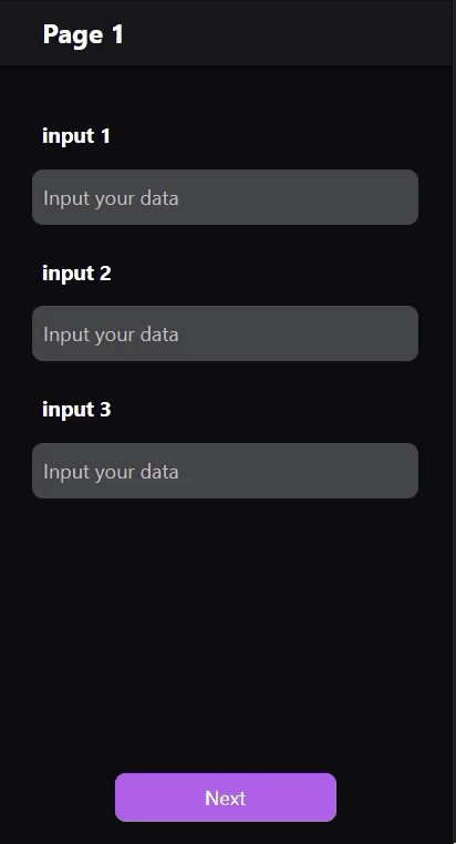
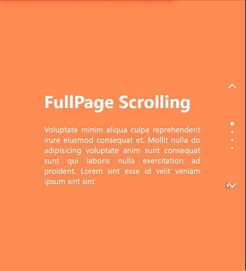
- Best for creating tabs, image slider, fullPage scrolling and more.

Installation
npm install react-js-pager
Usage
- Note: If you have pages with different heights, give them a style with
height: 100%andoverflow: autoto make sure that the scrollbar will show on the pages not on the pager wrapper element.
//...
import Pager from 'react-js-pager';

export default function App() {
  let pagerMethods = null;

  const next_page_handle = () => {
    if (pagerMethods !== null) pagerMethods.next();
  };

  const previous_page_handle = () => {
    if (pagerMethods !== null) pagerMethods.previous();
  };

  const set_page_handle = pageIndex => {
    if (pagerMethods !== null) pagerMethods.setPage(pageIndex);
  };

  return (
    <>
      <div id='pager'>
        <Pager
          ref={node => (pagerMethods = node)}
          orientation='horizontal'
          animationStyle='scroll'
          wrapperStyle={{ width: '300px' }}
        >
          {/* Page with index (0) */}
          <div className='pageContainer'>...Page0 Content</div>

          {/* Page with index (1) */}
          <div className='pageContainer'>...Page1 Content</div>

          {/* Page with index (2) */}
          <div className='pageContainer'>...Page2 Content</div>
        </Pager>
      </div>
    </>
  );
}
Props
orientation : [ 'horizontal' | 'vertical' ] [optional]
- Set
horizontalorverticalpages arrangement orientation. - If you set it to
verticalmake sure to provide aheightvalue inwrapperStyleprop otherwise it will be set to50vhby default. - Default Value
horizontal
initialPage : [Number] [optional]
- Index of initial page that should be selected on the first render.
- Default Value
0
loop : [Boolean] [optional]
- Loop scrolling between pages.
- Note: Loop scrolling does not work for touch swipe/drag gestures.
- Default Value
false
touchGestures : [Boolean] [optional]
- Whether to enable or disable swipe/drag gestures for touch screens.
- Default Value
true
wrapperStyle : [Object] [optional]
- Pager wrapper element inline style.
- You can also use
idorclassNameattributes to add style from CSS StyleSheet. - Note: Pager wrapper element has a flex box style by default.
wheelScroll : [Boolean] [optional]
- Change pages by rotating mouse scroll wheel.
- Default Value
true
wheelScrollWithAnimation : [Boolean] [optional]
- Whether to use animation when changing pages with mouse scroll wheel or not.
- Default Value
true
showScrollbar : [Boolean] [optional]
- Whether to show or hide Pager scrollbar.
- Will show scrollbar on the bottom for
horizontalorientation and on the left forverticalorientation. - Default Value
false
animationStyle : [ 'blur' | 'opacity' | 'scroll' | 'scale' | 'scaleX' | 'scaleY' | 'rotateX' | 'rotateY' ] [optional]
- Animation style when navigating through pages.
- Note: touch swipe/drag gestures always uses
scrollanimation style. - Default Value
scroll
perspective : [Number] [optional]
- 3d transform perspective value used only for
rotateXandrotateYanimation style. - Default Value
1000
duration : [Number] [optional]
- Navigation animation duration in ms.
- Default Value
300
ease : [ String | Function ] [optional]
- Navigation animation transition timing function.
- Check easings.net to learn more.
- Default Value
easeOutExpo - If you want to provide your own timing-function make sure that the function takes one parameter and returns one value.
function easeInQuad(x) {
  return x * x;
}
onAnimation : [ ( event: Object ) => void ] [optional]
- This callback will be called every time animation frame changes, including touch swipe/drag gestures.
| Event props | Description | Type |
| :-------------------: | ---------------------------------------------------------- | :-----: |
| animationPercentage | Animation progress percentage, a value between (0 - 1). | Number |
| selectedPageIndex | The page index that will be navigated to. | Number |
| previousPageIndex | The page index that will be navigated from. | Number |
| touchSwipe | Whether the animation is coming from a touch swipe or not. | Boolean |
onNavigationStart : [ ( selectedPageIndex: Number, previousPageIndex: Number ) => void ] [optional]
- This callback will be called once the pager starts navigating to the selected page.
- Note: this callback will be called on the first render too.
| Params | Description | Type |
| :-----------------: | ------------------------------------------- | :----: |
| selectedPageIndex | The page index that will be navigated to. | Number |
| previousPageIndex | The page index that will be navigated from. | Number |
onPageSelected : [ ( selectedPageIndex: Number, previousPageIndex: Number ) => void ] [optional]
- This callback will be called once the pager finishes navigating to the selected page.
- Note: this callback will be called on the first render too.
| Params | Description | Type |
| :-----------------: | ----------------------------------- | :----: |
| selectedPageIndex | The page index that navigated to. | Number |
| previousPageIndex | The page index that navigated from. | Number |
onPagerScroll : [ ( event: Object ) => void ] [optional]
- Executed when transitioning between pages (ether because the animation for the requested page has changed or when the user is swiping/dragging between pages).
- This is usefull for animating pages/tabs/slides indicators among other things.
| Event props | Description | Type |
| :------------: | ------------------------------------------------------------------------ | :----: |
| percentageX | Pager scrolled length percentage on the X axis, a value between (0 - 1). | Number |
| percentageY | Pager scrolled length percentage on the Y axis, a value between (0 - 1). | Number |
| scrollX | Pager current scrolling position on the X axis. | Number |
| scrollY | Pager current scrolling position on the Y axis. | Number |
| scrollWidth | Pager scroll width in px. | Number |
| scrollHeight | Pager scroll height in px. | Number |
| pagerWidth | Pager computed width in px. | Number |
| pagerHeight | Pager computed height in px. | Number |
| event | Pager onscroll native event. | Object |
Methods
next : ( withAnimation?: Boolean = true ) => void
- Navigate to the next page.
- Takes a boolean param to enable/disable animation.
previous : ( withAnimation?: Boolean = true ) => void
- Navigate to the previous page.
- Takes a boolean param to enable/disable animation.
setPage : ( pageIndex: Number, withAnimation?: Boolean = true ) => void
- Navigate to a specific page index.
- Takes a number param (pageIndex) and a boolean param to enable/disable animation.