
bs_vue_confirm_dialog
v0.2.5
Published
simple action confirm
Maintainers
 mfsanchez
Readme

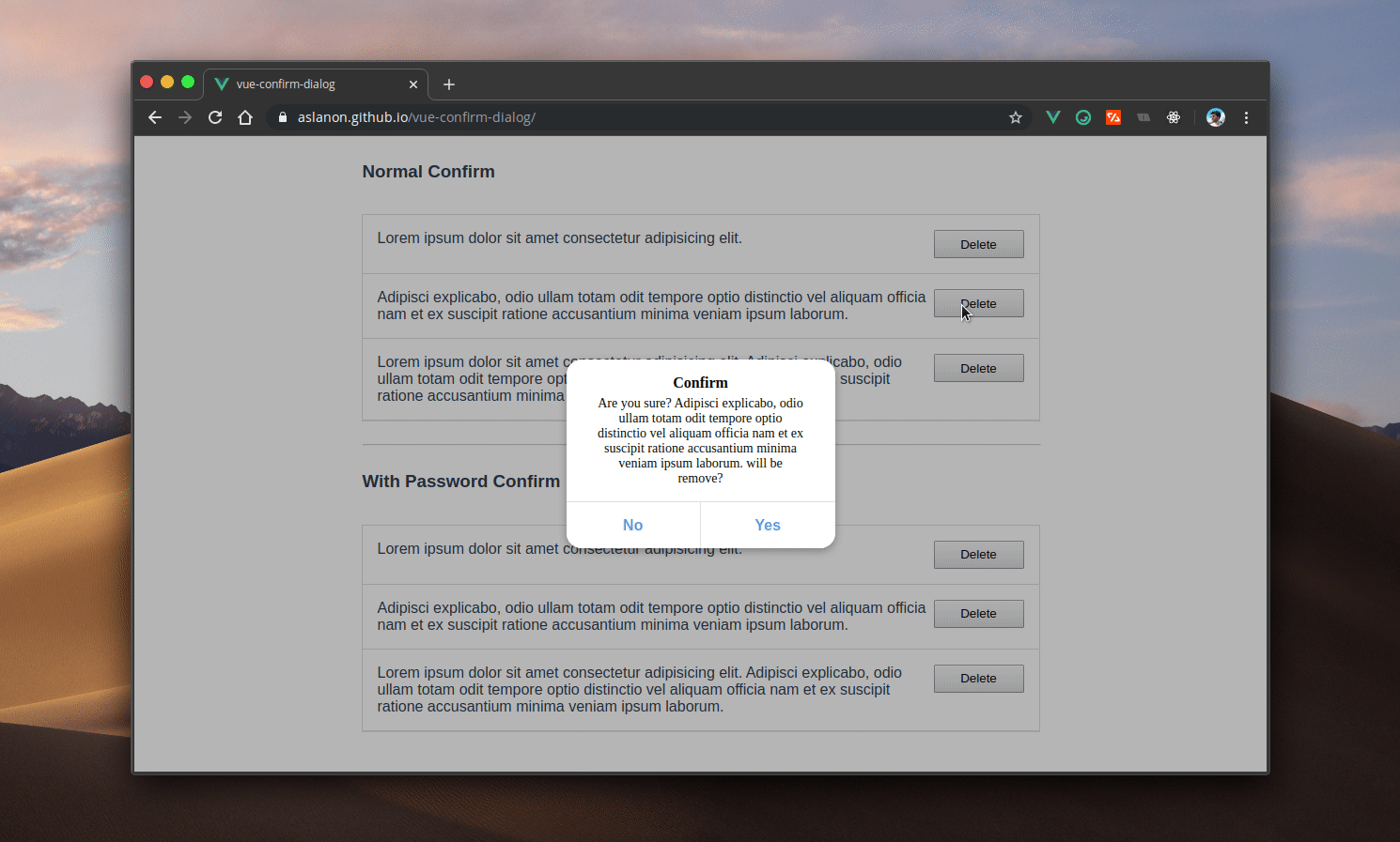
Vue.js Confirm Dialog
Demo: https://aslanon.github.io/vue-confirm-dialog/
Install
npm install --save vue-confirm-dialogQuick Start Usage
(you can use with Nuxt.js)
In main.js:
import Vue from "vue";
import VueConfirmDialog from "vue-confirm-dialog";

Vue.use(VueConfirmDialog);
In App.vue (or in the template file for Nuxt.js (layout/default.vue)):
<vue-confirm-dialog></vue-confirm-dialog>In any of functions :
methods: {
  ...
    handleClick(){
      let self = this
      this.$vueConfirm.confirm(
        {
          auth: false,
          message: `Are you sure?`,
          button: {
            no: 'No',
            yes: 'Yes'
          }
        },
        function(confirm) {
          if (confirm == true) {
            // ... do some thing
          }
        }
      )
    }
	...
  }
API
// for scope
let self = this

this.$vueConfirm.confirm(
    {
        // If you want to password confirm, this key must be true.
        auth: true,

        // This is the message the user will see
        message: 'foo',

        // You can replace the button text.
        button: {
            yes: 'Yes',
            no: 'Cancel'
        }

    },

    // This is callback function.The first parameter (confirm) is returned confirmed or
    // not confirmed state. And if you are using password confirm, second parameter of
    // this function will return password from dialog input.
    function(confirm, password){

      // This action was confirmed from user, user clicked to 'yes' button
    	if (confirm == true) {
        // ...do some thing
        if (password == USER_PASSWORD) // ...do some thing

      }

    }


)
Use only for confirmation
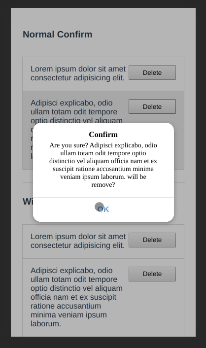
If you want to use only for confirmation;
methods: {
  ...
    handleClick(){
      let self = this
      this.$vueConfirm.confirm(
        {
          title: 'Information',
          message: 'This content has been removed',

          // If you want to use only for confirmation and you want of see one button in 		  // dialog, you can use only one of  'no' or 'yes' object keys.
          button: {
          	yes: 'OK', // or use to no: 'OK'
          }

        },
        function(confirm) {
          if (confirm == true) {
            self.$vueConfirm.close()
          }
        }
      )
    }
	...
  }
Style
.vc-title {
  color: black !important;
  padding: 0 1rem !important;
  width: 100% !important;
  font-weight: 900 !important;
  text-align: center !important;
  font-size: 16px !important;
  line-height: initial !important;
  margin-bottom: 5px !important;
}

.vc-text {
  color: black !important;
  padding: 0 1rem !important;
  width: 100% !important;
  font-weight: 500 !important;
  text-align: center !important;
  font-size: 14px !important;
  line-height: initial !important;
}

.vc-overlay {
  background: rgba(0, 0, 0, 0.29);
  width: 100%;
  height: 100%;
  transition: all 0.1s ease-in;
  left: 0;
  top: 0;
  z-index: 999999999999;
  position: fixed;
  display: flex;
  justify-content: center;
  align-items: center;
  align-content: baseline;
}

.vc-container {
  background: white;
  border-radius: 1rem;
  width: 286px;
  height: auto;
  display: grid;
  grid-template-rows: 1fr auto;
  box-shadow: rgba(0, 0, 0, 0.29) 0px 3px 8px 0px;
}

.vc-text-grid {
  padding: 1rem;
}

.vc-btn-grid {
  width: 100%;
  display: grid;
  grid-template-columns: 1fr 1fr;
  height: 50px;
  border-radius: 0 0 1rem 1rem;
  overflow: hidden;
}

.vc-btn-grid.isMono {
  grid-template-columns: 1fr;
}

.vc-btn {
  border-radius: 0 0 1rem 0;
  color: cornflowerblue;
  background: white;
  border: 0;
  font-size: 1rem;
  border-top: 1px solid rgb(224, 224, 224);
  cursor: pointer;
  font-weight: 700;
  outline: none;
}

.vc-btn:hover {
  background: whitesmoke;
}

.vc-btn:disabled {
  background: whitesmoke;
}

.vc-btn:active {
  box-shadow: inset 0 2px 0px 0px #00000014;
}

.vc-btn.left {
  border-radius: 0;
  /* color: black; */
  border-right: 1px solid #e0e0e0;
}

.vc-input[type="password"] {
  width: 100%;
  outline: none;
  border-radius: 8px;
  height: 35px;
  border: 0;
  margin: 5px 0;
  background-color: #ebebeb;
  padding: 0 0.5rem;
  font-size: 16px;
  transition: 0.21s ease;
}

.vc-input[type="password"]:hover,
.vc-input[type="password"]:focus {
  background-color: #dfdfdf;
}