build-plugin-component
v1.12.2
Published
build plugin for component development


Keywords
Readme
build-plugin-component
通过 build-scripts 和 build-plugin-component 支持业务组件(即 NPM 包)的开发,功能:
- 支持构建 ES5 + ES Module 产物,对应
es/,使用 babel 构建 - 支持构建 ES5 + Commonjs 产物,对应
lib/,使用 babel 构建 - 支持构建 UMD 产物,对应
dist/,使用 webpack 构建 - 支持使用 markdown 写 demo 同时构建文档产物,对应
build/,使用 webpack 构建
该方案同时支持 React 和 Rax 业务组件开发,如果是开发 Rax 组件请查阅 Rax 官方文档,本文档主要介绍 React 组件开发。
目录
创建组件
通过命令行初始化一个业务组件项目:
# 安装全局 CLI
$ npm i -g iceworks
# 新建组件文件夹
$ mkdir my-component && cd my-component
# 初始化
$ iceworks init component如果是阿里内部的同学并且想接入 DEF 发布 NPM 包,可以参考文档 组件开发接入 DEF
组件调试构建
$ cd my-component
$ npm install
$ npm start

# 实时编译 lib&es 产物
$ npm start -- --watch

# 实时编译 dist 产物
$ npm start -- --watch-dist

# 启动 https 服务
$ npm start -- --https

# 跳过 demo 构建
$ npm start -- --skip-demo
$ npm build -- --skip-demo

# 跳过自动打开预览链接
$ npm start -- --disable-open
组件目录
目录结构
├── src/                  # 组件源码
│  └── index.js
├── demo                  # 组件 demo
│  └── usage.md
├── lib/                  # 构建产物,编译为 ES5 + Commonjs 规范的代码
├── es/                   # 构建产物,编译为 ES5 + ES Module 规范的代码
├── dist/                 # 构建产物,UMD 相关产物,默认不生成,需要通过设置 library 参数开启
├── build/                # 构建产物,用于组件文档预览
├── build.json            # 工程配置
├── README.md
└── package.json
组件入口
组件入口文件为 src/index.tsx:
import React from 'react';

export default function ExampleComponent(props) {
  const { type, ...others } = props;
  return <>Hello</>;
}
样式文件
默认生成样式文件为 src/index.css,根据需求可调整成 sass 或 less 文件。
推荐在 src/index.tsx 中引入组件样式:
import React from 'react';
+ import './index.css';

export default function ExampleComponent(props) {}
组件 demo
组件的 demo 演示文件,位于 demo 目录下,使用 yaml-markdown 语法。可以通过修改默认的 usage.md 来调整组件 demo,或通过增加 example.md 文件来创建多个 demo。
每个 demo 的格式如下:
---
title: Simple Usage
order: 1
---

本 demo 演示一行文字的用法。

```jsx
import React from 'react';
import ReactDOM from 'react-dom';
import ExampleComponent from 'my-component';

function App() {
  return <ExampleComponent />;
}

ReactDOM.render(<App />, mountNode);
```
组件文档
在执行 npm run build 时,会通过 demo/ 以及 README.md 生成 build/index.html,将 html 进行托管即可完整预览组件的文档。
以 @icedesign/qrcode 组件的文档为例,通过 unpkg 的服务即可查阅文档:文档地址 。
注意:构建 build 会加长 npm run build 的时间,如不需要可通过 --skip-demo 的命令行参数关闭。
工程配置
基于 build-scripts 的项目统一使用 build.json 作为工程配置的文件:
{
  "type": "react",
  "plugins": [["build-plugin-component"]]
}
通过 build-plugin-component 这个基础插件,我们支持了以下配置项:
alias
- 类型:object
- 默认值:
{}
{
  "alias": {
    "@": "./src"
  }
}
babelPlugins
- 类型:array
- 默认值:[]
注意:该选项仅影响 es/lib 目录构建产物,如需要修改 demo 预览时的 babel 配置,请通过 webpack-chain 形式进行自定义。
devServer
- 类型:object
- 默认值:
{ hot: true, disableHostCheck: true, clientLogLevel: 'silent' }
同 webpack devServer 配置,自定义配置将会与默认配置合并。
filename
- 类型: string
- 默认值:
null
如果打包 library 到 dist 目录,用来配置打包文件的名字。
library
- 类型: string
- 默认值:
null
如果打包 library 到 dist 目录,用来配置 library 名字。
libraryExport
- 类型: string
- 默认值:
null
如果打包 library 到 dist 目录,用来配置 library 出口配型,如可配置 default,对应的组件出口为 export default MyComponent。
libraryTarget
- 类型: string
- 默认值:
null
如果打包 library 到 dist 目录,用来配置 library 的类型,如 umd、amd 等。
sourceMap
- 类型: boolean
- 默认值:
false
如果打包 library 到 dist 目录,用来配置是否产出 sourceMap 文件。
define
- 类型:object
- 默认:
null
minify
- 类型:boolean
- 默认:
false
如果打包 library 到 dist 目录,配置打包文件是否压缩。
generateTypesForJs
- 类型:boolean
- 默认值:
false
htmlInjection
- 类型:object
- 默认值:
{}
向 demo 预览的 html 里注入内容,比如插入一些静态脚本等:
{
  "htmlInjection": {
    "headAppend": [
      "<script src='http://foo.com/a.js' />",
      "<link href='http://foo.com/a.css' />"
    ],
    "headPrepend": [],
    "bodyAppend": [],
    "bodyPrepend": [],
  }
}
externals
- 类型: object
- 默认值:
null
如果打包 library 到 dist 目录,用来配置是否需要外部 externals,用来避免三方包被打包。
babelOptions
- 类型:array
- 默认值:[]
比如修改 preset-env 的配置:
{
  "babelOptions": [{ "name": "@babel/preset-env", "options": { "module": false } }]
}
注意 babelOptions 仅影响 es/lib 目录构建产物,如需要修改 demo 预览时的 babel 配置,请通过 webpack-chain 形式进行自定义
basicComponents
- 类型: array
- 默认值:
[] - 备注:当设置
disableGenerateStyle: true时,该功能也会随之关闭
插件内置了 ['antd', '@alifd/next'] 两个 NPM 包,开发者配置的数组会跟内置数组做合并。配置在该数组里的 NPM 包会在构建时经过 babel-plugin-import 处理,也就是会经过一下转换:
// src/index.tsx
import { Button } from 'antd';

      ↓ ↓ ↓ ↓ ↓ ↓

// es/index.js
import Button from 'antd/es/button';
// lib/index.js
var _button = require('antd/lib/button');
应用级的项目在使用 webpack + babel-loader 时,一般都会设置 exclude: /node_modules/ 的选项,这会导致 babel-plugin-import 无法处理 NPM 包里的此类语法,因此我们在 NPM 包打包时前置做了该项转换。
当下的构建工具都已经内置支持 tree-shaking,不再需要使用 babel-plugin-import 做一层转换,因此该选项不推荐使用,建议通过设置 disableGenerateStyle: true 来关闭该能力。
disableGenerateStyle
- 类型:boolean
- 默认值:false
- 备注:推荐将该选项置为 true
如果不设置该选项或者设置为 false,组件打包时会自动分析 src/ 代码并生成 [es|lib]/style.js 的文件,内容格式如下:
// es/style.js
import '@formily/next-components/esm/time-picker/style';
import '@alifd/next/es/input/style';
import '@alifd/next/es/tag/style';
代码里依赖的 NPM 包符合下述规则之一则会被生成到 style.js 中:
- 配置在 basicComponents 中的包名,如
antd,@alifd/next - 对应包的 package.json 里有
stylePath字段
功能设计初衷:假设业务组件依赖了 antd 里面的 N 个组件,在应用项目里使用该业务组件时如何有效引入 antd 这 N 个组件的样式?要么显视的一个一个 import,要么直接引入 antd 的全量样式,前者手写成本太高,后者无法按需引入样式,因此我们设计了这个功能,项目里只需要引入这个业务组件的 style.js 即可(如果使用了 icejs 框架那么应用会自动分析并引入 style.js,开发者完全不需要关心样式引入问题)。
经过一些实践之后,我们发现按需引入大包组件样式的收益并不大,参考 issue,另外还会引入一些复杂的工程问题,因此我们不再推荐使用该能力,建议应用项目里直接全量引入大包(antd/fusion)组件的样式。
subComponents
- 类型:Boolean
- 默认值:false
是否包含子组件,一般用于开发类似 fusion/antd 这种大包,开启该选项之后,会为每个组件生成对应的 style.js 文件。
demoTemplate
- 类型:array | string
- 默认值:
template-component-demo
插件内置了 npm 包 template-component-demo 作为组件开发及构建时的 demo 预览,可以通过指定 demoTemplate 对进行自定义。
demo 预览组件默认接受如下参数:
readmeData:readme.md 文件中的解析数据demoData:demo 文件夹下 markdowm 内容解析的数据env:当前运行环境development|productiontemplateProps:模版自定义参数,可以通过设置"demoTemplate": ["template-component-demo", { "platform": "h5" }]的方式为模版定义参数
docGenIncludes
- 类型:Array
- 默认值:
[]
使用 react-docgen 自动生成 demo api 预览。需要配置代码扫描路径才会生效,例如:
{
  "plugins": ["build-plugin-component"],
  "docGenIncludes": ["src/*.tsx"]
}
便会扫描代码文件 src 文件夹下的所有 *.tsx 文件(不包含子文件夹):
interface ComponentProps {
  /** Title of the example  */
  title: string;
  /** Type of the example  */
  type?: 'native' | 'hybrid';
}

export default function ExampleComponent(props: ComponentProps) {
  ...
}
则会生成对应的 api 预览:
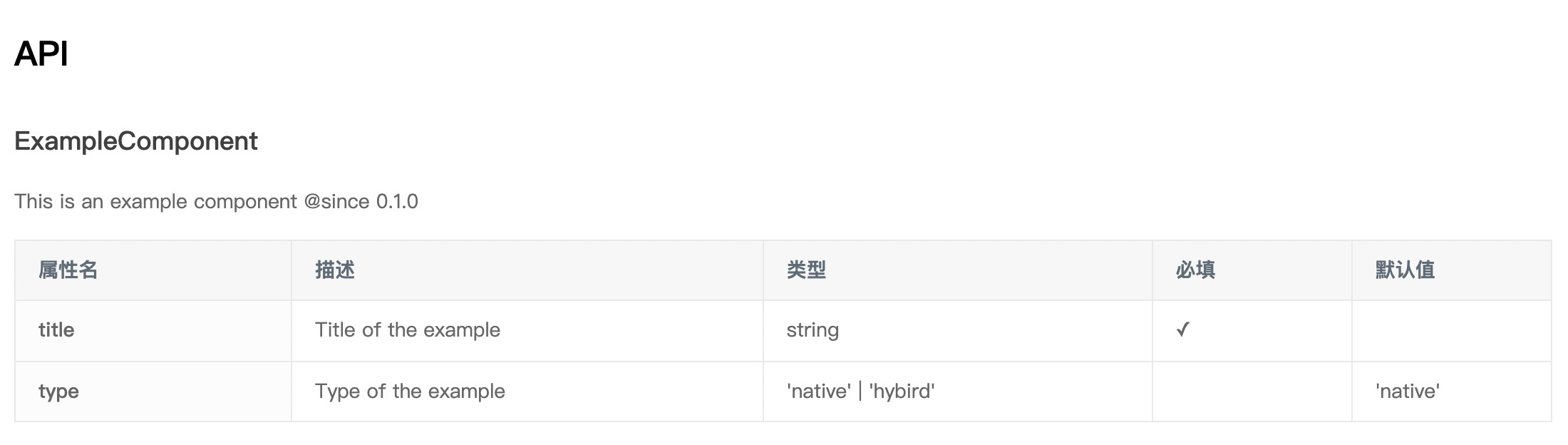
该能力目前支持 PropType、TypeScript 等方式的类型注解,具体可详见 react-docgen 文档。需要注意的是,react-docgen 不支持为匿名组件生成 api 预览:
// 不支持匿名组件
export default (props: ComponentProps) => {
  ...
}
如果是多组件项目,且配置了多页文档,例如文件结构为:
- demo
- List
- usage.md
- customize-styles.md
- List
可以在 demo/List/ 下面新建 api.md 文件,并在头部配置此页面包含哪些接口文档。(正文可以留空,也可以补充内容)
---
title: 列表组件 API
order: 3
docGenIncludes:
  - src/components/List.tsx
  - src/components/ListItem.tsx
---
版本升级
0.x -> 1.x
[email protected] 完全向前兼容,因此直接修改 package.json 中的对应依赖即可。
高阶用法
定制 demo 样式
demo/usage.md:
---
title: Simple Usage
order: 1
---

```jsx
ReactDOM.render(<div className="ttt">hello<>, mountNode);
```

+ ```css
+ .ttt {
+   background: red;
+ }
+ ```
使用 js/ts 文件编写 demo
新建 demo/usage.jsx:
import React from 'react';
import ReactDOM from 'react-dom';
import ExampleComponent from 'my-component';

function App() {
  return <ExampleComponent />;
}

export default App;
修改 demo/usage.md:
---
title: Simple Usage
order: 1
---

本 demo 演示一行文字的用法。

```jsx
+ <DemoCode src="./usage.jsx" />
```
工程上将自动将路径中的源码获取,并展示在 Demo 预览页面中。通过上述的方式开发 Demo 可以享受编辑器带来的代码提示、语法高亮等便捷功能。
生成 UMD 文件
通过设置工程上的 UMD 的相关配置,可以将业务组件以 UMD 模块方式打包,比如对上述示例组件进行设置:
{
"library": "ExampleComponent",
"libraryTarget": "umd"
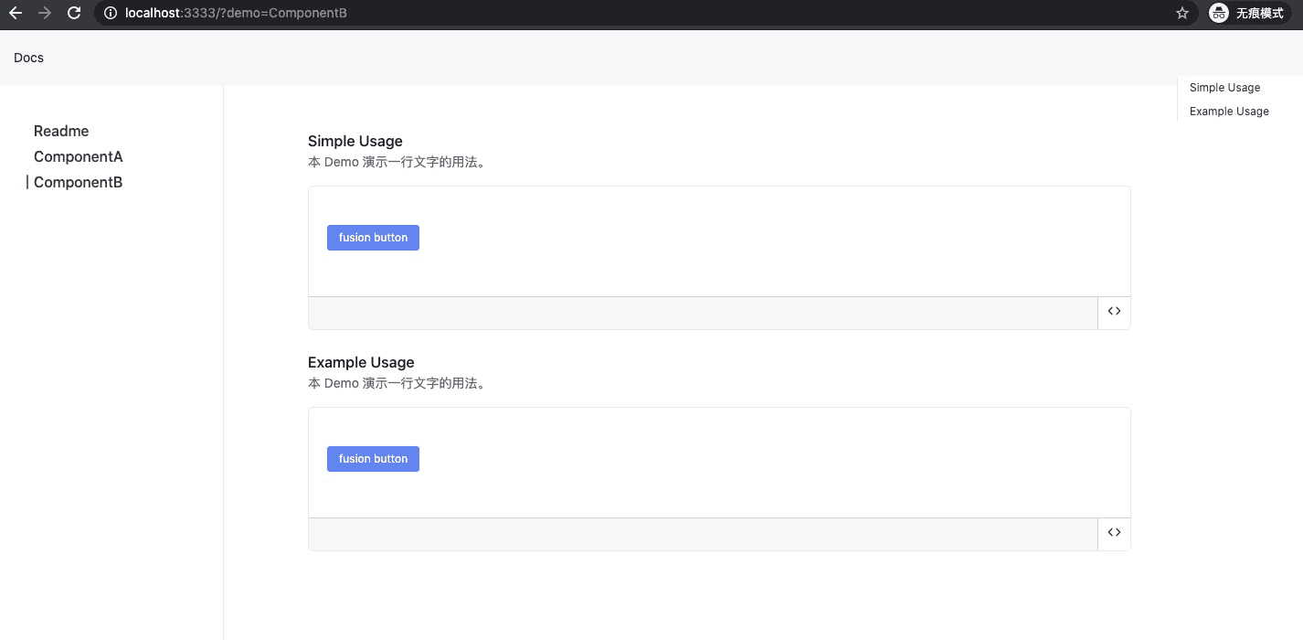
}多组件文档
默认情况下,demo/ 目录里的文件都是扁平的,适合展示单个组件的文档,比如:
demo/
├── simple.md
└── usage.md
但是某些情况下,我们的业务组件可能会导出多个组件,此时可以通过目录嵌套来展示多个组件的文档:
├── demo/
│   ├── ComponentA/
│   │  ├── simple.md
│   │  └── simple2.md
│   ├── ComponentB/
│   │  ├── simple.md
│   └──└── simple2.md
最终效果如下,其中每个目录对应一个组件,即左侧的一个导航: