
byte-datepicker
v2.2.2
Published
A lightweight, elegant, and highly customizable React datepicker component library with support for both month/year and full date selection.
Downloads
78
Maintainers
 rahmannugar
Readme
ByteDatePicker v2
Byte Datepicker V2 is live!
The new version includes a complete architectural refactor, a brand new design system, and improved developer experience.
What's new in v2
ByteDatePicker v2 is built with a focus on performance, clarity, and developer experience. The component features a modern design system with comprehensive theming support and a modular architecture.
Design System
The v2 design system implements a solid, high-contrast interface optimized for both light and dark environments:
- Color Palette: Blue primary (
#3b82f6) with gold accent (#f59e0b) for visual hierarchy - Surface Treatment: Opaque backgrounds with multi-tier shadow system (sm, md, lg, xl, 2xl) for depth perception
- Typography: Enhanced contrast ratios with refined font weights for improved readability
- Interactive States: Transform-based hover effects with cubic-bezier timing functions for smooth transitions
- Visual Feedback: Linear gradient backgrounds on selected states with inset highlights
Dark Mode Implementation
The dark mode theme uses a deep navy color scheme with optimized contrast ratios:
- Background:
#0f172abase with#1e293belevated surfaces - Color Adjustments: Lighter blue and gold variants calibrated for dark backgrounds
- Shadow System: Enhanced shadow depths with adjusted opacity for visibility
- Text Hierarchy: Improved contrast with dedicated secondary and muted text colors
- Overlay Treatment: Theme-specific overlay backgrounds for proper visual separation
Theme selection supports light, dark, or system modes via the theme prop, with system mode automatically detecting OS preferences.
User Experience Improvements
- Compact Layout: Reduced component dimensions with optimized spacing for modern interfaces
- Clearable Input: Optional clear functionality via
clearableprop - Selection Feedback: Proper visual state management for month/year selection modes
- Border Consistency: Uniform 1px border widths across all interactive elements
Architecture
- Component Structure: Modular design with separated concerns (CalendarHeader, DayGrid, MonthGrid, YearGrid)
- State Management: Custom
useDatePickerhook for reusable date selection logic - Type Safety: Full TypeScript implementation with comprehensive interface definitions
- Dependencies: Zero runtime dependencies beyond React peer dependencies
- Theming: CSS custom property-based theming system for easy customization
Byte DatePicker
A lightweight, elegant, and highly customizable React datepicker component with support for both month/year and full date selection.

🎬 Demo
✨ Features
- Lightweight - Minimal dependencies, small bundle size
- Highly Customizable - Easy to style and theme
- Responsive - Works great on mobile and desktop
- Accessible - Built with accessibility in mind
- Flexible - Month/year picker or full date picker modes
- Modern - Built with TypeScript and modern React patterns
- Beautiful UI - Clean, modern interface with smooth animations
- Custom Input Support - Use your own input/button with full control
- Display Formatting - Easily control how the date is displayed with flexible format tokens
Installation
npm install byte-datepickeryarn add byte-datepickerpnpm add byte-datepicker📖 Usage
Basic Usage
import React, { useState } from "react";
import ByteDatePicker, { DatePickerProps } from "byte-datepicker";
import "byte-datepicker/styles.css";

function App() {
  const [selectedDate, setSelectedDate] = useState<Date | null>(null);

  return (
    <div>
      <ByteDatePicker
        value={selectedDate}
        onChange={setSelectedDate}
        placeholder="Select a date"
      />
    </div>
  );
}
Month/Year Picker (Default)
Perfect for date of birth, expiry dates, or when you only need month and year:

import ByteDatePicker from "byte-datepicker";
import "byte-datepicker/styles.css";

function MonthYearPicker() {
  const [date, setDate] = useState<Date | null>(null);

  return (
    <ByteDatePicker
      value={date}
      onChange={setDate}
      placeholder="Select month and year"
      // includeDays={false} is the default
    />
  );
}
Full Date Picker with Days
For complete date selection including days:

import ByteDatePicker from "byte-datepicker";
import "byte-datepicker/styles.css";

function FullDatePicker() {
  const [date, setDate] = useState<Date | null>(null);

  return (
    <ByteDatePicker
      value={date}
      onChange={setDate}
      includeDays={true}
      placeholder="Select complete date"
    />
  );
}
Custom Input (Hide Default Input)
You can use your own input or button to trigger the datepicker and fully control its styling (e.g., with Tailwind CSS):
import React, { useState } from "react";
import ByteDatePicker from "byte-datepicker";
import "byte-datepicker/styles.css";

function CustomInputExample() {
  const [date, setDate] = useState<Date | null>(null);

  return (
    <ByteDatePicker
      value={date}
      onChange={setDate}
      hideInput
      formatString="dd-mm-yyyy" // Controls display format for formattedValue
    >
      {({ open, formattedValue }) => (
        <input
          readOnly
          value={formattedValue}
          placeholder="Pick a date"
          onClick={open}
          className="border border-blue-600 rounded-lg px-4 py-2 text-lg focus:ring-2 focus:ring-blue-400"
        />
      )}
    </ByteDatePicker>
  );
}hideInputhides the default input.- Use the
childrenrender prop to provide your own input or button. formattedValueis automatically formatted usingformatString.
Custom Display Formatting
You can control how the date is displayed in the input (default or custom) using the formatString prop.
Supported tokens (case-insensitive):
dd– day (e.g.,05)mm– numeric month (e.g.,08)mmm– short month name (e.g.,Aug)month– full month name (e.g.,August)yyyy– year (e.g.,2025)
Examples:
<ByteDatePicker
  value={date}
  onChange={setDate}
  formatString="yyyy/mm/dd" // e.g., 2025/08/14
/>
<ByteDatePicker
  value={date}
  onChange={setDate}
  formatString="dd-mm-yyyy" // e.g., 14-08-2025
/>
<ByteDatePicker
  value={date}
  onChange={setDate}
  formatString="mmm yyyy" // e.g., Aug 2025
/>
<ByteDatePicker
  value={date}
  onChange={setDate}
  formatString="month yyyy" // e.g., August 2025
/>
Note: Format tokens are case-insensitive (
mmm,MMM,mm,MM, etc. all work).
Controlled Component
function ControlledExample() {
  const [selectedDate, setSelectedDate] = useState<Date | null>(new Date());

  const handleDateChange = (date: Date | null) => {
    console.log("Selected date:", date);
    setSelectedDate(date);
  };

  return (
    <ByteDatePicker
      value={selectedDate}
      onChange={handleDateChange}
      placeholder="Pick a date"
    />
  );
}
Min/Max Date
You can restrict the selectable date range using the minDate and maxDate props.
You can pass either a Date object or a string in "YYYY-MM-DD" or "YYYY/MM/DD" format:
import ByteDatePicker from "byte-datepicker";
import "byte-datepicker/styles.css";

function LimitedRangePicker() {
  const [date, setDate] = useState<Date | null>(null);

  return (
    <ByteDatePicker
      value={date}
      onChange={setDate}
      minDate="2020-01-01" // or new Date(2020, 0, 1)
      maxDate="2030-12-31" // or new Date(2030, 11, 31)
      placeholder="Pick a date within range"
      includeDays={true}
    />
  );
}- Dates outside the range will be disabled in the picker.
Clearable Selection
You can add a clear button to the input by setting the clearable prop to true:
<ByteDatePicker
value={date}
onChange={setDate}
clearable={true}
placeholder="Select a date"
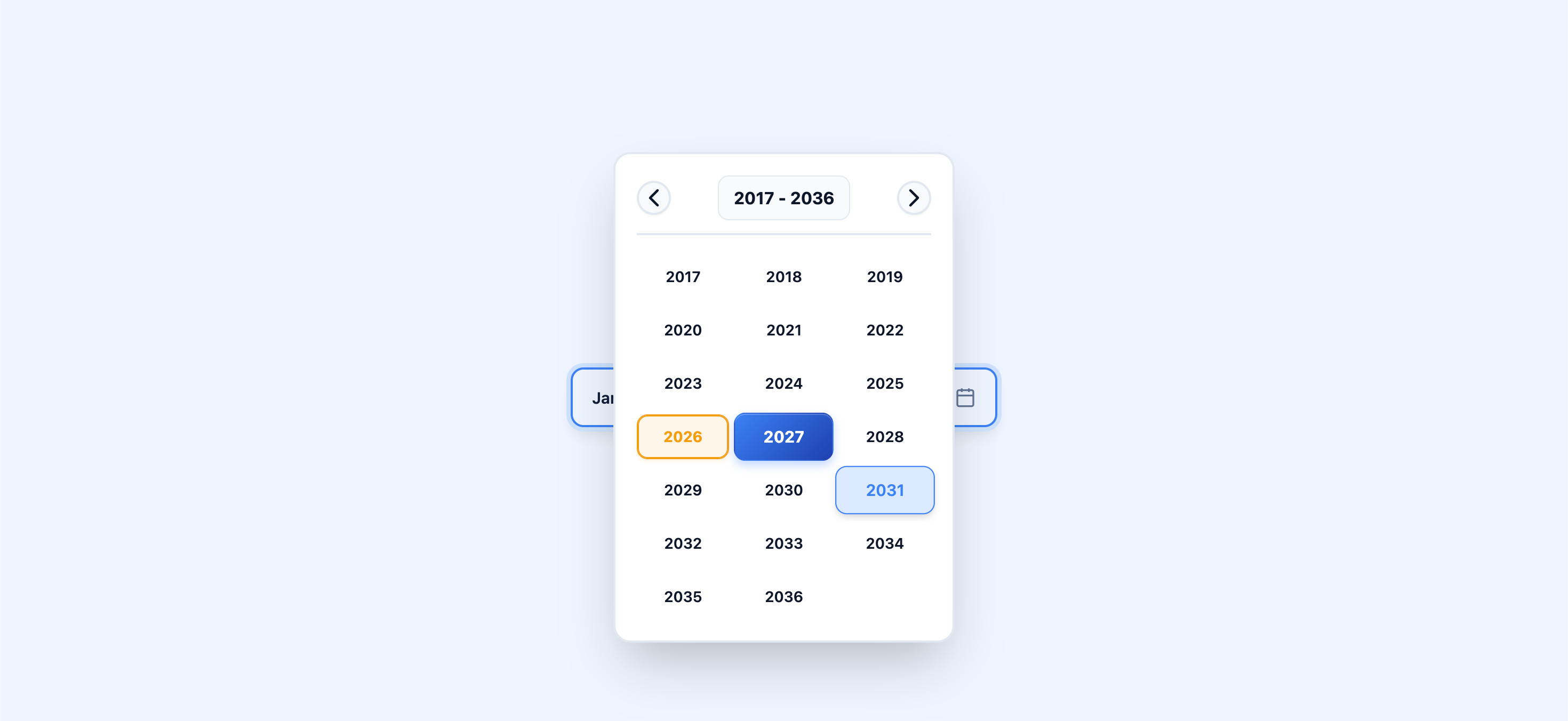
/>Year Only Picker
For scenarios where you only want users to select a year (e.g., graduation year, manufacturing year):
import ByteDatePicker from "byte-datepicker";
import "byte-datepicker/styles.css";

function YearOnlyPicker() {
  const [year, setYear] = useState<Date | null>(null);

  return (
    <ByteDatePicker
      value={year}
      onChange={setYear}
      yearOnly={true}
      placeholder="Select year"
      formatString="yyyy" // Only show year in input
    />
  );
}- Set
yearOnly={true}to show only the year selection grid. - The selected value will be a
Dateobject with January 1st of the selected year.
Using the useDatePicker Hook
For advanced use cases where you need full control over the datepicker's rendering and behavior, you can use the useDatePicker hook directly. This hook manages all the internal state and logic, allowing you to build completely custom datepicker UIs.
import { useDatePicker } from "byte-datepicker";

function CustomDatePicker() {
  const {
    selectedDate,
    currentYear,
    setCurrentYear,
    currentMonth,
    setCurrentMonth,
    isOpen,
    setIsOpen,
    viewMode,
    setViewMode,
    handleChange,
    toggleOpen,
    close,
    clear,
  } = useDatePicker({
    value: null,
    onChange: (date) => console.log("Selected:", date),
    includeDays: true,
    minDate: "2020-01-01",
    maxDate: "2030-12-31",
  });

  return (
    <div>
      <button onClick={toggleOpen}>
        {selectedDate ? selectedDate.toLocaleDateString() : "Pick a date"}
      </button>

      {isOpen && (
        <div className="custom-calendar">
          <div>
            <button onClick={() => setCurrentYear(currentYear - 1)}>←</button>
            <span>{currentYear}</span>
            <button onClick={() => setCurrentYear(currentYear + 1)}>→</button>
          </div>

          {/* Build your custom calendar UI here */}
          {/* Use the provided state and handlers */}

          <button onClick={close}>Close</button>
          <button onClick={clear}>Clear</button>
        </div>
      )}
    </div>
  );
}
Hook Return Values:
| Property | Type | Description |
| ----------------- | ------------------------------- | ------------------------------------------- |
| selectedDate | Date \| null | Currently selected date |
| currentYear | number | Year currently being viewed in the calendar |
| setCurrentYear | (year: number) => void | Update the year being viewed |
| currentMonth | number | Month currently being viewed (0-11) |
| setCurrentMonth | (month: number) => void | Update the month being viewed |
| isOpen | boolean | Whether the calendar dropdown is open |
| setIsOpen | (open: boolean) => void | Control the dropdown open state |
| viewMode | "days" \| "months" \| "years" | Current view mode of the calendar |
| setViewMode | (mode: ViewMode) => void | Switch between day, month, and year views |
| min | Date \| undefined | Normalized minimum date |
| max | Date \| undefined | Normalized maximum date |
| handleChange | (date: Date \| null) => void | Call this when a date is selected |
| toggleOpen | () => void | Toggle the dropdown open/closed |
| close | () => void | Close the dropdown and reset view mode |
| clear | () => void | Clear the selected date |
This hook is useful when you need to:
- Build a completely custom UI that doesn't match the default design
- Integrate with existing design systems or component libraries
- Implement custom calendar layouts or interactions
- Have fine-grained control over the datepicker's behavior
📋 Props
| Prop | Type | Default | Description |
| -------------- | ------------------------------- | --------------- | ----------------------------------------------------- |
| value | Date \| string \| null | null | The currently selected date |
| onChange | (date: Date \| null) => void | undefined | Callback function called when a date is selected |
| placeholder | string | "Select Date" | Placeholder text shown when no date is selected |
| disabled | boolean | false | Whether the datepicker is disabled |
| includeDays | boolean | false | Whether to show day selection (full date picker mode) |
| minDate | Date \| string | undefined | Minimum selectable date |
| maxDate | Date \| string | undefined | Maximum selectable date |
| formatString | string | undefined | Controls how the date is displayed (see tokens above) |
| hideInput | boolean | false | Hide the default input and use custom input |
| required | boolean | false | Makes the field required for form validation |
| name | string | undefined | Input name for form submission |
| onBlur | () => void | undefined | Called when the input loses focus |
| error | boolean | false | Whether the field has a validation error |
| className | string | "" | Custom class for the container |
| theme | 'light' \| 'dark' \| 'system' | 'light' | Toggles the UI theme |
| clearable | boolean | false | Shows a clear button in the input |
| children | (props) => React.ReactNode | undefined | Render prop for custom input (includes clear) |
| yearOnly | boolean | false | Show only year selection grid |
className Prop
You can use the className prop to add your own custom CSS class to the outer container of the datepicker.
This is useful for applying custom styles, layout.
Example:
<ByteDatePicker
  value={date}
  onChange={setDate}
  className="my-datepicker-custom-class"
  placeholder="Pick a date"
/>
This will render:
<div class="datepicker-container my-datepicker-custom-class">...</div>You can then target .my-datepicker-custom-class in your CSS to style the datepicker container as needed.
🗓️ Accepted Date Formats
You can pass a Date object, an ISO string ("YYYY-MM-DD"), or a date string that JavaScript's Date constructor can parse to the value, minDate, and maxDate props.
Examples of accepted values:
<ByteDatePicker value={new Date()} onChange={setDate} />
<ByteDatePicker value="2025-08-16" onChange={setDate} /> // ISO string
<ByteDatePicker value="June 2025" onChange={setDate} />  // Month and year
<ByteDatePicker value="2025" onChange={setDate} />       // Year only (Jan 1)
<ByteDatePicker value="2013-01-01" onChange={setDate} /> // ISO string
<ByteDatePicker value="25 Jan 2019" onChange={setDate} />// Day, month, year
Note:
- Short or ambiguous formats like
"jun 25"or"25/1/2019"may not work reliably in all browsers. - For best results, use ISO strings (
"YYYY-MM-DD"), full month names with year ("June 2025"), orDateobjects.
Styling
Important: You must import the CSS file for the component to display correctly:
import "byte-datepicker/styles.css";Custom Styling
The component uses CSS classes that you can easily override. Here are the main classes:
.byte-datepicker-container {
}
.byte-input {
}
.byte-input:hover {
}
.byte-input.disabled {
}
.byte-dropdown {
}
.byte-overlay {
}
.byte-cell {
}
.byte-cell.selected {
}
.byte-cell.today {
}
.byte-cell-lg {
}
Using Tailwind CSS or Custom CSS
- For the input: Use
hideInputand provide your own input/button with any Tailwind or custom classes. - For the calendar/dropdown: Override the provided CSS classes in your global stylesheet.
Theme Customization
ByteDatePicker v2 is built with CSS variables, making it easy to create custom themes or override specific styles.
Using the theme prop
The easiest way to toggle between light and dark modes is via the theme prop:
<ByteDatePicker theme="light" />(Default)<ByteDatePicker theme="dark" />- Forces dark mode.<ByteDatePicker theme="system" />- Automatically follows user OS preference.
Global Variable Overrides
You can override colors, radii, and fonts globally in your CSS:
:root {
  --byte-primary: #2563eb; /* Primary brand color */
  --byte-radius-lg: 12px; /* Container corners */
  --byte-font: "Inter", sans-serif;
}

/* Custom dark mode overrides */
.byte-dark {
  --byte-bg: #1e293b;
  --byte-dropdown-bg: #0f172a;
}
🌟 Examples
Integration with Forms
import { useForm, Controller } from "react-hook-form";
import ByteDatePicker from "byte-datepicker";
import "byte-datepicker/styles.css";

function FormExample() {
  const { control, handleSubmit } = useForm();

  return (
    <form onSubmit={handleSubmit(console.log)}>
      <Controller
        name="birthDate"
        control={control}
        render={({ field: { onChange, value } }) => (
          <ByteDatePicker
            value={value}
            onChange={onChange}
            placeholder="Select birth month/year"
          />
        )}
      />

      <Controller
        name="appointmentDate"
        control={control}
        render={({ field: { onChange, value } }) => (
          <ByteDatePicker
            value={value}
            onChange={onChange}
            includeDays={true}
            placeholder="Select appointment date"
          />
        )}
      />
    </form>
  );
}
Multiple Date Pickers
function MultiplePickers() {
  const [startDate, setStartDate] = useState<Date | null>(null);
  const [endDate, setEndDate] = useState<Date | null>(null);

  return (
    <div className="flex gap-4">
      <ByteDatePicker
        value={startDate}
        onChange={setStartDate}
        placeholder="Start date"
        includeDays={true}
      />
      <ByteDatePicker
        value={endDate}
        onChange={setEndDate}
        placeholder="End date"
        includeDays={true}
      />
    </div>
  );
}
Form Validation Examples
Simple Form Validation
function SimpleFormExample() {
  const [date, setDate] = useState<Date | null>(null);

  const handleSubmit = (e: React.FormEvent) => {
    e.preventDefault();
    if (!date) {
      alert("Please select a date");
      return;
    }
    // Form submission logic here
    console.log("Submitting date:", date);
  };

  return (
    <form onSubmit={handleSubmit}>
      <ByteDatePicker value={date} onChange={setDate} required name="date" />
      <button type="submit">Submit</button>
    </form>
  );
}
Form Validation with props
function FormExample() {
  const [date, setDate] = useState<Date | null>(null);
  const [error, setError] = useState(false);

  const handleSubmit = (e: React.FormEvent) => {
    e.preventDefault();
    if (!date) {
      setError(true);
      return;
    }
    // Form submission logic
  };

  return (
    <form onSubmit={handleSubmit}>
      <ByteDatePicker
        value={date}
        onChange={(newDate) => {
          setDate(newDate);
          setError(false);
        }}
        required
        name="date"
        error={error}
        onBlur={() => setError(!date)}
      />
      {error && <span style={{ color: "red" }}>Date is required</span>}
      <button type="submit">Submit</button>
    </form>
  );
}
The datepicker supports:
- Native HTML form validation
- Custom validation state
- Form library integration (React Hook Form, Formik)
- Required field indication
- Error state styling
Development
Want to contribute? Great! Here's how to get started:
# Clone the repository
git clone https://github.com/Rahmannugar/byte-datepicker.git

# Navigate to the project directory
cd byte-datepicker

# Install dependencies
npm install

# Start development server
npm run dev

# Build the project
npm run build
📦 Bundle Size
Byte DatePicker is designed to be lightweight:
- Unpacked Size: <100KB (includes all build files, types, and source maps)
- Minified: The actual component code is much smaller when bundled
- Zero runtime dependencies (except React peer dependencies)
- Tree-shakeable: Modern bundlers will only include what you use
Contributing
Contributions are welcome! Please feel free to submit a Pull Request. For major changes, please open an issue first to discuss what you would like to change.
- Fork the project
- Create your feature branch (
git switch -c feature/AmazingFeature) - Commit your changes (
git commit -m 'Add some AmazingFeature') - Push to the branch (
git push origin feature/AmazingFeature) - Open a Pull Request
Acknowledgments
- Built with ❤️ by Rahman Nugar
- Inspired by the need for a simple, customizable React datepicker