
chroma-panel
v1.1.0
Published
Accessible React color picker with CSS Color 4, gradients, color wheel, sliders, palettes, image sampling and an eyedropper. Zero dependencies.
Downloads
1,771

Maintainers
 re-sohail
Keywords
Readme




chroma-panel — React color picker
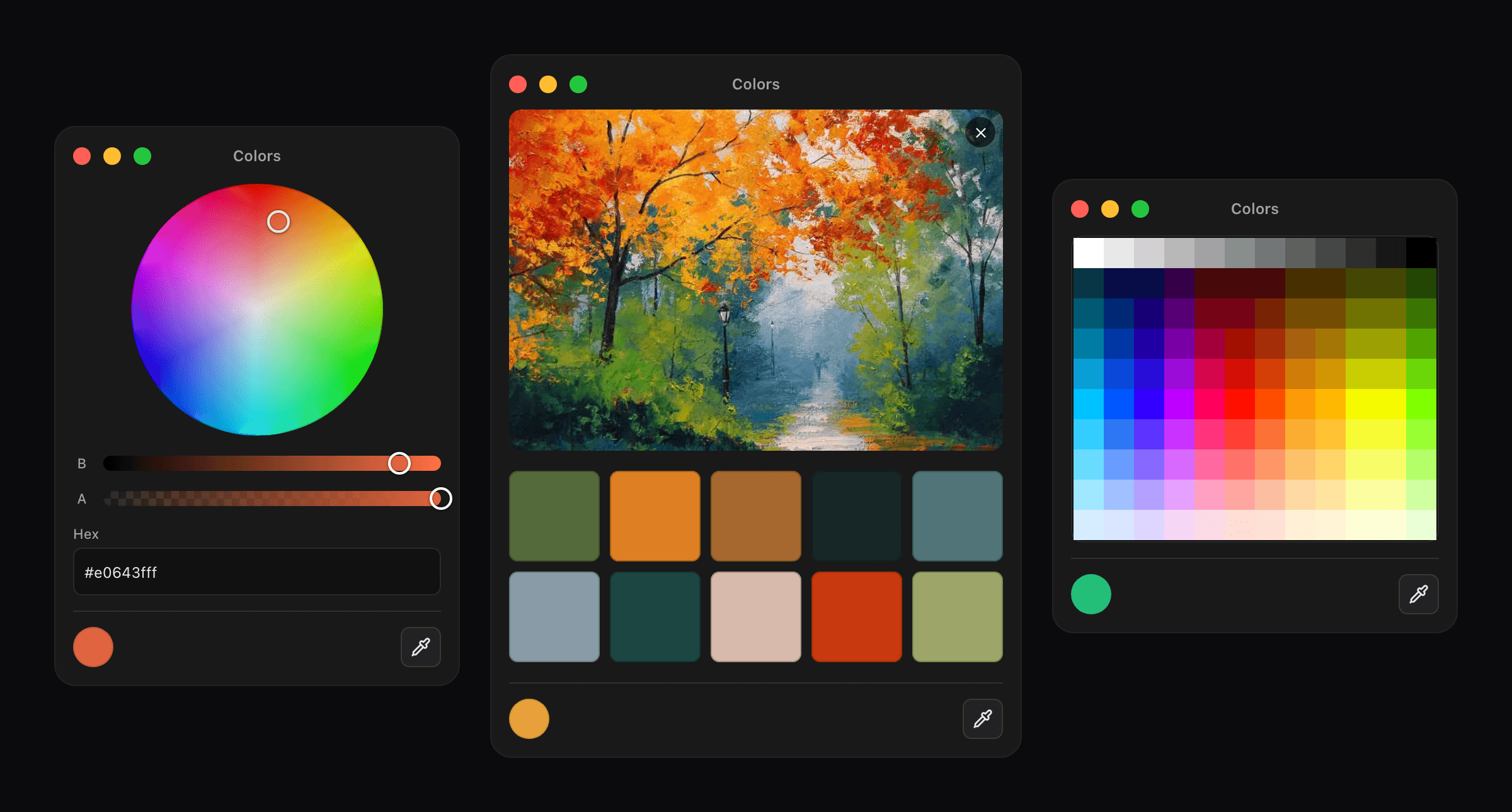
A React color picker for forms, toolbars, settings, and design tools. Use a small color input or render the full panel with a wheel, RGB and HSL sliders, searchable palettes, image sampling, opacity, and an eyedropper.
Version 1 also includes CSS Color 4 tools, a gradient editor, contrast suggestions, and design-token exports. The package has no runtime dependencies and includes TypeScript types.
Documentation and live demo · Quick start · Comparison · FAQ · Releases
- Five ways to pick a color: a wheel, RGB, HSL and HSB sliders, palettes, a 120-color pencil grid, and sampling from an image
- Hex, RGB(A), HSL(A), HSB/HSV and opacity controls for exact color values
- An eyedropper for grabbing a color from anywhere on screen in supported browsers
- Drops into a form like an
<input>, withname,requiredandform.reset() - Accessible: every color channel is a real range input, so keyboards and screen readers work
- No runtime dependencies, TypeScript types included, ESM and CommonJS
- CSS Color 4: OKLCH, OKLab, Lab, LCH and Display P3 parsing, conversion and gamut mapping
- A standalone, keyboard-accessible gradient editor with perceptual interpolation
- Alpha-aware contrast checks, accessible-color suggestions and CSS/SCSS/design-token exports
Install
npm install chroma-panelUsage
import { useState } from 'react';
import { ColorInput } from 'chroma-panel';

export function Example() {
  const [color, setColor] = useState('#3366cc');

  return (
    <ColorInput
      value={color}
      onChange={(c) => setColor(c.hexa)}
      onChangeComplete={(c) => save(c.hexa)}
    />
  );
}
No CSS import and no provider. ColorInput renders a swatch button that opens the panel in a popover.
onChange fires while you drag, onChangeComplete once when you let go. Which to use.
Inline panel
ChromaPanel is the same panel without the popover, for when you want it on the page:
import { ChromaPanel } from 'chroma-panel';

<ChromaPanel defaultValue="#3366cc" modes={['wheel']} showTitleBar={false} />
Pick colors from an image
The image mode takes a dropped, pasted or chosen file, shows its dominant colors as swatches, and lets you click an exact pixel through a zoom lens. Palettes can be ordered by population, luminance or hue. The sampler behind it is exported too, for when you want the palette without the panel:
import { extractPalette } from 'chroma-panel';

const { swatches } = await extractPalette(file, { maxColors: 8 });
// [{ hex: '#3e5f8a', rgb: [62, 95, 138], population: 4213 }, ...]
It takes a File, a Blob or an image URL, validates safe size limits, and reads only a downscaled sampling surface. More in the image mode docs.
Import fewer modes
Importing chroma-panel registers all five modes. If you only need one or two, import the shell and pass explicit mode objects:
import { ChromaPanel } from 'chroma-panel/panel';
import { wheelMode } from 'chroma-panel/modes';

<ChromaPanel modes={[wheelMode]} />
The original side-effect import (import 'chroma-panel/wheel') remains supported. Explicit mode objects are easier for bundlers to analyze. Every mode also has its own entry point — see entry points.
New in 1.0
The color engine reads OKLCH, OKLab, Lab, LCH, sRGB and Display P3, while preserving the source space and mapping wide-gamut colors perceptually:
import { parseColor, convertColor, isInGamut, mapToGamut, serializeColor } from 'chroma-panel/color';

const color = parseColor('oklch(72% 0.18 250)')!;
const fallback = isInGamut(color, 'srgb') ? color : mapToGamut(color, 'srgb');
chroma-panel/gradient adds a keyboard-accessible linear/radial gradient editor with perceptual interpolation. chroma-panel/export produces CSS, SCSS, Tailwind and design-token output. Alpha-aware contrast suggestions are available from chroma-panel/contrast.
The original change callbacks remain intact. onValueChange and onValueCommit add metadata that identifies pointer, keyboard, field, swatch, image, eyedropper, recent-color and programmatic changes. See the v1 API reference.
Theming
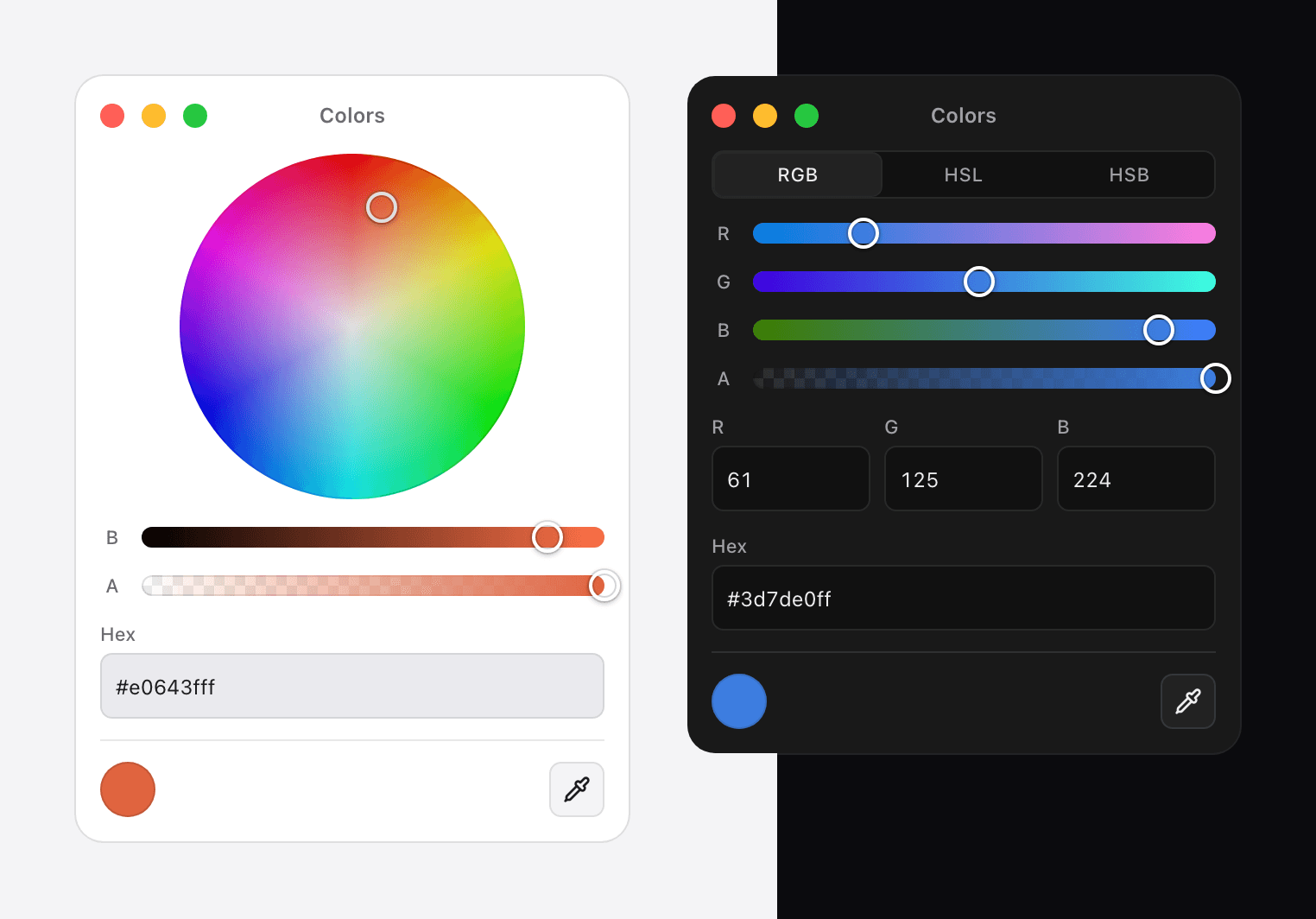
The panel follows the system color scheme. To change how it looks, override the CSS variables or pass your own class per part:
<ColorInput classNames={{ root: 'shadow-2xl', trigger: 'h-8 w-12' }} />Full details in the theming guide. Using Tailwind? See styling with Tailwind.
Size
Measured as the increase in a real Vite production build, gzipped, with React external.
| What you import | Added to your app | | --- | --- | | all five modes | 23.1 kB | | shell plus one mode | 15.0 kB |
dependencies is empty. react and react-dom are peer dependencies, so the copy already in your app is the one that gets used.
Compatibility
| | |
| --- | --- |
| React | 16.14 and newer, including 19 |
| React DOM | Required. The popover renders through createPortal |
| Browsers | Chrome 123, Firefox 120, Safari 17.5 |
| TypeScript | Types included, no @types package needed |
| Modules | ESM and CommonJS |
| Server rendering | Safe. Browser-dependent files are marked 'use client'. Next.js and SSR |
The browser versions come from light-dark(), a CSS function the stylesheet relies on. What happens on older browsers.
Help
- Documentation: chroma-panel.jscrate.dev, including the FAQ and common mistakes
- Reference in this repository: API and guides
- Questions and bug reports: github.com/re-sohail/chroma-panel/issues
License
MIT © Sohail Khan