
cl-icon-select
v1.0.9
Published
vue3 + element-plus二次封装的图标下拉组件,支持拓展iconfont的有色图标库
Downloads
260
Maintainers
 code_life
Readme
cl-icon-select
说明
使用 vue3 + element-plus 封装的图标选择组件
- 支持 element-plus 所有图标(若有遗漏可提醒作者添加)
- 支持预览所选图标
- 图标回显时支持自动定位到对应位置
- 支持随意拓展 iconfont 的 Symbol 图标(可选择有色图标)
使用方法
使用前提
- 该组件是基于 element-plus 二次封装,所以请先确保安装了 element-plus
- 该组件默认内置 element-plus 图标,请确保已执行
npm install @element-plus/icons-vue,图标无需导入,组件内部已自动将所有 element-plus 的图标导入并进行全局注册。
1.安装组件
npm i cl-icon-select2.引入组件
import { createApp } from 'vue'
import ElementPlus from 'element-plus'
import 'element-plus/dist/index.css'
import App from './App.vue'
// 引入依赖
import ClIconSelect from 'cl-icon-select'

const app = createApp(App)
app.use(ElementPlus)
// 组件注册,包含cl-icon-select和cl-icon两个组件
app.use(ClIconSelect)
app.mount('#app')
3.开始使用
3.1 基础使用
<template>
  <ClIconSelect style="width: 400px" v-model="val"></ClIconSelect>
</template>

<script setup>
  import { ref } from 'vue'
  const val = ref()
</script>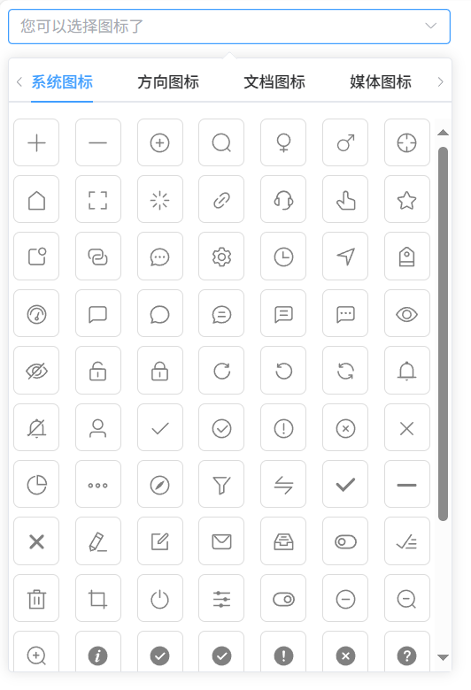
3.2 拓展 iconFont 的 Symbol 图标
3.2.1 使用在线地址配置 (无需多余配置,操作简单,但是 iconfont 平台不承诺服务的稳定性,建议企业客户需下载字体包自行发布使用并做好备份。)
先在 iconfont 里面将需要的图标加入到我的项目
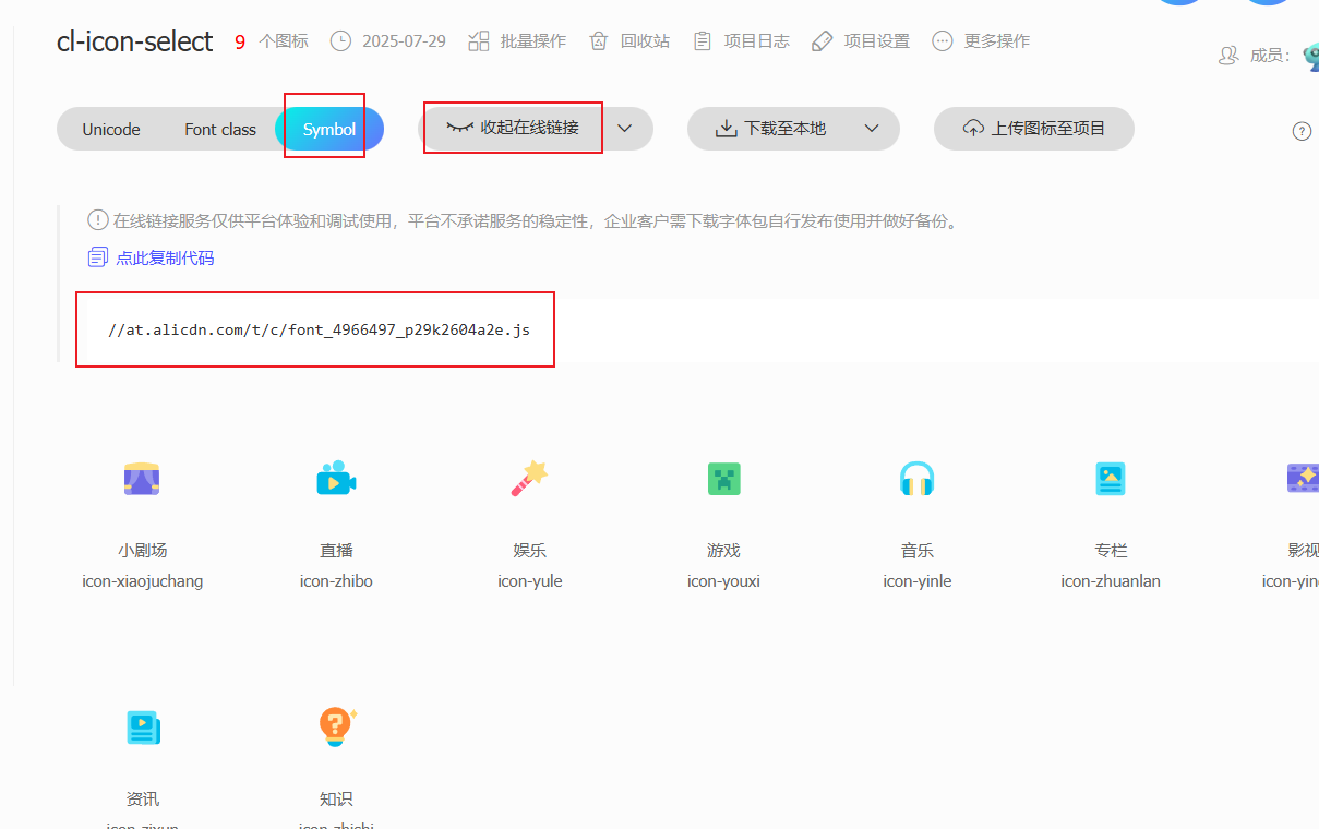
在配置里添加线上地址
app.use(ClIconSelect, {
  placeholder: '您可以选择图标了',
  useIconMethod: 'additional',
  iconFontUrl: '//at.alicdn.com/t/c/font_4966497_p29k2604a2e.js',
  customIconList: [
    {
      type: 'blibli图标',
      list: [
        'icon-xiaojuchang',
        'icon-zhibo',
        'icon-yule',
        'icon-youxi',
        'icon-yinle',
        'icon-zhuanlan',
        'icon-yingshi',
        'icon-zixun',
        'icon-zhishi',
      ],
    },
  ],
})
3.2.2 引入图标 js 文件到 main.js 里(需要下载字体包进行导入,操作复杂但是最稳定)
- 先在 iconfont 里面将需要的图标加入到我的项目
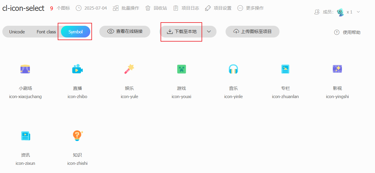
- 下载获取 Symbol 格式的图标的文件,只需要里面的 js 文件即可
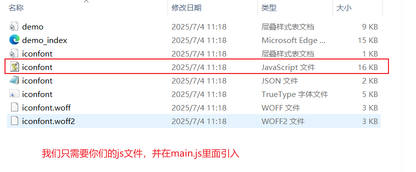
- 在 main.js 中引入 js 文件
import './assets/iconfont/iconfont.js' - 在 main.js 的组件配置项设置自己使用图标的方式以及图标的列表(这里我使用的 additional:在原 element-plus 的基础上添加自定义的图标列表)
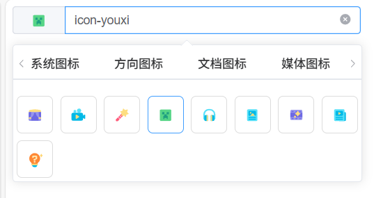
app.use(ClIconSelect, { placeholder: '您可以选择图标了', useIconMethod: 'additional', customIconList: [ { type: 'blibli图标', list: [ 'icon-xiaojuchang', 'icon-zhibo', 'icon-yule', 'icon-youxi', 'icon-yinle', 'icon-zhuanlan', 'icon-yingshi', 'icon-zixun', 'icon-zhishi', ], }, ], }) - 最终效果
Props 属性
| 属性名 | 类型 | 默认值 | 说明 | | --------------- | -------- | ------------------------- | --------------------------------------------------------------------------------------------------------------------------------------------------------------------------------------- | | placeholder | String | '请选择图标' | 输入框的提示文字 | | activeColor | String | '#409eff' | 选中图标的图标颜色和边框颜色(注意如果是原本就有颜色的 Symbol 图标只会设置边框颜色) | | iconSize | Number | 20 | 下拉选项里的图标大小 | | maxHeight | String | '500px' | 图标列表的最大高度 | | iconBoxWidth | String | '' | 图标列表的宽度,可以指定宽度 如:100px 或者设置auto为自动宽度,跟随输入框宽度, | | iconShow | Boolean | true | 是否展示选中边框 | | useIconMethod | String | 'elementPlus' | 使用图标的方式(elementPlus:使用 element-plus 的图标;custom:只使用自定义的图标列表,只会使用 customIconList 配置的图标,additional:在原 element-plus 的基础上添加自定义的图标列表) | | customIconList | Array | iconType[] | 自定义图标列表 | | beforeGetIconFun | Function | (iconList) => newIconList | 获取图标前的钩子函数,可以在这里对图标进行过滤,新增等操作,最后需要返回新的图标列表 | | iconFontUrl | String | '' | 可以进行 iocnfont 的 symbol 图标线上地址的配置,使用该配置就无需在 mian.js 中引入字体的 js 文件了 | | loadIconUrlOk | Function | null | 引用线上字体成功的回调 | | loadIconUrlFail | Function | null | 引用线上字体失败的回调 |
iconType 对象
| 属性名 | 类型 | 默认值 | 说明 | | ------ | -------- | ------ | ------------ | | label | String | - | 图标类型名称 | | type | String | - | 图标类型值 | | list | String[] | - | 图标集合 |
方法列表
| 方法名 | 说明 | 参数 | | ----------- | ------------------ | -------------- | | tab-change | 图标类型切换时触发 | type:类型值 | | icon-change | 图标修改时触发 | icon:图标值 |
cl-icon
说明
为了支持可以对 iconfont 的 Symbol 图标的拓展,所以单独封装了图标展示组件,原 elementPlus 图标和 iconfont 的 Symbol 图标都可使用该组件展示。
- 支持回显 iconfont 的 Symbol 图标和 elementPlus 图标
Props 属性
| 属性名 | 类型 | 默认值 | 说明 | | ---------------- | ------ | ------ | ----------------------------------------------------------------------------------------------------------------------- | | size | Number | 20 | 图标大小 | | color | String | 'grey' | 图标颜色(iconfont 的 Symbol 图标颜色修改需要在下载的 symbol 图标的 js 文件里面将下载图标的对应 fill 属性删除才会生效) | | componentName | Number | 20 | 图标名称 | | iconSymbolPrefix | String | 'icon' | iconfont 的 Symbol 图标前缀,由此区分是否是 iconfont 的 Symbol 图标; 默认读取插插件注册时候的值 |
iconfont 的 Symbol 图标前缀可以在 iconfont 上,
我的项目里面选择项目设置可以进行批量对图标前缀的修改,记得同步修改 iconSymbolPrefix 值
为什么选择Symbol方式进行图标导入?
- iconfont平台所推荐的
- 支持多色图标了,不再受单色限制
- 通过一些技巧,支持像字体那样,通过font-size,color来调整样式。
使用 symbol 的缺点
- 兼容性较差,支持 ie9+,及现代浏览器
- 浏览器渲染svg的性能一般,还不如png
综合来看,随着浏览器的不断更新与客户端性能的不断提升,使用symbol是带来的缺点会被日区抹平