
clock-time-picker-react
v1.0.1
Published
A dependency-free, clock-face time picker for React and Next.js. Works in JS and TS, no Tailwind required.

Maintainers
 sushobhan111
Readme
clock-time-picker-react
A React clock-face time picker inspired by React Native's native time picker UI. No dependencies, no Tailwind required — ships with its own CSS, fully customizable.
Works with: React, Next.js (App Router + Pages Router), Vite, Create React App — JavaScript and TypeScript.



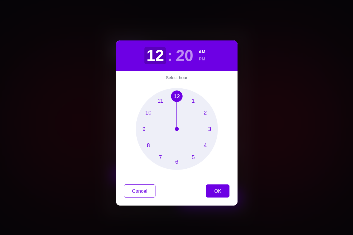
Features
- 🕐 Clock-face UI — just like React Native's time picker, now for the web
- 🎯 Drag or click to select hour and minute
- 🌗 AM / PM toggle built in
- 📦 Zero dependencies
- 💅 No Tailwind — plain CSS with CSS variable theming
- 🔷 Full TypeScript support
- ⚡ Works in Next.js App Router (pre-marked
"use client") - ✅ Input validation — invalid values fall back gracefully
Install
npm install clock-time-picker-reactQuick Start
import { ClockTimePicker } from 'clock-time-picker-react';
import 'clock-time-picker-react/dist/index.css';
import { useState } from 'react';

function App() {
  const [open, setOpen] = useState(false);
  const [time, setTime] = useState('');

  return (
    <>
      <button onClick={() => setOpen(true)}>Pick Time</button>

      <ClockTimePicker
        open={open}
        onOpenChange={setOpen}
        value={time}
        onValueChange={setTime}
      />

      {time && <p>Selected: {time}</p>}
    </>
  );
}
Usage
Controlled trigger (your own button)
Use open + onOpenChange to control when the clock opens from your own button or any other element. The component renders only the clock popup — no input field.
const [open, setOpen] = useState(false);
const [time, setTime] = useState('');

<button onClick={() => setOpen(true)}>Pick Time</button>

<ClockTimePicker
  open={open}
  onOpenChange={setOpen}
  value={time}
  onValueChange={setTime}
/>
Uncontrolled (built-in input field)
Skip open/onOpenChange and the component renders its own clickable input field.
const [time, setTime] = useState('');

<ClockTimePicker
  value={time}
  onValueChange={setTime}
  placeholder="Select a time"
/>
Default value
Pass an initial value to useState — accepts both 12hr and 24hr formats:
const [time, setTime] = useState('02:30 PM'); // 12hr
const [time, setTime] = useState('14:30');    // 24hr
Invalid values like '12:61 PM' are silently ignored and fall back to 12:00 AM.
Event-object callback (form libraries)
Use onChange if your form library expects a native-input-shaped event. Fires with 24hr value.
<ClockTimePicker
  name="meetingTime"
  value={time}
  onChange={(e) => setTime(e.target.value)} // e.target.name, e.target.value ("14:30")
/>
Next.js App Router
Add "use client" to your page since you'll be using useState:
'use client';

import { ClockTimePicker } from 'clock-time-picker-react';
import 'clock-time-picker-react/dist/index.css';
import { useState } from 'react';

export default function Page() {
  const [open, setOpen] = useState(false);
  const [time, setTime] = useState('');

  return (
    <>
      <button onClick={() => setOpen(true)}>Pick Time</button>
      <ClockTimePicker open={open} onOpenChange={setOpen} value={time} onValueChange={setTime} />
    </>
  );
}
Styling / Theming
Class names are prefixed ctp- so they won't collide with your styles.
CSS variables (recommended)
The package ships with a default indigo theme out of the box — you don't need to set any variables. Just import the CSS and the component works with no configuration.
To customize, import the package CSS first in your global stylesheet, then declare only the variables you want to change after it:
In your globals.css (or any global stylesheet):
@import "clock-time-picker-react/styles.css";

/* Only add variables you want to override — everything else uses package defaults */
:root {
  --ctp-accent: #2563eb;        /* clock hand + highlight color */
  --ctp-accent-active: #1d4ed8; /* active button color */
  --ctp-face-bg: #f1f5f9;       /* clock face background */
  --ctp-header-bg: #2563eb;     /* header background */
  --ctp-radius: 12px;           /* popup border radius */
}
Why
globals.css? If you import the package CSS inside a component file, the package's own:rootvariables load after your globals and override them. Importing it at the top of your global stylesheet guarantees your overrides always take precedence.
When using this approach, remove any direct CSS import from your component:
// ❌ remove this from your component
import 'clock-time-picker-react/styles.css';

// ✅ just use the component — CSS is already loaded globally
import { ClockTimePicker } from 'clock-time-picker-react';
Available CSS variables
| Variable | Default | Controls |
|---|---|---|
| --ctp-accent | #4f46e5 | Hand, highlights, buttons, tick marks |
| --ctp-accent-active | #4338ca | Darker hover/active states |
| --ctp-header-bg | #4f46e5 | Header background |
| --ctp-face-bg | #eef0f8 | Clock circle background |
| --ctp-radius | 12px | Popup corner rounding |
| --ctp-overlay-bg | rgba(0,0,0,0.55) | Backdrop darkness |
className props
For targeted overrides on specific elements:
<ClockTimePicker
  className="my-input"
  popupClassName="my-popup"
  onValueChange={setTime}
/>
.my-popup {
box-shadow: 0 20px 60px rgba(0, 0, 0, 0.3);
border: 1px solid #e0e7ff;
}Props
| Prop | Type | Default | Description |
|------------------|---------------------------------------------|-----------------|--------------------------------------------------------------------|
| value | string | — | "HH:mm" (24hr) or "hh:mm AM/PM" (12hr). Invalid → falls back. |
| onValueChange | (value: string) => void | — | Fires with selected time as "hh:mm AM/PM" |
| onChange | (e: { target: { name?, value } }) => void | — | Native-input-shaped event, value in 24hr format |
| open | boolean | — | Controlled open state. Hides built-in input when set. |
| onOpenChange | (open: boolean) => void | — | Called when picker wants to open or close |
| onBlur | React.FocusEventHandler | — | Blur handler (uncontrolled mode only) |
| id | string | — | Input id |
| name | string | — | Passed back in onChange's e.target.name |
| placeholder | string | "Select time" | Input placeholder (uncontrolled mode only) |
| className | string | — | Extra class on the input element |
| popupClassName | string | — | Extra class on the popup wrapper |
FAQ
Does it work without Tailwind? Yes — it ships with its own plain CSS. No Tailwind, no CSS framework needed.
Does it work in Next.js App Router?
Yes — the component is pre-marked "use client" in the built output. Just add "use client" to your own page since you'll be using useState.
Can I use it in a form?
Yes — use the onChange prop for a native-input-shaped event, or onValueChange for a simple string callback.
What format does the value come back in?
onValueChange returns "hh:mm AM/PM" (e.g. "02:30 PM"). onChange returns 24hr "HH:mm" (e.g. "14:30").
License
MIT