
cm-angular-dual-listbox
v4.0.0
Published
Dual List Box for Angular
Maintainers
 chandumaram333
Readme
Angular Dual-Listbox (v14, v15, v16 and v17)
The angular-dual-listbox is an Angular component that provides two lists controls side-by-side that allows items in one list to be selected and moved to the other list via drag-and-drop and/or a button-based interface.
The component supports multiple select options from the list, programatic setting of list sources, and layout with direction and button formatting.
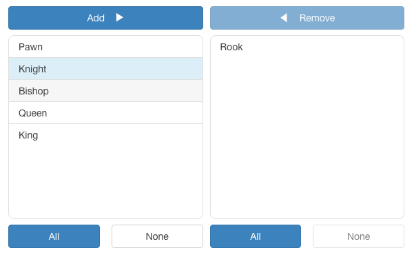
Table of Contents
Version
| Angular | angular-dual-listbox |
| ------- | -------------------- |
| 17 | 4.0.0 |
| 16 | 3.0.0 |
| 15 | 2.1.1 |
| 14 | 1.0.0 |
Usege
Installation
$ npm i cm-angular-dual-listboxapp.module.ts
import { NgModule } from "@angular/core";
import { BrowserModule } from "@angular/platform-browser";
import { CmAngularDualListboxComponent } from "cm-angular-dual-listbox";

import { AppRoutingModule } from "./app-routing.module";
import { AppComponent } from "./app.component";
@NgModule({
  declarations: [AppComponent],
  imports: [BrowserModule, AppRoutingModule, CmAngularDualListboxComponent],
  providers: [],
  bootstrap: [AppComponent],
})
export class AppModule {}app.component.html:
<dual-listbox [source]="source" [(destination)]="confirmed"></dual-listbox>app.component.ts:
export class AppComponent {
  employeeImage = "assets/employee.png";

  source: any[] = [
    { id: 1, name: "one" },
    { id: 2, name: "two" },
    { id: 3, name: "three" },
    { id: 4, name: "four" },
    { id: 5, name: "five" },
    { id: 6, name: "six" },
  ];

  confirmed: any[] = [];

  format = {
    add: "Add",
    remove: "Remove",
    all: "All",
    none: "None",
    direction: CmAngularDualListboxComponent.LTR,
    draggable: true,
  };
}
Inputs
| Name | Description |
| ------------- | ---------------------------------------------------------------------------------------------------------------------------------------------------------------------------------------------------------------------------------------------------- |
| key | The unique identifier field of each object in the source and destination arrays, default is _id. (Note: with a source of an array of strings, each string is its own id.) |
| display | The field of each object for displaying the object each the lists, default is _name. Or, a function that returns a string that can be used for displaying an object. (Note: with a source of an array of strings, each string is its own display.) |
| height | The height of the lists, default is 100px. |
| format | A format object, default is { add: 'Add', remove: 'Remove', all: 'All', none: 'None', direction: 'left-to-right', draggable: true, locale: undefined } |
| filter | A boolean whether or not to display a filter for the lists, default is false. |
| sort | A boolean whether or not to keep the lists sorted, default is false. |
| compare | A compare function to be used for sorting the lists. Note if sort is not set and compare is set, then sort will be set true. |
| source | The source array of objects or strings for the list. (This is the universal, master list of all possible objects.) |
| destination | The destination array of objects or strings selected from the source. Note, the destination array can have prexisting elements. |
| disabled | The dual-list is disabled, default is false. |
Outputs
| Name | Description |
| ------------------- | ------------------------------------------------------ |
| destinationChange | An event triggered when the destination array changes. |
Final Usage
<dual-listbox [sort]="true" [source]="source" key="id" display="name" [filter]="true" [(destination)]="confirmed" height="300px" [format]="format" [disabled]="false"></dual-listbox>License
MIT
Author
- Maram Chandrasekhar Reddy @chandumaram