
col-browser
v2.6.6
Published
Catalogue of Life browse and search React components

Maintainers
 mdoering
Readme
ChecklistBank ReactJS components
This is a small ReactJS component library to visualise datasets in checklistbank.org. The components work against a single dataset, configured by a datasetKey, and can be used to interact with each other.
- Tree - navigate the taxonomic tree of a dataset in checklistbank, linking out to individual taxa
- Search - a search form with filters and a tabular response view
- Taxon - comprehensive information of a single taxon including the taxon breakdown and distribution map
- TaxonBreakdown - one or two level pie chart of a taxon's major groups by rank
- TaxonDistribution - the Taxon page's distribution map (MapLibre + optional GBIF overlay) as a standalone component
- SourceDatasetList - table of source datasets contributing to a compiled project
- SourceDataset - source dataset details. Relevant for projects compiled from several source datasets providing taxonomic 'sectors'
- BibTex - simple icon that provides a BibTex citation for a dataset
Examples
Live demo
A hosted demo of the latest released version is at https://catalogueoflife.github.io/portal-components/. It exercises every top-level component against the production ChecklistBank API. The page is rebuilt and redeployed by .github/workflows/pages.yml on every v* tag push.
Catalogue of Life
All components are in use on the main Catalogue of Life portal.


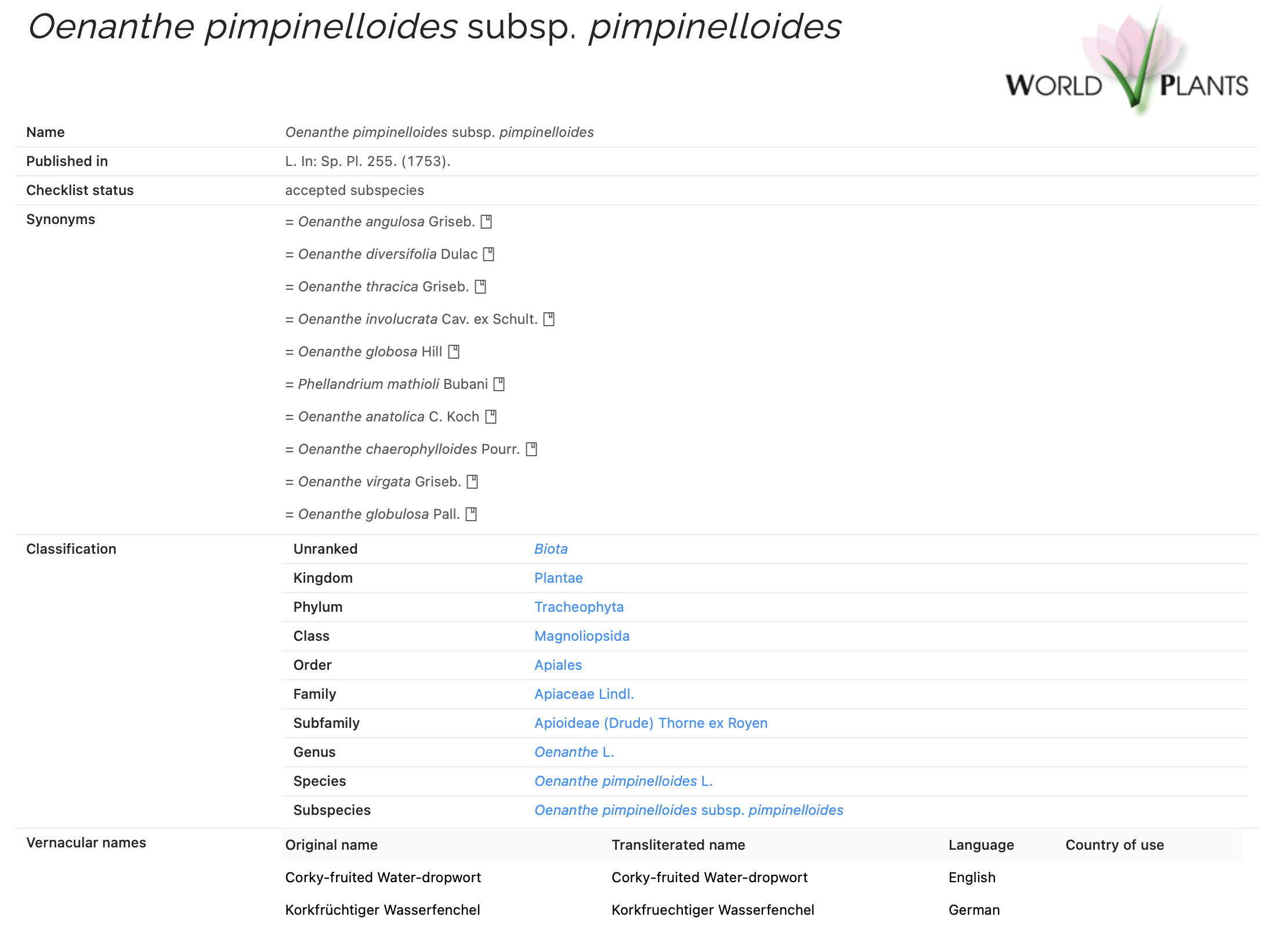
Catalogue of the Pterophoroidea & Alucitoidea
- https://pterophoroidea.hobern.net
- https://alucitoidea.hobern.net

Usage
The documentation below describes the 2.x version. For the 1.x version (React 16 / antd 4 era), see the README on the
v1branch. If you're moving from 1.x to 2.x, jump to Upgrading from 1.x to 2.0 first.
These components can be included in any html page. React 19 no longer ships a UMD build of its own, so the UMD bundle of col-browser includes React and react-dom/client and re-exposes them as ColBrowser.React and ColBrowser.ReactDOM. No separate React <script> tag is needed.
Include the library — pin to a major so you don't get migrated unexpectedly:
<script src="https://cdn.jsdelivr.net/gh/CatalogueOfLife/portal-components@2/umd/col-browser.min.js"></script>
<link rel="stylesheet" href="https://cdn.jsdelivr.net/gh/CatalogueOfLife/portal-components@2/umd/main.css">
Then mount any component using ColBrowser.React and ColBrowser.ReactDOM:
<div id="tree"></div>
<script>
  ColBrowser.ReactDOM.createRoot(document.querySelector('#tree')).render(
    ColBrowser.React.createElement(ColBrowser.Tree, {
      datasetKey: '3LR',
      hrefForTaxon: (id) => `/taxon/${id}`,
    })
  );
</script>(ColBrowser.Taxon and ColBrowser.TaxonDistribution additionally need MapLibre GL JS loaded separately — see those components below.)
The full version list is on the releases page.
npm / ES module
If you bundle your own app, install from npm and import the components plus the stylesheet:
npm install col-browserimport { Tree } from 'col-browser';
import 'col-browser/style.css';
<Tree datasetKey="3LR" hrefForTaxon={(id) => `/taxon/${id}`} />The col-browser/style.css import carries the .catalogue-of-life layout overrides and is not auto-injected, so import it once in your entry. antd 6 injects its own component styles at runtime (CSS-in-JS), so no antd stylesheet is needed. Taxon / TaxonDistribution additionally need MapLibre GL JS and its CSS — see those components below.
jsDelivr version selectors
jsDelivr resolves semver-style git tags, so you can pick the granularity that suits you:
| Selector | Resolves to | Use when |
|---|---|---|
| @2 | latest 2.x release | recommended — gets bugfixes, no breaking changes |
| @1 | latest 1.x release (React 16 / antd 4 era) | you can't yet migrate the host page to React 19 |
| @v2.0.0 | exactly v2.0.0 | you need byte-for-byte reproducibility |
| @latest | most recent release across all majors | avoid for production — a future v3 release will silently migrate you |
v1 is in maintenance mode on the
v1branch. Critical fixes will be backported there as v1.x patch releases; no new features.
After a versioned release, the @latest, @1, or @2 URLs cache for up to ~12 h on the jsDelivr edge — purge them via https://www.jsdelivr.com/tools/purge if you need to roll out faster.
URL adapter (optional)
The 2.x components are fully controlled: they take their identifier (e.g. taxonKey, sourceDatasetKey, taxonId) and their navigation as plain props. To wire identifiers to your URL and links into the right paths, you can either:
- Pass
hrefForTaxon/onNavigateToTaxon(and the equivalents for Tree, Search and Source) yourself — see the per-component examples below and the bypassing-the-adapter section. - Wrap the component with the built-in
withRoutingadapter, which reads the identifier fromwindow.locationand provides all four navigation pairs from a singlepathsmap.
withRouting is exported from the main entry — available both as ColBrowser.withRouting in UMD <script> tags and as import { withRouting } from 'col-browser' in ES module builds.
<!-- UMD -->
<script>
  const URLTaxon = ColBrowser.withRouting(ColBrowser.Taxon, {
    kind: 'taxon',
    mode: 'path', // or 'hash' — see the GitHub Pages demo
    navigation: 'reload', // static portal; use 'spa' (the default) for SPA hosts — see below
    paths: {
      taxon:  '/taxon/',   // /taxon/{taxonKey}
      tree:   '/tree',     // /tree?taxonKey={…}
      search: '/search',   // /search?q=…
      source: '/source/',  // /source/{sourceDatasetKey}
    },
  });

  ColBrowser.ReactDOM.createRoot(document.querySelector('#taxon'))
          .render(ColBrowser.React.createElement(URLTaxon, { datasetKey: '3LR' }));
</script>
// ES module
import { Taxon, withRouting } from 'col-browser';
const URLTaxon = withRouting(Taxon, {
kind: 'taxon',
mode: 'path',
navigation: 'reload',
paths: { taxon: '/taxon/', tree: '/tree', search: '/search', source: '/source/' },
});
<URLTaxon datasetKey="3LR" />One wrapper per top-level component. The mode controls whether identifiers are read from location.pathname ("path") or from location.hash ("hash"). The paths map gives each navigation target a prefix; the adapter appends the identifier when navigating (e.g. /taxon/ + 6W3C4 → /taxon/6W3C4).
navigation: 'spa' vs navigation: 'reload'
A third option controls what the four onNavigateToX callbacks do when an in-component action triggers cross-page navigation:
navigation: 'spa'(default) — callshistory.pushState. The URL changes but the page is not reloaded; an SPA host re-renders in response. Right for react-router, Next.js, TanStack Router, Redux-driven hosts.navigation: 'reload'— callswindow.location.assign(url), forcing the browser to load the target page. Right for static / multi-page hosts: a Jekyll site, the GitHub Pages demo, any plain-HTML embedder where each/taxon/<id>is a separate page.
If you're embedding into a static portal, use navigation: 'reload'. Otherwise links that don't have an <a href> fallback (most visible: Highcharts pie segments in TaxonBreakdown) will update the URL without loading the new page, leaving the user stuck on the current one.
ColBrowser.withRouting(ColBrowser.Taxon, {
  kind: 'taxon',
  mode: 'path',
  navigation: 'reload',   // ← static / multi-page hosts
  paths: { taxon: '/data/taxon/', tree: '/data/browse', search: '/data/search', source: '/data/dataset/' },
});
The in-component state callbacks (onExpandedTaxonKeyChange on Tree, onFiltersChange on Search) always use pushState regardless of navigation — those represent local state within a single component (tree expansion, filter typing) and reloading the page on each change would be disruptive.
navigation: 'reload' is only meaningful with mode: 'path'. With mode: 'hash', hash changes never reload the page by definition, so 'reload' and 'spa' behave identically.
Available kinds and what each one wires up:
| kind | Controlled identifier from URL | State callbacks |
| --- | --- | --- |
| taxon | taxonKey from path after paths.taxon | — |
| tree | expandedTaxonKey from ?taxonKey=… | onExpandedTaxonKeyChange writes to URL |
| search | filters from query string | onFiltersChange writes to query string |
| source | sourceDatasetKey from paths.source | — |
| sourceList | none (it's a static-by-datasetKey list) | — |
| taxonBreakdown | taxonId from paths.taxonBreakdown | — |
| taxonDistribution | taxonId from paths.taxonDistribution | — |
| bibtex | sourceDatasetKey from paths.bibtex | — |
The COL portal uses mode: 'path'. The GitHub Pages demo uses mode: 'hash' against the same components — see demo/src/index.js.
For SPA frameworks where the adapter doesn't fit (a custom router, Redux state, no URL at all), every component also works as a plain controlled component — see Bypassing the adapter.
API endpoint (optional)
By default every component reads from the production ChecklistBank API (https://api.checklistbank.org/). To point them at the dev API — or a local backend — call configure() once before mounting:
// ES module — from the barrel …
import { configure } from 'col-browser';
// … or from its own subpath, if you only import single components:
import { configure } from 'col-browser/config';

configure({ dataApi: 'https://api.dev.checklistbank.org/' });
<!-- UMD -->
<script>
ColBrowser.configure({ dataApi: 'https://api.dev.checklistbank.org/' });
</script>| Key | Default | Used for |
|---|---|---|
| dataApi | https://api.checklistbank.org/ | every ChecklistBank API request |
| clbPortal | https://www.checklistbank.org | outbound links to dataset / publisher pages |
| gbifApi | https://api.gbif.org | occurrence counts and distribution-map tiles |
| gbifPortal | https://www.gbif.org | the GBIF occurrence-search attribution link |
| basemapStyle | https://basemaps.cartocdn.com/gl/positron-gl-style/style.json | the MapLibre basemap under the distribution map |
| cartoKey | "" | CARTO Basemaps API key, appended to every CARTO request the map makes |
configure() merges into the shared config, so keys you leave out keep their current value, and trailing slashes are normalised — pass the URL in either form. Components read the base URL as they render and as they fire each request, so call configure() before mounting; to switch endpoints at runtime, remount afterwards (the demo app does this with a React key).
Basemap
basemapStyle is the one key that is not a base URL, so it is stored verbatim — path, query string and API key survive untouched. It takes anything MapLibre accepts as style: a style URL with your provider's key baked in, or an inline style object.
cartoKey authenticates CARTO's own basemaps. CARTO's published styles are static files whose glyphs, sprite and vector-source URLs are absolute and key-free, so putting ?key= in the style URL authenticates that one request and nothing else — while CARTO meters tile requests. Setting cartoKey instead installs a MapLibre transformRequest that appends the key to every cartocdn.com request the map makes, and leaves other hosts (GBIF occurrence tiles, ChecklistBank) alone:
configure({ cartoKey: "your-carto-key" });A key already baked into basemapStyle is left as-is. Leave cartoKey empty for a non-CARTO provider and bake that provider's key into basemapStyle instead.
// your own CARTO account
configure({ basemapStyle: 'https://basemaps.cartocdn.com/gl/positron-gl-style/style.json?api_key=YOUR_KEY' });

// or another provider entirely
configure({ basemapStyle: 'https://api.maptiler.com/maps/basic-v2/style.json?key=YOUR_KEY' });

// or a style you host yourself
configure({ basemapStyle: { version: 8, sources: { … }, layers: [ … ] } });
The default is CARTO's public Positron CDN, which needs no key — check CARTO's terms before relying on it for production traffic. Map attribution comes from the style document, so switching providers updates the credit in the map's attribution control automatically.
Taxon and TaxonDistribution also take a basemapStyle prop, which overrides this default for a single map. Unlike the config keys, the prop is live: changing it rebuilds the map on the new style in place, no remount needed. If you pass an inline style object as the prop, hold it in a stable reference (a module constant or useMemo) rather than an object literal.
Theming (optional)
Every top-level component accepts two optional theming props. When neither is set, the library's defaults are used and no Ant Design ConfigProvider is mounted.
theme— full antdThemeConfigforwarded straight toConfigProvider.theme. Use it to override design tokens, component-level styles, or the algorithm.darkMode— convenience boolean. Whentrueandtheme.algorithmis not set,theme.darkAlgorithmis applied. TheTaxonBreakdownchart also uses this flag to colour the outer-ring gap arcs; otherwise it falls back toprefers-color-scheme.
// ES module
import { Search } from 'col-browser';

<Search
  datasetKey="3LR"
  darkMode
  theme={{ token: { colorPrimary: '#d97706', borderRadius: 6 } }}
/>
<!-- UMD -->
<script>
ColBrowser.ReactDOM.createRoot(document.querySelector('#search')).render(
ColBrowser.React.createElement(ColBrowser.Search, {
datasetKey: '3LR',
darkMode: true,
theme: { token: { colorPrimary: '#d97706' } },
})
);
</script>This will create a global ColBrowser library variable with the components documented below.
The prop tables below describe each component's component-specific props (identifier, content options). Every component also accepts the four navigation pairs —
hrefForTaxon/onNavigateToTaxon,hrefForTree/onNavigateToTree,hrefForSearch/onNavigateToSearch,hrefForSource/onNavigateToSource. Each section below shows two examples: one wiring the navigation pairs manually, and one using the built-inwithRoutingadapter.
ColBrowser.Tree
A browsable taxonomic tree. Component-specific props:
datasetKey- the dataset key from the Catalogue of Life ChecklistBank.expandedTaxonKey- (Optional, controlled) which taxon the tree is expanded down to. Pair withonExpandedTaxonKeyChangeto keep host state in sync.onExpandedTaxonKeyChange- (Optional) called with the new key when the user expands a different taxon.defaultTaxonKey- (Optional, uncontrolled fallback) initial taxon to expand to whenexpandedTaxonKeyis not provided. Nothing is expanded unless one of these is set — pass a root id to open it on load, e.g.defaultTaxonKey="CS5HF"opens Eukaryota in current Catalogue of Life releases.showTreeOptions- (Optional) show toggles for extinct taxa and info (estimates, providers etc).linkToSpeciesPage- (Optional) when the searchbox finds a species or infraspecific taxon, jump directly to the taxon page rather than opening the tree.citation- (Optional) either"top"or"bottom"; include the necessary dataset citation above or below the tree component.type- (Optional) e.g.type="project"will show info about contributing sources on the tree nodes.insertPlaceholder- (Optional, defaults totrue) when true, the API virtually groups children of lower ranks into a "Not assigned" placeholder node for a more compact browsing experience. Passfalseto disable.
<div id="tree"></div> <!-- Dom element for the tree to attach to -->
<script>
'use strict';
ColBrowser.ReactDOM.createRoot(document.querySelector('#tree')).render(
  ColBrowser.React.createElement(ColBrowser.Tree, {
    datasetKey: 9999,
    hrefForTaxon: (id) => `/taxon/${id}`,
    hrefForSource: (id) => `/source/${id}`,
  })
);
</script>
Wire only hrefForX for plain anchor navigation (the browser does a full page load on click — fine for static portals). Add onNavigateToX as well for SPA-style in-page navigation, or use the withRouting adapter to wire both from a single paths map.
With the URL adapter:
<div id="tree"></div>
<script>
'use strict';
const URLTree = ColBrowser.withRouting(ColBrowser.Tree, {
  kind: 'tree',
  mode: 'path',
  navigation: 'reload', // static portal; use 'spa' (the default) for SPA hosts
  paths: { taxon: '/taxon/', tree: '/tree', search: '/search', source: '/source/' },
});

// /tree?taxonKey=…  is read into `expandedTaxonKey`; changes write back.
ColBrowser.ReactDOM.createRoot(document.querySelector('#tree')).render(
  ColBrowser.React.createElement(URLTree, { datasetKey: '3LR' })
);
</script>
ColBrowser.Search
Search component with table view. Component-specific props:
datasetKey- the dataset key from the Catalogue of Life ChecklistBank.filters- (Optional, controlled) current filter object ({ q, rank, status, TAXON_ID, sortBy, … }). Pair withonFiltersChangeto persist filters in your host's URL or state.onFiltersChange- (Optional) called with the next filter object whenever the user changes a filter.defaultTaxonKey- (Optional) if the search should default to a certain Family, Order etc.citation- (Optional) either"top"or"bottom"; include the necessary dataset citation above or below the search component.
<div id="search"></div>
<script>
'use strict';
ColBrowser.ReactDOM.createRoot(document.querySelector('#search')).render(
  ColBrowser.React.createElement(ColBrowser.Search, {
    datasetKey: 9999,
    hrefForTaxon: (id) => `/taxon/${id}`,
  })
);
</script>
With the URL adapter:
<div id="search"></div>
<script>
'use strict';
const URLSearch = ColBrowser.withRouting(ColBrowser.Search, {
  kind: 'search',
  mode: 'path',
  navigation: 'reload',
  paths: { taxon: '/taxon/', tree: '/tree', search: '/search', source: '/source/' },
});

// /search?q=…&rank=…  is read into `filters`; user changes write back.
ColBrowser.ReactDOM.createRoot(document.querySelector('#search')).render(
  ColBrowser.React.createElement(URLSearch, { datasetKey: '3LR' })
);
</script>
ColBrowser.Taxon
Taxon detail page. Component-specific props:
datasetKey- the dataset key from the Catalogue of Life ChecklistBank.taxonKey- (controlled) the taxon to render. Read by the host from its URL and passed in.pageTitleTemplate- (Optional) a template for formatting the page title. A string containing the variable__taxon__that will be replaced with the taxon name.identifierLabel- (Optional) label for the identifier listed on top of the taxon view. Defaults to"Identifier".showDistributionMap- (Optional) Whentrue, render an interactive MapLibre GL map for distributions whose areas have a known geometry, with a toggle to switch to the plain text list view. The basemap defaults to the keyless CARTO Positron vector style; override it with thebasemapStyleprop below or globally viaconfigure(). Requires the consumer to load MapLibre GL JS 4+ or 5+ and its CSS (peer dependency).gbifChecklistKey- (Optional) When set, the distribution map adds a GBIF occurrence overlay (iNaturalist.poly hex bins) for the focal taxon, using the GBIF v2 multitaxonomy tile endpoint. The value is passed as thechecklistKeyquery parameter; the focal taxon's id is passed astaxonKey. The consumer is responsible for only setting this when the configureddatasetKeyactually uses identifiers that GBIF recognises under the given checklist. For datasets keyed by COL identifiers, use the Catalogue of Life backbone UUID:gbifChecklistKey="7ddf754f-d193-4cc9-b351-99906754a03b"basemapStyle- (Optional) MapLibre style for the basemap under the distribution polygons — a style URL with your provider's API key baked in, or an inline style object. Overrides the globalconfigure({ basemapStyle })default for this map only, and can be changed at runtime: the map rebuilds on the new style in place. Pass an inline style object from a stable reference, not an object literal.
To use the map, include MapLibre GL JS alongside React in your page:
<link rel="stylesheet" href="https://unpkg.com/maplibre-gl@5/dist/maplibre-gl.css" />
<script src="https://unpkg.com/maplibre-gl@5/dist/maplibre-gl.js"></script>
ES module consumers: npm install maplibre-gl and import "maplibre-gl/dist/maplibre-gl.css" in your bundle entry.
<div id="taxon"></div>
<script>
'use strict';
// Read the taxonKey from your host's URL however you like. For a portal
// where each taxon has its own page at /taxon/<id>, the trailing path
// segment works:
const taxonKey = location.pathname.split('/').pop();

ColBrowser.ReactDOM.createRoot(document.querySelector('#taxon')).render(
  ColBrowser.React.createElement(ColBrowser.Taxon, {
    datasetKey: 9999,
    taxonKey: taxonKey,
    pageTitleTemplate: 'COL | __taxon__',
    showDistributionMap: true,
    gbifChecklistKey: '7ddf754f-d193-4cc9-b351-99906754a03b',
    hrefForTaxon:  (id) => `/taxon/${id}`,
    hrefForTree:   ({ taxonKey }) => `/tree?taxonKey=${taxonKey || ''}`,
    hrefForSearch: (filters) => `/search?${new URLSearchParams(filters)}`,
    hrefForSource: (id) => `/source/${id}`,
  })
);
</script>
With the URL adapter:
<div id="taxon"></div>
<script>
'use strict';
const URLTaxon = ColBrowser.withRouting(ColBrowser.Taxon, {
  kind: 'taxon',
  mode: 'path',
  navigation: 'reload',
  paths: { taxon: '/taxon/', tree: '/tree', search: '/search', source: '/source/' },
});

// On a route like /taxon/6W3C4, the adapter reads `taxonKey` itself.
ColBrowser.ReactDOM.createRoot(document.querySelector('#taxon')).render(
  ColBrowser.React.createElement(URLTaxon, { datasetKey: '3LR', showDistributionMap: true })
);
</script>
ColBrowser.TaxonBreakdown
A Highcharts pie chart breaking the accepted children of a taxon down by rank, with click-to-drill into each child. Rendered inside the Taxon page but also exported standalone for use on dashboards or summary pages. Component-specific props:
datasetKey- the dataset key from the Catalogue of Life ChecklistBank.taxonId- (controlled) the taxon to break down. The chart loads the taxon, its rank vocabulary, and the dataset citation itself, so no preloading is needed.level- (Optional,1or2, default1) controls how deep the breakdown nests.1renders a single-ring donut (direct children oftaxonId).2renders a two-ring donut adding grandchildren. The value is passed through as thelevelquery parameter on the/dataset/{key}/taxon/{id}/breakdownAPI.showLevelSwitch- (Optional, defaultfalse) whentrue, render an in-chart antdSwitchthat lets the user toggle between level 1 and 2 at runtime.darkMode- (Optional) whentrue, use the dark-mode outer-ring gap colour. Falls back toprefers-color-schemewhen unset.
<div id="breakdown"></div>
<script>
'use strict';
ColBrowser.ReactDOM.createRoot(document.querySelector('#breakdown')).render(
  ColBrowser.React.createElement(ColBrowser.TaxonBreakdown, {
    datasetKey: '3LR',
    taxonId: 'ST',
    showLevelSwitch: true,
    hrefForTaxon: (id) => `/taxon/${id}`,
  })
);
</script>
With the URL adapter:
<div id="breakdown"></div>
<script>
'use strict';
const URLBreakdown = ColBrowser.withRouting(ColBrowser.TaxonBreakdown, {
  kind: 'taxonBreakdown',
  mode: 'path',
  navigation: 'reload',
  paths: { taxonBreakdown: '/breakdown/', taxon: '/taxon/' },
});

// On a route like /breakdown/ST, the adapter reads `taxonId` itself.
ColBrowser.ReactDOM.createRoot(document.querySelector('#breakdown')).render(
  ColBrowser.React.createElement(URLBreakdown, { datasetKey: '3LR', showLevelSwitch: true })
);
</script>
ColBrowser.TaxonDistribution
The Taxon page's distribution block — a MapLibre GL vector map of the taxon's distribution polygons, with an optional GBIF occurrence overlay and a Map/List toggle — exposed as a standalone component. Useful when you want to surface a taxon's distribution on a non-COL page without rendering the whole Taxon view. Component-specific props:
datasetKey- the dataset key from the Catalogue of Life ChecklistBank.taxonId- (controlled) the taxon to render. The component loads the taxon, its distributions, and the rank vocabulary itself.gbifChecklistKey- (Optional) when set, adds the GBIF occurrence overlay (iNaturalist.poly hex bins) for the focal taxon. See the same prop onColBrowser.Taxonfor the caveat about checklist-key alignment.style- (Optional) inline style passed through to the outer wrapper. Note this is the wrapper's CSS, not the map style — seebasemapStylebelow.basemapStyle- (Optional) MapLibre style for the basemap under the distribution polygons — a style URL with your provider's API key baked in, or an inline style object. Overrides the globalconfigure({ basemapStyle })default for this map only, and can be changed at runtime: the map rebuilds on the new style in place. Pass an inline style object from a stable reference, not an object literal.
Requires the consumer to load MapLibre GL JS 4+ or 5+ and its CSS (peer dependency), same as ColBrowser.Taxon with showDistributionMap:
<link rel="stylesheet" href="https://unpkg.com/maplibre-gl@5/dist/maplibre-gl.css" />
<script src="https://unpkg.com/maplibre-gl@5/dist/maplibre-gl.js"></script>
<div id="distribution"></div>
<script>
'use strict';
ColBrowser.ReactDOM.createRoot(document.querySelector('#distribution')).render(
ColBrowser.React.createElement(ColBrowser.TaxonDistribution, {
datasetKey: '3LR',
taxonId: '6W3C4',
gbifChecklistKey: '7ddf754f-d193-4cc9-b351-99906754a03b',
hrefForSource: (id) => `/source/${id}`,
})
);
</script>With the URL adapter:
<div id="distribution"></div>
<script>
'use strict';
const URLDistribution = ColBrowser.withRouting(ColBrowser.TaxonDistribution, {
  kind: 'taxonDistribution',
  mode: 'path',
  navigation: 'reload',
  paths: { taxonDistribution: '/distribution/', source: '/source/' },
});

// On a route like /distribution/6W3C4, the adapter reads `taxonId` itself.
ColBrowser.ReactDOM.createRoot(document.querySelector('#distribution')).render(
  ColBrowser.React.createElement(URLDistribution, { datasetKey: '3LR' })
);
</script>
ColBrowser.SourceDatasetList
Sortable table of the source datasets contributing to a project, grouped by publisher. Each row shows the source dataset's alias, publisher, number of taxa and last import — and the merged-data badge where applicable. Only useful for compiled datasets like the Catalogue of Life that pull from many sources; for standalone datasets the table will be empty. Component-specific props:
datasetKey- the dataset key of the catalogue/project from the Catalogue of Life ChecklistBank.
Per-row links into the source-dataset and search pages are built from the four navigation pairs (hrefForSource and hrefForSearch in particular).
<div id="contributors"></div>
<script>
'use strict';
ColBrowser.ReactDOM.createRoot(document.querySelector('#contributors')).render(
  ColBrowser.React.createElement(ColBrowser.SourceDatasetList, {
    datasetKey: 9999,
    hrefForSource: (id) => `/source/${id}`,
    hrefForSearch: (filters) => `/search?${new URLSearchParams(filters)}`,
  })
);
</script>
With the URL adapter:
<div id="contributors"></div>
<script>
'use strict';
const URLSourceList = ColBrowser.withRouting(ColBrowser.SourceDatasetList, {
  kind: 'sourceList',
  mode: 'path',
  navigation: 'reload',
  paths: { search: '/search', source: '/source/' },
});

ColBrowser.ReactDOM.createRoot(document.querySelector('#contributors')).render(
  ColBrowser.React.createElement(URLSourceList, { datasetKey: '3LR' })
);
</script>
ColBrowser.SourceDataset
Source-dataset detail page. Component-specific props:
datasetKey- the dataset key from the Catalogue of Life ChecklistBank. WhensourceDatasetKeyis set, this is the catalogue/project containing the source; otherwise it's the dataset being rendered directly.sourceDatasetKey- (Optional, controlled) the source dataset to render within the catalogue identified bydatasetKey.pageTitleTemplate- (Optional) a template for formatting the page title. A string containing the variable__dataset__that will be replaced with the dataset title.
<div id="dataset"></div>
<script>
'use strict';
ColBrowser.ReactDOM.createRoot(document.querySelector('#dataset')).render(
  ColBrowser.React.createElement(ColBrowser.SourceDataset, {
    datasetKey: 9999,
    sourceDatasetKey: 2073,
    pageTitleTemplate: 'COL | __dataset__',
    hrefForTree:   ({ taxonKey }) => `/tree?taxonKey=${taxonKey || ''}`,
    hrefForSearch: (filters) => `/search?${new URLSearchParams(filters)}`,
  })
);
</script>
With the URL adapter:
<div id="dataset"></div>
<script>
'use strict';
const URLSourceDataset = ColBrowser.withRouting(ColBrowser.SourceDataset, {
  kind: 'source',
  mode: 'path',
  navigation: 'reload',
  paths: { source: '/source/', tree: '/tree', search: '/search' },
});

// On a route like /source/2073, the adapter reads `sourceDatasetKey` itself.
ColBrowser.ReactDOM.createRoot(document.querySelector('#dataset')).render(
  ColBrowser.React.createElement(URLSourceDataset, { datasetKey: '3LR' })
);
</script>
ColBrowser.BibTex
A small icon that links to the BibTex citation for a dataset on ChecklistBank. Component-specific props:
datasetKey- the dataset key from the Catalogue of Life ChecklistBank. WhensourceDatasetKeyis also given, this is the catalogue/project containing the source; otherwise it's the dataset being cited directly.sourceDatasetKey- (Optional) the source dataset to cite within the catalogue identified bydatasetKey. Use this when the citation is for a source compiled into a larger dataset such as the Catalogue of Life.style- (Optional) to set margins, height etc. Defaults to{ height: "40px" }.
<div id="bibtex"></div>
<script>
'use strict';
// Cite a standalone dataset
ColBrowser.ReactDOM.createRoot(document.querySelector('#bibtex')).render(
  ColBrowser.React.createElement(ColBrowser.BibTex, { datasetKey: 9999 })
);

// Or cite a source within a catalogue:
// ColBrowser.React.createElement(ColBrowser.BibTex, { datasetKey: 9837, sourceDatasetKey: 1010 })
</script>
With the URL adapter:
<div id="bibtex"></div>
<script>
'use strict';
const URLBibTex = ColBrowser.withRouting(ColBrowser.BibTex, {
  kind: 'bibtex',
  mode: 'path',
  navigation: 'reload',
  paths: { bibtex: '/bibtex/' },
});

// On a route like /bibtex/1010, the adapter reads `sourceDatasetKey` itself.
ColBrowser.ReactDOM.createRoot(document.querySelector('#bibtex')).render(
  ColBrowser.React.createElement(URLBibTex, { datasetKey: '3LR' })
);
</script>
Upgrading from 1.x to 2.0
v2.0 brings the React / Ant Design / React Router stack up to current versions, and turns every top-level component into a fully controlled component — the library no longer reads or writes the URL. Embedders need to update their host page in a few places (peer dependencies, root API, and the routing wiring), and then either drop in the built-in URL adapter or pass identifiers and navigation callbacks as props.
1. Drop the React / ReactDOM <script> tags
React 19 dropped UMD builds entirely, so the v2 col-browser UMD bundle now bundles React 19 and react-dom/client and re-exposes them as ColBrowser.React and ColBrowser.ReactDOM. Remove the separate React <script> tags from your page:
<!-- old (v1.x) -->
<script src="https://unpkg.com/react@16/umd/react.production.min.js"></script>
<script src="https://unpkg.com/react-dom@16/umd/react-dom.production.min.js"></script>
<script src="https://cdn.jsdelivr.net/gh/CatalogueOfLife/portal-components@1/umd/col-browser.min.js"></script>

<!-- new (v2.x): just col-browser -->
<script src="https://cdn.jsdelivr.net/gh/CatalogueOfLife/portal-components@2/umd/col-browser.min.js"></script>
2. Mount via ColBrowser.ReactDOM.createRoot (was bare ReactDOM.render)
Use the React + ReactDOM exposed on the ColBrowser global:
// old (v1.x): bare React / ReactDOM globals + ReactDOM.render
ReactDOM.render(React.createElement(Tree), document.querySelector('#tree'));

// new (v2.x): ColBrowser-scoped React / ReactDOM + createRoot
ColBrowser.ReactDOM.createRoot(document.querySelector('#tree'))
  .render(ColBrowser.React.createElement(ColBrowser.Tree));
3. Keep loading the JS bundle alongside the CSS
Ant Design 5+ injects component styles via cssinjs at runtime when components mount. umd/main.css is now ~87 KB (was ~557 KB) — it only contains the library's custom overrides. The antd component styling now travels inside col-browser.min.js, so do not load just the CSS without the JS.
Net wire size for a typical embedder (col-browser.min.js + main.css) — including the bundled React 19 + react-dom/client: ~836 KB gzipped (v1 was ~532 KB gzipped split across three CDN files for React + ReactDOM + col-browser). The single-file load is friendlier to static-portal embedders even if the byte count is higher.
4. Components are now fully controlled
The biggest API change in 2.0 is that the library no longer reads or writes the URL. Every top-level component takes its identifier and navigation as plain props:
- Identifier (whichever of
taxonKey,sourceDatasetKey,taxonId,expandedTaxonKey,filtersapplies) is a controlled prop. - Navigation is two optional callbacks per target —
onNavigateToTaxon(id)for the click handler andhrefForTaxon(id)for the<a href>. When neither is wired, the affected link renders as plain text. When both are wired, you get full anchor semantics (right-click → open in new tab, etc.). - Component-local state changes (e.g. tree expansion, search filters) emit through
onExpandedTaxonKeyChange/onFiltersChangecallbacks — never via a URL write inside the library.
This makes the components host-agnostic: they work the same inside react-router, Next.js, TanStack Router, an unrouted page, a Storybook story, or a Redux app.
For new code, the easiest way to wire identifiers and links is the built-in URL adapter — its kinds table lists exactly which identifier each component reads.
Migrating from v1
-import { Taxon } from 'col-browser';
+import { Taxon, withRouting } from 'col-browser';
+
+const URLTaxon = withRouting(Taxon, {
+  kind: 'taxon',
+  mode: 'path',
+  paths: { taxon: '/taxon/', tree: '/tree', search: '/search', source: '/source/' },
+});

-<Taxon datasetKey="3LR" pathToTaxon="/taxon/" pathToTree="/tree" pathToSearch="/search" pathToDataset="/source/" />
+<URLTaxon datasetKey="3LR" />
Bypassing the adapter (custom router, Redux, no URL at all)
You don't have to use withRouting. Every top-level component is a plain controlled React component — feed it the props it needs and the library will never touch the URL.
function MyTaxonPage() {
  const { taxonKey } = useParams();              // react-router
  const navigate = useNavigate();
  return (
    <Taxon
      datasetKey="3LR"
      taxonKey={taxonKey}
      hrefForTaxon={(id) => `/taxon/${id}`}      // your URL shape
      onNavigateToTaxon={(id) => navigate(`/taxon/${id}`)}
      hrefForTree={({ taxonKey }) => `/tree?t=${taxonKey || ''}`}
      onNavigateToTree={({ taxonKey }) => navigate(`/tree?t=${taxonKey || ''}`)}
      hrefForSearch={(filters) => `/search?${new URLSearchParams(filters)}`}
      onNavigateToSearch={(filters) => navigate(`/search?${new URLSearchParams(filters)}`)}
      hrefForSource={(id) => `/source/${id}`}
      onNavigateToSource={(id) => navigate(`/source/${id}`)}
    />
  );
}
Tree and Search take additional state callbacks:
const [expanded, setExpanded] = useState(undefined);
<Tree
  datasetKey="3LR"
  expandedTaxonKey={expanded}
  onExpandedTaxonKeyChange={setExpanded}
  /* …plus the four nav pairs from above */
/>

const [filters, setFilters] = useState({});
<Search
  datasetKey="3LR"
  filters={filters}                              // { q, rank, status, TAXON_ID, sortBy, … }
  onFiltersChange={setFilters}
/>
Any callback you don't supply just makes that link render as plain text — no crash, no warning. So you can wire the navigations gradually.
Building your own adapter
withRouting is ~150 LOC; nothing stops you from writing your own. The shape is simply:
function withMyRouting(Component) {
  return function Wrapped(props) {
    // 1. Derive the controlled identifier from wherever your state lives
    const taxonKey = useMyRouter().params.taxonKey;

    // 2. Build the four nav pairs
    const hrefForTaxon = (id) => `/taxon/${id}`;
    const onNavigateToTaxon = (id) => myNavigate(`/taxon/${id}`);
    // …same for tree / search / source

    return (
      <Component
        {...props}
        taxonKey={taxonKey}
        hrefForTaxon={hrefForTaxon}
        onNavigateToTaxon={onNavigateToTaxon}
        /* …rest */
      />
    );
  };
}
You can copy src/url/index.js as a starting template — it covers both path and hash modes plus the per-kind state wiring (Tree's expandedTaxonKey ↔ ?taxonKey=, Search's filters ↔ query string).
5. Dataset and DatasetSearch were renamed
The two source-dataset components were renamed to make their purpose explicit (a "dataset" in COL terms is a source dataset contributing to a project, not a generic CRUD-style dataset):
| Old export | New export |
|---|---|
| Dataset | SourceDataset |
| DatasetSearch | SourceDatasetList |
Update imports:
// old
import { Dataset, DatasetSearch } from 'col-browser';
// new
import { SourceDataset, SourceDatasetList } from 'col-browser';
<!-- old -->
ColBrowser.Dataset
ColBrowser.DatasetSearch
<!-- new -->
ColBrowser.SourceDataset
ColBrowser.SourceDatasetListProps and behaviour are unchanged.
6. catalogueKey was renamed to datasetKey
The prop previously called catalogueKey is now called datasetKey. The old name still works (with a console warning) but will be removed in a future major release — please update embeddings.
7. The shared history singleton is gone
v1 exported a history singleton from col-browser/history (used internally for the in-component navigation). It is no longer needed and no longer exported, because the library no longer mutates the URL.
If your host page subscribes to its own history@5 listener and the signature change matters to you, note that v5's listener receives ({ location, action }) instead of (location, action):
// old (history@4)
history.listen((location) => { /* ... */ });
// new (history@5)
history.listen(({ location }) => { /* ... */ });
Releasing
A release publishes the package to npm and pushes a v* tag (which also redeploys the GitHub Pages demo). The Catalogue of Life portal consumes the npm package via Astro, so it needs no extra step.
Third-party embedders loading the UMD bundle from jsDelivr can optionally purge the floating @2 / @latest URLs at https://www.jsdelivr.com/tools/purge to pick up the new build within minutes instead of waiting out the ~12 h edge cache:
# v2.x release — purge @2 and @latest
https://cdn.jsdelivr.net/gh/CatalogueOfLife/portal-components@2/umd/col-browser.min.js
https://cdn.jsdelivr.net/gh/CatalogueOfLife/portal-components@2/umd/main.css
https://cdn.jsdelivr.net/gh/CatalogueOfLife/portal-components@latest/umd/col-browser.min.js
https://cdn.jsdelivr.net/gh/CatalogueOfLife/portal-components@latest/umd/main.css

# v1.x backport — purge @1 only (do NOT purge @latest)
https://cdn.jsdelivr.net/gh/CatalogueOfLife/portal-components@1/umd/col-browser.min.js
https://cdn.jsdelivr.net/gh/CatalogueOfLife/portal-components@1/umd/main.css