comins-table
v0.1.6
Published
Comins Table is a controlled React data table for data-heavy application screens, with virtualized rendering, precise selection, movable headers, controlled Row Expand Details, Summary Row aggregation, Tree Grid data, built-in component cells, and framewo
Readme
Comins Table
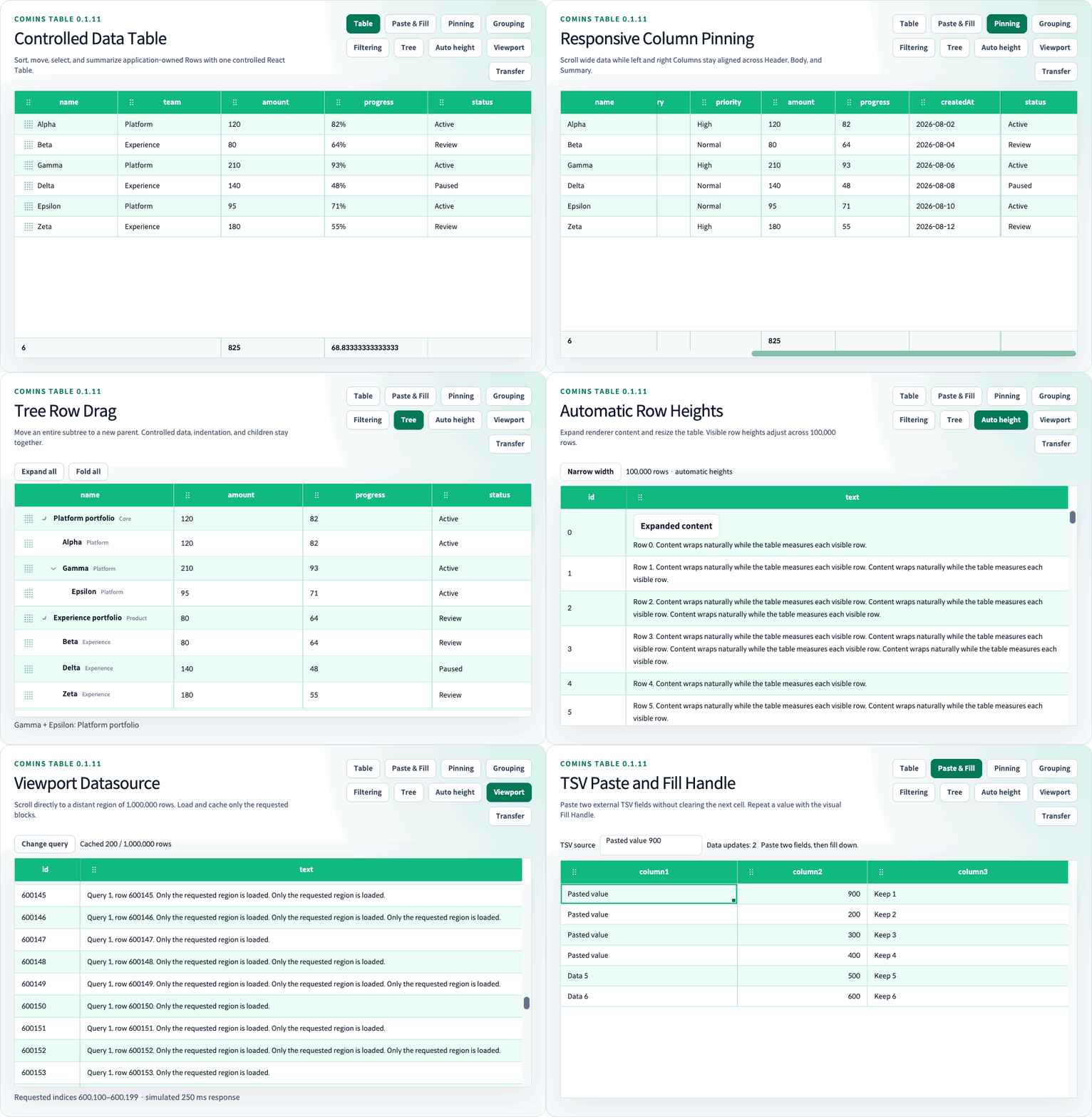
Comins Table is a controlled React data table for data-heavy application screens, with virtualized rendering, precise selection, movable headers, controlled Row Expand Details, Summary Row aggregation, Tree Grid data, built-in component cells, and framework-independent core helpers.

Why Comins Table
| Area | Shipped capabilities |
| --- | --- |
| Controlled data | Application-owned data, CRUD helpers, onChangeData, pagination, sorting, and layout callbacks |
| Rendering and scale | Fixed-height virtualization with a tested 100,000-row route, infinite scroll, append-mode lazy loading, loading, and empty states |
| Interaction | Accessible single and opt-in multi-column Header sorting, resize, 6-pixel horizontal column reorder with source placeholder, Row and Cell selection, ranges, clipboard, and context menu callbacks |
| Data structure | Controlled flat Row Expand Details, Summary Row aggregation, and controlled Tree Grid expand/fold |
| Custom UI | Cell/Header renderers, built-in button/input/checkbox/radio/select/toggle/progress/menu/Virtual List components, and CSS-variable themes |
Comins Table is standalone and does not wrap another table or grid implementation.
Support
| Surface | Support |
| --- | --- |
| React | >=18.0.0 <20.0.0 |
| React DOM | >=18.0.0 <20.0.0 |
| TypeScript | Declarations bundled with every JavaScript entry point; CSS available through the stylesheet export |
| Chrome and Edge | Current stable Chromium-based releases |
| Automated browser gate | Playwright-bundled Chromium |
| Firefox and Safari | Outside the supported contract until Firefox and WebKit projects are added |
| SSR | Client boundary required; server rendering is not currently supported |
| Runtime network behavior | No package-owned requests, remote assets, telemetry, or error reporting |
Installation
npm install comins-table react react-domimport { CominsTable, type CominsTableColumn } from "comins-table";
import "comins-table/styles.css";React and React DOM are peer dependencies. Import comins-table/styles.css when the default table shell, themes, and built-in component skin are required.
Quick Start
import { useState } from "react";
import { CominsTable, type CominsTableColumn } from "comins-table";
import "comins-table/styles.css";
type UserRow = {
active: boolean;
age: number;
id: string;
name: string;
role: string;
};
const columns: Array<CominsTableColumn<UserRow>> = [
{ field: "name", label: "Name", sort: true },
{ field: "age", label: "Age", sort: true },
{ field: "role", label: "Role" },
{
field: "active",
label: "Active",
cell: {
format: ({ value }) => (value ? "Active" : "Inactive"),
},
},
];
export function UsersTable() {
const [data, setData] = useState<UserRow[]>([
{ active: true, age: 31, id: "u-1", name: "Example user", role: "Admin" },
]);
return (
<CominsTable<UserRow>
columns={columns}
data={data}
getRowId={(row) => row.id}
onChangeData={setData}
pagination={{ pageIndex: 0, pageSize: 30 }}
theme={{ density: "compact" }}
/>
);
}Controlled Model
Comins Table is a CSR-focused controlled component for application-owned data. The application owns the data array.
For table-owned data mutations, onChangeData emits the next flat Row array or Tree Grid node array; pass that array back through data to retain the mutation. Other controlled models use their matching callback and value prop rather than onChangeData.
Selection, column layout, and sort are internal view state. onChangeSelection, onChangeColumnLayout, onChangeSort, and onChangeSortModel observe those changes so an application can coordinate or persist them externally; the table updates the corresponding view state even when a callback is omitted.
Where restoration is supported, use the supported Ref API: setSelectedRow and setSelectedRows restore Row selection by visible index, setColumnLayout restores layout, and setSortState and clearSort restore or clear sorting. setSortModel restores the complete ordered model; getColumnLayout, getSortState, and getSortModel read the current layout and sort state.
Multi-column Sort
Set multiSort to opt into ordered multi-column sorting. Normal Header click or Enter/Space keeps single sorting; hold Shift while using the same input to add, update, or remove one rule without replacing the others. Active Headers display their 1-based priority.
<CominsTable
columns={columns}
data={data}
multiSort
onChangeSortModel={(model) => saveSortModel(model)}
/>getSortModel() and setSortModel(model) read and restore the full model. The existing getSortState(), setSortState(rule), and onChangeSort APIs remain the single-rule compatibility surface. Two-level child Columns and Tree Grid sibling sets use the same ordered comparison rules.
Package Entry Points
| Import | Purpose |
| --- | --- |
| comins-table | React component, public types, and root helper exports |
| comins-table/core | State, row, column, pagination, sorting, layout, selection, clipboard, export, and virtualization helpers |
| comins-table/clipboard | Clipboard helper subset |
| comins-table/selection | Selection helper subset |
| comins-table/styles.css | Optional table shell, theme, and built-in component skin |
Header And Layout
Sortable headers support pointer and keyboard activation and expose aria-sort. Columns support width constraints and resize interactions.
A left-button mouse interaction activates column movement after a 6-pixel horizontal drag, provided horizontal movement remains greater than vertical movement. The source becomes a source placeholder while a ghost and target marker show the proposed move. Pointer Up commits only over a valid target; vertical intent, pointer cancellation, Escape, and window blur cancel the pending move. Non-mouse pointers retain one-second long-press compatibility. Parent header groups move their children as one block.
Use getColumnLayout() and setColumnLayout() through the Ref API, or serializeCominsColumnLayout() and applyCominsColumnLayout() from comins-table/core, to persist and restore order, widths, and visibility.
Rows, Cells, And Selection
Rows expose click, double-click, keyboard, and context-menu callbacks. Cells expose the corresponding Cell callbacks plus format, renderer, and props hooks.
A normal Row interaction selects one Row, Ctrl/Cmd toggles a Row, and Shift extends the visible Row range from the selection anchor. Cell selection supports a single Cell, Ctrl/Cmd multi-selection, and Shift or pointer-drag ranges. Built-in component interactions remain isolated from onClickCell and onClickRow callback payloads so component actions do not also trigger the owning Cell or Row action.
Row Expand
See the Row Expand guide and run the /examples/row-expand Playground route.
const [expandedRowIds, setExpandedRowIds] = useState<readonly string[]>([]);
<CominsTable
columns={columns}
data={data}
expandedRowIds={expandedRowIds}
getRowDetailHeight={() => "auto"}
getRowId={(row) => row.id}
onChangeExpandedRowIds={setExpandedRowIds}
renderRowDetail={({ row }) => <Detail row={row.data} />}
/>;Row Expand is controlled by stable owner business Row IDs. An interactive disclosure requires the application to feed the next value from onChangeExpandedRowIds back into expandedRowIds; when that callback is omitted, the disclosure is disabled and read-only. A finite positive CSS pixel height is fixed and retains its inline height. Missing values, invalid numeric values, and "auto" use measured automatic height with no inline height. Before an automatic Detail has a matching-width measurement, a valid finite positive estimatedRowDetailHeight is used; otherwise the resolved rowHeight is the estimate. Details render as semantic owner-following Rows, stay outside selection and clipboard addressing, and preserve dormant IDs across sorting and pagination.
Tree Grid Row Details, general automatic height for owner data Rows, and nested Details managed by Comins Table remain unsupported.
Virtualization And Loading
Set virtualized, rowHeight, and "buffer-size" for fixed-height windowed rendering. The performance Playground includes a tested 100,000-row route while keeping only the current window and buffer mounted.
infiniteScroll requests application-owned append loading near the body viewport boundary. lazyLoad supports asynchronous append-mode batches with an AbortSignal. When loading is true, an empty table renders skeleton Rows and a populated table keeps its Rows visible under a loading overlay. emptyComponent controls the no-data content.
Summary Row
See the Summary Row guide and run the /examples/summary-row Playground route.
Configure summary.columns with built-in count, sum, avg, min, and max aggregation or a custom aggregator. The object form supports visible-column colSpan, post-aggregation format, and per-cell className and style; summary.className and summary.style apply to the footer Row.
Tree Grid
See the Tree Grid guide and run the /examples/tree-grid Playground route.
Set tree and provide controlled { item, expand, children } nodes. defaultExpandAll supplies the initial fallback expansion state and defaults to true; explicit node state wins. expand(nodeIds?) and fold(nodeIds?) update multiple node ids, while an omitted argument targets every branch and an empty array is a no-op. Descendant-only expansion is blocked while an ancestor remains folded unless both ids are included in the same call.
Tree Grid reuses cell.components and cell.renderer, so component cells and custom React renderers work against each node's item. The Tree Grid Playground includes an exactly 10,000-node virtual example.
Components And Renderers
Cell components include button, input, checkbox, radio, select, toggle, progress, and virtual-list; Header components also support menu. Use cell.renderer or header.renderer when the built-in component types are not sufficient.
Virtual List Item activation follows the normal Row selection modifiers. More selects its owning Row exclusively before expanding the virtualized list. Search is available only while exactly one Row is selected. Keyboard activation keeps the More button focused after expansion. Item and More actions remain isolated from the Row and Cell click callbacks.
Clipboard And Export
copyCominsRow, copyCominsCell, and copyCominsCellRange read Row or Cell selections. pasteCominsRow, pasteCominsCell, and pasteCominsCellRange apply clipboard data while respecting props.copyable, props.pasteable, and disabled guards. fillCominsCellRange remains a framework-independent core helper; no visual fill handle is presented as shipped UI.
Use exportCominsRowsToCsv and exportCominsRowsToJson with the exact rows and export columns the application wants to serialize. Export remains independent of visible pagination, filtering, and selection unless the application passes those rows.
Styling And Themes
The package stylesheet exposes module-local --comins-table-* CSS variables and does not apply a global reset. The six shipped theme classes are comins-table-theme--basic, comins-table-theme--dark, comins-table-theme--skyblue, comins-table-theme--mint, comins-table-theme--gray, and comins-table-theme--orange.
Use theme.className, theme.style, Row class/style hooks, Cell props, and renderer output for application-specific presentation. Keep virtualized rowHeight aligned with --comins-table-row-height when overriding height tokens.
Ref API
const tableRef = useRef<CominsTableRef<UserRow>>(null);
tableRef.current?.getColumnLayout();
tableRef.current?.setColumnLayout(savedLayout);
tableRef.current?.getSortState();
tableRef.current?.setSortState({ columnId: "age", direction: "desc" });
tableRef.current?.getSortModel();
tableRef.current?.setSortModel([
{ columnId: "team", direction: "asc" },
{ columnId: "age", direction: "desc" },
]);
tableRef.current?.clearSort();
tableRef.current?.setSelectedRow(0);
tableRef.current?.setSelectedRows([0, 1]);
tableRef.current?.setMoveTargetRow(3, 1);
tableRef.current?.expand(["department-1", "team-1-1"]);
tableRef.current?.fold(["team-1-1"]);
tableRef.current?.expand(); // all Tree Grid branches
tableRef.current?.fold(); // all Tree Grid branchessetSelectedRow, setSelectedRows, and setMoveTargetRow use the visible Row index after current sorting and pagination. getColumnLayout, setColumnLayout, getSortState, setSortState, getSortModel, setSortModel, and clearSort read and update the current Header view state. expand(nodeIds?) and fold(nodeIds?) accept readonly Tree Grid node-id arrays; flat tables ignore them.
Playground
npm run devThe local Playground starts at /docs/getting-started. Key routes include /examples/selection-clipboard, /examples/row-expand, /examples/summary-row, /examples/tree-grid, /examples/component, and /performance/virtualization.
Documentation
Start with the English Quick Start, then browse all English feature guides. The detailed Tree Grid, Summary Row, and Row Expand contracts include runnable examples and edge cases. Korean guides are retained as secondary documentation.
Use the source repository for development context, review the changelog for version history, and follow the security policy for vulnerability reporting.
Current Boundaries
Comins Table currently ships a CSR controlled data model. Server-side Row models, Row grouping, pivoting, charts, AI assistance, remote Tree loading, hierarchy pagination, Tree Row drag, Tree Row copy/paste, Tree Grid Row Details, general automatic owner Row height, nested managed Details, Firefox, Safari, and SSR are not shipped or supported.
The visual fill handle is not shipped or supported. fillCominsCellRange remains available as a core helper without a drag-handle UI.
Development
npm run lint
npm run test:run
npm run build
npm run test:e2e
npm run test:perf -- --workers=1
npm run test:consumer
npm run verify
npm run docs:readme-gifnpm run docs:readme-gif is a maintainer command that captures the real hidden Playground fixture and regenerates the checked-in README animation.
Trusted Publishing
The package bootstrap is complete. Trusted publishing for later versions uses the manual publish.yml OIDC trusted publisher and npm stage publish through the protected npm environment. The workflow builds one exact package artifact, verifies and scans that artifact before staging, and requires maintainer approval before public publication. Token-based publication is not part of this release path.