
cq-lerp
v0.1.2
Published
Make any CSS value scale with a container's width: degrees, seconds, font weights, percentages, plain numbers.

Maintainers
 petros_papa21
Readme
cq-lerp
Container-query linear interpolation.
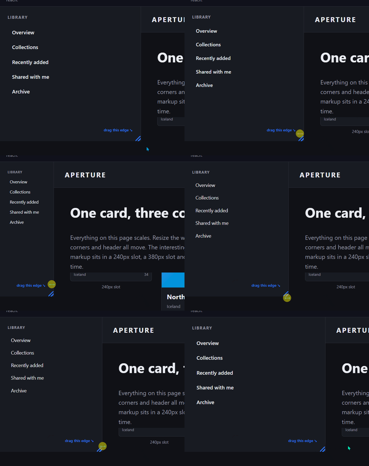
Drag the sidebar. The window never moves, so a media query has nothing to read.
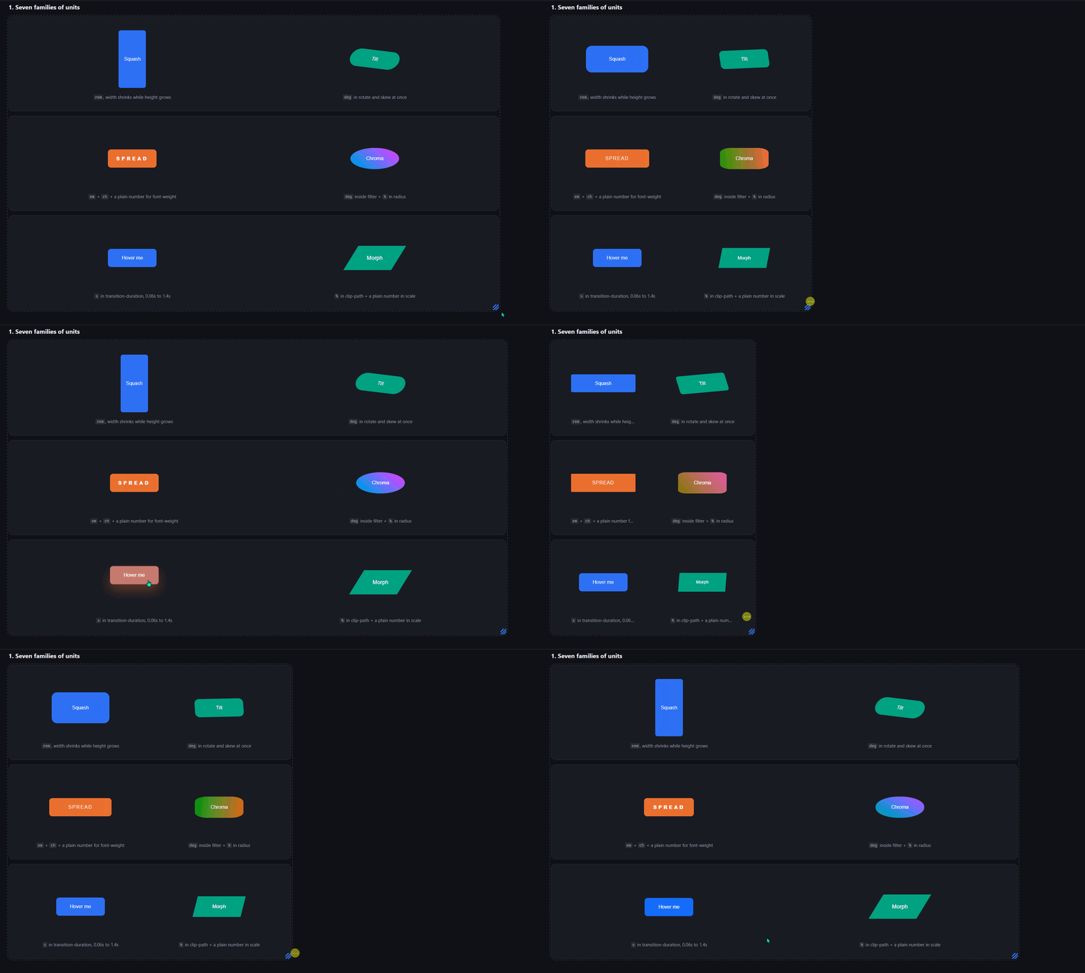
Six properties, six unit families. 0 JavaScript, 0 keyframes, 0 width breakpoints.
Make any CSS value scale with a container's width. Degrees, seconds, font weights, percentages, plain numbers, alongside the usual sizes.
rotate:              fluid-on(-7deg, 7deg,   var(--cq-t));
transition-duration: fluid-on(0.06s, 1.4s,   var(--cq-t));
font-weight:         fluid-on(200,   900,    var(--cq-t), "");
The usual fluid formula builds a line inside your own unit, so it only type-checks for
lengths: calc(-7deg + 2cqi) is an error. This divides two lengths to get a unitless
progress from 0 to 1, then multiplies.
CSS ships that division as
progress(),
and it is brand new: Chrome 138, Safari 26, Firefox 155. In practice that means browsers
from 2026 onward. This library uses progress() where it exists and falls back to a
clamp() expression everywhere else, which is what makes it usable today.
MIT.
Demos
Both run live at subamanis.github.io/cq-lerp.
examples/index.html builds the same app shell twice, once with this library and once
with clamp() plus vw plus media queries, and lets you flip between them in place. The
sidebar is resizable: drag its edge and watch its contents respond in one version and sit
still in the other, while the window never moves.
examples/units.html is the reference for which CSS units the interpolation handles.
Install
npm i cq-lerpTwo entry points, pick one. Plain CSS needs no build:
import "cq-lerp/css"; // bundler<link rel="stylesheet" href="node_modules/cq-lerp/dist/cq-lerp.css">SCSS, if you want the helpers:
@use "cq-lerp" as *; // sass --load-path=node_modulesPlain CSS, no build
Put .cq-lerp on a container, then multiply anything by var(--cq-t):
.panel .badge {
  rotate:  calc(0deg + 45deg * var(--cq-t));
  padding: calc(12px + 12px * var(--cq-te));
}
--cq-t is linear, --cq-te is smoothstep. Change the range with two lengths:
.panel { --cq-floor: 375px; --cq-ceil: 1440px; }Use .cq-lerp-track when the element is already a container.
SCSS
Writes the arithmetic for you: give it the two ends and it works out the difference, the sign and the unit.
@use "cq-lerp" as *;

.panel { @include cq-track(); }
.panel .badge { rotate: fluid-on(-7deg, 7deg, var(--cq-te)); }

.standalone { padding: fluid(12px, 24px); }
| | |
| --- | --- |
| cq-track($floor, $ceil) | mixin: declares --cq-t and --cq-te with the progress() upgrade |
| fluid-on($min, $max, $t, $unit) | calc(base + range * progress) |
| fluid($min, $max, $floor, $ceil, $unit) | standalone, bakes in its own clamp() track |
| fluid-track() / fluid-track-native() | the track expression on its own |
| fluid-ease($t) | smoothstep |
Configure at import: @use "cq-lerp" as * with ($cq-floor: 375, $cq-ceil: 1440). A bare
number means pixels. Floor and ceil must share a unit here, because Sass does the subtraction
at compile time.
Gotchas
- Bounds are container widths, and the ceiling is where scaling stops. Because the box that has to reach it is usually a content column, a high ceiling means most things never arrive at their declared maximum.
- Bounds are lengths, and units survive.
--cq-floor: 20remis resolved by the browser at its real root font size, so a user who scales their text keeps the range you meant. A bare number in the CSS file makes--cq-tinvalid and every declaration reading it drops to its initial value, silently. In SCSS a bare number is read as pixels. - The progress variable re-resolves per user. Declare it on an outer container, read it
inside a nested
container-typeelement, and you get two different values. Handy for per-component progress, surprising when you expect one shared number. - Two different browser floors. The
progress()path needs Chrome 138 / Safari 26 / Firefox 155, all from 2025-2026. Theclamp()fallback needs container query units and thetan(atan2())trick for dividing two lengths, which puts it at Chrome 111, Safari 16 and Firefox 110, all early 2023. A plain/between two lengths is newer thanprogress()itself (Chrome 140, Safari 26, nothing in Firefox yet), so the fallback avoids it. Below the 2023 floor there are no@supportsguards and the declarations are dropped. - Nothing animates over time. Values recompute on layout, the way
width: 50%does.
Prior art
The pieces are all older than this repo.
progress()
standardises the core trick. Dividing two lengths with tan(atan2()) is the trick from
Jane Ori, written up by
Typetura.
MadeByMike
documented the limitation this works around.
@lunelson/sass-lerp has done calc-based Sass
interpolation for years, and Utopia is where most people met fluid
interpolation. Assembled here: the container-driven track, the fallback, the unit inference
and the ergonomics.
Credit
The idea of a container-based fluid engine, and the useclamp-* naming that started this,
come from Zeus CSS by Stavros Lazaris, as observed in v1.0.12:
zeuscss.com ·
npm. Written from scratch, no code copied, no
dependency on it. The version is pinned because Zeus is under active development.