
css-houdini-circles
v1.2.0
Published
CSS Houdini Background Circles
Maintainers
 bramus
Readme
CSS Houdini Circles
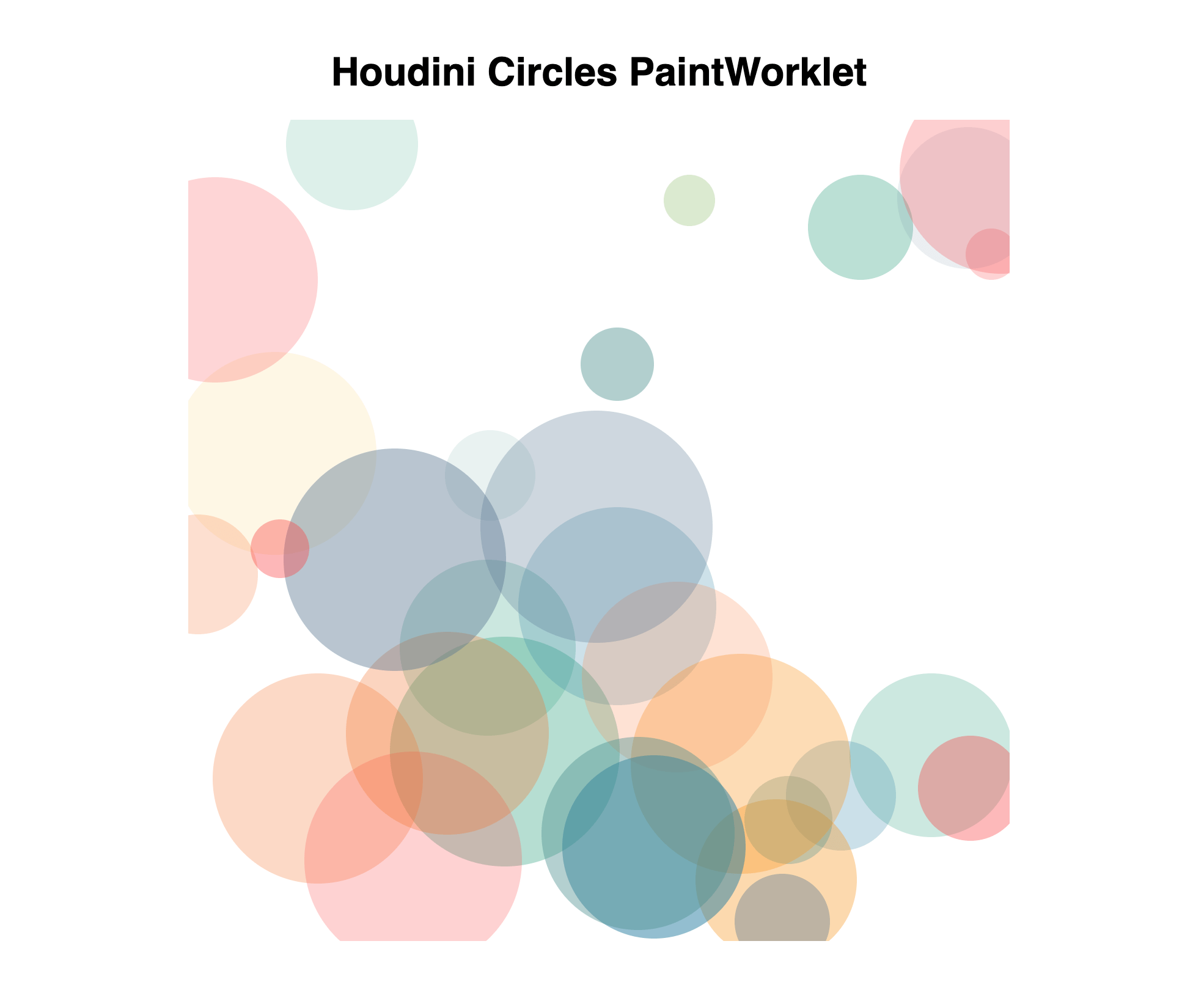
A CSS Houdini Paint Worklet to draw background circles.
Usage
1. Getting css-houdini-circles
Using a pre-built hosted version
The easiest way to get css-houdini-circles is to use the prebuilt version through UNPKG. Just skip ahead to step 2 in that case.
Installing it Locally
You can install the css-houdini-circles locally using NPM.
npm install css-houdini-circlesAlternatively you can clone the css-houdini-circles repo and after manually build the project:
cd css-houdini-circles
npm install
npm run build
You'll find the built file in the ./dist folder.
2. Loading css-houdini-circles
To include it you must loads the module in the given JavaScript file and add it to the Paint Worklet.
If you want to use the UNPKG hosted version of css-houdini-circles, use https://unpkg.com/css-houdini-circles/dist/circles.js as the moduleURL.
if ('paintWorklet' in CSS) {
    CSS.paintWorklet.addModule(
        'https://unpkg.com/css-houdini-circles/dist/circles.js'
    );
}
If you've installed css-houdini-circles using NPM or have manually built it, refer to its url:
if ('paintWorklet' in CSS) {
    CSS.paintWorklet.addModule('url/to/circles.js');
}
A note on older browsers
To add support for browsers that don't speak Houdini, you can include the css-paint-polyfill before loading the Worklet.
<script>
    (async function () {
        if (CSS['paintWorklet'] === undefined) {
            await import('https://unpkg.com/css-paint-polyfill');
        }

        CSS.paintWorklet.addModule(
            'https://unpkg.com/css-houdini-circles/dist/circles.js'
        );
    })();
</script>
3. Applying css-houdini-circles
To use Circles Paint Worklet you need to set the background-image property to paint(circles)
.element {
    background-image: paint(circles);
}
Configuration
You can tweak the appearance of the Cicles Paint Worklet by setting some CSS Custom Properties
| property | description | default value |
| ------------- | ---------------------------------------------------------------------------------------------------------------------------------------------------------------------------------------------- | ------------------ |
| --colors | Colors To Use, one or more hexadecimal colors comma separated | #71a7ee, #7940c1 |
| --min-radius | Minimum Radius, minimum circle radius (in pixels) | 10 |
| --max-radius | Maximum Radius, maximum circle radius (in pixels) | 50 |
| --min-opacity | Minimum Opacity, minimum circle opacity (as a percentage: 0 – 100) | 10 |
| --max-opacity | Maximum Opacity, maximum circle opacity (as a percentage: 0 – 100) | 80 |
| --num-circles | Number of Circles to draw | 5 |
| --seed | Seed for the "predictable random" generator, See https://jakearchibald.com/2020/css-paint-predictably-random/ for details. | 0 |
💡 The Worklet provides default values so defining them is not required
Example
.element {
    --colors: #f94144, #f3722c, #f8961e, #f9844a, #f9c74f, #90be6d, #43aa8b,
        #4d908e, #577590, #277da1;
    --min-radius: 20;
    --max-radius: 100;
    --num-circles: 30;
    --min-opacity: 10;
    --max-opacity: 50;
    --seed: 42;

    background-image: paint(circles);
}
Registering the Custom Properties
To properly animate the Custom Properties and to make use of the built-in syntax validation you need to register the Custom Properties. Include this CSS Snippet to do so:
@property --colors {
    syntax: '<color>#';
    initial-value: #71a7ee, #7940c1;
    inherits: false;
}
@property --min-radius {
    syntax: '<number>';
    initial-value: 10;
    inherits: false;
}
@property --max-radius {
    syntax: '<number>';
    initial-value: 50;
    inherits: false;
}
@property --min-opacity {
    syntax: '<number>';
    initial-value: 10;
    inherits: false;
}
@property --max-opacity {
    syntax: '<number>';
    initial-value: 80;
    inherits: false;
}
@property --num-circles {
    syntax: '<number>';
    initial-value: 5;
    inherits: false;
}
@property --seed {
    syntax: '<number>';
    initial-value: 0;
    inherits: true;
}
💡 Inclusion of this code snippet is not required, but recommended.
Demo / Development
You can play with a small demo on CodePen over at https://codepen.io/bramus/pen/PoGbbzL
If you've cloned the repo you can run npm run demo to launch the included demo.
Acknowledgements
The structure of this project was borrowed from The lines PaintWorklet by @nucliweb. More inspiration was fetched from extra.css by @una
License
css-houdini-circles is released under the MIT public license. See the enclosed LICENSE for details.