
cssonly-loaders-react
v0.0.8
Published
React wrapper for the CSS Only Loaders project (https://github.com/theanam/css-only-loaders)
Maintainers
 theanam
Readme
React component for the CSS only loader project
React wrapper for the CSS Only loaders project.
How to use
Download the module with npm (or yarn)
yarn add cssonly-loaders-reactThe module come with two component, <Loader/> and <FullLoader/>, The Loader is also a default export.
to use only the loader, component, without any wrapper or anything, use the sample code:
    import Loader from "cssonly-loaders-react";

    function App(props){
        return (
            <Loader/>
        )
    }
Every prop has default, so,it will still render without any props, It should render the simple-circle loader with default colors and attributes.
If you want to use a loader, that fills in the container and blocks everything(most probable use IMO) you need to use the FullLoader component.
To use the full loader, make sure the loader container has position set to anothing other than static. because this component relies on position absolute.
Here's a barebone sample code:
    import Loader from "cssonly-loaders-react";

    function App(props){
        return (
            <FullLoader/>
        )
    }
It should render the simple circle loader with all the default color and attributes with a semi-transparent, black rgba(0,0,0,0.4) backdrop.
You can change the loader attributes with props
List of props:
| Prop | value type | default | available for | description |
| ---- | ---------- | ------- | ------------- | ----------- |
| type |String| simple-circle | ALL | Type of loader available. See table of loaders below |
| size |Number| 70 | ALL | Loader size in pixels |
| color |String| #27ae60 | ALL | The color for the loader |
| secondaryColor| String | #eeeeee | ALL | The secondary color for the loader |
| backgroundColor |String| rgba(0,0,0,0.4) | <FullLoader/> | The backdrop color for the full size loader. use a rgba color for better effect.|
| line |Number| 3 | ALL | Line width for the loaders that features line this unit is in pixels. No need to include px. just use a number |
| duration |Number| 2 | ALL | Animation duration in seconds|
| visible | Boolean | true | ALL | Determine if the loader will be visible or not. Takes the extra pain away for implementing any show-hide logic.|
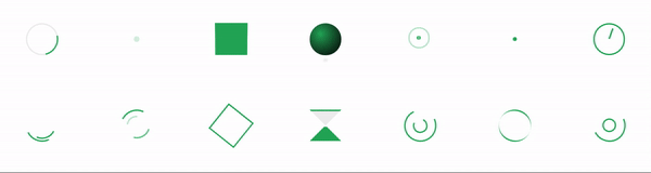
Available Loaders
All the loaders from the main project is available in the component:
| Loader Name | | ----------- | | simple-circle | | rotating-plane | | awesome-spin | | blasting-circle | | box-rotation | | clock | | color-pulse-ball | | double-circle | | hour-glass | | quantum-spinner | |recursive-circle | | block-spin | | cascading-bars |
Any new loader added to the project will be added to the component as well.