
curvy-graphs
v1.0.4
Published
A modern, highly customizable React component library for rendering beautiful, animated, and responsive line and area graphs with smooth curves, gradients, and labeling.

Readme
curvy-graphs
A modern, highly customizable React component library for rendering beautiful, animated, and responsive line and area graphs with smooth curves, gradients, and labeling.
*Caret buttons used to change the date in the Humidity And Temperature chart are not part of this graph library.
Features
- Multiple Graph Types: line, dashed-line, area, or hybrid graphs with smooth Bézier curves or linear lines between points.
- Custom Styling: Easily customize and override styles for title, axes, labels, data tooltips, and svg paths.
- Composable API: Use low-level parts for total control, or high-level components for speed and simplicity.
- Modern UX: Animated drawing, gradients with transparency, responsive layout, data tooltips, and TypeScript support.
Installation
npm install curvy-graphsQuick Start
Live Demo
Try it out in CodeSandbox!
Basic Usage
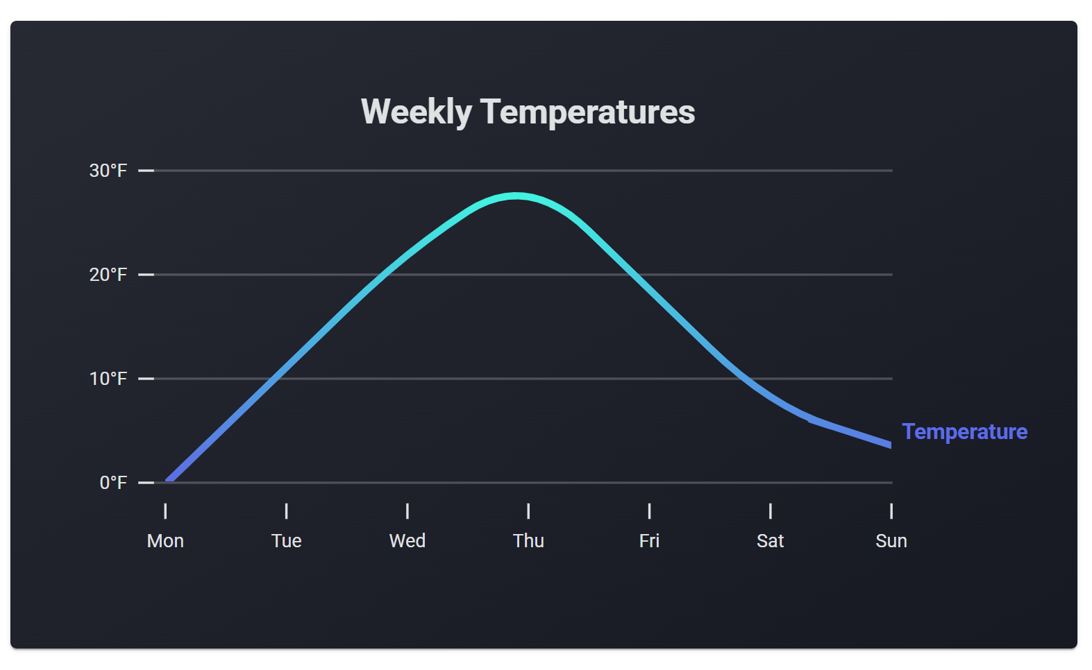
Below is a basic example of <CurvyGraph /> using only the required props.
See API Reference for full details.
import { CurvyGraph } from 'curvy-graphs';

<CurvyGraph
  chartTitle='Weekly Temperatures'
  textColor='#E0E1E2' // For title and axes
  width={613}
  height={310}
  yAxis={{
    labeledPoints: [
      { y: 0, yLabel: '0°F' },
      { y: 10, yLabel: '10°F' },
      { y: 20, yLabel: '20°F' },
      { y: 30, yLabel: '30°F' },
    ],
  }}
  xAxis={{
    labeledPoints: [
      { x: 0, xLabel: 'Mon' },
      { x: 1, xLabel: 'Tue' },
      { x: 2, xLabel: 'Wed' },
      { x: 3, xLabel: 'Thu' },
      { x: 4, xLabel: 'Fri' },
      { x: 5, xLabel: 'Sat' },
      { x: 6, xLabel: 'Sun' },
    ],
  }}
  dataSets={[
    {
      id: 'temperatures', // Unique id accross all charts and datasets
      graphStyle: 'line',
      label: 'Temperature',
      labelColor: '#5D6CE9',
      gradientColorStops: ['#2FF3E0', '#5D6CE9'],
      gradientDirection: 'v',
      data: [
        { x: 0, y: 0 },
        { x: 1, y: 10 },
        { x: 2, y: 21 },
        { x: 3, y: 28 },
        { x: 4, y: 18 },
        { x: 5, y: 7 },
        { x: 6, y: 4 },
      ],
      yRange={[0, 30]} // Necessary because our y-axis is 0 - 30
    }
  ]}
/>
Try this example in CodeSandbox
The above code will produce this chart:
To animate the chart, add the animate prop to CurvyGraph, and optionally add animationDelay to your dataset(s).
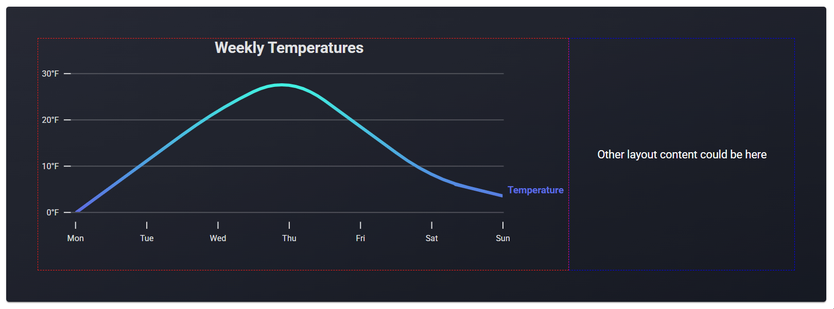
Responsive Usage
In the basic usage example, we set the chart’s width and height using pixels. Alternatively, you can use percentages via the ResponsiveCurvyGraph component.
The only difference in usage between these two components is how the width and height props are handled. Instead of numbers (for pixels), you can pass string percentages or other units. These are converted to pixels and passed to a CurvyGraph.
Below, we recreate the basic usage example, but with a width of 100% within a flex layout:
import { ResponsiveCurvyGraph } from 'curvy-graphs';

<ResponsiveCurvyGraph
  width='100%'
  height={310}
  // ... rest of props ...
/>
import { ResponsiveCurvyGraph } from 'curvy-graphs';
<div style={{ width: '70%', border: '1px dashed red' }}>
<ResponsiveCurvyGraph
width='100%'
height={310}
// ... rest of props ...
/>
</div>
<div style={{
flex: 1,
padding: '20px',
border: '1px dashed blue',
color: 'white',
alignContent: 'center',
textAlign: 'center',
}}>
<p>Other layout content could be here</p>
</div>Try this example in CodeSandbox
The result is this
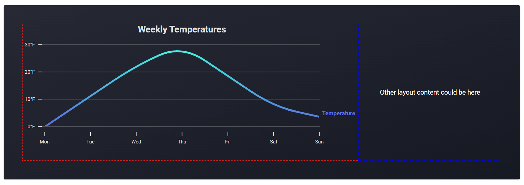
We can also add animation like this:
import { ResponsiveCurvyGraph } from 'curvy-graphs';

<ResponsiveCurvyGraph
  width={'100%'}
  height={310}
  animate={true}  // <-- set animate true here
  // ... rest of props ...
  dataSets={[
    {
      // ... other props ...
      animationDelay: 0, // Default is 0, but this is where you can set delays
    }
  ]}
/>
Try this example in CodeSandbox
The result is this
Tooltips
Charts will show tooltips by default when users hover over data points, or touch them on mobile devices. On touch, tooltips will display for 3 seconds before disappearing.
The data point indicator will be colored according to the chart's textColor.
The hideTooltips prop will disable the tooltips.
Default
The tooltip header shows the dataset label.
The x and y coordinates of the data point appear below the header.
Customize
Tooltips can be customized using the tooltipConfig prop inside each entry of the dataSets array in CurvyGraph or ResponsiveCurvyGraph.
Replace the "x" and "y" labels using xAlias and yAlias:
tooltipConfig: {
  xAlias: "Day",
  yAlias: "Temperature"
}
Result:
Format x/y values using getXLabel and getYLabel:
tooltipConfig: {
  xAlias: "Day",
  yAlias: "Temperature",
  getXLabel: getDayFromX,
  getYLabel: (y) => `${y}°F`
}
Result:
Alternatively, use getCustomLabel for fully customized text:
tooltipConfig: {
  getCustomLabel: (x: number, y: number) => `${y}°F on ${getDayFromX(x)}`
}
Result:
Styles
Customize tooltip styles with:
styles.tooltips.pointIndicatorStyle— styles the indicator circle at the data pointstyles.tooltips.tooltipStyle— styles the tooltip label box
See API Reference for full details or try it in CodeSandbox
Examples
Below are more example charts created with this library.
Click on any image to view the source code for that chart (including the first chart at the top of this README).
For simplicity, the example graphs use hard-coded data.
API Reference
<CurvyGraph /> Props
chartTitle:
string— Main heading text.textColor:
string— Hex color used for the chart title, axis labels, and data point indicators for tooltips.width, height:
number— Chart dimensions in pixels.Use
ResponsiveCurvyGraphfor more options.spaceBelowData:
number(optional) — Extra visual padding (in pixels) below the lowest data point.Note: If you use this, you must also provide
getExtendedYLabelinyAxis. This will affect y-axis tick mark logic and label frequency.This is useful for dynamic y-axis ranges when you want to avoid data touching the x-axis and are working with multiple datasets of different units. e.g. if you are visualizing temperature and humidity on the same chart and want both datasets to have a consistent visual gap below their lowest points,
spaceBelowDataensures that.The first graph in this README uses
spaceBelowData. You can click on the graph to view its source code.When you use
spaceBelowData, the y-axis will determine an extended y-axis minimum value based on the gap you want (px) and your lowest y-value in the dataset. Since this creates new y-axis values,getExtendedYLabelis required to generate labels for those extended points.You can also use this if you want a fixed number of pixels between your lowest data point and the x-axis.
Tip: If your datasets share the same y-axis unit, you can simply pad the yRange that you use for your datasets and y-axis. e.g. if you are visualizing temperatures and your lowest value is 15, you can set the min in your yRange to 10. This achieves the same effect and avoids the need for
spaceBelowData.Default is
0(no padding).animate:
boolean(optional) — Enables animation on data or layout changes.Default is
false.hideTooltips:
boolean(optional) — Hides hover/touch tooltips over data points.Default is
false.isSharp:
boolean(optional) — If true, renders sharp/linear lines between points instead of smooth curves.Default is
false.yAxis:
{ ... }— y-axis configuration:labeledPoints:
LabeledYPoint[]— Array of{ y, yLabel }used to place labeled tick marks on the y-axis.See
generateLabeledYPointsto generate your labeled points!getExtendedYLabel:
(y: number) => string(optional) Callback used to label additional y-axis ticks added whenspaceBelowData> 0.Default returns an empty string for those labels.
labelFrequency:
number(optional) — Show a label on every nth tick.Default is
1.showGuidelines:
boolean(optional) — If true, horizontal guidelines will display behind the chart for each primary (labeled) tick.Default is
true.
xAxis:
{ ... }— x-axis configuration:labeledPoints:
LabeledXPoint[]— Array of{ x, xLabel }used to place labeled tick marks on the x-axis.labelFrequency:
number(optional) — Show a label on every nth tick.Default is
1.
dataSets:
DataSet[]— Datasets to plot. Each dataset includes:id:
string— Unique key accross all charts (no spaces).graphStyle:
'line' | 'dashed-line' | 'area'label:
string— Label displayed to the right of the chart.labelColor:
string— Color of the right-side label.gradientColorStops:
[string, string]— Start and end colors for the gradient.Use the same color for both stops if no gradient is needed.
gradientTransparencyStops:
[number, number](optional) — Start and end opacity values (0–1) for gradient.Default is
[1, 1].gradientDirection:
'v' | 'h'— Direction of the gradient (v= vertical,h= horizontal).Default
v.gradientRelativeToPath: boolean — If true, the gradient will be applied relative to the path shape (starts and ends with data min/max). If false, the gradient will be applied to the entire svg height (starts and ends on entire y-axis range).
Default is
true.yRange:
[number, number](optional) — Custom y-axis range for this dataset.Defaults to your dataset's min and max.
xRange:
[number, number](optional) — Custom x-axis range for this dataset.Defaults to your dataset's min and max.
animationDelay:
number(optional) — Delay (in seconds) before this dataset animates. Useful for staggered effects.Default is
0.data:
Point[]— Array of data points{ x: number | null, y: number | null }.Supports null values for incomplete data. Lines are not drawn between points separated by null.
tooltipConfig: (optional)
getCustomLabel:
(x: number, y: number) => string— (optional) Returns a fully custom label string. When this option is used, the next 4tooltipConfigoptions are ignored.getXLabel:
(x: number) => string(optional) — Custom formatter for the x-value in the tooltip.getYLabel:
(y: number) => string(optional) — Custom formatter for the y-value in the tooltip.xAlias:
string(optional) — Alias to replace the"x"label in the tooltip.yAlias:
string(optional) — Alias to replace the"y"label in the tooltip.
styles:
object(optional) — Custom styles per dataset:labelTop:
number— Top offset for the right-side label relative to its original position (in px).labelLeft:
number— Left offset for the right-side label relative to its original position (in px).pathStyle:
React.CSSProperties— Custom styles applied directly to the SVG path element.
styles:
{ ... }— Custom styling:chartTitle:
{ ... }minHeight:
number(optional) — Minimum height of the title container in pixels.style:
React.CSSProperties(optional) — Custom styles for the chart title.
axes:
{ ... }— Axis tick and label styles:primaryTickColor:
string(optional) — Color of labeled ticks.Default is
textColor.secondaryTickColor:
string(optional) — Color of unlabeled ticks.Defaults to ~25% opacity of
textColor.textStyle:
React.CSSProperties(optional) — Styles applied to the SVG text elements of the axes directly.
rightDataLabels:
{ ... }— Styling for the dataset labels aligned to the chart’s right:style:
React.CSSProperties(optional) — Styles for the label container.textStyle:
React.CSSProperties(optional) — Styles applied to the SVG text elements directly.
tooltips:
{ ... }— Styling for the data point tooltips:pointIndicatorStyle:
React.CSSProperties(optional) — Styles for the point indicator.tooltipStyle:
React.CSSProperties(optional) — Styles for the tooltip.
<ResponsiveCurvyGraph /> Props
width, height:
string | number— Chart dimensions in pixels, %, or other units.See CurvyGraph section for all other props.
generateLabeledYPoints
Utility function that generates an array of evenly spaced LabeledYPoint objects, each with a y value and a corresponding yLabel — across a given y-axis range.
Parameters
yRange:[min, max]range for the y-axis.totalDataPoints: Total number of labeled points to generate across the range.getLabel:(y: number) => string— Function that returns a label for each y value.
Note: If your chart uses spaceBelowData for visual padding, you may want to adjust your desired totalDataPoints.
Returns
LabeledYPoint[]— Array of{ y: number, yLabel: string }objects.
Example
import { generateLabeledYPoints } from 'curvy-graphs/parts'

generateLabeledYPoints([2, 10], 5, (y) => `${y}°F`);
Returns:
[
  { y: 2, yLabel: '2°F' },
  { y: 4, yLabel: '4°F' },
  { y: 6, yLabel: '6°F' },
  { y: 8, yLabel: '8°F' },
  { y: 10, yLabel: '10°F' }
]
Parts - Advanced Use
For even greater customization, use the graph parts that make CurvyGraph directly: ChartTitle, CurvyGraphPart, CurvyGraphAnimator, TooltipsLayer, InteractionPoints, Tooltip, XAxis, YAxis, and RightDataLabel.
ChartTitle— Renders a styled, centered chart title.title:
string— The text to display as the chart title.widthToCenterOn:
number— The width (in pixels) used to center the title.leftOffset:
number— The left offset (in pixels) for positioning the title.style:
React.CSSProperties(optional) — Additional CSS styles to apply to the title. This will also override the default styles (including the default width and left values controlled by props).
CurvyGraphPart— renders the data of a curvy graph, supporting line, area, and dashed-line types with gradients and refs for external animation.id:
string— Unique identifier for the graph part instance.animationRefs:
{ clipPathRect: React.Ref<SVGRectElement>; svgRoot: React.Ref<SVGSVGElement>; }(optional) — Refs for SVG elements, allowing parent components to control animation (e.g., for reveal effects).data:
{ x: number | null, y: number | null }[]— Array ofPointobjects representing the data to plot.width:
number— Width of the SVG/chart area in pixels.height:
number— Height of the SVG/chart area in pixels.yRange:
[number, number](optional) — y-axis range to be used instead of normalizing over data min/max.xRange:
[number, number](optional) — x-axis range to be used instead of normalizing over data min/max.type:
GraphType—'area' | 'dashed-line' | 'line'.spaceBelowData:
number— Extra space below the lowest data point for visual padding.gradientColorStops:
[string, string]— Start and end color for the SVG gradient fill/stroke. gradientTransparencyStops:[number, number](optional) — Start and end opacity values (0–1) for gradient.Default is
[1, 1].gradientDirection:
'v' | 'h'— Direction of the gradient (v= vertical,h= horizontal).Default
v.gradientRelativeToPath: boolean — If true, the gradient will be applied relative to the path shape (starts and ends with data min/max). If false, the gradient will be applied to the entire svg height (starts and ends on entire y-axis range).
Default is
true.showAreaShadow:
boolean(optional) — If true, displays a shadow above/behind the area graph.isSharp:
boolean(optional) — If true, renders straight lines between data points (sharp/linear). If false, renders smooth, curvy lines using Bézier curves.Default is
false.style:
React.CSSProperties(optional) — CSS styles for the container div.pathStyle:
React.CSSProperties(optional) — CSS styles for the path element.
CurvyGraphAnimator— Handles animated reveal of graph paths.id:
string— Unique identifier for the animator instance.animate:
boolean(optional) — If false, disables the animation.Default
truedata:
{ x: number | null, y: number | null }[]— Array ofPointobjects; changes to this array trigger re-animation.width:
number— The target width (in pixels) to animate the reveal to.delay:
number— Delay (in seconds) before starting the animation.children:
(refs: { clipPathRect: React.Ref<SVGRectElement>; svgRoot: React.Ref<SVGSVGElement>; }) => React.ReactNode— Render prop function that receives refs for the clip path rectangle and SVG root, allowing child graph components to use these refs for animation.The component uses a wrapper pattern, so the child graph is not defined here.
Instead, it passes animation refs to its children for flexible integration.Example
  <CurvyTimeGraphAnimator>
    {(refs) => (
      <CurvyTimeGraph
        animationRefs={refs}
      />
    )}
  </CurvyTimeGraphAnimator>
TooltipsLayer— Overlay invisible interaction points on the graph (viaInteractionPoints) and show a styled tooltip (viaTooltip) when a user hovers over a data point.All
InteractionPointProps — exceptonHover(handled internally)All
TooltipProps — exceptinteractionPoint(provided internally)
InteractionPoints— Render invisible SVG circles over each data point to enable tooltip interactions on hover or touch.width:
number— Width of the SVG/chart area in pixels.height:
number— Height of the SVG/chart area in pixels.dataTop:
number— Top offset in pixels to position the SVG overlay.dataLeft:
number— Left offset in pixels to position the SVG overlay.dataSets: Array of datasets to visualize:
id:
string— Unique identifier for the dataset.label:
string— Label used for identifying the dataset.data:
Point[]— Array of data points to render.xRange:
[number, number](optional) — Min and max range to normalize x-values.yRange:
[number, number](optional) — Min and max range to normalize y-values.tooltipConfig: (optional)
getCustomLabel:
(x: number, y: number) => string— (optional) Returns a fully custom label string.getXLabel:
(x: number) => string(optional) — Custom formatter for the x-value in the tooltip.getYLabel:
(y: number) => string(optional) — Custom formatter for the y-value in the tooltip.xAlias:
string(optional) — Alias to replace the"x"label in the tooltip.yAlias:
string(optional) — Alias to replace the"y"label in the tooltip.
spaceBelowData:
number— Extra vertical padding below the lowest data point (affects normalization).onHover:
(point: InteractionPoint | null) => void— Callback triggered on hover or touch. Receives anInteractionPointornullwhen leaving a point.
Tooltip— Displays a styled tooltip and a point indicator for a hovered data point on a graph.interactionPoint: Object describing the current point being hovered or touched.
svgPoint:
{ x: number, y: number }— SVG coordinates of the hovered point.dataSetLabel:
string— Label for the dataset the point belongs to.pointLabel: Either of the following:
CustomInteractionLabel:
{ custom: string }— A fully customized tooltip string, rendered as-is.XYInteractionLabel:
{
  xLabel: string; // The value to display for x
  yLabel: string; // The value to display for y
  xAlias: string; // The label to display before x
  yAlias: string; // The label to display before y
}
dataLeft:
number— The left offset (in pixels) for positioning the tooltip relative to the graph.dataTop:
number— The top offset (in pixels) for positioning the tooltip relative to the graph.textColor:
string— Color used for the tooltip border and the point indicator.pointIndicatorStyle:
React.CSSProperties(optional) — Custom styles for the circular point indicator.tooltipStyle:
React.CSSProperties(optional) — Custom styles for the tooltip.
XAxis— Render x-axis with ticks and labels.data:
{ xLabel: string, xSubLabel?: string, x: number}[]— Array of labeled X points, each with a value and label (and optional sublabel).width:
number— The width of the chart area in pixels.xRange:
[number, number](optional) — x-axis range to use instead of normalized values from your data min and max.labelFrequency:
number(optional) — Show a label on every nth tick.Default is
1.primaryTickColor:
string— Color for primary (labeled) tick marks.secondaryTickColor:
string— Color for secondary (unlabeled) tick marks.labelColor:
string— Color for the x-axis labels and sublabels.style:
React.CSSProperties(optional) — CSS styles for the x-axis container.
textStyle:
React.CSSProperties(optional) — CSS styles for the labels of the axis.YAxis— Render y-axis with ticks, labels, and guidelines.height:
number— The height of the y-axis in pixels (should match chart height).graphWidth:
number— The width of the chart area, used for drawing guidelines.labelFrequency:
number(optional) — Show a label on every nth tick.Default is
1.labeledYPoints:
LabeledYPoint[]— Array of{ y, yLabel }used to place labeled tick marks on the y-axis.See
generateLabeledYPointsto generate your labeled points!spaceBelowData:
number(optional) — Extra space below the lowest data point for visual padding.getLabel:
(y: number) => string(optional) Callback used to label additional y-axis ticks added whenspaceBelowData> 0.Default returns an empty string for those labels.
yRange:
[number, number](optional) — y-axis range to use instead of normalized values from your data min and max.onConfigMeasured:
(config: YAxisLabelConfig) => void(optional) — Callback to access the rendered y-axis config values (in pixels).primaryTickColor:
string— Color for primary (labeled) tick marks.secondaryTickColor:
string— Color for secondary (unlabeled) tick marks and guidelines.labelColor:
string— Color for the y-axis labels.showGuideLines:
boolean(optional) — If true, horizontal guidelines will display behind the chart for each primary (labeled) tick. Default is true.style:
React.CSSProperties(optional) — CSS styles for the y-axis container.textStyle:
React.CSSProperties(optional) — CSS styles for the labels of the axis.
RightDataLabel— Renders a label next to the last data point. The component normalizes data points, positions the label at the last data point, and dynamically measures its width for layout purposes.data:
{ x: number | null, y: number | null }[]— Array ofPointobjects representing the data to plot. Used to calculate the normalized y values the same way the chart data does. This way we get an accurate final y value to position the text relative to.height:
number— Height of the SVG/chart area in pixels.yRange:
[number, number](optional) — y-axis range to specify instead of the data min/max.labelColor:
string— Color for the label text.label:
string— The text to display as the label.spaceBelowData:
number(optional) — Extra space below the lowest data point for visual padding. Used for position calculations to match where the data is actually rendered in the chart.onWidthMeasured:
(width: number) => void(optional) — Callback to access the rendered label width (in pixels).style:
React.CSSProperties(optional) — CSS styles for the container div.textStyle:
React.CSSProperties(optional) — CSS styles for the SVG text element directly. Can also override default values.
Here is an example of using parts. To reduce complexities in this example, the graph is not responsive or dynamic in its dimensions.
import { ChartTitle, CurvyGraphAnimator, CurvyGraphPart, XAxis, YAxis, RightDataLabel } from 'curvy-graphs/parts';

export const BasicPartsGraph = () => {
  const themePrimary = '#E0E1E2';
  const width = 500;
  const height = 250;
  const dataTop = 50; // Top offset of data below title
  const yAxisWidth = 55;
  const graphId: string = 'temperature-parts';

  const data = [
    { x: 0, y: 0 },
    { x: 1, y: 10 },
    { x: 2, y: 21 },
    { x: 3, y: 28 },
    { x: 4, y: 18 },
    { x: 5, y: 7 },
    { x: 6, y: 4 },
  ];

  const xLabels = [
    { x: 0, xLabel: 'Mon' },
    { x: 1, xLabel: 'Tue' },
    { x: 2, xLabel: 'Wed' },
    { x: 3, xLabel: 'Thu' },
    { x: 4, xLabel: 'Fri' },
    { x: 5, xLabel: 'Sat' },
    { x: 6, xLabel: 'Sun' },
  ];

  const getXLabel = (xCoor) => xLabels.find(({ x }) => x === xCoor)!.xLabel;
  const getYLabel = (yCoor) => `${yCoor}°F`;

  return (
    <div style={{ position: 'relative', width: width, height: height}}>
      <ChartTitle
        title='Weekly Temperatures'
        color={themePrimary}
        widthToCenterOn={width - yAxisWidth}
        leftOffset={yAxisWidth}
      />
      <YAxis
        style={{ position: 'absolute', top: dataTop - 1, left: 0 }}
        labeledYPoints={[
          { y: 0, yLabel: '0°F' },
          { y: 10, yLabel: '10°F' },
          { y: 20, yLabel: '20°F' },
          { y: 30, yLabel: '30°F' },
        ]}
        spaceBelowData={0}
        getLabel={undefined}
        graphWidth={width - yAxisWidth}
        height={height - dataTop}
        primaryTickColor={themePrimary}
        secondaryTickColor='#E0E1E240'
        labelColor={themePrimary}
        labelFrequency={1}
        showGuideLines={true}
      />
      <CurvyGraphAnimator
        id={graphId}
        animate={true}
        width={width}
        delay={0}
        data={data}
      >
        {(refs: {
              clipPathRect: React.Ref<SVGRectElement>;
              svgRoot: React.Ref<SVGSVGElement>;
          }) => (
          <>
            <CurvyGraphPart
              id={graphId}
              animationRefs={refs}
              style={{ position: 'absolute', top: dataTop, left: yAxisWidth }}
              width={width - yAxisWidth}
              height={height - dataTop}
              spaceBelowData={0}
              data={data}
              yRange={[0, 30]}
              xRange={undefined}
              gradientColorStops={['#2FF3E0', '#5D6CE9']}
              gradientDirection='v'
              type='line'
              isSharp={false}
            />
            <RightDataLabel
              style={{ position: 'absolute', top: dataTop - 18, left: width + 7 }}
              height={height - 50}
              spaceBelowData={0}
              data={data}
              label={'Temperature'}
              labelColor={'#5D6CE9'}
              yRange={[0, 30]}
            />
          </>
        )}
      </CurvyGraphAnimator>

      <TooltipsLayer
        width={width - yAxisWidth}
        height={height - dataTop}
        dataTop={dataTop}
        dataLeft={yAxisWidth}
        spaceBelowData={0}
        dataSets={[{
          id: graphId,
          label: 'Temperature',
          data: data,
          yRange: [0, 30],
          tooltipConfig: {
            getXLabel,
            getYLabel,
            xAlias: 'Day',
            yAlias: 'Temp',
          }
        }]}
        textColor={themePrimary}
      />

      <XAxis
        style={{ position: 'absolute', top: height + 7, left: yAxisWidth }}
        width={width - yAxisWidth}
        data={xLabels}
        labelFrequency={1}
        primaryTickColor={themePrimary}
        secondaryTickColor='#E0E1E240'
        labelColor={themePrimary}
      />
    </div>
  );
}
Try this example in CodeSandbox
This produces the same graph as our first basic example:
Maintenance & Support
⚠️ Please note, this package is lightly maintained. PRs and issues are welcome but support may be limited.
Changelog
See CHANGELOG.md or GitHub Releases for details on updates.
License
Apache License
(Anyone can use, modify, and distribute the code freely. They just need to keep the license, credit the original authors, and note any changes they make. See full details in license.)