
custom-themed-button
v1.0.5
Published
A buttons package that works best with styled-components. so set up your styled-components theme if you haven't already and keep on reading!


Readme
Custom Themed Button
A buttons package that works best with styled-components. so set up your styled-components theme if you haven't already and keep on reading!
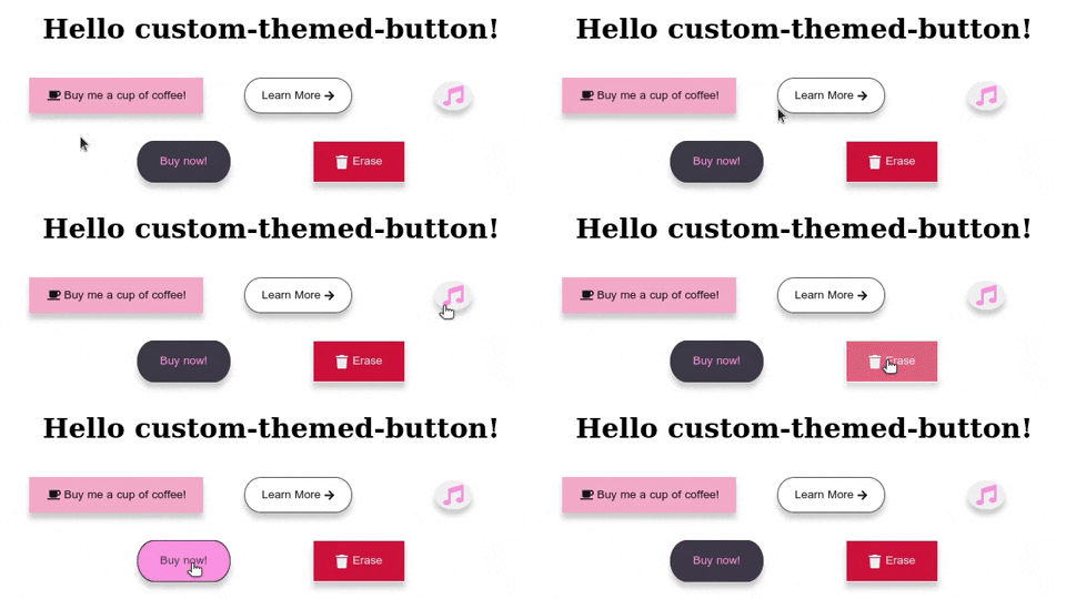
CodeSandbox playground: https://codesandbox.io/s/custom-themed-button-sandbox-r6ei7?file=/src/App.tsx
npm i custom-themed-button// Set up your styled-components theme
export const theme = {
main: '#39A2DB',
mainDark: '#053742',
mainLight: '#A2DBFA',
sec: '#FFA900',
secDark: '#E2703A',
secLight: '#E6DD3B',
error: '#D44000',
};
// Wrap your app with the <ThemeProvder> and pass your theme
import { ThemeProvider } from 'styled-components';
function App() {
return <ThemeProvider theme={theme}>...App Children</ThemeProvider>;
}
// The Button Components wil be available anywhere in your app!
import { Button } from 'custom-themed-button';
function Example() {
return (
<div>
<Button text="Custom Themed Button" color="main" bgColor="sec" />
</div>
);
}Note that when we pass color props to the Button component, we use the same names as in the theme object.
Let's review the available props:
Required props:
| prop | value | Description | default | required? | | ------- | ------ | ------------------------------------------------------------------------------------------ | ------- | --------- | | text | string | Button text. | none | no | | color | string | Font color. The name of the color as written in the theme object. e.g color='main' | none | yes | | bgColor | string | Background color. The name of the color as written in the theme object. e.g bgColor='main' | none | yes |
Styling Props:
| prop | value | Description | default | required? | | ------------ | ---------------------------- | ------------------------------------------------------------------------------------------------------ | --------- | --------- | | size | 'xs', 'sm', 'md', 'lg', 'xl' | Background color. The name of the color as written in the theme object. | 'md' | no | | icon | any | Icon to display in the button or next to the text if provided. | none | no | | iconSize | string | The font-size of the icon, any unit is acceptable. e.g: iconSize='2rem' or iconSize='20px'. | 'initial' | no | | iconPosition | 'left', 'right' | The position of the icon, relatively to the text if provided. | 'left' | no | | shape | 'pill', 'circle' | The shape of the button. | regular | no | | showShadow | boolean | Determines whether the button should have a shadow or not. | true | no | | showBorder | boolean | Determines whether the button should have a border or not. | true | no | | borderWidth | string | The width of the border if exists, works with any unit. e.g: borderWidth='2rem' or borderWidth='20px'. | '1px' | no | | borderColor | string | Border color. The name of the color as written in the theme object. e.g borderColor='secDark' | 'bgColor' | no | | fontWeight | string | Font weight of the text. Accepts any valid CSS value. | 'initial' | no |
Animation/Hover Props:
| prop | value | Description | default | required? | | ------------ | ---------------------------------------------------------------------- | ------------------------------------------------------------------------------------------------------------------------------------------- | -------------------------- | --------- | | hoverColor | string | Font color on hover. The name of the color as written in the theme object . e.g hoverColor='sec' | color | no | | hoverEffect | 'expand', 'lowerOpacity', '2dClick', 'slideFormLeft', 'slideFromRight' | Button animation on hover | 'expand'. | no | | slideBgColor | string | if a slide hoverEffect was selected, you can specify the background color of the slider. Should be written the same as in the theme object. | inverses 'color'&'bgColor' | no |
Button Element Props:
| prop | value | Description | default | required? | | ----------- | -------- | -------------------------------------------------------- | ------- | --------- | | handleClick | function | Works the same as onClick. | none | no | | disabled | boolean | Determines whether the button should be disabled or not. | false | no |
Hit me up at [email protected] if you have any questions.
Also available on LinkedIn