
cw-component-vue3
v1.5.42
Published
## Installation ### Vue2安裝方式 #### npm 安裝 v1.5.0 ``` npm install cw-component ``` #### 全域import (recommended) ```javascript import Vue from "vue"; import App from "./App.vue"; import CwComponent from "cw-component";


Readme
共用組件
Installation
Vue2安裝方式
npm 安裝 v1.5.0
npm install cw-component全域import (recommended)
import Vue from "vue";
import App from "./App.vue";
import CwComponent from "cw-component";

Vue.use(CwComponent);
new Vue({
  render: (h) => h(App),
}).$mount("#app");
以components方式使用
import { CwButton } from "cw-component";

// Register components in your 'main.js'
Vue.component("CwButton", CwButton);

// Or just use in separate component
export default {
  components: { CwButton }
  ...
}
常用方法,部分組件需使用,建議全域套用
import { ClickOutside } from 'cw-component';
Vue.directive("click-outside", ClickOutside);
組建需引用的其他組件,部分組件需使用,建議建議全域套用
import { CwFontAwesomeIcon } from 'cw-component';
Vue.component("CwFontAwesomeIcon", CwFontAwesomeIcon);
Vue3安裝方式
npm 安裝
npm install cw-component-vue3全域 import (recommended)
import { createApp } from 'vue';
import App from './App.vue';
import CwComponent from 'cw-component-vue3';

const app = createApp(App);
app.use(CwComponent);
app.mount('#app');
以components方式使用
import { CwButton } from 'cw-component-vue3';

// Register components in your 'main.js'
const app = createApp(App);
app.component('CwButton', CwButton);
...

// Or just use in separate component
export default {
  components: { CwButton },
  ...
};
常用方法,部分組件需使用,建議全域套用
import { ClickOutside } from 'cw-component';
app.directive("click-outside", ClickOutside);
組建需引用的其他組件,部分組件需使用,建議建議全域套用
import { CwFontAwesomeIcon } from 'cw-component';
app.component("CwFontAwesomeIcon", CwFontAwesomeIcon);
樣式設定
引入共用組件時可以加入options設定樣式的基本共用樣式。
- 基礎樣式的key為theme
- 除了基礎樣式個別組件也能自訂樣式,如:button、input
- 個別組件樣式可能有多層設定,詳細請參照各組件說明
app.use(CwComponent, {
  theme: { 基本樣式設定於此 },
  button: { button預設樣式設定於此 },
});
基本樣式
| 參數1 | 參數2 | 說明 | | - | - | - | | theme | | | | - | color_primary | 主色 - default | | - | color_primary_200 | 主色 - 200 | | - | color_primary_100 | 主色 - 100 | | - | color_secondary | 輔色 - 綠色 - default | | - | color_warn | 警告色 - default | | - | color_warn_100 | 警告色 - 100 | | - | color_black | 黑色 | | - | color_gray_600 | 灰色 - 600 | | - | color_gray_500 | 灰色 - 500 | | - | color_gray_400 | 灰色 - 400 | | - | color_gray | 灰色 - default | | - | color_gray_300 | 灰色 - 300 | | - | color_gray_200 | 灰色 - 200 | | - | color_gray_100 | 灰色 - 100 | | - | border_radius | 圓角弧度 | | - | font_size_xl | 字體大小 - extra large | | - | font_size_l | 字體大小 - large | | - | font_size_m | 字體大小 - medium | | - | font_size_s | 字體大小 - small | | - | font_size_xs | 字體大小 - extra small |
Button

usage
元件名稱: CwButton
<CwButton type="button" width="120px" :buttonStyle="{ color: '#01579B', background: '#FFF', borderColor: '#01579B', padding: '0 15px', height: '35px' }"></CwButton>props
| 參數 | type | 說明 | default | | ------------ | ------- | ------------ | ------- | | width | String | 按鈕寬度,預設 fit-content | fit-content | | type | String | button type | button | | disabled | Boolean | 是否禁用 | false | | primary | Boolean | 主按鈕樣式 | false | | secondary | Boolean | 次按鈕樣式 | false | | warn | Boolean | 警告按鈕樣式 | false | | customClasses| Array | 客製化樣式表, ex: ['class1', 'class2'] | [] | | buttonStyle | Object | 客製化樣式,支援 key:color、background、borderColor、padding、height | {} |
events
| Name | 說明 | | ----- | -------- | | click | 按鈕點擊(無參數) |
slot
| Name | 說明 | | - | - | | default | 按鈕文字 | | icon | 按鈕icon |
樣式設定
| 參數1 | 參數2 | 參數3 | 說明 | | - | - | - | - | | button | | | | - | background_color | | 背景顏色 | | - | border | | 邊框 | | - | border_radius | | 邊角圓弧 | | - | font_size | | 文字大小 | | - | font_color | | 文字顏色 | | - | padding | | 內距 | | - | min_height | | 最小高度 | | - | min_width | | 最小寬度 | | - | box_shadow | | 陰影 | | - | primary | | primary按鈕樣式 | | - | - | background | primary背景顏色 | | - | - | border | primary邊框 | | - | - | font_color | primary文字顏色 | | - | - | box_shadow | primary陰影 | | - | secondary | | secondary按鈕樣式 | | - | - | background | secondary背景顏色 | | - | - | border | secondary邊框 | | - | - | font_color | secondary文字顏色 | | - | - | box_shadow | secondary陰影 | | - | warn | | warn按鈕樣式 | | - | - | background | warn背景顏色 | | - | - | border | warn邊框 | | - | - | font_color | warn文字顏色 | | - | - | box_shadow | warn陰影 |
範例
app.use(CwComponent, {
  button: {
    border_radius: '10px',
    background_color: '#0084FF',
    primary: {
      background_color: '#00d739',
    }
  },
})
Input
[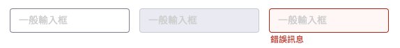 ](https://cdn-km.cwg.tw/uploads/images/gallery/2023-02/image-1675752893264.png)
usage
元件名稱: CwInput
<CwInput></CwInput>props
| 參數 | type | 說明 | options | default | | - | - | - | - | - | | width | String | input寬度須加單位,ex: "250px" | | | | value | String | input的值 | | | | type | String | input類型 | text、number| text | | disabled | Boolean | 是否禁用 | | false | | invalid | Boolean | 是否警示 | | false | | error | String | 錯誤訊息 | | placeholder | String | placeholder | | align | String | 對齊方式 | left、right、center | left |
events
| Name | 說明 | | - | - | | input | 輸入框 on input | | change | 輸入框 on change | | focus | 輸入框 on focus | | blur | 輸入框 on blur | | compositionStart | 中文輸入法開始事件 | | compositionUpdate | 中文輸入法更新事件 | | compositionEnd | 中文輸入法結束事件 |
樣式設定
| 參數1 | 參數2 | 參數3 | 說明 | | - | - | - | - | | input | | | | | - | min_height | | 最小高度 | | - | font_size | | 文字大小 | | - | border_radius | | 輸入匡圓弧 | | - | padding | | 輸入匡內距 | | - | box_shadow | | 陰影 | | - | font_color | | 文字顏色 | | - | placeholder_color | | placeholder顏色 | | - | border | | 邊框 | | - | background_color | | 背景色 | | - | hover | | hover時的樣式設定 | | - | - | border | hover時邊框 | | - | - | background_color | hover時背景色 | | - | focus | | focus時的樣式設定 | | - | - | border | focus時邊框 | | - | - | background_color | focus時背景色 | | - | - | box_shadow | focus時陰影 | | - | disabled | | disabled時的樣式設定 | | - | - | font_color | disabled時文字顏色 | | - | - | border | disabled時邊框 | | - | - | background_color | disabled時背景色 | | - | invalid | | 警告時的樣式設定 | | - | - | border | 警告時邊框 | | - | - | background_color | 警告時背景色 | | - | error | | 錯誤樣式設定 | | - | - | font_color | 錯誤提示文字顏色 | | - | - | font_size | 錯誤提示文字大小 |
範例
app.use(CwComponent, {
  input: {
    border_radius: '10px',
    hover: {
      background_color: '#f4f4f4'
    }
  },
})
Select

usage
元件名稱: CwSelect
<CwSelect></CwSelect>props
| 參數 | type | 說明 | options | default | | - | - | - | - | - | | width | String | select寬度,須加單位 | | 100% | | value | Any | v-model雙向綁定值,單選為字串,多選為陣列 | | | | disabled | Boolean | 是否禁用 | | false | | invalid | Boolean/Number | 是否警示 | | false | | error | String | 錯誤訊息 | | | | placeholder | String | placeholder | | 請選擇 | | multiple | Boolean | 是否為多選 | | false | | filter | Boolean | 是否啟用篩選功能 | | false | | clean | Boolean | 是否啟用清空功能 | | false | | options | Array | select選項 | | [] | | editOptions | Array/null | 編輯時選項(優先於 options) | | null | | readOptions | Array/null | 顯示時選項(優先於 options) | | null | | labelKey | String | 顯示文字的key | | text | | valueKey | String | 儲存值的key | | value | | emptyText | String | 選項為空時的提示文字 | | 沒有資料 : ( | | customFilter | Boolean | 是否自訂篩選(不自動過濾) | | false | | usePosition | String | 選單定位方式 | fixed/absolute | fixed |
events
| Name | 說明 | | - | - | | update:value | v-model用,值變更時觸發 | | change | 值變更時觸發 | | select | 選擇時觸發 | | valueChange | 舊版相容,值變更時觸發 | | metaChange | 當option有meta參數時觸發,回傳完整option | | clean | 清空選項時觸發 | | input | 輸入框內容變更時觸發 | | focus | 輸入框 focus 時觸發 | | blur | 輸入框 blur 時觸發 | | cancel | 多選取消選項時觸發 | | compositionStart | 中文輸入法開始事件 | | compositionUpdate | 中文輸入法更新事件 | | compositionEnd | 中文輸入法結束事件 |
slot
| Name | 說明 | | - | - | | icon | select左側icon | | custom-empty | 自訂無資料顯示內容 |
樣式設定
| 參數1 | 參數2 | 參數3 | 說明 | | - | - | - | - | | select | | | | | - | font_size | | 文字大小 | | - | min_height | | 最小高度 | | - | border_radius | | 輸入匡圓弧 | | - | box_shadow | | 陰影 | | - | font_color | | 文字顏色 | | - | placeholder_color | | placeholder顏色 | | - | padding_top | | 輸入匡上內距 | | - | padding_right | | 輸入匡右內距 | | - | padding_bottom | | 輸入匡下內距 | | - | padding_left | | 輸入匡左內距 | | - | border_width | | 邊框粗細 | | - | border_style | | 邊框樣式 | | - | border_color | | 邊框顏色 | | - | hover | border | hover時邊框 | | - | - | background_color | hover時背景色 | | - | - | box_shadow | hover時陰影 | | - | disabled | | disabled時的樣式設定 | | - | - | border | disabled時邊框 | | - | - | background_color | disabled時背景色 | | - | - | box_shadow | disabled時陰影 | | - | - | font_color | disabled時文字顏色 | | - | invalid | | 警告樣式設定 | | - | - | border | 警告時邊框 | | - | - | background_color | 警告時背景色 | | - | - | box_shadow | 警告時陰影 | | - | - | font_color | 警告時文字顏色 | | - | error | | 錯誤樣式設定 | | - | - | font_color | 錯誤提示文字顏色 | | - | - | font_size | 錯誤提示文字大小 | | - | options | | 選項樣式設定 | | - | - | actived_background_color | 選項actived的背景顏色 | | - | - | actived_font_color | 選項actived的文字樣式 | | - | - | hover_background_color | 選項hover的背景顏色 | | - | - | hover_font_color | 選項hover的文字樣式 | | - | - | hover_actived_background_color | actived選項hover時的背景顏色 | | - | - | hover_actived_font_color | actived選項hover時的文字樣式 | | - | - | disabled_background_color | 選項disabled的背景顏色 | | - | - | disabled_font_color | 選項disabled的文字樣式 | | - | multiple-tag | | multiple select tag樣式設定 | | - | - | border | tag邊框 | | - | - | background_color | tag背景色 | | - | - | font_color | tag文字顏色 | | - | - | border_radius | tag圓弧 | | - | - | padding | tag輸入匡內距 | | - | - | font_size |文字大小 | | - | - | disabled_background_color | disabled tag的背景顏色 | | - | - | disabled_font_color | disabled tag的文字顏色 | | - | - | cancel_btn_color | 叉叉顏色 | | - | - | min_height | 最小高度 | | - | error | | 錯誤樣式設定 | | - | - | font_color | 錯誤提示文字顏色 | | - | - | font_size | 錯誤提示文字大小 |
範例
app.use(CwComponent, {
  select: {
    background_color: '#f4f4f4',
    actived: {
      background_color: '#E6F7FF'
    }
  },
})
Checkbox

usage
元件名稱: CwCheckbox
<CwCheckbox></CwCheckbox>props
| 參數 | type | 說明 | options | default | | - | - | - | - | - | | width | String | input寬度須加單位,ex: "250px" | | | value | String | 單選時v-model監測對象 | | | values | Array | 多選時v-model監測對象 | | [] | | checkboxValue | String | checkbox的value | | part | Boolean | 是否為部分選取 | | false | | disabled | Boolean | 是否禁用 | | false | | invalid | Boolean | 是否警示 | | false | | error | String | 錯誤訊息 | | reverse | Boolean | 勾選邏輯是否顛倒,啟用時勾選狀態為false | | false | | symbol | String | 勾選時的樣式 | tick/cross(打勾/打叉) | tick |
events
| Name | 說明 | | - | - | | change | checkbox勾選變更 |
slot
| Name | 說明 | | - | - | | default | checkbox文字 |
樣式設定
| 參數1 | 參數2 | 參數3 | 說明 | | - | - | - | - | | checkbox | | | | | - | size | | checkbox大小 | | - | border_radius | | checkbox的圓角弧度 | | - | border | | checkbox匡線 | | - | tick | | 打勾型checkbox樣式 | | - | - | border | 匡線 | | - | - | background_color | 背景色 | | - | - | color | 勾勾顏色 | | - | - | checked_background_color | 打勾時背景色 | | - | cross | | 打叉型checkbox樣式 | | - | - | border | 匡線 | | - | - | background_color | 背景色 | | - | - | color | 叉叉顏色 | | - | - | checked_background_color | 打叉時背景色 | | - | error | | 錯誤樣式設定 | | - | - | font_color | 錯誤提示文字顏色 | | - | - | font_size | 錯誤提示文字大小 |
範例
app.use(CwComponent, {
  checkbox: {
    size: '30px',
    tick: {
      color: '#E6F7FF'
    }
  },
})
Radio

usage
元件名稱: CwRadio
<CwRadio></CwRadio>props
| 參數 | type | 說明 | options | default | | - | - | - | - | - | | width | String | input寬度須加單位,ex: "250px" | | | value | String | v-model監測對象 | | radioValue | String | radio的value | | disabled | Boolean | 是否禁用 | | false | | invalid | Boolean | 是否警示 | | false | | error | String | 錯誤訊息 |
events
| Name | 說明 | | - | - | | change | radio勾選變更 |
slot
| Name | 說明 | | - | - | | default | radio文字 |
樣式設定
| 參數1 | 參數2 | 參數3 | 說明 | | - | - | - | - | | radio | | | | | - | size | | radio大小 | | - | border_radius | | radio的圓角弧度 | | - | border | | radio匡線 | | - | background_color | | radio背景色 | | - | checked | | 選擇時樣式 | | - | - | color | 中心顏色 | | - | - | border | 邊框 | | - | disabled | | disabled樣式 | | - | - | border | 邊框 | | - | - | background_color | 背景色 | | - | - | checked_color | 選中時顏色 | | - | invalid | | 警告樣式 | | - | - | border | 邊框 | | - | - | background_color | 背景色 | | - | - | checked_color | 選中時顏色 | | - | error | | 錯誤樣式設定 | | - | - | font_color | 錯誤提示文字顏色 | | - | - | font_size | 錯誤提示文字大小 |
範例
app.use(CwComponent, {
  radio: {
    size: '30px',
    checked: {
      color: '#E6F7FF'
    }
  },
})
Textarea

usage
元件名稱: CwTextarea
<CwTextarea></CwTextarea>props
| 參數 | type | 說明 | options | default | | - | - | - | - | - | | width | String | textarea寬度須加單位,ex: "250px" | | | height | String | textarea高度須加單位,ex: "250px" | | value | String | v-model監測對象 | | disabled | Boolean | 是否禁用 | | false | | invalid | Boolean | 是否警示 | | false | | error | String | 錯誤訊息 | | placeholder | String | placeholder | | autoHeight | Boolean | 是否根據內文自動調整高度 | | false |
events
| Name | 說明 | | - | - | | input | 輸入框 on input | | focus | 輸入框 on focus | | blur | 輸入框 on blur |
樣式設定
| 參數1 | 參數2 | 參數3 | 說明 | | - | - | - | - | | textarea | | | | | - | font_size | | 文字大小 | | - | border_radius | | 輸入匡圓弧 | | - | padding | | 輸入匡內距 | | - | box_shadow | | 陰影 | | - | font_color | | 文字顏色 | | - | placeholder_color | | placeholder顏色 | | - | border | | 邊框 | | - | background_color | | 背景色 | | - | hover | | hover時的樣式設定 | | - | - | border | hover時邊框 | | - | - | background_color | hover時背景色 | | - | - | box_shadow | hover時陰影 | | - | focus | | focus時的樣式設定 | | - | - | border | focus時邊框 | | - | - | background_color | focus時背景色 | | - | - | box_shadow | focus時陰影 | | - | disabled | | disabled時的樣式設定 | | - | - | font_color | disabled時文字顏色 | | - | - | border | disabled時邊框 | | - | - | background_color | disabled時背景色 | | - | - | box_shadow | disabled時陰影 | | - | invalid | | 警告時的樣式設定 | | - | - | border | 警告時邊框 | | - | - | background_color | 警告時背景色 | | - | error | | 錯誤樣式設定 | | - | - | font_color | 錯誤提示文字顏色 | | - | - | font_size | 錯誤提示文字大小 |
範例
app.use(CwComponent, {
  textarea: {
    border_radius: '10px',
    hover: {
      background_color: '#f4f4f4'
    }
  },
})
Table

usage
元件名稱: CwTable
<CwTable></CwTable>props
| 參數 | type | 說明 | options | default | | - | - | - | - | - | | headerFixTop | String/Number | 啟用header fix,sticky top的數值,須加單位 | | 0 | | height | String | 表格高度 | | null | | width | String/Number | 表格寬度 | | null | | columns | Array | 欄位設定,詳見下方 | | [] | | columns[i].width | String | 欄位寬度,須加單位 | | | | columns[i].minWidth | String | 欄位最小寬度 | | | | columns[i].header | String | 表頭文字 | | columns[i].key | String | 欄位內容的key | | columns[i].align | String | 對齊方式 | left/center/right | | | columns[i].headerSlot | String | header slot名稱 | | columns[i].bodySlot | String | body slot名稱 | | columns[i].fixed | String | 凍結窗格 | left/right | | | useGrid | Boolean | 是否使用格線 | | false | | data | Array | 表格資料 | | [] | | useNoData | Boolean | 沒有資料時是否顯示無資料區塊 | | true | | noDataText | String | 沒有資料時顯示的文字 | | 沒有資料 | | customRowBg | Array | 自定義每列背景色,長度需等於data長度 | | [] | | customListClick | Array | 每列自定義點擊事件function陣列 | | [] | | listClick | Function | 全域列點擊事件 | | () => {} | | customListDoubleClick | Array | 每列自定義雙擊事件function陣列 | | [] |
events
| Name | 說明 | | - | - | | 無 | 事件皆以props function方式傳入 |
slot
| Name | 說明 | | - | - | | {{ columns[i].headerSlot }} | header自定義內容 | | {{ columns[i].bodySlot }}-{{index}} | body自定義內容 | | noData | 無資料自定義內容 |
樣式設定
| 參數1 | 參數2 | 參數3 | 說明 | | - | - | - | - | | table | | | | | - | border_radius | | 表格圓角 | | - | border_color | | 表格邊框顏色 | | - | border_width | | 表格邊框粗細 | | - | row_min_height | | row最小高度 | | - | column_padding | | cell內距 | | - | header | | header樣式 | | - | - | font_size | 文字大小 | | - | - | font_weight | 文字粗細 | | - | - | font_color | 文字顏色 | | - | - | background_color | 背景顏色 | | - | body | | body樣式 | | - | - | font_size | 文字大小 | | - | - | font_weight | 文字粗細 | | - | - | font_color | 文字顏色 | | - | - | background_color_odd | 奇數列背景色 | | - | - | background_color_even | 偶數列背景色 |
範例
app.use(CwComponent, {
  table: {
    border_radius: '10px',
    header: {
      background_color: '#f4f4f4'
    }
  },
})
Switch

usage
元件名稱: CwSwitch
<CwSwitch v-model:opened="isOpen"></CwSwitch>props
| 參數 | type | 說明 | options | default | | - | - | - | - | - | | width | String | 開關寬度須加單位,ex: "250px" | | opened | Boolean | v-model監測對象 | | false | | value | String | switch組件中checkbox的value | | disabled | Boolean | 是否禁用 | | false | | invalid | Boolean | 是否警示 | | false | | error | String | 錯誤訊息 |
events
| Name | 說明 | | - | - | | change | 開關 on change,回傳布林值 |
樣式設定
| 參數1 | 參數2 | 參數3 | 說明 | | - | - | - | - | | switch | | | | | - | width | | 寬度 | | - | height | | 高度 | | - | border_radius | | 邊角弧度 | | - | border_color | | 邊匡顏色 | | - | background_color | | 背景顏色 | | - | btn_color | | 按鈕顏色 | | - | active | | 開啟樣式 | | - | - | border_color | 邊匡顏色 | | - | - | background_color | 背景顏色 | | - | - | btn_color | 按鈕顏色 | | - | disabled | | body樣式 | | - | - | border_color | 邊匡顏色 | | - | - | background_color | 背景顏色 | | - | - | btn_color | 按鈕顏色 | | - | disabled_active | | body樣式 | | - | - | border_color | 邊匡顏色 | | - | - | background_color | 背景顏色 | | - | - | btn_color | 按鈕顏色 | | - | invalid | | body樣式 | | - | - | border_color | 邊匡顏色 | | - | - | background_color | 背景顏色 | | - | - | btn_color | 按鈕顏色 | | - | invalid_active | | body樣式 | | - | - | border_color | 邊匡顏色 | | - | - | background_color | 背景顏色 | | - | - | btn_color | 按鈕顏色 | | - | error | | 錯誤樣式設定 | | - | - | font_color | 錯誤提示文字顏色 | | - | - | font_size | 錯誤提示文字大小 |
範例
app.use(CwComponent, {
  switch: {
    border_radius: '10px',
    active: {
      background_color: '#f4f4f4'
    }
  },
})
Pagination

usage
元件名稱: CwPagination
<CwPagination :currentPage="1" :size="15" :maxSize="100" :showSelectPageSize="true"></CwPagination>props
| 參數 | type | 說明 | options | default | | ----------- | -------------- | ---------------- | ------- | ------- | | width | String | 分頁寬度須加單位,ex: "250px" | | height | String | 分頁高度須加單位,ex: "250px" | | currentPage | String/Number | 目前所在頁數 | | 1 | | size | String/Number | 每頁資料筆數 | | 15 | | maxSize | String/Number | 資料總筆數 | | '' | | disabled | Boolean | 是否禁用 | | false | | showSelectPageSize | Boolean | 是否開放顯示選擇每頁比數 | | true |
events
| Name | 說明 |
| --------------- | -------------------------------------- |
| input | 分頁 on input(回傳目前頁碼字串) |
| change | 分頁 on change,回傳 { currentPage, size } |
| onShowSizeChange| 每頁資料筆數變更,回傳 { currentPage, size } |
樣式設定
| 參數1 | 參數2 | 參數3 | 說明 | | - | - | - | - | | pagination | | | | | - | arrow_size | | 箭頭大小 | | - | arrow_color | | 箭頭顏色 | | - | arrow_hover_color | | 箭頭hover顏色 | | - | arrow_disabled_color | | 箭頭disabled顏色 | | - | count_font_color | | 頁數顏色 | | - | arrow_extreme_size | | 按鈕(最左/右)邊線粗度 |
範例
app.use(CwComponent, {
  pagination: {
    arrow_size: '18px',
  },
})
DatePicker

usage
元件名稱: CwDatePicker
<CwDatePicker></CwDatePicker>props
| 參數 | type | 說明 | options | default | | - | - | - | - | - | | width | String | 分頁寬度須加單位,ex: "250px" | | 100% | | value | Date | v-model監測對象 | | iconPosition | String | icon位置 | left right | left | | attrs | Array | v-calendar的attrs ex: [ { key: 'today', highlight: { style: { backgroundColor: 'red' } }, dates: new Date() }] | | selectAttribute | Object | ex: { highlight: { contentStyle: { color: '#FFFFFF', backgroundColor:'#26ABE3', } }} | | | | placeholder | String | 日期placeholder | | 請選擇日期 | | disable | Boolean | 是否禁用 | | false | | is24hr | Boolean | 是否為24時制,false為12時制 | | false | | masks | String | 日期顯示格式 | | YYYY-MM-DD HH:mm | | mode | String | 選擇日期模式 | date dateTime time | dateTime | | errorMsg | String | 錯誤訊息 | | clean | Boolean | 是否啟用清除 | | false |
events
| Name | 說明 | | - | - | | input | 日期 on input |
slot
| Name | 說明 | | - | - | | date-title | 日期標題 | | date-icon | 日期圖示 |
樣式設定
| 參數1 | 參數2 | 參數3 | 說明 | | - | - | - | - | | datepicker | | | | | - | min_height | | 最小高度 | | - | font_size | | 文字大小 | | - | border_radius | | 輸入匡圓弧 | | - | padding | | 輸入匡內距 | | - | box_shadow | | 陰影 | | - | font_color | | 文字顏色 | | - | placeholder_color | | placeholder顏色 | | - | border | | 邊框 | | - | background_color | | 背景色 | | - | hover | | hover時的樣式設定 | | - | - | border | hover時邊框 | | - | - | background_color | hover時背景色 | | - | focus | | focus時的樣式設定 | | - | - | border | focus時邊框 | | - | - | background_color | focus時背景色 | | - | - | box_shadow | focus時陰影 | | - | disabled | | disabled時的樣式設定 | | - | - | font_color | disabled時文字顏色 | | - | - | border | disabled時邊框 | | - | - | background_color | disabled時背景色 | | - | invalid | | 警告時的樣式設定 | | - | - | border | 警告時邊框 | | - | - | background_color | 警告時背景色 | | - | error_message | | 錯誤樣式設定 | | - | - | font_color | 錯誤提示文字顏色 | | - | - | font_size | 錯誤提示文字大小 |
範例
app.use(CwComponent, {
  datepicker: {
    border_radius: '10px',
    hover: {
      background_color: '#f4f4f4'
    }
  },
})
DateRangePicker

usage
元件名稱: CwDateRangePicker
<CwDateRangePicker></CwDateRangePicker>props
| 參數 | type | 說明 | options | default | | - | - | - | - | - | | width | String | 分頁寬度須加單位,ex: "250px" | | 100% | | value | Object | v-model監測對象,須包含start、end兩個參數 | | value.start | Date | | value.end | Date | | iconPosition | String | icon位置 | left right | left | | placeholder | String | 日期placeholder | | 請選擇日期 | | disable | Boolean | 是否禁用 | | false | | is24hr | Boolean | 是否為24時制,false為12時制 | | false | | masks | String | 日期顯示格式 | | YYYY-MM-DD HH:mm | | mode | String | 選擇日期模式 | date dateTime time | dateTime | | errorMsg | String | 錯誤訊息 |
events
| Name | 說明 | | - | - | | input | 日期 on input |
slot
| Name | 說明 | | - | - | | date-title_start | 日期start標題 | | date-title_end | 日期end標題 | | date-title_center | 兩日期之間的插槽 | | date-icon | 日期圖示 |
Toast

usage
元件名稱: CwToast
<CwToast></CwToast>props
| 參數 | type | 說明 | options | default | | - | - | - | - | - | | open | Boolean | 是否開啟toast | | false | | delay | Number/String | 延遲關閉時間 | | 3000 | | type | String | icon類型 | info success warning error question | | useClose | Boolean | 是否啟用關閉按鈕 | | false | | noticeable | Boolean | 是否啟用醒目樣式 | | false |
events
| Name | 說明 | | - | - | | onClose | toast關閉 |
樣式設定
| 參數1 | 參數2 | 參數3 | 說明 | | - | - | - | - | | toast | | | | | - | min_width | | 最小寬度 | | - | font_size | | 文字大小 | | - | height | | 高度 | | - | border_radius | | 圓角弧度 | | - | padding | | 內距 | | - | box_shadow | | 陰影 | | - | font_color | | 文字顏色 | | - | border | | 邊框 | | - | notice_font_color | | notice文字顏色 | | - | success_color | | success顏色 | | - | info_color | | info顏色 | | - | warning_color | | warning顏色 | | - | error_color | | error顏色 | | - | question_color | | question顏色 |
範例
app.use(CwComponent, {
  toast: {
    font_size: '14px',
  },
})
slot
| Name | 說明 | | - | - | | default | toast顯示文字 |
Tooltip

usage
元件名稱: CwTooltip
<CwTooltip></CwTooltip>props
| 參數 | type | 說明 | options | default | | - | - | - | - | - | | text | String | tooltip顯示文字 | | left | String | tooltip離物件最左距離 | | 50% | | triangleLeft | String | tooltip三角形左邊相對距離 | | 50% | | position | String | tooltip相對於內容位置 | top/bottom/left/right | bottom |
slot
| Name | 說明 |
| - | - |
| default | tooltip依附的載體,ex: button |
| content | tooltip的內容,需要複雜客製化時使用,ex: <div>test</div> |
樣式設定
| 參數1 | 參數2 | 參數3 | 說明 | | - | - | - | - | | tooltip | | | | | - | font_size | | 文字大小 | | - | font_color | | 文字顏色 | | - | font_weight | | 文字粗細 | | - | border_radius | | 圓角弧度 | | - | background_color | | 背景色 | | - | padding | | 內距 | | - | arrow_size | | 箭頭大小 |
範例
app.use(CwComponent, {
  tooltip: {
    font_size: '16px',
  },
})
Popup

usage
元件名稱: CwPopup
<CwPopup></CwPopup>props
| 參數 | type | 說明 | options | default | | --------- | ------- | ------------ | ------- | ------| | open | Boolean | 是否開啟 | | false | | header | String | Header標題 | | | | message | String | 訊息模式 | | | | messageType | String | 若有值會帶入相應icon | info, success, warning, error, question | '' | | maskClose | Boolean | 點擊 mask 關閉 popup | | false | | size | String | popup寬度 | xl: 1080, l: 976, m: 800, s: 500 | '' | | customSize | String | 自訂寬度 | | '' | | minSize | String | 最小寬度 | | '400px' | | maxSize | String | 最大寬度 | | '' | | noFooter | Boolean | 不使用預設 footer | | false | | contentOverflowY | String | 內容區塊 overflow-y 設定 | auto, scroll, hidden | auto |
events
| Name | 說明 | | ----- | -------- | | onClose | Popup 關閉事件 | | onCancel | Popup 取消按鈕點擊事件,若有註冊則 footer 顯示取消按鈕 | | onConfirm | Popup 確認按鈕點擊事件,若有註冊則 footer 顯示確認按鈕 | | onSave | Popup 儲存按鈕點擊事件,若有註冊則 footer 顯示儲存按鈕 | | onDelete | Popup 刪除按鈕點擊事件,若有註冊則 footer 顯示刪除按鈕 | | onScroll | Popup 內容區塊滾動時觸發 |
slot
| Name | 說明 | | - | - | | default | popup 內容 | | popup-footer | popup footer 內容(插槽,會顯示在預設 footer 之後) | | header | header 內容(插槽,會覆蓋 header prop) | | icon | 訊息模式時 icon 區塊(可自訂 icon) |
樣式設定
| 參數1 | 參數2 | 參數3 | 說明 | | - | - | - | - | | popup | | | | | - | border_radius | | 圓角弧度 | | - | box_shadow | | 陰影 | | - | background_color | | 背景色 | | - | mask_background_color | | mask 顏色 | | - | max_height | | 最大高度 | | - | header | | header 樣式 | | - | - | font_size | 文字大小 | | - | - | font_color | 文字顏色 | | - | - | font_weight | 文字粗細 | | - | - | padding | 內距 | | - | - | border | 下邊線 | | - | footer | | footer 樣式 | | - | - | padding | 內距 | | - | - | border | 上邊線 | | - | body | | 內容區塊樣式 | | - | - | padding | 內距 | | - | size | | 尺寸設定 | | - | - | xl | extra large 寬度 | | - | - | l | large 寬度 | | - | - | m | medium 寬度 | | - | - | s | small 寬度 |
範例
app.use(CwComponent, {
  popup: {
    border_radius: '10px',
    box_shadow: '0 5px 15px rgba(0,0,0,0.3)',
    header: {
      font_size: '20px',
      font_color: '#333',
    },
    footer: {
      padding: '10px 20px',
    },
    size: {
      xl: '1080px',
      l: '976px',
      m: '800px',
      s: '500px',
    }
  },
})
ManagementTools(未打包,請使用tooltip工具)
props
| 參數 | type | 說明 | options | default | | - | - | - | - | - | | useAdd | Boolean | 是否顯示「新增」按鈕 | | false | | useApprove | Boolean | 是否顯示「審核」按鈕 | | false | | useEdit | Boolean | 是否顯示「編輯」按鈕 | | false | | useView | Boolean | 是否顯示「檢視」按鈕 | | false | | useDelete | Boolean | 是否顯示「刪除」按鈕 | | false | | useRemove | Boolean | 是否顯示「移除」按鈕 | | false | | customData | Array/Object | 客製化按鈕 | | customData.text customData[i].text | String | 要顯示的tooltip文字 | | customData.icon customData[i].icon | String | 要顯示的icon(fontawesome) | | customData.click_event customData[i].click_event | String | customClick回傳的event名稱 |
events
| Name | 說明 | | - | - | | onAdd | 新增按鈕點擊事件 | | onApprove | 審核按鈕點擊事件 | | onEdit | 編輯按鈕點擊事件 | | onView | 檢視按鈕點擊事件 | | onDelete | 刪除按鈕點擊事件 | | onRemove | 移除按鈕點擊事件 | | customData.click_event customData[i].click_event | custom按鈕點擊事件 |
Drawer

usage
元件名稱: CwDrawer
<CwDrawer></CwDrawer>props
| 參數 | type | 說明 | options | default | | - | - | - | - | - | | open | Boolean | 抽屜是否開啟,支援雙向綁定(v-model:open) | | false | | size | object | 抽屜size相關設定 | | {maxWidth: '100%',minWidth: '400px',defaultWidth: '400px'} | | size.maxWidth | String | 抽屜最大寬度 | | '100%' | | size.minWidth | String | 抽屜最小寬度 | | '400px' | | size.defaultWidth | String | 抽屜預設寬度 | | '400px' | | toolBars | object | 抽屜工具列 | | {close: true,expand: true,previous: truenext: true} | | toolBars.close | Boolean | 關閉按鈕 | | true | | toolBars.expand | Boolean | 展開按鈕 | | true | | toolBars.previous | Boolean | 上一個按鈕 | | true | | toolBars.next | Boolean | 下一個按鈕 | | true |
events
| Name | 說明 | | - | - | | update:open | open狀態更新 | | close | close按鈕點擊 | | expand | expand按鈕點擊 | | previous | previous按鈕點擊 | | next | next按鈕點擊 | | resizePanel | 抽屜改變大小,會回傳新的寬度 |
slot
| Name | 說明 | | - | - | | default | Drawer內容 | | tools | 提供最上面客製化tools |