
d3-relation-graph
v0.1.0
Published
A force map based on D3.js to show the relation.
Maintainers
 cyx24848
Readme
d3-relation-graph
A visual relation graph based on d3.js. It has the functions: dragging, enlarging/shrinking by mouse wheel, double-clicking shrinking/expanding, highlighting, custom shapes, etc.
DEMO
Please clone the repository and run locally
Basic
Customize Content
INSTALL
NPM
npm install d3-relation-graph --save<script>
<!-- optional, and if you need to modify the style, please refer to the file -->
<link rel="stylesheet" href="dist/css/d3-relation-graph.css" />

<!-- Importing d3.js must be in front of d3-relation-graph -->
<script src="../node_modules/d3/dist/d3.js"></script>
<script type="text/javascript" src="dist/js/d3-relation-graph.min.js"></script>
USAGE
- HTML:
<div id="app">
  <!-- SVG will be generated here, and its size is based on the parent element -->
</div>
JS:
// optional, and if you need to modify the style, please refer to the file import "d3-relation-graph/dist/css/d3-relation-graph.css"; import * as rg from "d3-relation-graph"; let rgObj = rg.create(options);let rgObj = rg.create(options);
API
Methods
create(options):
RGObj
Generate the graph, and return an object(RGObj)Options
| Prop | Type | Default | Description | Necessary | | ---------------- | -------------------------------- | ------- | -------------------------------------------------------------------------------------------------------------------------------- | --------- | | wrapper | string | Object | - | The target element's id or DOM object | √ | | typeOptions | TypeOptions | - | Structure(appearance) configuration of the nodes and links | | | data | RGData | - | The data of relation graph | √ | | defaultShowLevel | number | 3 | Configures which level of nodes(nodes which is less than or equal the level) to display when initializing | | | levelKey | string | "level" | Prop name of the node level params | | | nodeTypeKey | string | "type" | Prop name of the node type params | | | linkTypeKey | string | "type" | Prop name of the link type params | | | isZoomable | boolean | false | Controls whether the graph can be scaled. If isZoomable is true, isBounding will be set
falseforcibly | | | isBounding | boolean | true | If true, the nodes are not removed from the boundary. But if isZoomable is true,isBounding will be setfalseforcibly | | | isSticky | boolean | false | If true, the nodes after being dragged will be stuck(fixed position, but they still can be dragged) | | | click | function(EventObj) | - | The callback while the node/link was clicked | | | clickEmpty | function(EventObj) | - | The callback while click the background | | | mouseover | function(EventObj) | - | The callback while node/link was mouseovered | | | mouseout | function(EventObj) | - | The callback while node/link was mouseouted | |TypeOptions
Define the types of nodes and linksProps
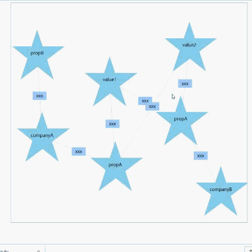
nodes: Object
typeOptions.nodes = {
  // The name of node type, which is used in RGData.nodes
  nodeA: {
    // Defining appearance
    appearance: {
      // Defining the content of appearance: Array
      contents: [
        {
          // name of content class, optional value: Rect/Circle/Image/Text, See below for details(Shape)
          className: "Rect",
          // Corresponding class parameters,See below for details(Shape)
          params: {
            width: 100,
            height: 100,
            borderRadius: 10
          }
        },
        {
          className: "Image",
          params: {
            width: 80,
            height: 80,
            srcKey: "imgUrl"
          }
        }
      ]
    },
    // The strength of the node's charge(The greater the charge intensity, the stronger the repulsive force between the nodes)
    collideRadius: 50
  },
  nodeB: {
    appearance: {
      contents: [
        {
          className: "Circle",
          params: {
            r: 40
          }
        },
        {
          className: "Text",
          params: {
            textStrKey: "label",
            isOverflowHidden: true,
            maxWidth: 60
          }
        }
      ]
    },
    collideRadius: 40
  },
  customizeA: {
    appearance: {
      contents: [
        // Customize Content, param options'prop includes d3Parent(The d3 selection object of the root element of the node,
        // see d3 selector for details, similar to jQuery)
        {
          draw: function(options) {
            var d3Parent = options.d3Parent;
            var polygon = d3Parent.append("polygon");
            polygon
              .attr("points", "0,-90 60,90 -90,-30 100,-30 -60,90")
              .style("fill", "skyblue");
            var text = d3Parent.append("text").text(function(d) {
              return d.showText;
            });
          }
        }
      ]
    },
    collideRadius: 150
  }
};
links<Array> Define what is displayed in the middle of the link, similar to the above nodes, but not configuration of
collideRadiustypeOptions.links = { linkA: { describe: { contents: [ { className: "Rect", params: { width: 50, height: 30, borderRadius: 0 } }, { className: "Text", params: { textStrKey: "label", isOverflowHidden: true, maxWidth: 50 } } ] } } }
Shape
Rect
- Params
- width: number Default 100
- height: number Default 100
- borderRadius: number The width of border, default 10
- Params
Circle
- Params
- r The radius, default 40
- Params
Image
- Params
- width Default 80
- height Default 80
- srcKey The prop's name of image url, default "src"
- Params
Text
- Params
- textStrKey Prop's name of showing text, default "showText"
- maxWidth Max width of the text, default 60
- isOverflowHidden Whether the text length is longer than the max width and the ellipsis is displayed, default true
- Params
RGData
Props
nodes<Array>
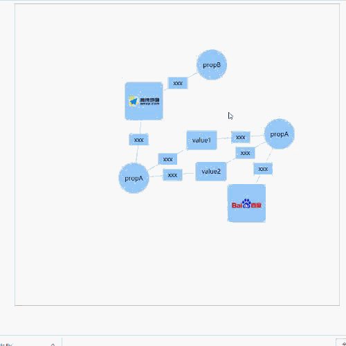
[
  {
    // The id of node
    id: "companyA",
    // The node type, which is defined in typeOptions.nodes
    type: "nodeA",
    // Url for image(Shape.Image)(srcKey is assigned to "imgUrl" in shape image of nodeA)
    imgUrl:
      "https://upload.wikimedia.org/wikipedia/en/thumb/e/e7/AutoNaviLogo.png/220px-AutoNaviLogo.png",
    // The level of node
    level: 1
  },
  {
    id: "companyA-propA",
    type: "nodeB",
    // For showing text(Shap.Text)(textStrKey is assigned to "label" in shape text of nodeB)
    label: "propA",
    level: 2
  }
];
links<Array>
[
  {
    // The id of link
    id: "1",
    // The id of source node
    source: "companyA",
    // The id of target node
    target: "companyA-propB",
    // The link type, which is defined in typeOptions.links
    type: "linkA",
    // For showing text(Shap.Text)(textStrKey is assigned to "label" in shape text of linkA)
    label: "something"
  },
  {
    id: "2",
    source: "companyB-propA",
    target: "value2",
    type: "linkA",
    label: "something"
  }
]
EventObj
属性
- targetData: Object
The data object corresponding to the trigger event, e.g. if clicked a node, targetData will be the data of the node. - event: Event
The event object.
- targetData: Object
RGObj Methods
- showNodeById(id) - show node based on node's id
- hideNodeById(id) - hide node based on node's id
- showAllNodeByKey(key, value) - Display all eligible nodes based on the attribute and value
- hideAllNodeByKey(key, value) - Hide all eligible nodes based on the attribute and value
- updateData(data) - Update the data of graph
- destroy() - Destroy the graph(Remove the svg and all relational objects)
Browser Compatibility
Compatible with IE11(has not tested the compatibility of IE11)