
dansp-ui-met8-vue
v1.0.4
Published
Componentes Vue 3 reutilizáveis para Metronic 8
Downloads
47
Maintainers
 dansp1337
Readme
📦 Instalação
# Usando npm
npm i dansp-ui-met8-vue

# Usando yarn
yarn add dansp-ui-met8-vue

# Usando pnpm
pnpm add dansp-ui-met8-vue

# Usando bun
bun add dansp-ui-met8-vue
🔧 Configuração
1. Configure no seu projeto Vue 3
Para projetos Vue 3 com Vite:
// main.js ou main.ts
import { createApp } from 'vue';
import { createPinia } from 'pinia';
import App from './App.vue';
import router from './router';
import { Tooltip } from 'bootstrap';

// Importe o CSS do Bootstrap
import 'bootstrap/dist/css/bootstrap.min.css';
import 'bootstrap';

// Importe os componentes
import DanspUiMet8Vue from 'dansp-ui-met8-vue';

const app = createApp(App);

// Use o Pinia para gerenciamento de estado (opcional)
app.use(createPinia());

// Use o router
app.use(router);

// Use os componentes
app.use(DanspUiMet8Vue);

// Diretiva para tooltips do Bootstrap
app.directive('tooltip', (el) => {
  new Tooltip(el);
});

app.mount('#app');
🎨 Componentes Disponíveis
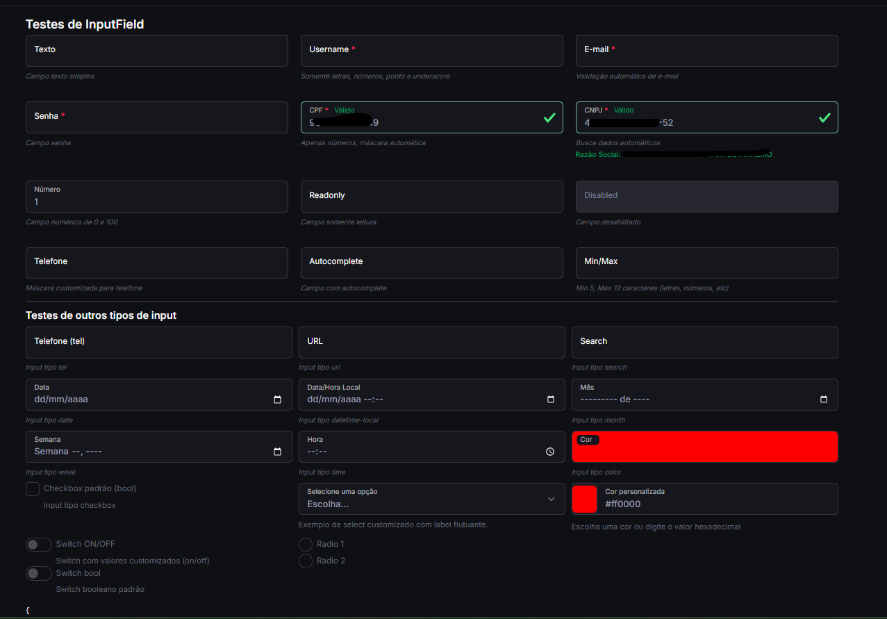
1. InputField
Campo de entrada com suporte a vários tipos e validações.
Exemplo de Uso:
<template>
  <div class="mb-3">
    <label class="form-label">Nome Completo</label>
    <InputField
      v-model="nome"
      type="text"
      placeholder="Digite seu nome"
      :required="true"
    />
  </div>

  <div class="mb-3">
    <label class="form-label">E-mail</label>
    <InputField
      v-model="email"
      type="email"
      placeholder="[email protected]"
      :required="true"
    />
  </div>

  <div class="mb-3">
    <label class="form-label">Senha</label>
    <InputField
      v-model="senha"
      type="password"
      placeholder="Digite sua senha"
      :required="true"
    />
  </div>

  <div class="mb-3">
    <label class="form-label">CPF</label>
    <InputField
      v-model="cpf"
      v-mask="'###.###.###-##'"
      type="text"
      placeholder="000.000.000-00"
    />
  </div>

  <div class="mb-3">
    <label class="form-label">Data de Nascimento</label>
    <InputField
      v-model="dataNascimento"
      type="date"
    />
  </div>
</template>

<script>
export default {
  data() {
    return {
      nome: '',
      email: '',
      senha: '',
      cpf: '',
      dataNascimento: ''
    };
  }
};
</script>
2. TextareaField
Área de texto para entradas maiores.
<template>
  <div class="mb-3">
    <label class="form-label">Mensagem</label>
    <TextareaField
      v-model="mensagem"
      placeholder="Digite sua mensagem aqui..."
      :rows="4"
      :required="true"
    />
  </div>
</template>

<script>
export default {
  data() {
    return {
      mensagem: ''
    };
  }
};
</script>
3. SelectField
Menu suspenso para seleção de opções.
<template>
  <div class="mb-3">
    <label class="form-label">Estado</label>
    <SelectField
      v-model="estado"
      :options="estadosBrasil"
      placeholder="Selecione um estado"
      :required="true"
    />
  </div>
</template>

<script>
export default {
  data() {
    return {
      estado: '',
      estadosBrasil: [
        { value: 'AC', label: 'Acre' },
        { value: 'AL', label: 'Alagoas' },
        // ... outros estados
        { value: 'SP', label: 'São Paulo' },
        { value: 'TO', label: 'Tocantins' }
      ]
    };
  }
};
</script>
4. CheckboxField
Caixa de seleção para opções booleanas.
<template>
  <div class="mb-3">
    <CheckboxField
      v-model="aceitaTermos"
      label="Aceito os termos de uso"
      :required="true"
    />
  </div>

  <div class="mb-3">
    <CheckboxField
      v-model="receberEmails"
      label="Desejo receber e-mails promocionais"
    />
  </div>
</template>

<script>
export default {
  data() {
    return {
      aceitaTermos: false,
      receberEmails: true
    };
  }
};
</script>
5. RadioField
Botões de opção para seleção única.
<template>
  <div class="mb-3">
    <label class="form-label d-block">Tipo de Pessoa</label>
    <div class="d-flex gap-4">
      <RadioField
        v-model="tipoPessoa"
        value="fisica"
        label="Pessoa Física"
        name="tipo-pessoa"
      />
      <RadioField
        v-model="tipoPessoa"
        value="juridica"
        label="Pessoa Jurídica"
        name="tipo-pessoa"
      />
    </div>
  </div>
</template>

<script>
export default {
  data() {
    return {
      tipoPessoa: 'fisica'
    };
  }
};
</script>
6. SwitchField
Interruptor para opções booleanas.
<template>
  <div class="mb-3">
    <SwitchField
      v-model="notificacoesAtivas"
      label="Ativar notificações"
      on-label="Sim"
      off-label="Não"
    />
  </div>

  <div class="mb-3">
    <SwitchField
      v-model="modoEscuro"
      label="Modo Escuro"
    />
  </div>
</template>

<script>
export default {
  data() {
    return {
      notificacoesAtivas: true,
      modoEscuro: false
    };
  }
};
</script>
7. EditorField
Editor de texto rico baseado no Quill.
<template>
  <div class="mb-3">
    <label class="form-label">Descrição do Produto</label>
    <EditorField
      v-model="descricao"
      :modules="modules"
      :toolbar="toolbar"
    />
  </div>
</template>

<script>
export default {
  data() {
    return {
      descricao: '',
      modules: {
        toolbar: [
          ['bold', 'italic', 'underline', 'strike'],
          ['blockquote', 'code-block'],
          [{ 'header': 1 }, { 'header': 2 }],
          [{ 'list': 'ordered'}, { 'list': 'bullet' }],
          [{ 'script': 'sub'}, { 'script': 'super' }],
          [{ 'indent': '-1'}, { 'indent': '+1' }],
          [{ 'direction': 'rtl' }],
          [{ 'size': ['small', false, 'large', 'huge'] }],
          [{ 'header': [1, 2, 3, 4, 5, 6, false] }],
          [{ 'color': [] }, { 'background': [] }],
          [{ 'font': [] }],
          [{ 'align': [] }],
          ['clean'],
          ['link', 'image', 'video']
        ]
      },
      toolbar: [
        ['bold', 'italic', 'underline', 'strike'],
        ['blockquote', 'code-block'],
        [{ 'header': 1 }, { 'header': 2 }],
        [{ 'list': 'ordered'}, { 'list': 'bullet' }],
        [{ 'script': 'sub'}, { 'script': 'super' }],
        [{ 'indent': '-1'}, { 'indent': '+1' }],
        [{ 'direction': 'rtl' }],
        [{ 'size': ['small', false, 'large', 'huge'] }],
        [{ 'header': [1, 2, 3, 4, 5, 6, false] }],
        [{ 'color': [] }, { 'background': [] }],
        [{ 'font': [] }],
        [{ 'align': [] }],
        ['clean'],
        ['link', 'image', 'video']
      ]
    };
  }
};
</script>
🔧 Propriedades dos Componentes
InputField
| Propriedade | Tipo | Padrão | Descrição | |--------------|---------------------|-------------|-----------------------------------------------| | v-model | String/Number | - | Valor do campo | | type | String | 'text' | Tipo do input (text, email, password, etc.) | | placeholder | String | '' | Texto de placeholder | | required | Boolean | false | Se o campo é obrigatório | | disabled | Boolean | false | Se o campo está desabilitado | | readonly | Boolean | false | Se o campo é somente leitura | | size | String | 'md' | Tamanho (sm, md, lg) | | state | String/Null | null | Estado de validação (null, 'valid', 'invalid')|
TextareaField
| Propriedade | Tipo | Padrão | Descrição | |--------------|---------------------|-------------|-----------------------------------------------| | v-model | String | - | Valor do campo | | rows | Number | 3 | Número de linhas visíveis | | placeholder | String | '' | Texto de placeholder | | required | Boolean | false | Se o campo é obrigatório | | disabled | Boolean | false | Se o campo está desabilitado | | readonly | Boolean | false | Se o campo é somente leitura |
SelectField
| Propriedade | Tipo | Padrão | Descrição | |--------------|---------------------|-------------|-----------------------------------------------| | v-model | Any | - | Valor selecionado | | options | Array | [] | Lista de opções ({value, label, disabled}) | | placeholder | String | '' | Texto de placeholder | | required | Boolean | false | Se a seleção é obrigatória | | disabled | Boolean | false | Se o select está desabilitado | | multiple | Boolean | false | Se permite seleção múltipla |
📱 Suporte e Compatibilidade
- Vue 3.3+
- Bootstrap 5.3+
- Navegadores modernos (Chrome, Firefox, Safari, Edge)
- Internet Explorer 11 (com polyfills)
🤝 Contribuição
- Faça um fork do projeto
- Crie uma branch para sua feature (
git checkout -b feature/AmazingFeature) - Commit suas alterações (
git commit -m 'Add some AmazingFeature') - Faça o push para a branch (
git push origin feature/AmazingFeature) - Abra um Pull Request
📄 Licença
Distribuído sob a licença MIT. Veja LICENSE para mais informações.
✉️ Contato
DanSP - @dansp89
Link do Projeto: https://github.com/dansp89/dansp-ui-met8-vue